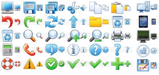
Best Practices for Icon Design


Icons are a huge part of the branding puzzle and can be a wonderful way for a designer to make some extra money. It seems like most clients want their own, customized icons, and it’s easier to do than you might think.
But, icons can also create a terrible mess if they’re done wrong. They have a unique, focused function within a design plan. Yet, all too often I observe poorly-planned icon design that either confuses, distracts, or just plain doesn’t make sense.
These tips are based on my own experience and have served me well when I’ve had the opportunity to customize icons. Like any other specific design elements, there are some general rules that can keep you out of trouble. But don’t be afraid to break these — especially when you’re experimenting or just playing around. Just make sure you know exactly why you’re breaking these general rules so you can step back and be somewhat objective prior to sending off crazy ideas to a client.
Know the Context
Not all icons function the same way. Context is king! Sometimes you need to create icons for a website. In other instances, you are building out a series of icons used within software. Still others are system tray/dock icons — PC and/or Mac.
You must know the context for which you are designing the icons and start from there. Otherwise you’ll get lost in irrelevant details or, worse, end up designing something completely inappropriate.
Start with Standards
I always like to start off with some standards. Usually this means researching icons designed by others that I really like. So, I spend awhile pulling together my own roundup of favorite icon designs and come up with some best-in-class examples.
This gives me a baseline and also helps me when I’m working with super-small designs like icons. It’s easy for me to get frustrated and feel like my palette has been dramatically limited. When I pull up some standards that I love, I tend to get excited and feel rejuvenated.
This also helps me avoid pitfalls and break me out of my box. I have a few favorites I keep around, but I also always go and find some new ideas before getting started.
Brand Awareness
Keep the brand in mind while designing. You may have a whole series of icons that you used for the website that can be easily integrated into the software package. Don’t reinvent the wheel! Use what ya have!
But, even if you’re starting from scratch, it’s always a good idea to get the basic brand elements in front of you. I like to have the logo, color swatches, any specific typography/fonts used, brochures, and the website all in front of me. Hopefully, the client has a well-defined brand scheme that is reflected throughout these marketing materials.
If not, no worries. Just focus on the best of the brand elements and build those into your icons. Basic colors and shapes are a great way to go, simply because icons are such simple pieces. So, don’t get too worried here. Think high-level colors and shapes when integrating branding into your icon designs.
Consistent Styling
As I design icons, I like to save layer styles in Photoshop (or whatever software you like to design icons in). This allows me to quickly apply the same basic effects to all my icons to keep a similar look and feel throughout.
Shadows and reflections are two of the easiest design concepts that pop into my head that I have to consistently repeat from one icon to the next. Make it once and apply it to them all. No sense in having to go through all those steps again.
This also creates a clear pattern to your designs and keeps this pattern tight and focused. You might think it’s no big deal if your global light on one icon is 20 degrees off on another, but it does! Okay, so maybe only the most picky user will notice, but it’s just too easy to prevent this misshap from happening with layer styling these days.
Simplicity
Avoid complex designs with lots of different shapes and ideas. I’ve seen plenty of icon designs that integrate a background, multiple shapes, and a giant checkmark on top of all of these. That’s too much! Way too much!
Keep icons simple. Their function is to give the user a fast visual reference. The simpler the design, the faster the interpretation. Too simple can be bad, too, of course. But the tendency in most cases is to go too far with too many design elements.
Look at your icon and see if anything that doesn’t affect the idea can be eliminated. If so, cut it!
Icons Should be…Iconic
This kind of goes back to not reinventing the wheel – there are a lot of well-defined icons out there that already communicate their respective messages. Integrate these into your designs and save yourself time – not to mention your users’ energy.
For example, we’re all familiar with the obligatory RSS feed symbol used on just about every site these days. You already know what I’m talking about without having to see it. So when it’s time for you to make a customer RSS icon, don’t try to start from scratch. Implement that obvious symbol, add your brand’s touch, and move on.
Create Multiple Sizes

Don’t forget to examine in what sizes your icons may be displayed. You may need to design for each of the possible sizes. Some icons go up to 512 x 512 pixels.
This is where context is so important. Most icons are static — you know exactly how big they are and how they’ll display every time. But sometimes you’re going to design for an environment that is less than simple. So know how your icons will be used and prepare accordingly.
Avoid Unnecessary Symbols

A HUGE, annoying, glaring mistake I see in icon design is the addition of extra symbols. If you have to include a checkmark or a giant X over your icon, just don’t include the icon at all. Use the checkmark or X by itself. Otherwise, you clutter the design.
Ask yourself if all the symbols are necessary. If so, is the icon necessary? Often you’ll find that you don’t need both. There’s just no need! Users can figure out from the context, in most cases, what to do if you just use the appropriate symbols.
Avoid Icon-Internal Text

Another glaring issue is the use of text inside the icons. Why? Seriously?! Do you think users need that much guidance? Is the brand so important that you have to cram characters into the icon? No! It’s an icon. Keep it simple.
There is an exception to this rule. Very large icons lose their iconistic value — they look more like giant pictures. In these rare cases, you may want to include some text to help people from a strictly user experience standpoint. But, these should be the exception to the rule, not the norm for your icon designs.
Icons are an important part of making a website usable. Make sure to use best practices for your icon designs to help clients keep their clients happy and ultimately help you bring in the big bucks. I’d love to see some of the icons you’ve designed, especially outside the box designs.
Have any of your own advice? Feel free to share in the comments below!
Frequently Asked Questions on Icon Design Best Practices
What are the key principles of effective icon design?
The key principles of effective icon design include simplicity, clarity, and recognizability. Icons should be simple and not overly detailed, as too much detail can make them confusing and hard to recognize. They should also be clear and easy to understand, conveying a single idea or concept. Recognizability is also crucial, as users should be able to instantly recognize what the icon represents.
How can I ensure my icons are user-friendly?
To ensure your icons are user-friendly, make sure they are intuitive and easy to understand. Avoid using abstract or complex designs that may confuse users. Also, ensure your icons are consistent in style and size to provide a seamless user experience. It’s also important to test your icons with users to get feedback and make necessary adjustments.
What are some common mistakes in icon design?
Some common mistakes in icon design include using too much detail, not considering cultural differences, and not testing icons with users. Overly detailed icons can be confusing and hard to recognize, especially on smaller screens. Cultural differences can also impact how an icon is perceived, so it’s important to consider your audience when designing icons. Lastly, not testing icons with users can lead to designs that are not user-friendly or intuitive.
How can I use color effectively in icon design?
Color can be a powerful tool in icon design, helping to convey meaning and draw attention. However, it’s important to use color sparingly and consistently. Too many colors can be overwhelming and confusing. Also, ensure the colors you choose are accessible to all users, including those with color vision deficiencies.
What tools can I use for icon design?
There are many tools available for icon design, including Adobe Illustrator, Sketch, and IconJar. These tools offer a range of features for designing and editing icons, including vector editing, color management, and export options.
How can I design icons for different platforms?
When designing icons for different platforms, it’s important to consider the specific guidelines and requirements of each platform. For example, iOS and Android have different icon sizes and styles. Also, consider the device and screen size, as this can impact how your icons are displayed and perceived.
How can I create a consistent icon set?
To create a consistent icon set, ensure all your icons share a common style and theme. This includes consistent shapes, colors, and line weights. Also, consider the spacing and alignment of your icons to ensure they look cohesive when displayed together.
How can I improve the recognizability of my icons?
To improve the recognizability of your icons, use familiar and intuitive designs. Avoid abstract or complex designs that may confuse users. Also, test your icons with users to get feedback and make necessary adjustments.
What are some best practices for icon usability?
Some best practices for icon usability include using labels to support icons, ensuring icons are large enough to be easily tapped on mobile devices, and using consistent iconography across your website or app.
How can I design accessible icons?
To design accessible icons, ensure your icons are clear and easy to understand, even for users with visual impairments. Use high contrast colors to ensure your icons are visible against their background. Also, consider providing alternative text for screen readers.
Tara Hornor has a degree in English and has found her niche writing about marketing, advertising, branding, graphic design, and desktop publishing. She is a Senior Editor for Creative Content Experts, a company that specializes in guest blogging and building backlinks. In addition to her writing career, Tara also enjoys spending time with her husband and two children.

Published in
·Design·Design & UX·Illustration·Photography & Imagery·Review·Sketch·Software·March 16, 2015