Elevating Wordmarks with the Power of a Custom Font

It’s the perennial question for logo designers tasked with creating a wordmark: to create the type from scratch, or to simply modify an existing typeface?
As we previously discussed, there is no shame in sprucing up an existing typeface – indeed, some of the world’s most famous companies have done it! At the same time, creating an entirely custom font can really take branding to the next level.
If you’ve got the chops to do it, perhaps you should. Consider the following:
Coca-Cola
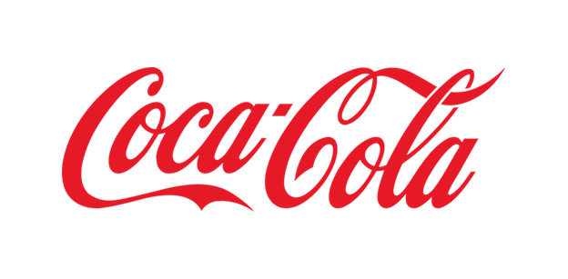
Coca-Cola’s logo, certainly one of the most well-known in the world, is based on Edwardian script – a style that was popular for handwriting in the late 19th century, but would not have worked very well as a printing typeface because of the way letters need to connect and because of limited legibility at smaller sizes.
If the founders of Coca-Cola had relied on an existing typeface, they probably would have wound up with something a lot blockier, and less memorable, than the version we know and love today.
IBM

For the IBM logo, Paul Rand did not simply take an existing typeface and slice it into bars. Rather, he created custom letters that are integrally composed of the separated horizontals. In the above image, Himanshu Khanna shows what the IBM logo might have looked like, had Rand taken the easy way out and simply chosen an existing font like Rockwell Bold (actual logo left; Rockwell Bold version right).
Many companies and organizations today are fully embracing the power of typeface to distinguish a brand, and not only requesting custom letters for their logos, but commissioning full, proprietary typefaces that can be used across all branding elements, from communications to packaging to advertisements.
Prada

Prada logo & typeface: Typecast
Prada is one example. Designer Gareth Hague of Alias took the distinctive forms of the fashion house’s existing logo and developed them into a full custom font set of letters, numbers and symbols.
Intel
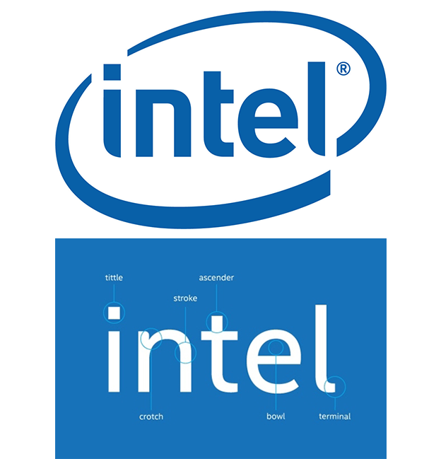
Intel logo: Design Week
Intel recently commissioned a proprietary typeface for use across all of its communications, designed by Red Peak Branding. It does not directly borrow letterforms from the Intel logo, but it is made to complement them in a pleasing way.
London 2012 Olympics
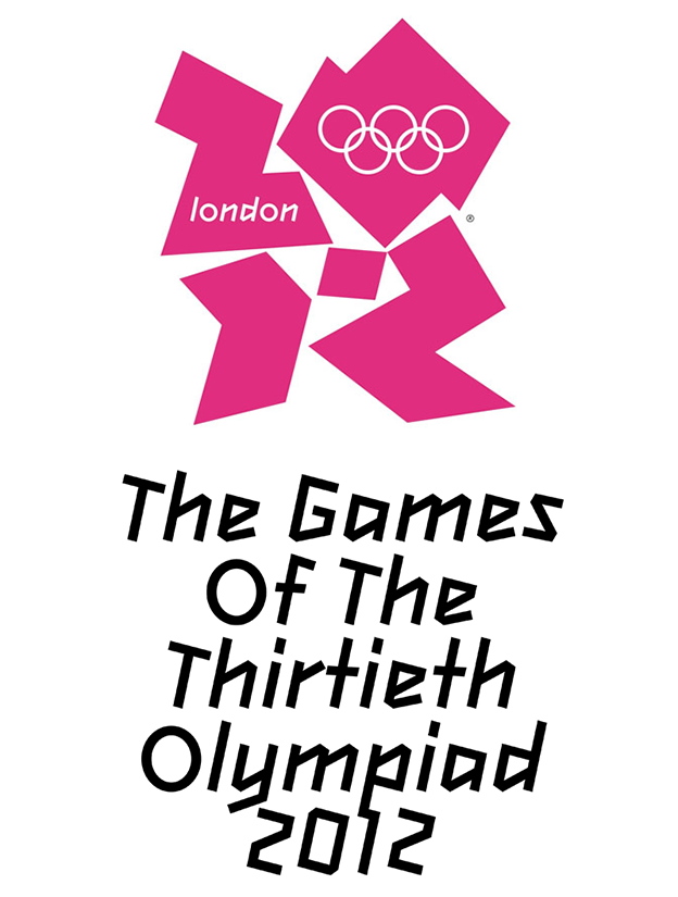
London 2012 Olympics logo: Typecast
The London 2012 Olympics did not have a wordmark logo per se, but it did create a proprietary typeface for use throughout the games (also designed by Mr. Hague), linking the various sports and media activities under one unified brand umbrella.
Chatype: A typeface for Chattanooga
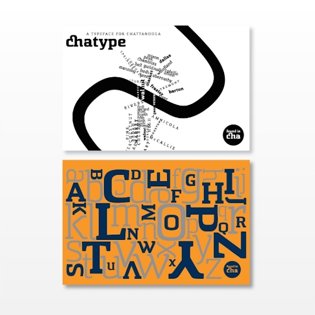
Chatanooga typeface: chatype
And why should brands be the only entities to reap the benefits of custom typefaces? When the town of Chattanooga, Tennessee decided to implement a “rebrand” of sorts, it commissioned a typeface it could call its own.
“A custom typeface reflects character, extends excitement, and becomes a rally point for suffering projects,” write the creators of Chatype. The custom font is now used across local civic entities and public institutions like this one:

Then there’s the other, perhaps more obvious reason to consider making a custom typeface: fun! Why shackle your work to someone else’s forms when you can make something that is entirely, top-to-bottom your own?
Plenty of designers are embracing the wordmark as an opportunity to release their full creativity, no holds barred. Just check out these inspiring examples:

Dirty Water Distillery: Sean McCabe
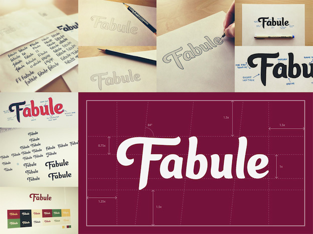
Fabule: Sean McCabe
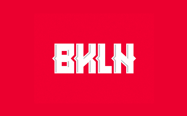
BKLN: Michael Spitz
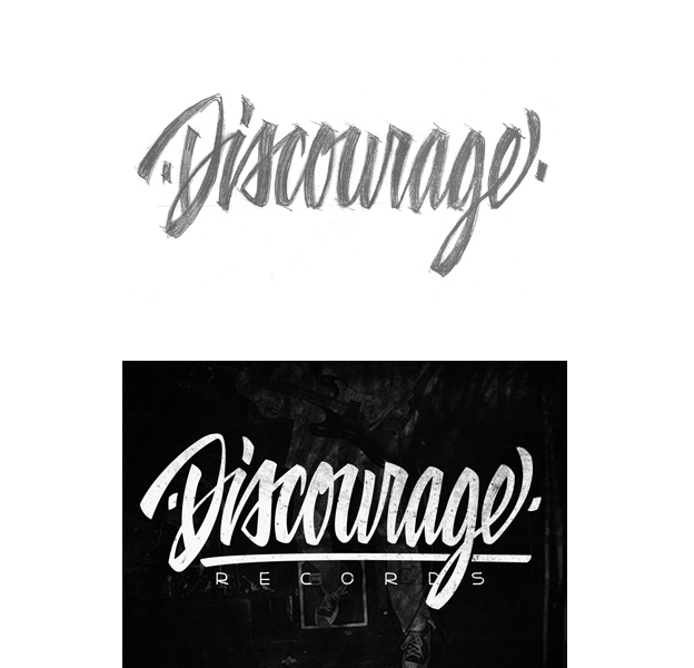
Discourage Records: Damian King
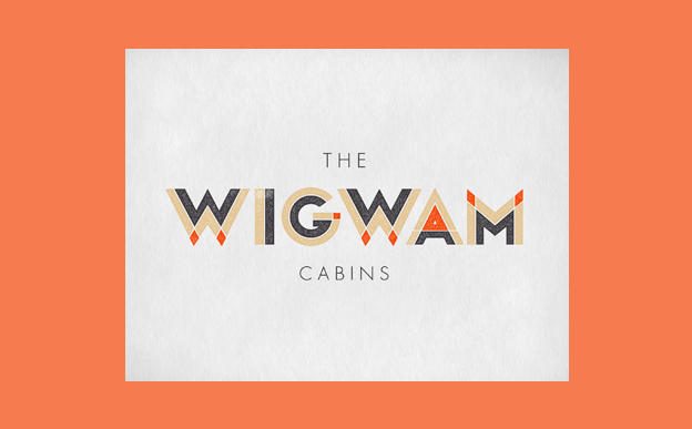
The Wigwam Cabins: Jennifer Lucey-Bzoza
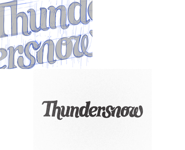
Thundersnow: Mae Mirkin
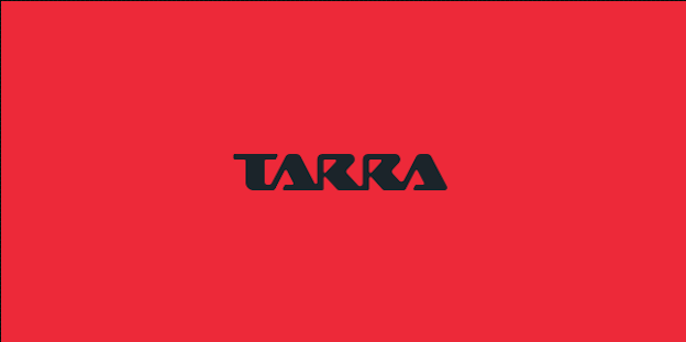
Tarra: Midgar
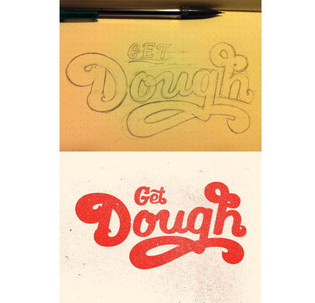
Get Dough: Nick Slater
When do you think it’s important to use custom fonts in typography? Share in the comments!
This article was originally published at 99designs Designer Blog. Reproduced with permission.
Frequently Asked Questions about Custom Fonts and Wordmarks
What is the significance of custom fonts in branding?
Custom fonts play a crucial role in branding. They help to create a unique identity for a brand, making it stand out from its competitors. A well-designed custom font can convey the brand’s personality, values, and message effectively. It can also enhance brand recognition and recall. For instance, Prada’s custom font is instantly recognizable and reflects the brand’s luxury and sophistication.
How does a custom font elevate a wordmark?
A custom font can significantly elevate a wordmark by adding a unique and distinctive touch to it. It can transform a simple wordmark into a powerful visual element that can capture the audience’s attention and leave a lasting impression. The Prada wordmark, for example, uses a custom font that exudes elegance and luxury, perfectly representing the brand’s high-end image.
What factors should be considered when designing a custom font for a wordmark?
When designing a custom font for a wordmark, several factors should be considered. These include the brand’s personality, target audience, and industry. The font should align with the brand’s identity and appeal to its target audience. It should also be appropriate for the industry the brand operates in. For instance, a playful and quirky font may work well for a children’s brand but not for a luxury brand like Prada.
How can I choose the right custom font for my brand?
Choosing the right custom font for your brand involves understanding your brand’s personality and target audience. You should also consider the legibility and versatility of the font. It should be easy to read across different mediums and sizes. Additionally, it’s important to ensure that the font is unique and sets your brand apart from its competitors.
Can I use a free font for my brand’s wordmark?
While it’s possible to use a free font for your brand’s wordmark, it may not provide the uniqueness and distinctiveness that a custom font can offer. A custom font can be tailored to your brand’s specific needs and personality, making it a more effective branding tool.
What is the process of creating a custom font?
Creating a custom font involves several steps. It starts with understanding the brand’s personality and target audience. Then, sketches are made to explore different font styles and shapes. Once a design is finalized, it’s digitized and refined using font design software. The final font is then tested for legibility and versatility.
How does Prada’s custom font contribute to its brand identity?
Prada’s custom font plays a key role in its brand identity. It reflects the brand’s luxury and sophistication, helping to create a distinctive and memorable image. The font’s clean and elegant lines mirror Prada’s high-quality products and meticulous craftsmanship.
Can a custom font be trademarked?
Yes, a custom font can be trademarked. This can provide legal protection for the font and prevent others from using it without permission. However, the process of trademarking a font can be complex and requires the assistance of a legal expert.
How can I ensure that my custom font is unique?
To ensure that your custom font is unique, it’s important to avoid copying existing fonts. Instead, focus on creating a font that reflects your brand’s personality and values. You can also hire a professional font designer to create a truly unique and distinctive font for your brand.
What are some examples of successful custom fonts in branding?
Some examples of successful custom fonts in branding include Prada’s elegant and sophisticated font, Coca-Cola’s iconic script font, and Google’s simple and modern font. These fonts have become synonymous with their respective brands, demonstrating the power of custom fonts in branding.
Alex Bigman is liaison to 99designs' awesome community of graphic designers. He is a recent grad of UC Berkeley, where he studied history of art and cognitive science.


Published in
·Accessibility·Canvas & SVG·Design·Design & UX·HTML & CSS·Illustration·Performance·UI Design·Usability·UX·Web Fonts·August 19, 2015
Published in
·Design·Design & UX·Illustration·Photography & Imagery·Resources·Typography·June 16, 2016