Design an Origami-Inspired Logo

Key Takeaways
- Logo designs should be visually appealing, unique, and creative, often drawing inspiration from company names, origins, mascots, products, or current trends.
- The process of designing an origami-inspired logo involves sketching the design, creating lineart, dissecting the sketch to create “folds”, and using different colors to distinguish the pieces.
- To make the logo appear three-dimensional, create shadows and gradients, and use a paper texture for a realistic origami effect.
- When designing a logo, it’s important to consider its scalability and versatility, ensuring it looks good in different sizes and contexts. Also, the logo should be saved in a high-resolution format for clarity and sharpness when resized.
Step 1: New Document
Once you have Photoshop up and running, create a new document. Set your canvas so that it has the dimensions of 1000 x 800px and press OK.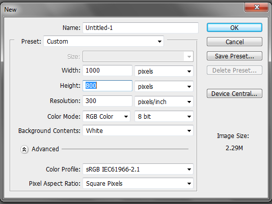
Step 2: Sketch
To make the construction of our logo easier, we need to first put together a sketch. It doesn’t have to be perfect; it just needs to give us an idea of what we want our logo to look like. You can either draw your sketch directly into Photoshop or draw it by hand and then scan it in. Below, you can see a quick sketch I did for my origami elephant logo.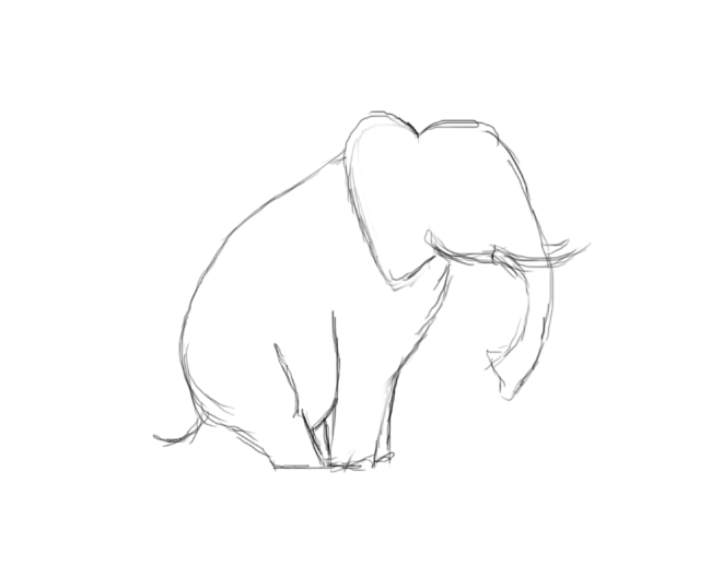
Step 3: Head Outline
Now that our sketch is finished, we need to create the lineart. In other words, we need to make a solid sketch so that we know where to divide pieces of the elephant into folder paper segments. To do this, you will need to use the pen tool and do the head and body separately. I used the color #db0052. You will notice in the image below that I created sharp points and edges for the head. Do not forget to outline the tusks.
Step 4: Body Outline
Make a new layer and place this beneath the head layer. Now, as you did for the head, make a solid outline for the body and tail. When you are finished, your outline should resemble the image below.
Step 5: Cuts
Since we now have the entire outline of our elephant, we need to start dissecting it in order to know where our “folds” will go. To achieve this, make a new layer and label it “cuts”. With a color different than the colors used before, begin creating lines with the pen tool. I used color #00afdb. Note that the more pieces you create, the more complex your logo will look. To make things simplistic, concentrate on outlining where the legs will be, the ear, and the trunk. Your final image should look like this: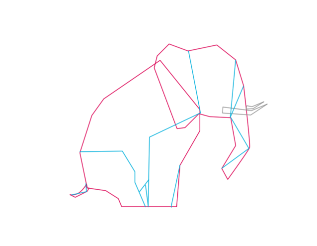
Step 6: Paint by Numbers
You might find yourself confused by the number of lines going on. If you are unable to distinguish different pieces, then I suggest you create a “paint by numbers” effect. Simply create a new layer and with a different color fill in each section. You should have 16 sections unless you have created more lines than I have. If assigning a different color to each piece confuses you, you can always assign numbers to differentiate the pieces. Use 1 and 2 to distinguish the pieces. Sections labeled with 1 will be under and sections labeled with a 2 will overlap. This will help you when it comes to building the shadows.

Step 7: #1 Color Sections
It is easier to break the color sections into two separate parts. We will start by coloring all the sections that are labeled with 1. Change your foreground color to #e0246a, create your paths with the pen tool, and fill them, making sure to only do those labeled with 1.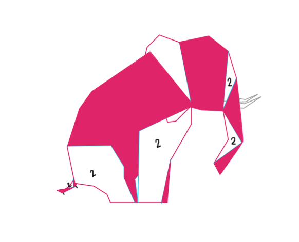
Step 8 #2 Color Sections
With the 1 sections now filled in, change your foreground color to #ec2c74 and use the same technique used in step 7.
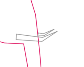
Step 9: Tusks
Create a new layer and change your foreground color to #c0c0c0. Use the pen tool to make a path for your tusks and fill them in.
Step 10: Ear
You might have noticed during the numberings that the ear and front leg of the elephant were both labeled with 2, so when you created your paths these two combined to look like one large shape. For our logo, we need these two shapes to appear as if they are overlapped. To do this, you need to simply pick the right color for the overlapped pieces and create a new layer. Lower the opacity of the “2” layer and turn the outline back on. Trace the shape of the ear alone and fill it in.
Step 11: Ear Shadow
Duplicate this layer and — staying on your newly-created ear layer — go to “Image” > “Adjustments” > “Hue/Saturation.” When the dialogue menu appears, leave everything alone aside from the “Lightness” option. Change the “Lightness” number to -42. The ear should look like this now: Apply a 2px Gaussian blur to the duplicated ear and then drag this layer under the ear layer so that it looks similar to the image below.

Step 12: Body Shadow
Just like with the ear, you probably noticed that the body and the left hind leg of the elephant both are labeled with the same number, making it appear as one piece. To rectify this problem, simply implement the same steps as done in step 10 to make the two pieces appear separate and overlapping. This is how your image should now look:
Step 13: #2 Section Overlap
We want to make the sections originally labeled with 2 look like they are overlapping the sections labeled with 1. We will use the same process used on the ear and body shadows. Go to the “2” layer and duplicate it. Next go to “Image” > “Adjustments” > “Hue/Saturation” and drop the Lightness to -42. Move this duplicated layer underneath the original “2” layer and apply a Gaussian blur to it.
Step 14: #2 Section Gradient
Make sure that you are on the original “2” layer, that your foreground color is #e0246a, and that your background color is #ffffff. Double-click on the layer to access the “Blending Options” menu. Select the “Gradient Overlay” box and change the gradient so it reflects your chosen colors. Enter the same numbers as shown below. Do not forget that your elephant’s ear is separate, so you will need to copy the layer style and paste it on to that layer as well.
Step 15: #1 Section Gradient
Copy the layer styles used in step 14 and paste them to the original “1” layer as well as the “body” layer.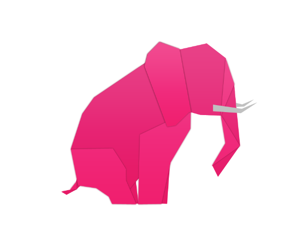
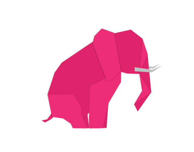
Step 16: Shadow
Create a new layer and place it underneath all the other layers. Use the elliptical marquee tool to create a shadow and fill it in with color #000000.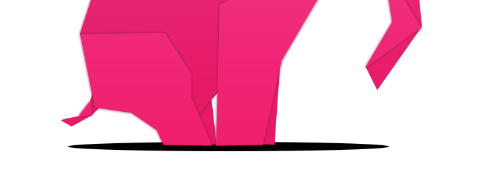 Drop the layer opacity to 20% and apply a 5px Gaussian blur.

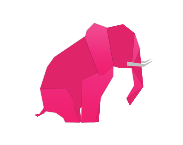
Step 17: Paper Texture
Copy and paste the paper texture above all over your layers and change the layer mode to “Divide.”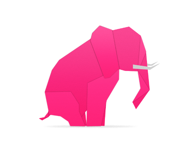
Finish
Finish your logo design by adding in elements like a background color and a company name. Download PSD File
Frequently Asked Questions about Designing an Origami-Inspired Logo in Photoshop
What is the ideal size for a logo in Photoshop?
The ideal size for a logo in Photoshop depends on its intended use. For a logo to be used on a website, a size of 250 x 150 pixels is usually sufficient. However, for print materials, a larger size is needed, typically around 1000 x 1000 pixels. It’s important to design your logo in a high resolution to ensure it remains clear and sharp when resized. Remember, you can always scale down a high-resolution image without losing quality, but scaling up a low-resolution image can result in a pixelated or blurry logo.
How can I make my logo unique and memorable?
To make your logo unique and memorable, consider incorporating elements that are relevant to your brand’s identity and values. For instance, an origami-inspired logo can convey a sense of creativity, precision, and attention to detail. Experiment with different shapes, colors, and typography until you find a design that feels right for your brand. Remember, simplicity is key when it comes to logo design. A simple, clean design is often more memorable and easier to recognize than a complex one.
Can I create a logo in Photoshop without any design experience?
Yes, you can create a logo in Photoshop even if you don’t have any design experience. Photoshop offers a variety of tools and features that can help you create a professional-looking logo. Start by sketching out your ideas on paper, then use Photoshop to bring your design to life. There are also plenty of tutorials and resources available online to help you learn the basics of Photoshop and logo design.
What are some common mistakes to avoid when designing a logo in Photoshop?
Some common mistakes to avoid when designing a logo in Photoshop include using too many fonts or colors, creating a design that’s too complex, and not considering how the logo will look in different sizes and contexts. It’s also important to avoid using raster images in your logo, as these can become pixelated when resized. Instead, use vector graphics, which can be scaled up or down without losing quality.
How can I incorporate origami elements into my logo design?
Incorporating origami elements into your logo design can be a great way to convey a sense of creativity and precision. Consider using geometric shapes and lines to create an origami-inspired design. You can also use gradients and shading to give your logo a three-dimensional, folded paper effect. Remember to keep your design simple and clean to ensure it’s easily recognizable.
What file format should I save my logo in?
The file format you should save your logo in depends on its intended use. For web use, JPEG or PNG formats are typically used as they support millions of colors and provide good quality. For print use, a vector format like EPS or PDF is recommended as these can be scaled up or down without losing quality.
How can I choose the right colors for my logo?
Choosing the right colors for your logo is crucial as colors can evoke certain emotions and perceptions. Consider your brand’s personality and the message you want to convey. For instance, blue can convey trust and reliability, while red can evoke excitement and passion. You can use online tools like Adobe Color to explore different color combinations and find one that suits your brand.
How can I ensure my logo looks good in different sizes and contexts?
To ensure your logo looks good in different sizes and contexts, it’s important to design it in a high resolution and to keep the design simple and clean. Test your logo in different sizes and on different backgrounds to make sure it’s always clear and recognizable. Remember, a good logo should be scalable, versatile, and relevant.
Can I use Photoshop to create a vector logo?
While Photoshop is primarily a raster-based program, it does have some capabilities for creating and working with vector graphics. However, for a fully scalable vector logo, a program like Adobe Illustrator is typically recommended.
How can I learn more about logo design in Photoshop?
There are plenty of resources available online to help you learn more about logo design in Photoshop. Websites like Adobe’s own tutorials, YouTube, and design blogs offer a wealth of information and step-by-step guides. You can also consider taking a course on a platform like Udemy or Coursera to deepen your understanding and skills.
Gabrielle is a creative type who specializes in graphic design, animation and photography.


