
Key Takeaways
- CSS being on the critical rendering path means that the browser stops rendering the web page until all the HTML and style information is downloaded and processed, which can cause delays and impact user experience.
- Not all style information is critical to building a usable page. The dominant approach is to defer or asynchronously load blocking resources, or inline the critical portions of those resources directly in the HTML.
- Taking advantage of media types and media queries can minimize render blocking. This involves splitting the content of your external CSS into different files according to media type and media queries, and referencing each file with the appropriate media type and media query inside the link element.
- The preload directive on the link element is a cutting-edge feature that can be used to counteract the block of the web page by browsers as they fetch external stylesheets. This tells browsers to fetch specific resources because the page is going to need those resources quite soon.
- Placing the link to the stylesheet files in the document body is another solution to the problem of delayed page rendering due to fetching of critical resources. This technique aims to achieve a sequential render of the page and does not rely on deciding what’s “above the fold”.

This article is part of a series created in partnership with SiteGround. Thank you for supporting the partners who make SitePoint possible.
I’ve always thought deciding how and when to load CSS files is something best left to browsers. They handle this sort of thing by design. Why should developers do anything more than slap a link element with rel="stylesheet" and href="style.css" inside the <head> section of the document and forget about it?
Apparently, this may not be enough today, at least if you care about website speed and fast-rendering webpages. Given how both these factors impact on user experience and the success of your website, it’s likely you’ve been looking into ways you can gain some control over the default way in which browsers deal with downloading stylesheets.
In this article, I’m going to touch on what could be wrong with the way browsers load CSS files and discuss possible ways of approaching the problem, which you can try out in your own website.
The Problem: CSS Is Render Blocking
If you’ve ever used Google Page Speed Insights to test website performance, you might have come across a message like this:
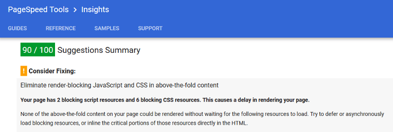
Here Google Page Insights is stating the problem and offering a strategy to counteract it.
Let’s try to understand the problem a bit better first.
Browsers use the DOM (Document Object Model) and the CSSOM (CSS Object Model) to display web pages. The DOM is a model of the HTML which the browser needs in order to be able to render the web page’s structure and content. The CSSOM is a map of the CSS, which the browser uses to style the web page.
CSS being on the critical rendering path means that the browser stops rendering the web page until all the HTML and style information is downloaded and processed. This explains why both HTML and CSS files are considered to be render blocking. External stylesheets especially involve multiple roundtrips between browser and server. This may cause a delay between the time the HTML has been downloaded and the time the page renders on the screen.
The problem consists in this delay, during which users could be staring at a blank screen for a number of milliseconds. Not the best experience when first landing on a website.
The Concept of Critical CSS
Although HTML is essential to page rendering, otherwise there would be nothing to render, can we say the same about CSS?
Of course, an unstyled web page is not user friendly, and from this point of view it makes sense for the browser to wait until the CSS is downloaded and parsed before rendering the page. On the other hand, you could argue that not all style information is critical to building a usable page. What users are immediately interested in is the above the fold portion of the page, that is, that portion which users can consume without needing to scroll.
This thought is behind the dominant approach available today to solve this problem, including the suggestion contained in the message from Google Page Insights reported above. The bit of interest there reads:
Try to defer or asynchronously load blocking resources, or inline the critical portions of those resources directly in the HTML.
But how do you defer or asynchronously load stylesheets on your website?
Not as straightforward as it might sound. You can’t just toss an async attribute on the link element as if it were a <script> tag.
Below are a few ways in which developers have tackled the problem.
Take Advantage of Media Types and Media Queries to Minimize Render Blocking
Ilya Grigorik illustrates a simple way of minimizing page rendering block which involves two stages:
- Split the content of your external CSS into different files according to media type and media queries, thereby avoiding big CSS documents that take longer to download
- Reference each file with the appropriate media type and media query inside the link element. Doing so prevents some stylesheet files from being render blocking if the conditions set out by the media type or media query are not met.
As an example, references to your external CSS files in the <head> section of your document might look something like this:
<link href="style.css" rel="stylesheet">

<link href="print.css" rel="stylesheet" media="print">

<link href="other.css" rel="stylesheet" media="(min-width: 40em)">
The first link in the snippet above doesn’t use any media type or media query. The browser considers it as matching all cases, therefore it always delays page rendering while fetching and processing the resource.
The second link has a media="print" attribute, which is a way of telling the browser: “Howdy browser, make sure you apply this stylesheet only if the page is being printed”. In the context of the page simply being viewed on the screen, the browser knows that stylesheet is not needed, therefore it won’t block page rendering to download it.
Finally, the third link contains media="(min-width: 40em)", which means that the stylesheet being referenced in the link is render-blocking only if the conditions stated by the media query match, i.e., where the viewport’s width is at least 40em. In all other cases the resource is not render blocking.
Also, take note that the browser will always download all stylesheets, but will give lower priority to non-blocking ones.
To sum up, this approach doesn’t completely eliminate the problem, but can considerably minimize the time browsers block page rendering.
Using the preload Directive on the Link Element
A cutting-edge feature you could leverage to counteract the block of the web page by browsers as they fetch external stylesheets, is the standard-based preload directive.
preload is how we, as developers, can tell browsers to fetch specific resources because we know the page is going to need those resources quite soon.
Scott Jehl, designer and developer working for The Filament Group, can be credited to be the first one who tinkered with this idea.
Here’s what you need to do.
Add preload to the link referencing the stylesheet, add a tiny bit of JavaScript magic using the link’s onload event, and the result is like having an asynchronous loading of the stylesheet directly in your markup:
<link rel="preload" as="style" href="style.css" onload="this.rel='stylesheet'">
The snippet above gets the browser to fetch style.css in a non-blocking way. After the resource has finished loading, i.e., the link’s onload event has fired, the script replaces the preload value of the rel attribute with stylesheet and the styles are applied to the page.
At this time browser support for preload is confined to Chrome and Opera. But fear not, a polyfill provided by the Filament Group is at hand.
More on this in the next section.
The Filament Group’s Solution: From Inlining CSS to HTTP/2 Server Push
Solving the problem of delayed page rendering due to fetching of critical resources has long been the highest priority for the Filament Group, an award-winning design and development agency based in Boston:
Our highest priority in the delivery process is to serve HTML that’s ready to begin rendering immediately upon arrival in the browser.
The latest update on optimizing web page delivery outlines their progress from inlining critical CSS to super efficient HTTP/2 Server Push.
The overall strategy looks like this:
- Any assets that are critical to rendering the first screenful of our page should be included in the HTML response from the server.
- Any assets that are not critical to that first rendering should be delivered in a non-blocking, asynchronous manner.
Before HTTP/2 Server Push, implementing #1 consisted in selecting the critical CSS rules, i.e., those needed for default styles and for a seamless rendering of the above the fold portion of the webpage, and cramming them in a <style> element inside the page’s <head> section. Filament Group devs devised Critical, a cool JavaScript plugin, to automate the task of extracting critical CSS.
With recent adoption of HTTP/2 Server Push, Filament Group has moved beyond inlining critical CSS.
What is Server Push? What is it good for?
Server push allows you to send site assets to the user before they’ve even asked for them. …
Server push lets the server preemptively “push” website assets to the client without the user having explicitly asked for them. When used with care, we can send what we know the user is going to need for the page they’re requesting.
In other words, when the browser requests a particular page, let’s say index.html, all the assets that page depends upon will be included in the response, e.g., style.css, main.js, etc., with a huge optimization boost on page rendering speed.
Putting into practice #2, asynchronous loading of non critical CSS, is done using a combination of the preload directive technique discussed in the previous section and LoadCSS, a Filament Group’s JavaScript library that includes a polyfill for those browsers that don’t support preload.
Using LoadCSS involves adding this snippet to your document’s <head> section:
<link rel="preload" href="mystylesheet.css" as="style" onload="this.rel='stylesheet'">

<!-- for browsers without JavaScript enabled -->

<noscript><link rel="stylesheet" href="mystylesheet.css">

</noscript>
Notice the <noscript> block that references the stylesheet file as usual to cater for those situations when JavaScript goes wrong or has been disabled.
Below the <noscript> tag, include LoadCSS and the LoadCSS rel=preload polyfill script inside a <script> tag:
<script>

/*! loadCSS. [c]2017 Filament Group, Inc. MIT License */

(function(){ ... }());

/*! loadCSS rel=preload polyfill. [c]2017 Filament Group, Inc. MIT License */

(function(){ ... }());

</script>
You can find detailed instructions on using LoadCSS in the project’s GitHub repo and see it in action in this live demo.
I lean towards this approach: it’s got a progressive enhancement outlook, it’s clean and developer friendly.
Placing the Link to the Stylesheet Files in the Document Body
According to Jake Archibald, one drawback of the previous approach is that it relies on a major assumption about what you or I can consider as being critical CSS. It should be obvious that all styles applied to the above the fold portion of the page are critical. However, what exactly constitutes above the fold is all but obvious because changes with viewport dimensions affect the amount of content users can access without scrolling. Therefore, one-size-fits-all is not always a reliable guess.
Jake Archibald proposes a different solution, which looks like this:
<head>

</head>

<body>

<!-- HTTP/2 push this resource, or inline it -->

<link rel="stylesheet" href="/site-header.css">

<header>…</header>
<link rel="stylesheet" href="/article.css">

<main>…</main>
<link rel="stylesheet" href="/comment.css">

<section class="comments">…</section>
<link rel="stylesheet" href="/about-me.css">

<section class="about-me">…</section>
<link rel="stylesheet" href="/site-footer.css">

<footer>…</footer>

</body>
As you can see, references to external stylesheets are not placed in the <head> section but inside the document’s <body>.
Further, the only styles that are rendered immediately with the page, either inlined or using HTTP/2 Server Push, are those that apply to the upper portion of the page. All other external stylesheets are placed just before the chunk of HTML content to which they apply: article.css before <main>, site-footer.css before <footer>, etc.
Here’s what this technique aims to achieve:
The plan is for each <link rel=”stylesheet”/> to block rendering of subsequent content while the stylesheet loads, but allow the rendering of content before it. The stylesheets load in parallel, but they apply in series.
… This gives you a sequential render of the page. You don’t need decide what’s “above the fold”, just include a page component’s CSS just before the first instance of the component.
All browsers seem to allow the placement of <link> tags in the document’s <body>, although not all of them behave exactly in the same way. That said, for the most part this technique achieves its goal.
You can find out all the details on Jake Archibald’s post and check out the result in this live demo.
Conclusion
The problem with the way in which browsers download stylesheets is that page rendering is blocked until all files have been fetched. This means user experience when first landing on a web page might suffer, especially for those on flaky internet connections.
Here I’ve presented a few approaches that aim to solve this problem. I’m not sure if small websites with relatively little and well-structured CSS would be much worse off if they just left the browser to its own devices when downloading stylesheets.
What do you think, does lazy loading stylesheets, or their sequential application (Jake Archibald’s proposal), work as a way of improving page rendering speed on your website? What is the technique you find most effective?
Hit the comment box below to share
Frequently Asked Questions (FAQs) on Critical Rendering Path and Fast Loading Websites
What is the Critical Rendering Path and why is it important for fast loading websites?
The Critical Rendering Path (CRP) is a sequence of steps that a browser goes through to convert HTML, CSS, and JavaScript into pixels on the screen. It’s crucial for fast loading websites because the quicker these steps are completed, the faster the webpage loads. The CRP involves constructing the Document Object Model (DOM), CSS Object Model (CSSOM), rendering tree, layout, and paint. Optimizing the CRP improves the performance of your website, leading to a better user experience.
How can I optimize the Critical Rendering Path?
Optimizing the Critical Rendering Path involves minimizing the amount of time it takes to complete the steps. This can be achieved by reducing the size of the files, minimizing the number of critical resources, and shortening the critical path length. Techniques such as minifying files, inlining critical CSS, deferring non-critical CSS and JavaScript, and using asynchronous loading can help optimize the CRP.
What are render-blocking resources and how do they affect website loading speed?
Render-blocking resources are files that prevent the webpage from being displayed until they are fully downloaded and processed. These typically include CSS and JavaScript files. They affect website loading speed by delaying the rendering of the webpage, leading to a slower perceived load time by the user.
How can I eliminate render-blocking resources?
Eliminating render-blocking resources can be achieved by deferring non-critical CSS and JavaScript, inlining critical CSS, and asynchronously loading files. Tools such as Google’s PageSpeed Insights can help identify render-blocking resources on your webpage.
What is the difference between synchronous and asynchronous loading?
Synchronous loading blocks the rendering of the webpage until the file is fully downloaded and processed. On the other hand, asynchronous loading allows the webpage to continue rendering while the file is being downloaded. Asynchronous loading can improve webpage loading speed by not blocking the rendering process.
How can I inline critical CSS and why is it beneficial?
Inlining critical CSS involves placing the CSS directly in the HTML document instead of an external file. This can be beneficial as it eliminates the need for a separate network request, reducing the time it takes to render the webpage. However, it’s important to only inline the CSS that’s necessary for the initial rendering of the webpage to avoid increasing the size of the HTML document.
What is the role of JavaScript in the Critical Rendering Path?
JavaScript plays a significant role in the Critical Rendering Path as it can manipulate both the DOM and CSSOM. However, it can also block the rendering process if not handled correctly. To prevent this, JavaScript should be made asynchronous or deferred until the initial rendering process is complete.
How does minifying files improve website loading speed?
Minifying files involves removing unnecessary characters (like spaces and comments) from the code without changing its functionality. This reduces the size of the files, leading to faster download times and improved website loading speed.
What tools can I use to analyze and optimize the Critical Rendering Path?
Tools such as Google’s PageSpeed Insights and Lighthouse, as well as WebPageTest, can help analyze and optimize the Critical Rendering Path. These tools provide insights into the performance of your webpage and offer suggestions for improvement.
How does optimizing the Critical Rendering Path improve user experience?
Optimizing the Critical Rendering Path improves user experience by reducing the time it takes for a webpage to load. A faster loading webpage leads to a better user experience as users are less likely to abandon the site due to slow load times. Additionally, a fast loading website can also improve your site’s ranking on search engine results pages.