
Key Takeaways
- The hero image on your portfolio site should reflect your type of work and offer a preview of your talents, setting the right impression for your visitors.
- Six key elements to focus on when creating a hero image are: selecting relevant imagery, using the background to add detail, styling fonts to clarify your voice, deciding on color usage, enhancing engagement with interactions, and choosing a clear call-to-action.
- Your hero image should align with your brand’s personality, values, and aesthetics, using colors, fonts, and imagery consistent with your brand’s visual identity.
- To ensure your hero image is effective, it should be high resolution, relevant, and optimized for web use, with a clear message about your brand or work. It should also be responsive for mobile devices and include a compelling call-to-action.
This article was created in partnership with BAWMedia. Thank you for supporting the partners who make SitePoint possible.
All it takes is a matter of seconds for visitors to form an impression about a website. Considering the hero image on the home page is the first bit of content that most visitors encounter, what sort of impression do you want them to get when they see yours?
To make the most of these initial encounters, your hero image needs to be well-thought-out and executed. It needs to convey what type of creator you are, offer a preview of your talents, and give visitors a reason to explore further.
To create the perfect hero image for your portfolio website, there are 6 elements to focus on. In this post, we’ll look at what those elements are as well as some pre built website examples from BeTheme – one of the world’s most popular and highly rated WordPress Themes with 264,000+ sales and a 4.83 out 5 star rating – and other brands that demonstrate various ways to artfully bring them together.
Designing the perfect hero image for your portfolio website
In general, there are 6 elements that come together to form every hero section, regardless of what type of site you’re building. Here are some things to think about as you create your hero image using these critical components:
1. Pick imagery that will be the best reflection of what you do
The imagery you choose for your hero image should have a direct connection to the type of work you do.
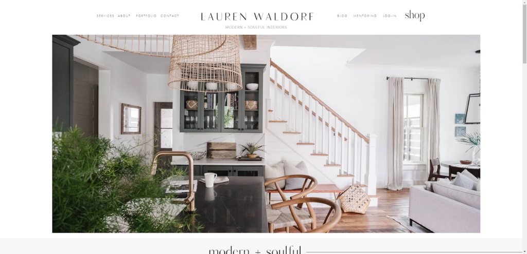
For example, Lauren Waldorf Interiors is a boutique interior design studio. As such, the hero section contains a sliding photo gallery of completed projects:
For photographers, videographers, web designers, and other visual artists, you probably have a lot of graphics you could show off in the hero. For artists that work with other types of media, it might be difficult to visually depict what you do.
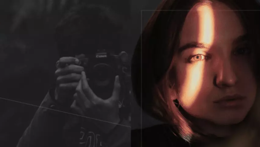
In the latter case, you might decide to make your face the primary image in the hero section, as we see in the BeDJ 2 pre built website hero image:
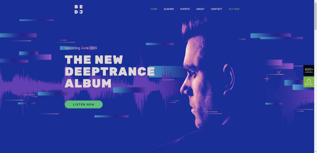
The DJ’s face gives visitors something more visually interesting to look at than just a bunch of colors and music-related graphics. It also creates a direct connection between the body of work and the artist.
As you go about designing your hero image, consider the following:
- What or who should be the main subject of the section?
- Does the image belong in the foreground or blended into the background?
- Will the image be untouched or is there a way to make it appear more artistic?
Also, do you even need imagery at all? For example, if you’re a font designer or copywriter, then you might decide to skip the imagery and just let your text do the talking.
2. Use the background to lend more details about what you do
There are different ways to deal with the background of the hero section.
In some cases, your work might occupy the backdrop. For instance, a videographer could put a slideshow of their videos in the background. Not only would this make the website feel lively, but it would also give visitors a quick preview of your work.
In other cases, you might want to give a small tease of your work in the hero section, like this example from the BeInterior 6 pre built website:

The photo gallery takes up about a quarter of the width of the section. While the designer could’ve used a color background to frame the work, they chose to add a textured photo instead. The sheet not only provides a comforting color to the backdrop, it’s a creative way to add context to what the interior designer does.
Your other option would be to use solid colors or gradients (along with illustrations) in the background the way that Mindgrub does:

For digital creatives, this might be your best option. While you could show off screenshots of websites you’ve built or UI kits you’ve developed, you can use this space to create a digital masterpiece of your own. You can save the work you’ve created for clients for another section or page.
3. Style your fonts so that your voice becomes crystal-clear
Even if you don’t write the text that appears in the hero section, the aesthetic choices you make can communicate just as much to prospective clients as the words themselves do.
There are a number of ways to add a voice to your hero messaging. The first is with the type of font you use. For example, BeDetailing 4 pre built website uses a Google font called Italiana:
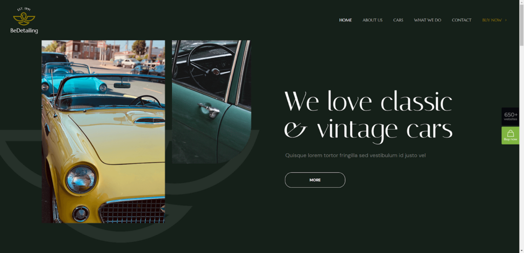
This auto detailing company expresses a fondness for classic and vintage cars right up front. The wording, car imagery, and the elegant calligraphy-inspired font all tell us as much.
Another thing to consider is how the styling of your sentences can make your messaging sound different. For example, Get Em Tiger does a number of things to change the way their hero image text sounds inside the heads of people reading it:

First, the main headline is in all caps. Text styled this way is generally interpreted to sound loud and bold.
Secondly, the words “STAND OUT” are highlighted in orange. This is meant as a substitute for italics or bolding that would normally be used to create emphasis in plain text.
In addition, the sub-headline is written in sentence case. When visitors read this, it will likely take on a friendlier, more conversational tone inside their heads.
4. Figure out the role that colors will play
By the time you’re ready to create the hero image for your portfolio site, you’ve likely worked out what your brand colors are going to be.
Typically, the brand color palette is useful for styling buttons as well as adding accents to key areas of your website. However, you might decide to heavily pull from it to create your hero section as G Sharp Design has done:
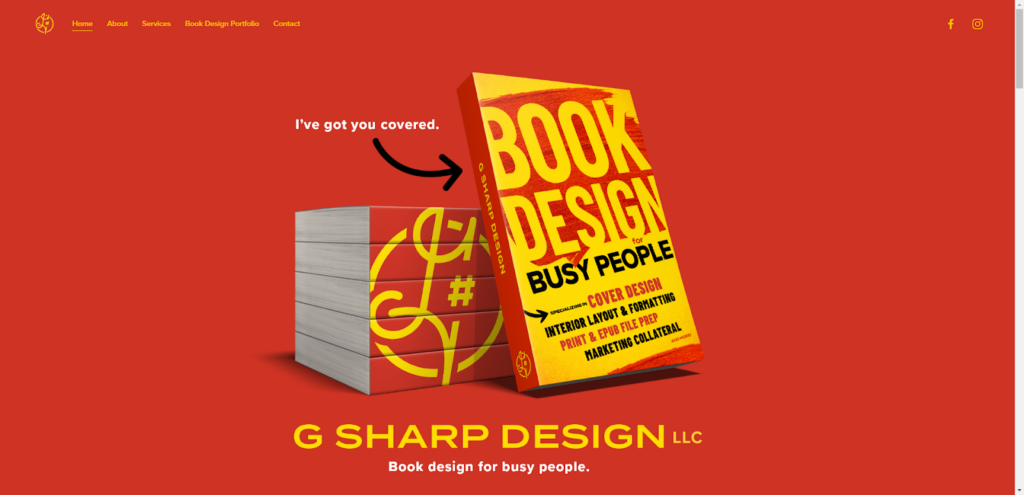
The color palette in this hero section is relatively simple. Yet, the vibrant red and yellow that dominate the design make it impossible to tear your eyes away from it.
While this spectacle of color works well for this agency, it might not feel right for other types of creatives. For instance, a photography pre built website like BePhoto 2 uses a dark theme:

The hero image has a photo slider in the center of it where a bright pop of color is revealed with each subsequent photo. Because the rest of the site is styled in a muted dark grey with off-white text, the photos instantly grab attention.
So as you decide on your own color palette, ask yourself the following questions:
- How many colors do you need?
- Which colors from your brand color palette will you use?
- Are there other colors you want to pull in?
- What role will each color play in terms of setting the mood, inspiring action, etc.
Color doesn’t need to be all-consuming in order to be effective. It all depends on what you need it to do for you in this section.
5. Make it more impressive with interactions
Without animation, your hero image is nothing more than a static billboard.
Now, there’s nothing wrong with billboard advertising — when it’s over 200 square feet in size and standing more than 10 feet off the ground. Without the grand presence that billboards have in the real world, though, static designs on a website can feel lifeless and uninspired.
Just like the other elements we’ve looked at today, there are different ways to add motion and interaction to your hero image design.
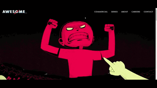
For instance, Awesome Inc is an animation and design studio. It would be weird if we saw nothing of their high-profile animation work after entering the website:
On the other hand, if you’re a creative that doesn’t do animation work, there would be no reason to take it to this extreme. That doesn’t mean that your hero image should be devoid of motion though.
For example, BeModel 3 pre built website has a dynamic hero image design:
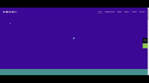
It’s not just the image slider that’s animated. The color palette of the slider changes in sync with the photo changes.
Even this might seem like a lot of motion for you. If that’s the case, there are more subtle ways to use animations to make your hero image feel more engaging — like adding hover transformations to buttons or transition animations to the section.
6. Pick a single call-to-action
Last but not least, you’ll want to figure out what the next logical action should be for visitors.
One option is to keep them scrolling down the page. If that’s the case, you might not even want to include a call-to-action button. The majority of visitors will naturally start scrolling after they’ve seen all that they need to see.
Another option is to invite them to visit another page on your website. If that’s the case, which page should it be? On a portfolio site, you’ll probably want visitors to go to your Portfolio or Services page.
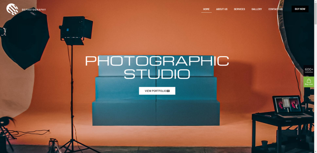
BePhotography 2 pre built website, for instance, directs prospective clients to the Portfolio page:
Yet one more option is to encourage visitors to engage with the hero image before giving them the option to go somewhere else. This will be useful if your hero image offers a slideshow of your work that users can engage with. This is what Perky Bros does:
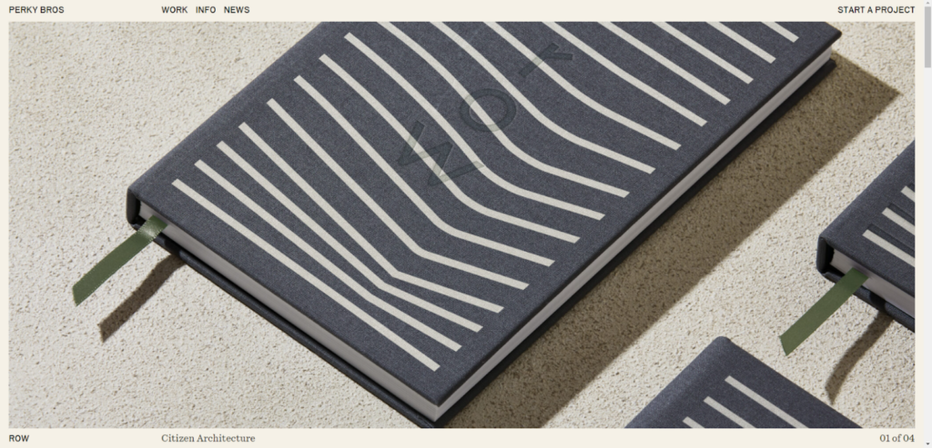
The visitor’s cursor will change appearance based on which part of the slider they hover over. On the left or right side of the screen, a blue arrowhead appears, letting them know there’s more work to explore. In the center of the screen, the words “View Project” appear. When clicked, the visitor will be taken to a case study page for the project.
Design a hero image that does your creative work justice
The design of the hero image is especially critical on portfolio sites as it not only needs to be reflective of what visitors will find on your site, but also reflective of your talents as a creative. So you have to make sure you create a hero image that properly sets the stage for you.
What’s nice about using a WordPress theme like BeTheme is that it comes with 101 pre built portfolio sites. Each of which comes with a hand-crafted hero image design that will make it easy to update the 6 crucial components we looked at above.
Frequently Asked Questions about Creating the Perfect Hero Image for Your Portfolio Site
What are the key elements to consider when creating a hero image for my portfolio site?
The key elements to consider when creating a hero image for your portfolio site include the image quality, relevance, size, and the message it conveys. The image should be of high resolution to ensure it looks professional and appealing. It should also be relevant to your portfolio’s content, helping to set the tone and context for what the visitor can expect. The size of the image is crucial as it should not slow down your site’s loading speed. Lastly, the image should convey a clear message about your brand or work, making it easier for visitors to understand what you do at a glance.
How can I ensure my hero image aligns with my brand?
To ensure your hero image aligns with your brand, it should reflect your brand’s personality, values, and aesthetics. This can be achieved by using colors, fonts, and imagery that are consistent with your brand’s visual identity. You can also include elements that represent your work or industry. For instance, if you’re a graphic designer, you might use a hero image showcasing your design work.
How important is the size of the hero image?
The size of the hero image is crucial as it can significantly impact your site’s loading speed. A large, high-resolution image may look stunning, but if it slows down your site, it could frustrate visitors and lead them to leave. Therefore, it’s essential to optimize your hero image for web use, ensuring it’s an appropriate size without compromising on quality.
Can I use text over my hero image?
Yes, you can use text over your hero image. This can be an effective way to communicate your value proposition or a call-to-action directly. However, ensure the text is legible against the image background. You can achieve this by using a high-contrast color for your text or adding a semi-transparent overlay to your image.
How can I optimize my hero image for mobile devices?
To optimize your hero image for mobile devices, you should ensure it’s responsive. This means the image will automatically adjust to fit different screen sizes, maintaining its quality and impact. You can also consider using a different, more suitable image for mobile if your main hero image doesn’t display well on smaller screens.
Should my hero image include a call-to-action?
Including a call-to-action (CTA) in your hero image can be highly effective. It guides visitors towards taking a specific action, such as viewing your portfolio, contacting you, or downloading a resource. Ensure your CTA is clear, compelling, and easy to spot.
How often should I update my hero image?
There’s no set rule for how often you should update your hero image. However, it’s a good idea to refresh it occasionally to keep your site looking current and engaging. This could be when you have new work to showcase, a change in your brand direction, or simply to give your site a fresh look.
Can I use a video as a hero image?
Yes, using a video as a hero image can be a dynamic and engaging choice. It can help to tell a story and create an immersive experience for your visitors. However, ensure the video is high quality, short, and doesn’t auto-play with sound, as this can be disruptive.
What are some common mistakes to avoid when choosing a hero image?
Some common mistakes to avoid when choosing a hero image include using a low-quality image, choosing an image that doesn’t align with your brand, using an image that’s too large and slows down your site, and using an image that’s too busy or distracting, making it hard for visitors to focus on your message or CTA.
How can I test the effectiveness of my hero image?
You can test the effectiveness of your hero image through methods like A/B testing, where you compare two versions of your hero image to see which performs better. You can also use analytics to track metrics like bounce rate, time on page, and conversion rate, which can give you insights into how engaging and effective your hero image is.