Over the past five weeks I’ve written about simple principles you can employ to improve your designs, namely Contrast, Proximity, Balance and Value. In this final part of the series we’re looking at color. Color in design is a huge topic in itself, and I will undoubtedly return to it in future blog posts, but for today let’s take a look at how you can use color schemes when creating a mood for your design.
Color is an integral part of our lives. Nature uses color to warn off potential predators, to attract pollinators, to attract mates and to show fruit is ready for eating. Anyone who drives a car in a city follows traffic rules defined by red, green and amber, no text necessary. In advertising and design, color is used to grab attention and stimulate interest in ways that would be difficult to create by any other means. Through history color has been used to indicate status, for example nobility and royalty is associated with purple, and color has been an important source of symbolism in many countries.
 Something’s not quite right here.
So how do you go about choosing the right colors for your design? There is no single hard and fast rule, but the color wheel is a good place to get started.
Warm and Cool
The three traditional primary colors are red, blue and yellow. When you combine these you get the three secondary colors: orange, purple and green. When you combine each secondary color with its neighboring primary, you get the six tertiary colors: yellow-orange, yellow-green, blue-green, blue-purple, red-purple, red-orange. That’s where the color wheel comes from.
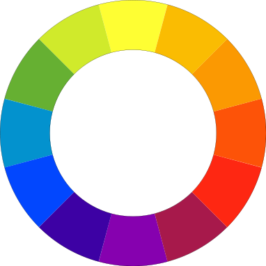 The image above shows colors arranged in the order of the spectrum: Red, orange, yellow, green, blue and purple (going anti-clockwise). Red is the warmest and blue is the coolest color. Warm tones appear in the red, orange and yellow side of the spectrum, with the cool tones appearing on the opposite side of the color wheel.
Monochromatic Color Schemes
The monochromatic color scheme uses variations in lightness and saturation of a single color. This scheme tend to look clean, elegant while producing a soothing effect. The primary color can be integrated with neutral colors such as black, white, or gray. The downside of monochromatic color schemes is that the can sometimes lack contrast and appear less vibrant than some other schemes.
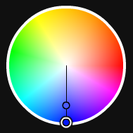
 Monochromatic scheme with a blue base
 Monochromatic scheme with a red base
Analogous Color Schemes
The analogous color scheme uses colors that are adjacent to each other on the color wheel. One color is set as the dominant color, the other add richness. The downside again is that there can sometimes be a lack of contrast.

 Analogous scheme with a blue base
Complimentary Color Scheme
The complementary color scheme is made of two colors that are opposite each other on the color wheel. This scheme is very successful for creating strong contrast and for drawing attention.
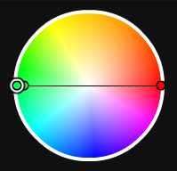
 Complementary scheme with a light green base
Split Complementary Scheme
The split complementary scheme is a variation of the standard complementary scheme. Take one color on the wheel and two colors adjacent to its complementary. The advantage of this scheme over a complimentary scheme is that it can be a little more sophisticated while still keeping a strong visual contrast.
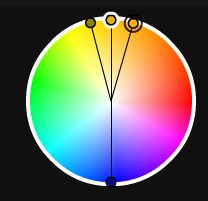
 Split Complementary scheme with a light green base
Triadic Color Schemes
The triadic color scheme uses three colors equally spaced around the color wheel. It’s great for providing balance, richness and contrast, although not as much contrast as the complimentary scheme.
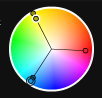
 Triadic scheme with a blue base
Tips for Using These Color Schemes
1. Choose one color to be used in larger amounts than others. You will get a horrible mess if you try to use equal amounts of every color. Be selective about your main or base color and then use the other colors to add interest.
 The By The Pond site uses a lovely dark-blue grey with complimentary mustard text and highlights.
2. If the colors look too gaudy, subdue them.
3. There are several tools online for creating color schemes, my favorite is Kuler. It allows you to play with the colour wheel and choose the color schemes discussed here with one click.
4. *updated* Black, white and grey can be used in all of these color schemes. You could think of them as neutrals that can be used with any color scheme.
All colors are influenced by the colors placed around them. The symbol below is the same shade of red on the left and right, but the background color dramatically changes the look. The color scheme on the left is extremely hard on the eye, while on the right the colors work well together and have an uplifting feel.
 Inspiration from Nature
If you’re looking for some inspiration and guidance for picking colours, turn off the computer and go outside. Mother Nature provides the best color combinations. Look at animals, plants, birds and take note of the amazing color schemes. Take photographs of them and keep them in your morgue file. Color Lovers has an excellent article on butterfly color schemes and I’ve written in the past about how to create color palettes from photographs in Photoshop and color schemes from paintings in Kuler.
Things to think about when using color in your designs:
1. Are the colors in your design working well together or are they hard on the eye? Is it difficult to read the text on the background?
2. Is your design too cool or too warm for what you want to convey? You can cool down overheated designs with small hints of cool colors (and vice versa).
3. Does your design work in black and white? If it does then a bit of color experimentation can really bring your design to its full potential.
4. If you’re designing for the web (or designing apps), have you thought about how color affects usability?
Color theory is a huge, huge topic and we’ll be back to visit it plenty more times. For now I hope this has been a helpful overview and that you’ve found the series on principles of design useful. Thanks for reading.
Do you have a natural flair for picking colors? What tools or methods do you use to help with picking colors?
Frequently Asked Questions on Principles of Design Colour
What is the significance of color in design?
Color plays a crucial role in design as it can influence emotions, actions, and how we respond to various products, ideas, and other stimuli. It is a powerful communication tool and can be used to signal action, influence mood, and even influence physiological reactions. Certain colors have been associated with certain types of products or industries and can be used strategically in design to make the most impact.
How can I choose the right color for my design?
Choosing the right color for your design depends on several factors including the message you want to convey, the audience you are targeting, and the context in which the design will be used. It’s important to understand the psychological implications of different colors and how they can influence perception. For instance, red can evoke feelings of passion and intensity, while blue can create a sense of calm and trust.
What is color theory and why is it important in design?
Color theory is a conceptual framework used in visual arts and design that explains how colors interact with each other and how they can be combined to create certain effects or evoke specific responses. It’s important in design because it provides guidelines for creating visually appealing and effective designs. Understanding color theory can help you make informed decisions about color use in your designs.
What are complementary colors and how can they be used in design?
Complementary colors are pairs of colors that, when combined, cancel each other out. This means that they produce a grayscale color when combined. They are located directly opposite each other on the color wheel. In design, complementary colors can create a strong contrast, making each color stand out more and creating a vibrant look.
How can I use color to improve user experience?
Color can significantly improve user experience by making your design more aesthetically pleasing and easier to navigate. Using contrasting colors can help differentiate between different elements on a page, making it easier for users to find what they’re looking for. Similarly, using a consistent color scheme can create a sense of harmony and balance, making your design more visually appealing.
What is the role of color in branding?
Color plays a significant role in branding as it can help to convey a brand’s personality and values, differentiate it from competitors, and make it more memorable. Different colors can evoke different emotions and associations, so it’s important to choose colors that align with your brand’s identity and message.
What is the difference between warm and cool colors?
Warm colors, such as red, orange, and yellow, are often associated with energy, brightness, and action. They are also often associated with warmth and sunlight. On the other hand, cool colors, such as blue, green, and purple, are often associated with calm, peace, and nature. They are often seen as soothing and are often used in designs to create a relaxed and peaceful mood.
How can I use color to highlight important information?
Color can be a powerful tool for highlighting important information. By using a contrasting color, you can draw attention to specific information or make certain elements stand out. For example, you might use a bright, bold color for a call-to-action button to make it stand out from the rest of the page.
What is a color palette and how do I create one?
A color palette is a selection of colors that are used in a particular design or group of designs. They help to create consistency and harmony in your designs. To create a color palette, you can start by choosing a base color and then select additional colors that complement or contrast with this base color. There are also many online tools available that can help you create a color palette.
How does color affect readability and accessibility in design?
Color can significantly affect readability and accessibility in design. For example, using high-contrast colors can make text easier to read, while using low-contrast colors can make it more difficult. Similarly, using certain color combinations can make your design more accessible to people with color vision deficiencies. It’s important to consider these factors when choosing colors for your design.
Jennifer Farley is a designer, illustrator and design instructor based in Ireland. She writes about design and illustration on her blog at Laughing Lion Design.


