

Key Takeaways
- The Quick Access Box in Magento themes can be made responsive using an off-canvas container with a toggle button to slide the content in and out of the screen. This method is 100% CSS and doesn’t change the browser history state.
- The quick access box is included in the header template file in the default Magento theme. Important elements to add are the checkbox and the label to control the checkbox state. The label should be clickable both when the quick access box is hidden and when it is shown.
- Browser support for this technique is very good, with all modern browsers supporting :checked and transitions. However, older or less feature-filled mobile browsers may not support position: fixed, meaning the quick access bar isn’t guaranteed to stick to the top of the screen. IE8 doesn’t support media queries, so a polyfill is needed for mobile-first design supporting IE8.
The Quick Access Box
In most Magento themes, the quick access box appears at the top right of the site and usually contains links to handy stuff such as the cart, checkout and maybe a search box.
Handling this in a responsive design can be tricky. It takes up a lot of room at the top of the page and it’s not really something that you want to completely remove from a small screen view.
The Off Canvas Solution
One solution that I am proposing is to use an off canvas container with a toggle button to slide the content in and out of the screen.
This form of navigation has now become commonplace in mobile application design and is mainly seen in the form of a hidden sidebar.
There is a really great article all about off canvas navigation in Smashing Magazine if you would like to learn more.
The way I have implemented this is by using a hidden checkbox and using the :checked pseudo selector to toggle the visibility of the quick access box. This has a couple of advantages over other techniques:
- No JavaScript – this is 100% CSS
- Doesn’t change the browser history state — The same effect could be used with the
:targetpseudoselector but I do not like the fact that it changes the history state by adding hashes (This is just a matter of personal opinion)
But there is also the drawback of the hidden checkbox being bad semantics.
The Template File
The quick access box is included in the header template file (app/design/frontend/base/default/template/page/html/header.phtml) in the default Magento theme.
Note: You should follow best practices and not edit this file but make the changes in your own theme.
The two most important things to add are the checkbox and the label to control the checkbox state.
Directly before <div class="quick-access"></div> add in the checkbox: <input type="checkbox" name="quick-access-checkbox" id="quick-access-checkbox"/>.
The label can go anywhere on the page as long as it is marked as for the checkbox you just added. Bear in mind that the label will need to be clickable both when the quick access box is hidden and when it is shown as well.
I chose to include the label inside the quick access box and wrap the main content of the quick access box inside a container div. This way the label can appear at the bottom of the quick access box and slide down with it whenever it opens.
<div class="quick-access">
<div class="quick-access-container">
<?php echo $this->getChildHtml('topSearch') ?>
<p class="welcome-msg"><?php echo $this->getWelcome() ?> <?php echo $this->getAdditionalHtml() ?></p>
<?php echo $this->getChildHtml('topLinks') ?>
<?php echo $this->getChildHtml('store_language') ?>
</div>
<label for="quick-access-checkbox" class="menu-toggle-button"><span class="visually-hidden">Menu</span><span aria-hidden="true" data-icon=""></span></label>
</div>One other thing to note is that I have used an icon font in the label, but you can include whatever you want.
And that is all you need in the HTML. Pretty simple really.
The CSS
Hide the Checkbox
There’s no point in showing the checkbox on the page as it serves no real purpose apart from as a way of storing a true or false value. I like to use the HTML5 Boilerplate method of visually hiding elements:
#quick-access-checkbox {

    border: 0;

    clip: rect(0 0 0 0);

    height: 1px;

    margin: -1px;

    overflow: hidden;

    padding: 0;

    position: absolute;

    width: 1px;

}
Position the Quick Access Box Off Screen
I have chosen to hide the quick access box off of the top of the page but it could just as easily be hidden to the side.
You can give the hidden content a fixed height, and position it off screen very easily:
.quick-access-container {

    height: 250px;

    overflow-y: auto;

}
.quick-access {

    position: fixed;

    top: -250px; /* Just enough to hide the content */

    left: 0;

    right: 0;

    z-index: 9999; /* Make sure it's on top of everything */

}
And then when the user hits the menu button the box just needs to be moved into the right position.
#quick-access-checkbox:checked + .quick-access {

    top: 0;

}
For a bit of extra eye candy, you can add a transition to have it slide up and down smoothly:
.quick-access {

    -webkit-transition: all .4s;

    -moz-transition: all .4s;

    -o-transition: all .4s;

    transition: all .4s;

}
Large Screen Styles
I generally write my CSS in a mobile first manner so the quick access box needs to be reset to the default position whenever the screen is large enough to accommodate it.
@media (min-width: 40em) {

    .quick-access-container {

        height: auto;

    }
    .quick-access {

        position: static;

    }

}
Finishing touches
That’s the basic functionality complete. All that’s left to do is style it up to match your theme.
And here is an example of it in action on a very basic starter theme.
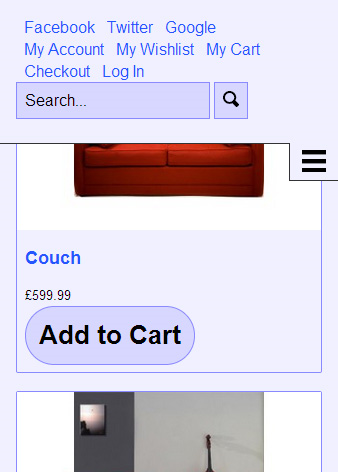
In the hidden view all you see is the menu button.
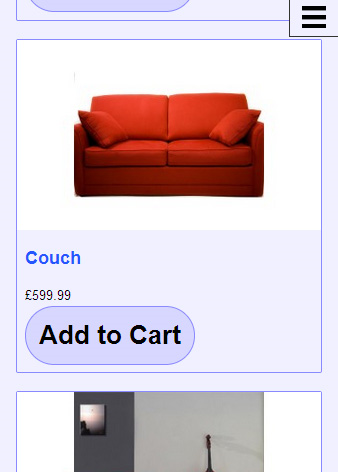
And when the menu button is pressed the quick access box slides down showing lots of useful links and features.
Browser Support
Browser support for this technique is very good, all modern browsers support :checked and transitions. Some older / not as feature filled mobile browsers don’t support position: fixed;, meaning the quick access bar isn’t guaranteed to stick to the top of the screen, but it gracefully degrades to just appearing at the very top of the website.
And a final note to remember is that IE8 doesn’t support media queries so you will need to add a polyfill if you are doing a mobile first design and want to support IE8.
Frequently Asked Questions on Building a Responsive Quick Access Box in Magento
What is a responsive quick access box in Magento?
A responsive quick access box in Magento is a user interface element that adjusts its size and layout based on the screen size and resolution of the device it’s being viewed on. This ensures that the quick access box is always easy to use and navigate, regardless of whether the user is accessing your Magento store from a desktop computer, a tablet, or a mobile phone.
How does a responsive quick access box improve the user experience?
A responsive quick access box improves the user experience by making it easier for customers to navigate your Magento store and find what they’re looking for. It adjusts to the user’s device, ensuring that it’s always easy to use and navigate. This can lead to increased customer satisfaction and potentially higher sales.
How can I build a responsive quick access box in Magento?
Building a responsive quick access box in Magento involves a combination of HTML, CSS, and JavaScript. You’ll need to create the HTML structure for the quick access box, style it with CSS to make it look good on all devices, and use JavaScript to make it interactive. Our article provides a detailed step-by-step guide on how to do this.
What are some common challenges when building a responsive quick access box in Magento?
Some common challenges when building a responsive quick access box in Magento include ensuring that the box is truly responsive and works well on all devices, making sure that it’s easy to use and navigate, and integrating it seamlessly with the rest of your Magento store. Our article provides solutions to these challenges.
Can I use a pre-built theme to get a responsive quick access box in Magento?
Yes, many pre-built Magento themes come with a responsive quick access box included. However, these may not always meet your specific needs or match the look and feel of your store. Building your own responsive quick access box gives you more control over its design and functionality.
How does a responsive quick access box in Magento compare to other e-commerce platforms?
Magento is known for its flexibility and customization options, and the ability to build a responsive quick access box is a testament to that. While other e-commerce platforms may also offer this feature, Magento allows you to have more control over its design and functionality.
What are some best practices for building a responsive quick access box in Magento?
Some best practices for building a responsive quick access box in Magento include making sure it’s truly responsive and works well on all devices, keeping it simple and easy to use, and testing it thoroughly to ensure it works as expected. Our article provides more detailed advice on these best practices.
How can I test the responsiveness of my quick access box in Magento?
You can test the responsiveness of your quick access box in Magento by viewing your store on different devices and screen sizes. You can also use tools like Google’s Mobile-Friendly Test to check how well your quick access box works on mobile devices.
Can I add additional features to my responsive quick access box in Magento?
Yes, Magento’s flexibility allows you to add additional features to your responsive quick access box. This could include things like a search bar, a shopping cart summary, or user account links. Our article provides guidance on how to add these features.
Do I need to know how to code to build a responsive quick access box in Magento?
While knowing how to code can certainly help, it’s not strictly necessary to build a responsive quick access box in Magento. There are many pre-built themes and extensions available that can provide this functionality. However, if you want to customize the quick access box to meet your specific needs, some coding knowledge will be beneficial.

