Build an Awesome Image Gallery with jQuery, Modernizr, and CSS3
Key Takeaways
- The article details how to build an image gallery using jQuery, Modernizr, and CSS3. It explains how to create a gallery that fades in photos and scatters them in a random fashion, with additional rotation for a more realistic effect.
- The tutorial begins by building a simple gallery using HTML and CSS. It then introduces Modernizr, a tool used to detect different kinds of browser support, and jQuery, a JavaScript library, to enhance the gallery’s functionality.
- The tutorial uses JavaScript’s Math object to randomly place images within the gallery’s boundaries. It also uses jQuery’s animate method to gradually reveal the images one by one. The images are first hidden and then revealed by increasing their opacity.
- For browsers that support CSS3 transform, the tutorial adds randomly generated rotations to the images for a more dynamic effect. The tutorial concludes by suggesting additional enhancements such as adding box-shadow or more animations.
Even though we’re definitely living in the Flickr Age (apparently that’s the one that comes right after the Age of Aquarius), there’s still something so lovely about being able to spread a big boxful of photos over my kitchen table. In fact, my favorite screensaver does a pretty good job of emulating this — it’s the one built into MacOS X that grabs photos from your iPhoto library, and scatters them gradually all over the screen in a nice, messy pile. It looks kind of like this:

The photos slowly fade in and drop onto the screen, rotating randomly as they go. It’s a nifty effect, and rather soothing to watch. On the right site, it could even make for a fun alternative to a regular image gallery.
Could we achieve this with CSS3 alone? I bet you’re already thinking of ways to make that work. Unfortunately, the versions of Firefox and IE that will support them are still in beta — and even when they do come out, we all know how long it takes the world to upgrade their browsers. For now, let’s look at a hybrid approach:
- For folks without JS, the images will be shown in a clean, plain photo gallery. There’s no need for heroics here.
- Browsers with JS on but lacking in CSS3-fu will see a version of this gallery that gently fades in the photos and scatters them in a random fashion. We’ll use jQuery for this.
- Browsers that can do CSS3 transforms will get the same fading and scattering animation, plus some rotation for a more realistic, messy effect.
Build a Simple Gallery
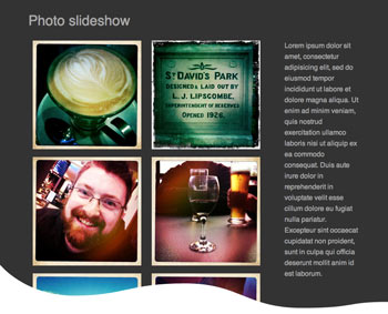
Let’s start with the bare bones version. Here’s a quick photo gallery using some 250×250 snaps I took with different iPhone camera apps:

The markup for non-JS users is simple: some divs, some CSS for a basic layout, and the images arranged as a grid on the left there. It’s clean and easy and will do just fine for now; you can see the markup in Example 1. Let’s move right on to tackling the JS users.
Enter the Modernizr
There’s a number of different ways to test for the presence or absence of JS — but what do you do when you need more detail, such as whether the browser supports CSS3’s box-shadow, or knows what to do with a canvas? Enter Modernizr, a clean and intuitive way to detect different kinds of browser support, without relying on junky browser-sniffing or frustrating tests. You can hear all about the details of how it does this in a recent episode of the SitePoint Podcast. We’ll use it to see whether CSS3 transforms are available.
The custom Modernizr builder can churn out a tidy, minified version of the script that includes just the tests you need, so I’ve used the builder to make a build with this option.
Let’s include this, and jQuery, in our page. Your HTML element should now have two new classes attached: js, and csstransforms. Use your favourite browser’s developer tools to check that they’re there.
Adjusting the CSS
When JavaScript is on, I’d like the images to first be hidden — we’ll reveal them by increasing their opacity one at a time. They’ll also be absolutely positioned within the gallery area. Modernizr gave us a js class, so let’s put that to use:
 .js #gallery {
     width: 960px;
     height: 300px;
     margin: 50px 0;
 }

.js #gallery,
.js #info {
    width: 100%;
    position: relative;
}

.js #gallery img {
    margin: 0;
    opacity: 0.0;
    -moz-opacity: 0.0;
    -ms-opacity: 0.0;
    -webkit-opacity: 0.0;
    position: absolute;
    bottom:0;
    left: 0;
}
Since the opacity property of images is set to 0.0, you should see no images once you insert this. It’s OK; we’ll put them all back in the next part. If it bothers you, comment these lines out for now.
Preparing the Images
Our next task is to shuffle the images around: we’ll start with a jQuery each loop that assigns new styles for them. Our gallery div is 760 pixels wide and 300 pixels high, so we’ll need a number up to about 510 for the images’ left positions, and up to around 30 for their positions from the bottom — this should ensure that they stay within the gallery’s boundaries. They’re going to shrink down to their normal size as they fall onto the division, so we’ll also add a variable for how many pixels’ worth of fat we want to add to each dimension. My images are no larger than 250 pixels in either dimension, so be sure do a bit of calculation of your own to accommodate larger or smaller images!
JavaScript’s Math object will take care of working out some random placements for us. Since Math.random only knows how to choose a number between 0 and less than one, we need to multiply and then round down with Math.floor to get a useful figure:
$('#gallery img').each(function(count) {
    var $photo = $(this);
    var zoom = 150;
    var offsetLeft = Math.floor(Math.random() * 510);
    var offsetBottom = Math.floor(Math.random() * 70);
 });
Now we have our numbers, we can plug them into the images’ styles and attributes, using jQuery’s css and attr methods. It’s a few easy lines:
$('#gallery img').each(function(count) {
    ...
    $photo.css({
        "left" : offsetLeft + "px",
        "bottom" : offsetBottom + "px"
     }).attr({
         height : $photo.height() + zoom,
         width : $photo.width() + zoom
    });
});
Showdown
Each photo should now be pumped up with artificial pixels and thrown carelessly in a mess — it’s time to reveal them one by one. jQuery’s animate method can take care of gradually shrinking the images down and increasing the opacity — just pass it the CSS attributes you want to change, and a time to spend doing it.
We’ll wrap all that up inside JavaScript’s setTimeout method, which allows us to perform actions after a delay. In our case, we want our animations to happen five seconds (that’s 5,000 milliseconds) apart. Did you notice that we have a counter, count, in our each function? We’ll use that to space out our photo animations, by multiplying it by 5,000 at the end of the each loops. At this point, entire each loop should now resemble this:
$('#gallery img').each(function(count) {
        var $photo = $(this);
        var zoom = 150;
        var offsetLeft = Math.floor(Math.random() * 450);
        var offsetBottom = Math.floor(Math.random() * 30);

        $photo.css({
            "left" : offsetLeft  + "px",
            "bottom" : offsetBottom  + "px"
        }).attr({
            height : $photo.height() + zoom,
            width : $photo.width() + zoom
        });

      if (Modernizr.csstransforms) {
           var degrees = Math.floor(Math.random() * 40) -20;
           var rotations = "rotate(" + degrees + "deg)";
           $photo.css({
               "transform" : rotations,
               "-moz-transform" : rotations,
               "-ms-transform" : rotations,
               "-o-transform" : rotations,
               "-webkit-transform" : rotations
            });
       }
        setTimeout(function() {
                $photo.animate({
                       height: "-=" + zoom + "px",
                       width: "-=" + zoom + "px",
                       opacity: 1.0
                   }, 4000);
        }, (count*5000));
        count++;
     });
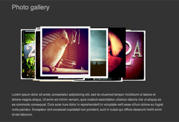
If all went well, you should have something much like Example 2, and when you run it, your gallery should look something like the below.

Tilt!
This is pleasingly random, but the angles really set off the effect. For those browsers with CSS3 transform support, we’ll add some randomly generated rotations. How do we do this?
As well as adding handy class names, Modernizr adds a global object which gives us a yay or nay on each of the capabilities we’re asking for. In our script, we’ll check to see if Modernizr.csstransforms is true; if so, we’ll do some more math to figure out a nice random rotation, and then apply it as a transformation to the photo. Doing so is much the same as the last step, except this time our random number can be a negative figure:
if (Modernizr.csstransforms) {
     var degrees = Math.floor(Math.random() * 40) -20;
     $photo.css({
         "transform" : "rotate(" + degrees + "deg)",
         "-moz-transform" : "rotate(" + degrees + "deg)",
         "-ms-transform" : "rotate(" + degrees + "deg)",
         "-o-transform" : "rotate(" + degrees + "deg)",
         "-webkit-transform" : "rotate(" + degrees + "deg)"
      });
 }
Put this in your each loop, before the setTimeout method begins. Example 3 shows you the whole kit and caboodle, and if you have a transform-capable browser, you should be able to see something like this:

That’s it!
You’ve just put together a smooth, soothing alternative to boring old rotating image slideshows. If you wanted to push it even further, you could add some fanciness with more visual treats, such as box-shadow, or additional animations. More importantly, if this was your first time using Modernizr, you’ve now had a taste of how easy it is to put into place in your projects.
Frequently Asked Questions about Building an Image Gallery with jQuery, Modernizr, and CSS3
How can I add more images to the gallery?
Adding more images to the gallery is quite simple. You just need to add more image elements in the HTML code. Each image element should have a unique ID and the source of the image file. Remember to also add the corresponding CSS rules for each image to ensure they are displayed correctly.
Can I use this method to create a random image gallery?
Yes, you can. To create a random image gallery, you would need to modify the JavaScript code to randomly select images from an array of images instead of displaying them in a fixed order. This can be achieved by using the Math.random() function in JavaScript.
How can I make the gallery responsive?
The gallery can be made responsive by using CSS media queries. Media queries allow you to apply different CSS rules depending on the size of the user’s screen. This way, you can adjust the size and layout of the images to fit different screen sizes.
Can I use this method with other JavaScript libraries?
Yes, you can. This method is not exclusive to jQuery and Modernizr. You can use it with any JavaScript library that supports manipulating the DOM and handling events. However, the specific code might vary depending on the library you are using.
How can I add captions to the images?
You can add captions to the images by adding a “figcaption” element inside the “figure” element for each image. The text inside the “figcaption” element will be displayed as the caption of the image.
Can I use this method to create a slideshow?
Yes, you can. To create a slideshow, you would need to modify the JavaScript code to automatically change the displayed image after a certain period of time. This can be achieved by using the setInterval() function in JavaScript.
How can I add navigation buttons to the gallery?
You can add navigation buttons by adding button elements in the HTML code and then using JavaScript to change the displayed image when the buttons are clicked. The specific code will depend on how you want the navigation to work.
Can I use this method to create a gallery with videos instead of images?
Yes, you can. Instead of using “img” elements, you would use “video” elements. The rest of the method would remain the same. However, keep in mind that videos are much larger than images, so this might affect the loading time of your gallery.
How can I add a zoom effect to the images?
You can add a zoom effect by using CSS transitions. When the user hovers over an image, you can increase its size using the “scale” transform. The transition property will make the change in size smooth and gradual.
Can I use this method to create a gallery with 3D effects?
Yes, you can. CSS3 includes several properties that allow you to create 3D effects, such as “perspective”, “transform”, and “backface-visibility”. By combining these properties with the rest of the method, you can create a gallery with 3D effects.
Raena Jackson Armitage is an Australian web developer with a background in content management, public speaking, and training. When she is not thinking about the Web, she loves knitting, gaming, all-day breakfasts, and cycling.

