7 Best Practices for Designing a Mobile User Experience

Key Takeaways
- Prioritize clear, focused content and simple navigation when designing for mobile user experience, keeping in mind that users often interact with their mobile devices in hurried, rushed states.
- Optimize mobile designs for touch inputs, ensuring that forms, buttons, and other interactive elements are large enough to avoid misinterpretation of touch events. However, also consider devices that use styluses or directional keypads.
- Leverage mobile-specific features such as GPS, Gyrometers, and other sensors to enhance user experience. Consider adding features like “Tap to Call” or GPS-based information and services.
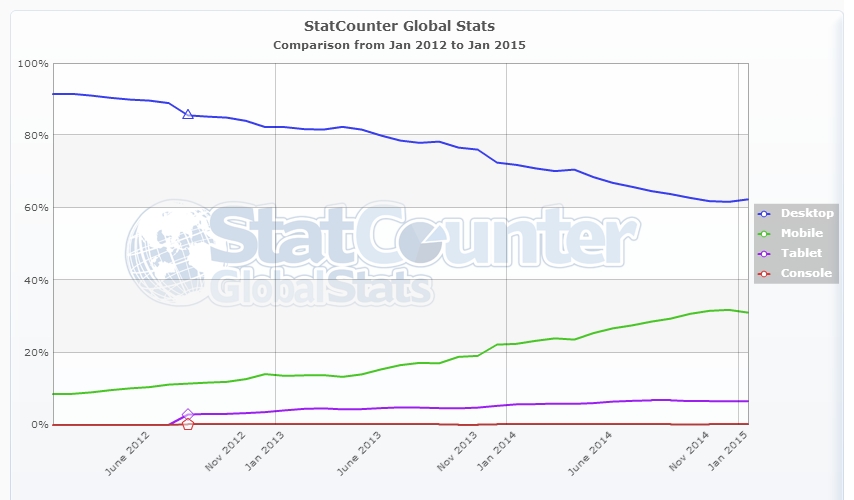
In the last 3 years desktop Internet usage has fallen from 90% to 60%, while mobile usage has increased to 40%.Following this trend, mobile devices are set to upstage desktop Internet access soon. Very soon.
The default approach used by many designers when designing for a mobile device is still to scale down their (desktop) website and make it responsive. This approach is a poor strategy for mobile design. Rather than just scaling down a site, you need to examine your client’s business and asses the importance of mobile access for their particular business.
If your client’s customers are primarily desktop/laptop users – for example, enterprise level access to a tool that will only be accessed from workstations – then you don’t need to bother about mobile access. But if your client wants an online store or provides localized information depending on where customers are – then you’re better off using a mobile first design approach. To reach the largest number of people and grow your (client’s) business, your website needs to work well when accessed from a range of devices. So take the effort to first sketch out your mobile web strategy.
The challenge in designing for mobile devices is that they come in so many variants, sizes and flavors. Much like Browsers during the great Browser wars of the 1990’s!
In the interest of a better, more intuitive and user friendly mobile experience, let’s take a closer look at some of the best practices to keep in mind for mobile designs:
1. Have Clear, Focused Content
Many people use their mobile device on the go – in a hurried, rushed state. Combined with small touch screens, it doesn’t make for easy search or navigation. While designing for a mobile experience, minimalism rules. Keep clutter to a minimum. Each page including the homepage should have just one central focus. If you have any atypical gestures, like a swipe to move to the next page or a horizontal scroll, don’t assume users will pick up on these. Make it easy for users. Tell them how to use these features with a small arrow or a hovering message, whatever it takes to make it easy for them to find what they’re looking for. Mobile users notice and appreciate, the small things that make their experience smoother. And of course, it works better for you too.
2. Menus and Navigation: Keep It Simple
Traditional desktop websites display a prominent menu bar at the top of the page. On a mobile this eats up precious screen space. To resolve this, make the menu a drop down accordion or icon on the top left or right of the mobile screen.
Another desktop habit that doesn’t work well on mobiles is multi level menus with sub menus that show on hover. On a mobile device, you want to keep things accessible. If the user has to tap through 4 levels of menus to find something, chances are high they’ll leave after the 2nd tap. Avoid multi level menus on mobile sites as much as possible. This is a stark contrast to desktop design where people worked hard to get almost every bit of information on the website even if it meant 3 levels navigation menus and 10 widgets crowding the sidebar. There’s a premium attached to screen space on mobile devices. Keep it minimal and focus on the key message you want the user to take away. In fact, that’s a good practice to follow even for desktop sites.
3. Create Fluid Layouts
Many mobile devices means many different dimensions. However tempting it may be, don’t just design for a 320 pixel width. Like it or not – 176, 240, 320, 360, ~480-600 (landscape) are also common device widths. Keeping your layout flexible and fluid ensures it displays properly on different screen sizes. You don’t want the site to work just on devices that match your fixed break points but look weird on everything else. Here’s a primer to fluid layouts and one on getting fluid layouts working in responsive designs.
4. Design for Touch
Gone are the good old days when we only used keyboard and mouse events to interact with a website. On mobile devices, the primary mode of interaction is usually touch. Designing for touch requires a level of care not needed in the desktop world. Instead of a precise cursor, you now have to account for fingers of all shapes and sizes applying varying kinds of pressure to touch screens that respond differently. You need to make sure forms, buttons and other elements that require a touch input or gesture are large enough to avoid overlap with adjacent elements or misinterpretation of the touch event.
Don’t just rely on touch inputs. There are many mobile devices that use styluses, and some older ones that still use directional key pads. There are many mobile devices/browsers that don’t fully support javascript touch events. There’s also the situation where the user has a combination of input devices, for example, when they’re using a mouse connected to the tablet. Though such scenarios are less frequent, evaluate how important they are for your website and take adequate steps to handle them.
5. Keep Forms Minimal
Small touch screens and yet smaller virtual keyboards with keys that are barely 5mm x 5mm in size do not make for a happy typing experience. Keep forms simple and small. If you need to, keep a separate form for mobile users, with the least number of fields required to get the data you need. As far as possible, pre-fill fields with defaults. Use auto-fill for commonly used fields.
For example, use visual calendars instead of making users type the date. For forms that are longer than a single screen, it’s good to show users a progress bar indicating how far they’ve come, and more importantly, how close they are to finishing. Here’s some good guidelines from Google to create good forms.
While we’re talking of forms, how can we not talk of label placements? Did you know users fill out forms faster with top aligned labels? Keeping the labels above the input field ensures that it is still visible, even if the device zooms in on the input field while you type. Top aligned labels also make it easier for the user to scan fields and keep track while scrolling down the page. You can learn more about label positioning here.
6. Drop the Images
Size and speed are the two most important performance measures for a mobile site. Don’t use images to achieve fancy effects like gradients and shadows. Learn the basics of what is possible with CSS and incorporate those into your design. The fewer special effects you try to achieve with images, the better it is. Not all CSS3 effects will be available on older mobile browsers, but that’s okay. The site does not have to be 100% pixel perfect to the design across all devices.
If you’re fond of using fancy text as images in your design, this would be a good time to drop it. Keep text as text. Use fancy fonts to achieve the effect you want. But drop the extra images in the interest of keeping your site’s footprint and page load times low.
7. Leverage Mobile Specific Features

Mobile devices have many features like GPS, Gyrometers and other sensors that are not available on desktop devices, such as “slide to unlock” or the ability to make phone calls. Figure out how to use these features to make the mobile experience for your website even better. You can add simple features like “Tap to Call” the phone number on your contact page, enable easier sharing across social media platforms, or GPS to offer location specific information and services. This is the part where you stretch yourself to think out of the box and leverage mobile specific functionality for a better mobile experience.
If you’re keen on learning more about mobile designs, here are some great resources to explore:
Are you already following these best practices? What are your favorite tips to designing a good mobile experience?
Frequently Asked Questions on Mobile User Experience Design
What are the key elements to consider when designing a mobile user experience?
The key elements to consider when designing a mobile user experience include simplicity, consistency, usability, and accessibility. Simplicity refers to the ease of use and navigation of the app or website. Consistency ensures that the design elements and functionalities are uniform across all pages. Usability is about making the app or website user-friendly, while accessibility ensures that the design is inclusive for all users, including those with disabilities.
How can I optimize my mobile website for speed?
Optimizing your mobile website for speed involves reducing the size of your images, minifying your CSS and JavaScript files, leveraging browser caching, and using a content delivery network (CDN). These practices help to reduce the load time of your website, thereby improving the user experience.
What is the role of typography in mobile UX design?
Typography plays a crucial role in mobile UX design. It helps to create a visual hierarchy, guide users through the content, and enhance readability. It’s important to choose a font that is legible on small screens and to use different font sizes and weights to differentiate between headings, subheadings, and body text.
How can I make my mobile website more accessible?
Making your mobile website more accessible involves using alt tags for images, providing captions for videos, using large clickable areas, and ensuring that your website is navigable using a keyboard. You should also use high contrast colors for text and background to improve readability for visually impaired users.
What is responsive design and why is it important?
Responsive design is a web design approach that ensures your website looks and functions well on all devices, regardless of their screen size. It’s important because it improves the user experience, helps to increase mobile traffic, and improves your website’s ranking in search engine results.
How can I improve the navigation of my mobile website?
Improving the navigation of your mobile website involves using clear and concise labels for your menu items, keeping the number of menu items to a minimum, using a hamburger menu for secondary navigation, and providing a search function for easy access to content.
What is the importance of user testing in mobile UX design?
User testing is crucial in mobile UX design as it helps to identify usability issues, understand user behavior, and gather feedback to improve the design. It involves observing users as they interact with your app or website and asking them questions about their experience.
How can I use color effectively in mobile UX design?
Using color effectively in mobile UX design involves using a consistent color scheme, using contrasting colors for text and background, and using color to guide users’ attention to important elements. You should also consider color blindness and use colors that are distinguishable for color-blind users.
What is the role of images in mobile UX design?
Images play a key role in mobile UX design. They help to create a visually appealing design, convey information quickly, and enhance the user’s emotional connection with the app or website. However, it’s important to use images sparingly and optimize them for speed to avoid slowing down your website.
How can I design for different screen sizes and resolutions?
Designing for different screen sizes and resolutions involves using a responsive design approach, using flexible layouts, and using scalable images and graphics. You should also test your design on different devices to ensure it looks and functions well on all screen sizes and resolutions.
Once upon a time, Richa was a savvy techie & manager, in the semiconductor software industry. After her miraculous escape and recovery, she now works from her garden, creating websites, writing about technology, business & entrepreneurship; and helping others escape the cubicle lifestyle.


Published in
·Android·App Development·Design·iOS·Mobile·Mobile Web Development·Responsive Web Design·Wearables·September 2, 2014
Published in
·App Development·Blogs·Business·Design & UX·Mobile·Mobile UX·Mobile Web Development·Responsive Web Design·February 4, 2015

Published in
·Cloud·Developer Tools·Performance·Performance & Scaling·Web·Web Hosting & Domains·March 29, 2023