

Key Takeaways
- Sailfish OS 2.0, the biggest update to the Jolla operating system, offers a new navigation model featuring consistent and context-independent gestures, making it more intuitive for new users and familiar to users of other platforms.
- The update brings functional changes to the home view, enhancing multitasking capabilities, and introducing a new status area that provides information about battery status, time, and connections.
- Along with improved Android compatibility, Sailfish OS 2.0 offers updated visual style and app updates, including the ability to record video clips in H.264 format in the camera app and display controls on the lock screen in the music app.
Jolla have released the biggest update to their Sailfish operating system. Version 2.0 was initially for the launch of the Jolla tablet, reached the Jolla phone before the first tablet shipped, giving a significantly new experience to current users.
Since the release of the phone, Jolla have made updates available every month, constantly improving the OS, making it more fluid, bug fixing, better memory handling and Android app support.
The latest update, named “Eineheminlampi”, will change everything, let’s see how.
A new Navigation Model
Sailfish OS used to have a distinctive navigational model.
The first OS release condensed the lock screen, the home screen (where running app are shown) and the application drawer into one long vertical screen that users can flick up and down. The phone has no buttons, but used “swipe from the edge” to put the current application into the background, “swipe from top” to close the application or lock the screen and a “swipe from the bottom” brings up the event view.
It sounds complicated, but after you got used to it, it felt natural and well designed. But a steep learning curve is not what a new user coming from other platforms wants.

Jolla’s designers have implemented a new navigation model, with consistent and context independent gestures that are easier to memorize, more intuitive for beginners and more familiar to other platform users.
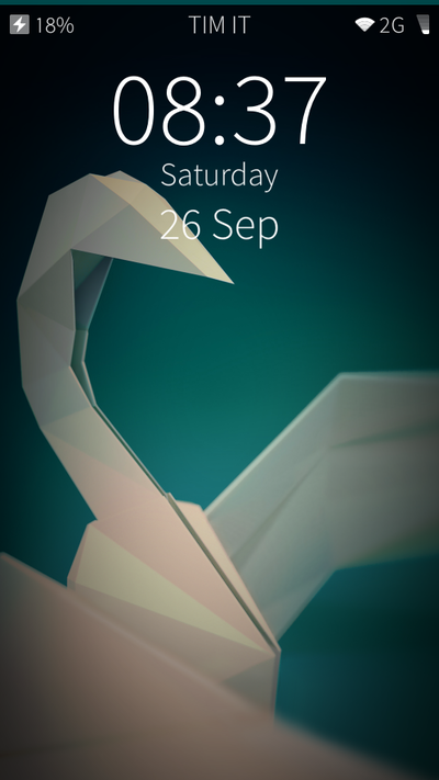
The lock screen is now separated from the home screen, no more “flick up to unlock”, but you can apply either a left or a right edge swipe to unlock and access the home screen. The same logic applies when navigating from an app to the home screen.
Whenever a notification is present you have a handy shortcut to access the events view.
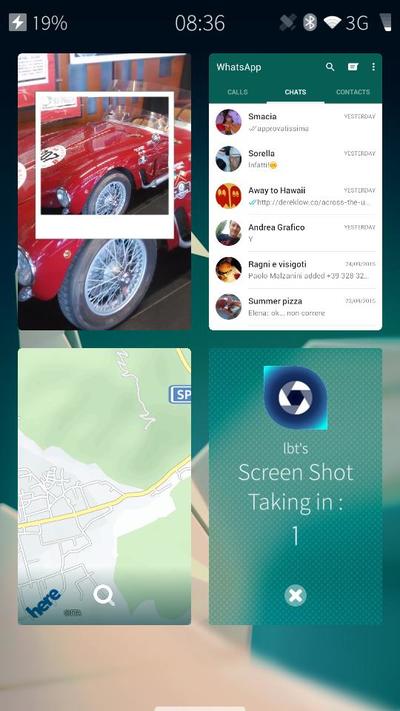
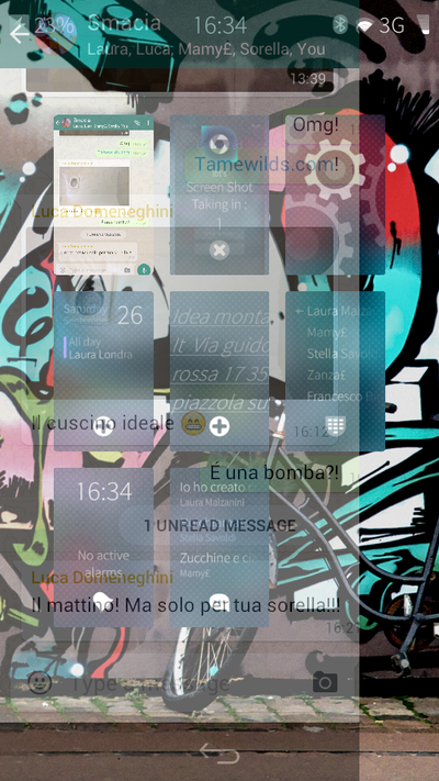
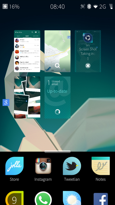
After unlocking you will see the home view. Here the changes are more functional than visual. Sailfish OS 2.0 is not limited to nine visible app covers anymore, but can now feature as many as you want.
Apps no longer shuffle around after swiping one away. Newly opened apps will go the end of the grid, so already running apps will return to the same location (you can also manually rearrange ).
This makes multitasking more powerful and easy to manage.
A new status area that provides information about battery status, time and connections has been added to the home screen. This is similar to other OSs but with a cooler style. I admit that I’m a fan of the old layout, where you could “peek” (swiping from an edge) down the home screen to have a bigger status area.
Fortunately Jolla maintained the ability to allow apps to use 100% of the screen, and users can take a brief look at the status area by “peeking” from an app.
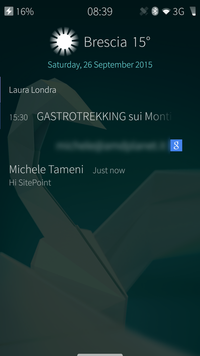
Swiping left or right from the home screen bring you to the new and improved events view. Notifications are now grouped by app and on the same screen you have a glimpse of your agenda and the weather.
Options to personalize the event view are now available in the settings app and if you want you can enable persistent access to the event view by swiping from the left edge. I was used to looking at events by swiping from the bottom in previous releases, so I find this new feature handy.
Tapping on the weather widget gives a five day forecast preview and the home and event view is now a carousel. You can flick to cycle between them. In the next release a “Partner space” may enter this carousel view.
The App drawer is now accessible from anywhere in the OS by just swiping from the bottom edge, providing a fast way to open new apps as needed.
The active covers of many apps are improved, but here we have one of the most controversial change to the UI.
In the previous release a user could trigger app actions (like switching to the next song in the media player or pausing it) by swiping from the left or right on the app cover.
This is now achieved by a button press. This is also handy but more prone to error as on a phone, these buttons can be small. It will likely work better on tablets.
Swiping from the top now brings a new menu where you can lock the phone or peak at the preferred ambiance.
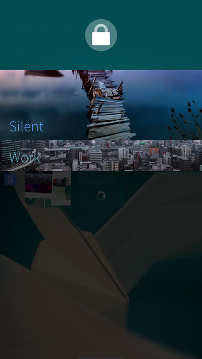
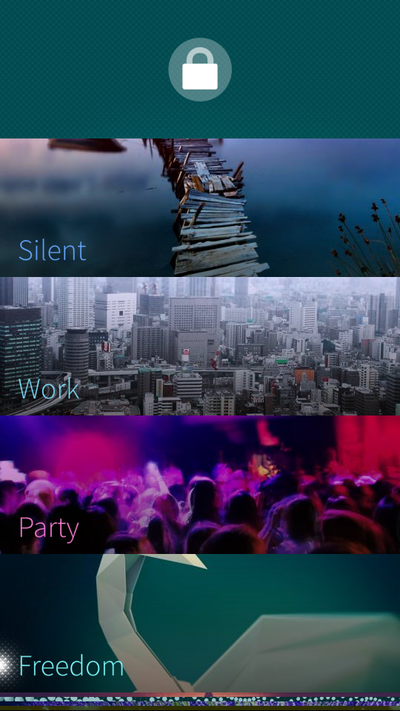
Ambiance can now be configured to different situations, personalizing them as you need. Such as changing sound levels, backgrounds, colors, and in the future, trigger actions (turn on/off features etc…).
Updated visual style
Silica Components (the building block of Sailfish apps) have an updated look and feel.
Buttons, pulley menus, time pickers, volume bars and remorse timers are updated and improved, even if I think that some need tuning.
Button are now more defined, but they lack some style compared to previous designs. The new animation for “peeking” an item from the pulley menu needs to be faster and this has already been noted as an issue.
App updates
Official apps have been updated. The camera can now record video clips in H.264 format and has a new and improved visual style. The music app now displays controls on the lock screen and the gallery, notes and camera have a new home screen cover layout.
The Jolla Store is improved and the tutorial app updated to introduce the new user interface.
Nothing big, but nice to have.
Android compatibility
Other important improvements were made to the Android compatibility layer. Android notifications now work as expected, using system tones, alerts with vibration and they can use the notification LED and wake up the display.
What’s next?
The next OS upgrade will complete the transition to Sailfish OS 2.0, including further improvements to the user experience.
We can expect the ability to pick favorite shortcuts to show in the events view, such as buttons to connect to internet, search the web, take a photo or make a note.
Social network integration will improve, showing feeds in the event view and reintroducing Facebook chat support.
Conclusion
I was in love with the Sailfish OS UI, and I am yet to get used to the changes. Overall I can see a big step forward in the right direction for Jolla.
It will be easier for newcomers to understand and use Sailfish-based devices and enjoy the beautiful style.
The OS feels fluid and well designed, remaining unique even if it’s not as much as before.
The new event view, the ambiance potential and improved Android support make the update worth installing alone and you should start developing apps for Sailfish 2.0 right now!
Frequently Asked Questions about Sailfish OS 2.0
What are the unique features of Sailfish OS 2.0?
Sailfish OS 2.0 is a Linux-based operating system designed for mobile devices. It offers a unique user interface that is gesture-based, allowing users to navigate through the system without the need for physical buttons. It also supports multitasking, allowing users to run multiple applications simultaneously. Additionally, Sailfish OS 2.0 offers strong privacy and security features, including the ability to run applications in a sandboxed environment to prevent them from accessing sensitive data.
How does Sailfish OS 2.0 compare to other mobile operating systems?
Sailfish OS 2.0 stands out from other mobile operating systems due to its unique gesture-based user interface and strong focus on privacy and security. Unlike other operating systems, Sailfish OS 2.0 does not rely on a central app store, allowing users to install applications from various sources. This provides users with more control over their devices and the applications they install.
Is Sailfish OS 2.0 compatible with Android apps?
Yes, Sailfish OS 2.0 is compatible with Android apps. This means that users can install and run most Android apps on devices running Sailfish OS 2.0. However, it’s important to note that not all Android apps will work perfectly on Sailfish OS 2.0 due to differences in the underlying systems.
How secure is Sailfish OS 2.0?
Sailfish OS 2.0 is designed with security in mind. It runs applications in a sandboxed environment, which prevents them from accessing sensitive data on the device. Additionally, Sailfish OS 2.0 does not rely on a central app store, which reduces the risk of installing malicious apps.
Can I install Sailfish OS 2.0 on my device?
Sailfish OS 2.0 can be installed on a variety of devices, including smartphones and tablets. However, the process of installing Sailfish OS 2.0 can be complex and may require technical knowledge. It’s recommended to check the compatibility of your device with Sailfish OS 2.0 before attempting to install it.
What is the user interface of Sailfish OS 2.0 like?
The user interface of Sailfish OS 2.0 is unique and intuitive. It is gesture-based, which means that users can navigate through the system using swipes and taps. This makes it easy to use and provides a smooth user experience.
Does Sailfish OS 2.0 support multitasking?
Yes, Sailfish OS 2.0 supports multitasking. Users can run multiple applications simultaneously and switch between them easily. This makes it a powerful operating system for mobile devices.
How does Sailfish OS 2.0 handle privacy?
Sailfish OS 2.0 takes privacy seriously. It runs applications in a sandboxed environment, which prevents them from accessing sensitive data. Additionally, Sailfish OS 2.0 does not rely on a central app store, which gives users more control over the applications they install.
What are the system requirements for Sailfish OS 2.0?
Sailfish OS 2.0 can be installed on a variety of devices, including smartphones and tablets. However, the specific system requirements will depend on the device. It’s recommended to check the compatibility of your device with Sailfish OS 2.0 before attempting to install it.
Where can I download Sailfish OS 2.0?
Sailfish OS 2.0 can be downloaded from the official Sailfish OS website. However, it’s important to note that installing Sailfish OS 2.0 may require technical knowledge and it’s recommended to check the compatibility of your device before attempting to install it.

