Apart from the usual charts and graphs libraries used to create interactive data visualizations already covered here, which can present a steep learning curve as a price for their powerful versatility, there are many less known JavaScript libraries that specifically address a visualization type. They come very handy when you deal with illustrating content from data journalism with an interactive experience. Here are a few of them to start with.
JSPlumb
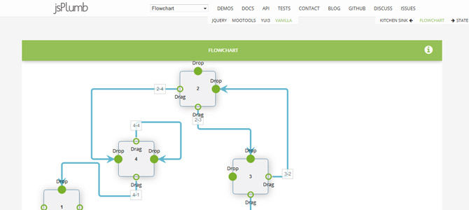
JSPlumb helps you visually connect elements: flowcharts, kitchen sinks, state machines, and hierarchical charts. It uses SVG where available and VML on IE8 and below, as it is compatible down to IE6. Its different implementations support animation and drag and drop features, which may need specific plugins. Its code is compatible with jQuery, MooTools, and YUI, and can also be used in vanilla JavaScript. This free library is available on GitHub.
Its four main concepts are anchors (specific location), endpoints (visual representation of connections ends, attached to anchors), connectors (visual representation of the line that connects two elements), and overlays (connector decoration, like an arrow or a label). With these four elements only, you are ready to go.
JS Sequence Diagrams
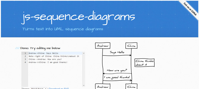
JS Sequence Diagrams turns text into vector UML sequence diagrams. It depends on both Raphaël and Underscore.js, and the result can be downloaded in SVG or even saved as a plain image if the interactive side of it is not needed (like creating diagrams on the fly through user input).
Two different themes are available: straight lines and rectangles for a neat professional look, and hand-drawn lines and written text for a fresh napkin look and feel. The text input represents a UML sequence diagram with processes linked by arrows. The examples are self-explaining with such an understandable syntax. A text input sample is shown below.
Title: Here is a title
A->B: Normal line
B-->C: Dashed line
C->>D: Open arrow
D-->>A: Dashed open arrow
Timeline
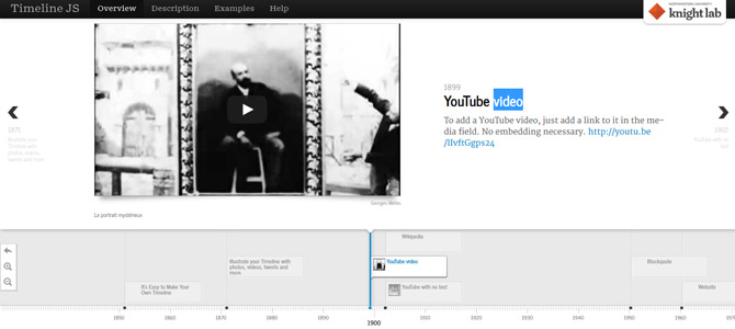
Timeline is an open source tool for creating interactive responsive timelines. You can embed many media sources, such as YouTube or Vimeo videos, Google Maps, SoundCloud, or Twitter feeds. The data source can be a Google spreadsheet or a JSON file, and you can either embed your timeline hosted on their site via an iframe or directly host it yourself, the code is available on GitHub.
Here is an example of an implementation using a JSONP data source. We first set up the time line parameters where we call the data.jsonp file.
<script type="text/javascript">
    var timeline_config = {
        width:              '100%',
        height:             '600',
        source:             'data.jsonp',
        embed_id:           'timeline-embed',
        start_zoom_adjust:  '-1',
        lang:               'en',
        css:                'javascript/timeline/css/timeline.css',
        js:                 'javascript/timeline/timeline-min.js'
    }
</script>
<script type="text/javascript" src="javascript/timeline/storyjs-embed.js"></script>
The JSONP file sets the timeline parameters and a array of data for each date, including the headline and the text alongside the media provided. The thumbnail displayed in the timeline is automatically taken from the given media asset, unless explicitly provided.
storyjs_jsonp_data = {
  "timeline":
  {
    "headline": "David J. Peterson",
    "type": "default",
    "text": "",
    "lang": "en",
    "startDate": "1981,01,20",
    "date": [
      {
        "startDate": "1981,01,20",
        "headline": "Birth",
        "text": "<p>David J. Peterson was born at Long Beach, California.</p>",
        "asset": {
          "media": "images/articles/david-j-peterson/Long-beach-CA.jpg",
          "thumbnail": "images/articles/david-j-peterson/Long-beach-s.jpg",
          "credit": "Wikimedia commons"
        }
      },
      {
        "startDate": "2006",
        "headline": "M.A. in linguistics",
        "text": "<img width=\"246\" height=\"200\" src=\"images/articles/david-j-peterson/University-of-California-San-Diego.jpg\" class=\"article-pic article-left-pic\" alt=\"University of California, San Diego\" /><p>M.A. in linguistics at the University of California, San Diego, with the subject “Front Vowels in Velar Coda Contexts: An Examination of the Front Vowels of Southern Californian English”.</p>"
      },
    ]
  }
}
The resulting timeline is a biography of David J. Peterson.
Smallworld
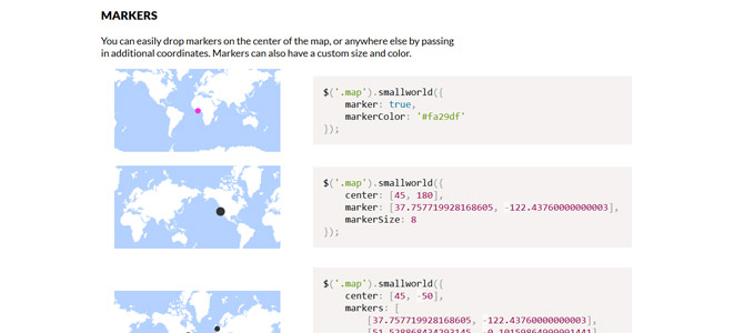
The free smallworld.js utility helps you generate maps overview with GeoJSON and HTML Canvas. It has no dependencies and comes with a simple wrapper to use with jQuery or Zepto. The map can be centered on latitude/longitude coordinates, a color can be given for water and landmass, and markers can be added with different size and colors. There is no interactive feature included out of the box, as it is mostly to be used with an illustrative purpose, but you should be able to script your own interactivity needs on top of it.
$('.map').smallworld({
  center: [45, -50],
  markers: [
    [37.757719928168605, -122.43760000000003],
    [51.528868434293145, -0.10159864999991441],
    [40.705960705452846, -73.9780035]
  ],
  markerSize: 8
});JointJS
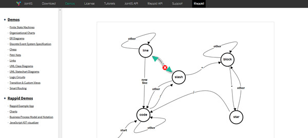
JointJS is a JavaScript diagramming library that creates diagrams like finite state machines, organizational charts, entity-relationship diagrams, Petri nets, UML, and logic circuits among other things. The tutorials are well explained, and useful for both beginners and advanced users.
Its licensing model works on a per-developer basis: each developer license enables them to create an unlimited number of commercial applications on any number of servers.
A code sample is shown below.
var graph = new joint.dia.Graph;

var paper = new joint.dia.Paper({
  el: $('#myholder'),
  width: 600,
  height: 200,
  model: graph,
  gridSize: 1
});

var rect = new joint.shapes.basic.Rect({
  position: { x: 100, y: 30 },
  size: { width: 100, height: 30 },
  attrs: { rect: { fill: 'blue' }, text: { text: 'my box', fill: 'white' } }
});

var rect2 = rect.clone();
rect2.translate(300);

var link = new joint.dia.Link({
  source: { id: rect.id },
  target: { id: rect2.id }
});

graph.addCells([rect, rect2, link]);
Heatmap
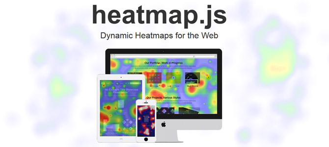
Heatmap.js is a library dedicated to heatmap displays, where data values contained in a matrix are represented as colors. Available on GitHub, its code has sparked enough interest for other developers to provide plugins for Google Maps, Open Layers, and Leaflet. While the code is open source, a support license is also available for companies and commercial products.
Example code:
var heatmap = h337.create({
  container: domElement
});

heatmap.setData({
  max: 5,
  data: [{ x: 10, y: 15, value: 5}, ...]
});
Tangle
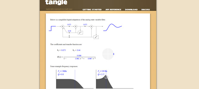
The standalone Tangle library creates reactive documents where the users can play with parameters within text or graphical areas to change other content. The examples are way more impressive than this short description, so you should check them out to get a better idea.
Example code:
When you eat <span data-var="cookies" class="TKAdjustableNumber"> cookies</span>, you consume <span data-var="calories"> calories</span>.var tangle = new Tangle(document, {
initialize: function () { this.cookies = 3; },
update: function () { this.calories = this.cookies * 50; }
});Conclusion
As you have seen with these focused libraries, there is no need for using huge chart and graph libraries like D3.js or InfoVis when your visualization project is limited in scope. For a specific project, a tailored library does the job very well and is easier to implement.
If you are using other specific data visualization libraries, you can share them with us in the comments.
Frequently Asked Questions (FAQs) about JavaScript Libraries for Visualizations
What are the key features to look for in a JavaScript library for visualizations?
When choosing a JavaScript library for visualizations, consider the following key features: ease of use, flexibility, compatibility, and the types of visualizations supported. The library should be user-friendly, even for beginners, and offer a wide range of customization options. It should also be compatible with various platforms and browsers. Additionally, it should support a variety of visualization types, such as charts, graphs, diagrams, and more.
How do I choose the best JavaScript library for my project?
The choice of a JavaScript library largely depends on the specific needs of your project. Consider the complexity of the visualizations you need to create, the learning curve of the library, and the support and documentation available. Also, consider the performance of the library, especially if you’re working on a large-scale project.
Are there any free JavaScript libraries for visualizations?
Yes, there are several free JavaScript libraries available for creating visualizations. These include D3.js, Chart.js, and Three.js, among others. However, keep in mind that while these libraries are free to use, they may not offer the same level of support or features as some paid options.
How do JavaScript libraries for visualizations compare to other programming languages?
JavaScript libraries for visualizations offer several advantages over other programming languages. They are generally easier to learn and use, especially for beginners. They also offer a wide range of customization options and are compatible with various platforms and browsers.
Can I use multiple JavaScript libraries in a single project?
Yes, it’s possible to use multiple JavaScript libraries in a single project. However, this can lead to conflicts and compatibility issues, so it’s generally recommended to stick to one library per project whenever possible.
How do I learn to use a new JavaScript library for visualizations?
The best way to learn a new JavaScript library is through practice. Start by reading the documentation and tutorials provided by the library. Then, try creating simple visualizations and gradually move on to more complex projects.
What are some common challenges when using JavaScript libraries for visualizations?
Some common challenges include dealing with complex data structures, ensuring compatibility across different browsers and platforms, and optimizing performance. Additionally, each library has its own learning curve, which can be steep for beginners.
How do I troubleshoot issues when using a JavaScript library for visualizations?
Start by checking the documentation and FAQs provided by the library. If you can’t find a solution there, try searching for the issue online or asking for help in relevant forums or communities.
Can I create interactive visualizations with JavaScript libraries?
Yes, many JavaScript libraries support the creation of interactive visualizations. This allows users to interact with the data in real-time, providing a more engaging and informative experience.
Are JavaScript libraries for visualizations suitable for mobile applications?
Yes, many JavaScript libraries are designed to be responsive and work well on both desktop and mobile platforms. However, it’s important to test your visualizations on various devices to ensure they display correctly.
 Alexis Ulrich
Alexis Ulrich is a full-stack web developer based in Paris, France. He is interested in the way content can be created, optimized, used and shared on the web. When not working on his pet sites (languagesandnumbers.com and mancko.com), he shares his MOOC experiences on web-technos.blogspot.com.

