30 jQuery Responsive Layout Plugins

Extensive list of some of the most useful jQuery responsive layout plugins used by designers aiming to design responsive layouts for their websites. Responsive layouts are relatively new in the web design world and are becoming more popular due to the rise in popularity of mobile web design and the broaden of screen resolutions. Enjoy!
Related Posts:
Key Takeaways
- This piece provides a comprehensive list of 30 jQuery responsive layout plugins that web designers can use to create adaptive and mobile-friendly websites.
- The plugins listed offer a variety of features such as dynamic layouts, image resizing, carousel creation, and content scrolling, all of which help to ensure websites function seamlessly across different devices and screen resolutions.
- The importance of these plugins is highlighted, emphasizing their role in modern web design where users access websites from multiple devices, and the need for websites to adapt to different screen sizes for an optimal user experience.
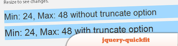
1. jquery-quickfit
A quick and dirty approach to fitting text into its surrounding container.
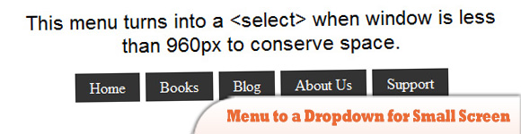
2. Menu to a Dropdown for Small Screens
The Five Simple Steps website has a responsive design with a neat feature. When the browser window is narrow, the menu in the upper right converts from typical menu links into a dropdown menu. Using jQuery, this tutorial will show you how to recreate it.
3. Doubletake
Dynamically updates the src of your images based on the browser width. Start with a small, mobile-friendly image in your HTML. Doubletake will use a defined set of breakpoints to update image SRCs when necessary.

4. ResponsiveSlides.js
A tiny jQuery plugin that creates a responsive slideshow using images inside “ul”. It works with wide range of browsers including all IE versions from IE6 and up.

5. jQuery Responsive Thumbnail Gallery
The plugin allows us to define each image in 2 different sizes, just set a breakpoint width and it decides which image to display according to the size of the screen.

6. rlightbox
Is a jQuery UI mediabox that can display many types of content such as images, YouTube and Vimeo videos. It has many unique features like Panorama and Live Re-size and like other jQuery UI widgets, it is ThemeRoller ready.

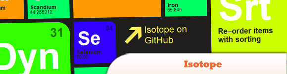
7. Isotope
Is a jQuery plugin for intelligent, dynamic layouts that can’t be achieved with CSS alone. You can hide and reveal item elements easily with jQuery selectors and re-order item elements with sorting.
8. Automatic Image Montage with jQuery
Arranging images in a montage like fashion can be a challenging task when considering certain constraints, like the window size when using fullscreen, the right image number to fill all the available space or also the size of the images in use.

9. wmuSlider
This is an easy-to-setup responsive image slider plugin. It has navigation and pagination controls, animations and touch support.

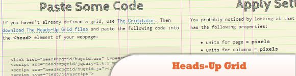
10. Heads-Up Grid
The Heads-Up Grid is a responsive overlay grid for in-browser website development. It has been created to make it relatively easy to adapt to the needs of responsive web design.
11. AdaptiveMedia
Why do you use AdaptiveMedia? Your desktop-centric images are loaded slowly and costed to your visitors for devices with small screen like mobile phones. That is why; you may create more than one image for different screen sizes and load them with AdaptiveMedia.

12. Hoverizr
A tiny responsive jQuery plugin that outputs manipulated images on top (or below) of any targeted images and has 3 built-in effects: grayscale, blur and color inversion.

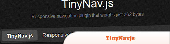
13. TinyNav.js
Converts your “navigations created with lists” into select dropdowns when browsed on small screens. It also automatically selects the current page and adds selected=”selected” for that item.
14. Adaptive Images in HTML
Detects your visitor’s screen size and automatically creates, caches, and delivers device appropriate re-scaled versions of your web page’s embedded HTML images.

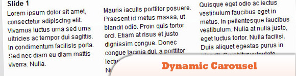
15. Dynamic Carousel
A carousel plugin built for responsive layouts.
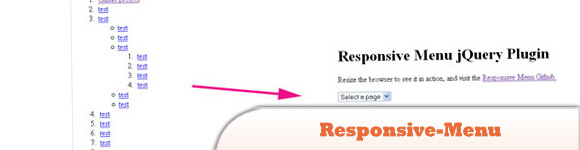
16. Responsive-Menu
This is also a simple jQuery plugin to convert list-based navigations into a select element for mobile devices and low browser widths.
17. Photo Swipe
This is a jQuery Mobile plugin for creating image galleries specifically targeting mobile devices. It provides an intuitive interface that makes it possible to interact with images on the mobile website.

18. scrolldeck.js
With this plugin, you can easily make responsive slideshow / presentation / landing page websites. It includes the nice simple animations that scrollorama provides.

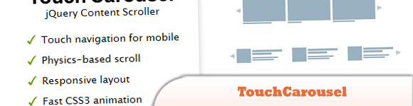
19. TouchCarousel
Is mobile-friendly and lightweight jQuery content scroller with touch navigation for mobile and desktop. May be used as carousel, banner rotator and image gallery.
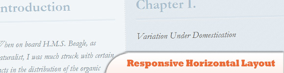
20. Responsive Horizontal Layout with jQuery & CSS3
The idea is to make each panel individually scrollable and animate a content panel to the left of the viewport once it’s clicked or selected from the menu.
21. Responsly.js
Contains a set of responsive widgets and responsive images slider is one of it. It’s a fairly simple slider with keyboard navigation, interval, autostart and prev & nav features.

22. Camera
Camera slideshow is an open source project based on Diapo slideshow, but with additional features such as responsive, public methods, skins, easing and more transition.

23. UnoSlider
A fully responsive, touch enabled, mobile optimized jQuery slider plugin.

24. FlexSlider
A responsive slider that comes with a bunch of customisable settings. It supports callback api, touch swipe, custom navigation options and you can use any html elements in the slides.

25. SwipeJS
A lightweight mobile slider with 1:1 touch movement, resistant bounds, scroll prevention, rotation/resize adjustment and completely library agnostic.

26. Blueberry
An experimental open-source jQuery image slider plugin which has been written specifically to work with fluid/responsive web layouts.

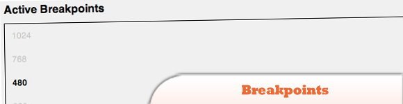
27. Breakpoints.js
A project of hackers and designers at XOXCO. It defines breakpoints for your responsive design. Breakpoints.js will fire custom events when the browser enters or exits breakpoint.
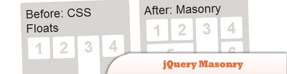
28. jQuery Masonry
A dynamic layout plugin for jQuery. It is a flip-side of CSS floats. While floating arranges elements horizontally and vertically.
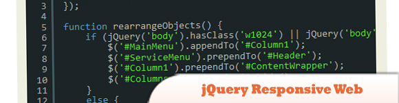
29. jQuery Responsive Web
A jQuery plugin helping design more responsive and adaptive websites by adding dynamic classes to the BODY class depending on the operating system, browser, and resolution.
30. Response JS
A lightweight jQuery plugin that gives web designers tools for building responsive websites. It provides semantic ways to dynamically swap code blocks based on breakpoints and service images progressively via HTML5 data attributes.
Frequently Asked Questions about jQuery Responsive Layout Plugins
What are jQuery responsive layout plugins and why are they important?
jQuery responsive layout plugins are tools that help web developers create websites that adapt to different screen sizes. They are important because they ensure that a website’s layout, images, and functionalities work seamlessly across various devices, such as desktops, tablets, and smartphones. This is crucial in today’s digital age where users access websites from multiple devices.
How do I choose the right jQuery responsive layout plugin for my project?
Choosing the right jQuery responsive layout plugin depends on your project’s specific needs. Consider factors such as the complexity of your website, the types of devices your audience uses, and the specific functionalities you need. It’s also important to consider the plugin’s compatibility with other tools you’re using, its ease of use, and the support available from the plugin’s developers.
Can I use multiple jQuery responsive layout plugins on the same website?
Yes, you can use multiple jQuery responsive layout plugins on the same website. However, it’s important to ensure that the plugins are compatible with each other to avoid conflicts that could break your website’s layout or functionality. It’s also crucial to test your website thoroughly on various devices after installing each plugin to ensure everything works as expected.
How do I install a jQuery responsive layout plugin?
Installing a jQuery responsive layout plugin typically involves downloading the plugin’s files and including them in your website’s code. The exact process may vary depending on the specific plugin and your website’s setup. Always refer to the plugin’s documentation for specific installation instructions.
What should I do if a jQuery responsive layout plugin breaks my website’s layout?
If a jQuery responsive layout plugin breaks your website’s layout, the first step is to deactivate the plugin and see if the issue resolves. If it does, the plugin is likely the cause of the problem. You can then try to troubleshoot the issue by checking the plugin’s documentation, reaching out to the plugin’s developers for support, or looking for solutions in online communities.
How can I customize a jQuery responsive layout plugin to fit my website’s design?
Most jQuery responsive layout plugins come with customization options that allow you to adjust their appearance and functionality to fit your website’s design. These options can usually be accessed through the plugin’s settings or by modifying the plugin’s code. Always refer to the plugin’s documentation for specific customization instructions.
Are jQuery responsive layout plugins compatible with all browsers?
While most jQuery responsive layout plugins aim to be compatible with all major browsers, there may be variations in how different browsers interpret and display the plugin’s code. It’s important to test your website on various browsers after installing a plugin to ensure that it works as expected.
Do jQuery responsive layout plugins affect my website’s loading speed?
jQuery responsive layout plugins can potentially affect your website’s loading speed, especially if they involve complex scripts or large files. However, many plugins are optimized for performance and have minimal impact on loading speed. It’s always a good idea to test your website’s loading speed after installing a plugin to ensure it doesn’t negatively affect user experience.
Can I use jQuery responsive layout plugins on a non-WordPress website?
Yes, jQuery responsive layout plugins can be used on any website that uses jQuery, not just WordPress websites. However, the installation process may vary depending on your website’s platform.
Are there free jQuery responsive layout plugins available?
Yes, there are many free jQuery responsive layout plugins available. However, keep in mind that free plugins may not offer as many features or as much support as paid plugins. Always consider your project’s specific needs and budget when choosing a plugin.
Sam Deering has 15+ years of programming and website development experience. He was a website consultant at Console, ABC News, Flight Centre, Sapient Nitro, and the QLD Government and runs a tech blog with over 1 million views per month. Currently, Sam is the Founder of Crypto News, Australia.