10 Company Logo Makeovers
When it comes to a company’s image, the logo plays a crucial part. Branding and marketing materials are one of the key factors in fostering a successful brand that resonates with customers. Just like with websites, the company image can be in need of a makeover from time to time. These makeovers can consist of simple changes like the addition of a slogan, or sometimes a huge overhaul that includes repackaging, substantial logo changes, and even remodeling the physical layouts of stores.
Over the years, we have seen logos come and go for various reasons. We have also seen community backlash when a logo is redone such as with Gap. Logos have played a large part in regards to brand recognition, as some of the most successful companies are recognized by their logo alone. Consider companies like Coca-Cola, Nike, and Ralph Lauren for example. These brands are ubiquitous, but they nonetheless are occasionally in need of a redesign. Today, I’m sharing ten major logo makeovers that have occurred in the last several years.
When reworking your logo, it isn’t always necessary to pull out all the bells and whistles. Sometimes a simple change in font choice and converting your logo to 3D can be just enough to freshen up your design.
Despite what your feelings may be for this company, there really isn’t any denying that the overhaul to the company’s logo was necessary. The new design feels more open and brighter, which gives it a more friendlier and welcoming feel.
Going back to the idea of simple logos, Burger King’s redesign is a nice take on one of their old designs. While completely redesigning your logo isn’t a requirement, adding extra subtle elements like the blue ring and tilting the design can make all the difference.
The jump from one-dimensional logos to three-dimensional seems to be the trend over the past few years when it comes to logo designs. Jack in the Box’s new design features a box-like shape and even uses a completely different font.
Sometimes, new logo designs aren’t always readily welcomed, as Kraft found out when their new logo was ranked 5th worst logo in 2009. Though the logo itself is rather nice, it goes to show you that sometimes keeping your design simple and traditional is the way to go.
You are probably already aware that PayPal’s site has undergone a slight makeover and with this makeover came the redesign of their logo. The redesign itself isn’t big enough to incur the wrath or praise of many, but it is a nice little change and a bit more professional looking.
Beverage companies are so notorious when it comes to the reworking of their logos that when it happens, it isn’t much of a surprise. Pepsi, like a few other well-known soda companies, took the plunge once more with their logo to give it a more modern look.
Giving your logos an up-to-date look is a terrific way to keep the product relevant, especially if you are targeting a younger demographic. While one of the original designs for Pringles is classy, the new modern design of the little man with the mustache has a lot more character.
Whether you’re a fan of the company or not, you probably can spot this logo a mile away. Starbuck’s logo has undergone several redesigns over the years. The logo is now a minimal take on one of the earlier designs, and while it may not be liked as much, it’s still very recognizable and thus effective.
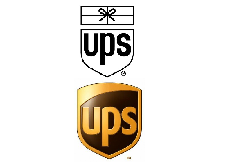
Though a far cry from being 3D, the new UPS logo is a nice spin on what was originally a simple black and white outline. This particular redesign proves that putting in a little time to your design a can really make a big difference.
There have been many redesigns of popular logos, some more recent than others. The logos featured here are just the tip of the iceberg, and I have undoubtedly neglected some of the more obvious ones. Feel free to share the logos that have not been included.
What do you think of the logos featured? Do you have a favorite or one you don’t particularly care for?
Frequently Asked Questions about Company Logo Makeovers
Why is a company logo makeover necessary?
A company logo is a visual representation of the brand. It’s often the first thing that customers notice about a business. Over time, a logo may become outdated or no longer reflect the company’s identity or values. A logo makeover can help to modernize the brand, attract new customers, and keep the business relevant in a competitive market. It’s a strategic move that can significantly impact a company’s image and success.
What are some successful examples of company logo makeovers?
There are numerous examples of successful company logo makeovers. For instance, Starbucks simplified their logo by removing the “Starbucks Coffee” text and focusing on the iconic mermaid image. Similarly, Apple transitioned from a multi-colored apple logo to a sleek, monochrome design that is now recognized worldwide. These changes helped to modernize the brands and make them more visually appealing.
How can a company decide when it’s time for a logo makeover?
There are several signs that it might be time for a logo makeover. If the logo looks outdated compared to competitors, if it no longer represents the company’s values or target market, or if the business has significantly evolved since the logo was created, it might be time for a change. It’s important to regularly evaluate the effectiveness of a logo and consider whether a makeover could benefit the business.
What are the risks associated with a company logo makeover?
While a logo makeover can bring many benefits, there are also risks involved. A new logo might not resonate with existing customers, leading to confusion or a loss of brand recognition. It’s also possible that the new design could be poorly received, resulting in negative publicity. Therefore, it’s crucial to carefully plan and execute a logo makeover, considering the potential impact on the brand and customers.
How can a company ensure a successful logo makeover?
A successful logo makeover requires careful planning and execution. It’s important to understand the brand’s identity and target audience, and to create a design that accurately represents these elements. It’s also beneficial to involve customers in the process, perhaps by seeking their feedback on potential designs. Finally, a successful makeover requires effective communication to ensure that customers understand the reasons for the change and can easily recognize the new logo.
Can a logo makeover improve a company’s bottom line?
Yes, a well-executed logo makeover can positively impact a company’s bottom line. A fresh, modern logo can attract new customers, increase brand recognition, and enhance the overall image of the business. This can lead to increased sales and profitability. However, it’s important to remember that a logo makeover is just one element of a comprehensive branding strategy.
What are some common mistakes to avoid in a logo makeover?
Some common mistakes in a logo makeover include making changes that are too drastic, not considering the target audience, and failing to communicate the reasons for the change to customers. It’s also a mistake to change the logo too frequently, as this can lead to confusion and a lack of brand consistency.
How much does a logo makeover typically cost?
The cost of a logo makeover can vary widely, depending on the complexity of the design and the designer’s rates. It can range from a few hundred to several thousand dollars. However, it’s important to view this as an investment in the company’s brand and future success.
How long does a logo makeover process typically take?
The process can take anywhere from a few weeks to several months, depending on the complexity of the design and the amount of feedback and revisions involved. It’s important to allow enough time for a thorough process, including research, design, feedback, and revisions.
Can a company do a logo makeover in-house, or should they hire a professional?
While it’s possible to do a logo makeover in-house, especially if the company has a skilled design team, it’s often beneficial to hire a professional. A professional designer or design agency brings expertise and an outside perspective that can be valuable in creating a successful new logo. They can also help to manage the process and ensure a high-quality result.
Gabrielle is a creative type who specializes in graphic design, animation and photography.


