Vino by Matthew Koyak
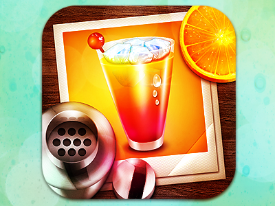
Cocktail by Michael Flarup
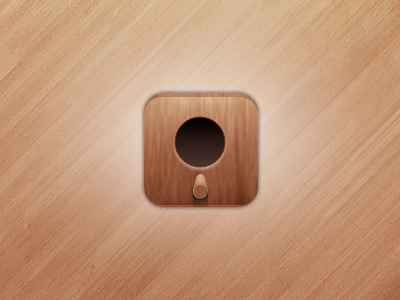
Birdhouse Icon by Bas van der Ploeg
Surf Icon by Mikkel Aggerbo
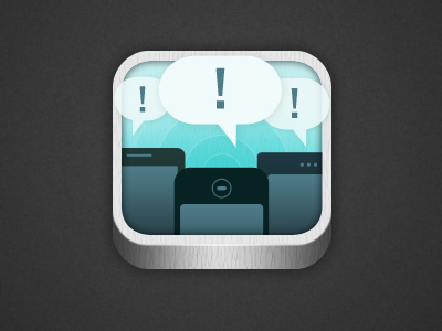
Mobiles App by Isaac Stott
Calendar Icon by Zane David
Appleteiser by John Torres
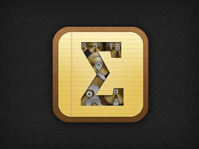
Scalar iOS Icon by Stephane Reverdy
Business Card App Icon by Sarah Parmenter
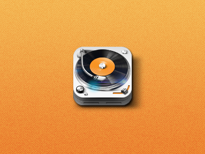
Tunesmate App Icon by Zaewan Suh
Frequently Asked Questions (FAQs) about iOS App Icon Concepts
What are the key elements to consider when designing an iOS app icon?
When designing an iOS app icon, it’s crucial to consider simplicity, uniqueness, and relevance. The icon should be simple enough to be recognized at a glance, unique enough to stand out among other apps, and relevant enough to convey the app’s purpose. It’s also important to adhere to Apple’s design guidelines, which include using a square format, avoiding text, and ensuring the icon looks good against different wallpapers.
How can I make my iOS app icon stand out?
To make your iOS app icon stand out, focus on creating a unique and memorable design. This could involve using bold colors, unique shapes, or a distinctive image. It’s also important to consider how your icon will look on different devices and against different wallpapers, as this can affect its visibility.
What are some common mistakes to avoid when designing an iOS app icon?
Some common mistakes to avoid when designing an iOS app icon include using too much detail, incorporating text, and not considering how the icon will look at smaller sizes. It’s also a mistake to ignore Apple’s design guidelines, as this can result in an icon that doesn’t fit well with the overall iOS aesthetic.
How can I test how my iOS app icon will look on different devices?
You can test how your iOS app icon will look on different devices by using a tool like Xcode, which allows you to preview your icon on different screen sizes and resolutions. You can also use an online tool like App Icon Tester, which lets you upload your icon and see how it will look on various devices.
What are some examples of well-designed iOS app icons?
Some examples of well-designed iOS app icons include the icons for apps like Instagram, Snapchat, and Spotify. These icons are simple, distinctive, and immediately recognizable, making them effective at capturing users’ attention and conveying the app’s purpose.
How can I ensure my iOS app icon is consistent with my brand?
To ensure your iOS app icon is consistent with your brand, consider incorporating elements of your brand identity into the design. This could include using your brand colors, incorporating your logo, or using imagery that reflects your brand’s personality.
What are the size requirements for an iOS app icon?
The size requirements for an iOS app icon are 1024×1024 pixels for the App Store, and various smaller sizes for use on devices. It’s important to create your icon at a high resolution to ensure it looks crisp and clear on all devices.
How can I create an iOS app icon if I don’t have design skills?
If you don’t have design skills, you can use an online tool like Canva or Adobe Spark to create your iOS app icon. These tools offer templates and easy-to-use design features that can help you create a professional-looking icon. Alternatively, you could hire a professional designer to create your icon for you.
Can I change my iOS app icon after it’s been published?
Yes, you can change your iOS app icon after it’s been published. However, it’s important to consider how this might affect your users. A drastic change could confuse users and make it harder for them to find your app on their device.
What are some resources for learning more about iOS app icon design?
Some resources for learning more about iOS app icon design include Apple’s Human Interface Guidelines, online design blogs like Smashing Magazine and Design Shack, and online courses on platforms like Udemy and Skillshare.
Joel Falconer is a technical content strategist. He has been managing editor at SitePoint, AppStorm, DesignCrowd, and Envato, and features editor at The Next Web.

Published in
·APIs·CMS & Frameworks·E-Commerce·Frameworks·Laravel·Libraries·PHP·Web Services·January 17, 2017
Published in
·Design·Design & UX·Illustration·Photography & Imagery·Review·Sketch·Software·March 16, 2015

