Have you noticed that when EA Games release a new title they often simultaneously release the game for every gaming platform from PS3 to Nintendo DS?
There are huge differences in the capabilities of those devices and yet they adapt the games to suit each one. They change the visual design and gameplay while maintaining the games’ core experiences, themes, and branding. They focus on giving each customer the best experience for their chosen gaming device.
I can relate this to CSS development. Issues regarding IE6 support aside, we seem to be in a fantastic situation where we have a capable collection of browsers, all with a decent level of CSS2.1 support: Safari, Firefox, Opera, Chrome and Internet Explorer. In fact, this is the first time I can remember when there are 5 browsers available, all with a mature and compatible level of CSS support.
Over the last few years, best-practice CSS development has shifted from graceful degradation to progressive enhancement. And buoyed by the progress of modern browsers and the demise of older browsers, the excitement about what is possible right now is increasing. More and more designers are considering how to provide the best user experience possible for each browser without risking compatibility.
Here are a few examples I’ve come across recently:
Media queries allow fine control over how CSS rules are applied based on the features of the device on which your web page is being displayed. Device width, color, resolution and more can all be queried for. Reinhold Weber has created a demonstration of how the combination of media queries and CSS3 columns enables you to provide an optimized experience to Firefox, Safari, and Chrome users. The technique increases the number of text columns according to screen width.
Jonathan Snook has demonstrated a text rotation trick using the CSS3 transform extension in Safari, Chrome, and the latest version of Firefox. As a bonus he also demonstrates that by using the proprietary Microsoft filterproperty you can also support Internet Explorer.
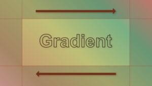
Tim Brown achieves a pure CSS text-gradient in Safari while Markus Stange has some fun with box shadows in his post “Fun with Box Shadows.” Markus produces some impressive effects for buttons in Firefox 3.5 and there is also some support for box shadows in Safari and Chrome.
I used the -webkit-box-sizing property in my Adobe AIR application in order to force an element to take 100% width while excluding the width of its borders and padding. Ordinarily the borders and padding would have extended the width of the element to greater than 100% — an often encountered annoyance. Now the box-sizing property has widespread browser support as James Hopkins explains.
CSS text shadows, which have always been supported by Chrome (and much longer by Safari [since version 1.1]), are now supported by the latest versions of Firefox and Opera. Westciv has an excellent CSS text shadow generation tool that you can play with. You can also have some fun with the CSS gradient generation tools, currently supported by Safari and Chrome.
The list goes on: rounded corners, custom fonts, and RGBA colors. It certainly is exciting!
But, as exciting as this stuff is, it still has to be cost effective to be worth the effort. So I’d be interested to hear if anyone is using progressive CSS enhancement in any way in their daily work? If you do so in client work, how do you sell the idea to clients? If a client can see an enhancement demonstrated in one browser, do they demand it in all browsers? And if you have any live examples let us know how you did it.
 Andrew Tetlaw
iOS Developer, sometimes web developer and Technical Editor.


