In this article, we’ll dig into how to use the CSS clamp() function to scale the size of text across a range of device sizes.
The landscape of web development and design is ever evolving. In recent years we’ve seen the introduction of powerful CSS APIs like Grid and container queries. To add to that mix, there have been some major efforts in pushing forward a paradigm shift in how we control the sizing of typography across our ever-changing device landscape.
This article will talk about a term known as “fluid typography”. It’s a new technique that leans heavily on the use of a new CSS function called clamp(). The foundational concepts of fluid typography can be difficult to really get to grips with, so it’s my hope that this deep dive will both explain the core concepts and also leave you excited about implementing fluid typography in your next project.
Understanding the Need for Fluid Typography
Up until recently, adapting font size to fit device width was a relatively manual task involving the use of CSS media queries. Depending on your device support, this could mean one or two media queries or even as many as ten.
The static nature of media queries forces us to declare a font size over or below a certain device width. While this font size may actually work fine at the given breakpoint, often frontend engineers are forced to add extra breakpoints to account for smaller font sizes at varying edge cases. This leads to bloat, inefficiency and frustration, as more media queries are introduced in order to satisfy these demands.
The above scenario is further complicated by the universe of devices that exist at different widths, pixel ratios and screen sizes. What we need as frontend engineers and designers is functionality that can help us adapt font size to a given device based on a set of dynamic and well thought out values.
This means we could move away from the restrictive nature of media queries, write less code, become more efficient and have more confidence in how our site looks across devices.
Why Fluid Typography Matters
So, why would I want to go through all the effort of refactoring my code in order to leverage the benefits of fluid typography? There are a few reasons:
- Reduce CSS bloat. Using fluid typography requires one definition in order to cater for a multitude of device ranges. We can move away from multiple CSS media query declarations and reduce the amount of CSS sent over the wire.
- Improve user experience. As fonts adapt to screen size, we can ensure that more edge cases are catered for across the device landscape, generating better and more consistent user experiences for users.
- Support more devices. Media queries only support static breakpoints, which is helpful but not an exact science. With
calc(), frontend engineers can make more dynamic decisions about how typography renders. - Improve efficiency. Implementing fluid typography means we can achieve improved and simplified CSS declarations without the need to for manually testing every device.
Now that we understand what fluid typography is, and why it matters, let’s look at how to implement it in our projects.
The Power of clamp()
clamp() is a well-supported CSS function that was introduced as part of the CSS Module 4 specification. CSS functions are not new to CSS; we’ve been using some for many years, such as rgb(). As with all functions, clamp() takes a number of inputs and yields an output.
clamp() takes three inputs:
- A minimum value. This is the floor of the range. The preferred value can’t be lower than this minimum value.
- A preferred value. This value is used as long as the number generated is not lower or higher than the expressed minimum and maximum values.
- A maximum value. This is the ceiling of the range. The preferred value can’t be higher than this maximum value.
Let’s first look at an example of using clamp() to set the width of an element:
width: clamp(350px, 50% ,600px)
In the example above, we’re setting the width of a given element to be no more than 600px, no less than 350px, and ideally 50%. Take a look at the CodePen demo below and resize the browser horizontally. You’ll notice that, no matter how wide the container gets or how wide your screen is, the grey <article> element never gets wider than 600px. Likewise, no matter how small you make the browser, the <article> element will never go below a width of 350px. This is the beauty of using clamp().
See the Pen
Clamp Example by SitePoint (@SitePoint)
on CodePen.
Can you see how this starts to relate to typography? We have far more control over the behavior of the <article> element. It’s good to note that, at this point, we haven’t used a single media query to achieve this, nor are we using particularly dynamic values. If we did have to rewrite the CodePen demo’s CSS with a media query, we’d likely be looking at something like this:
article {
    width: 350px;
}

@media only screen and (min-width: 480px) {
    width: 50%;
}

@media only screen and (min-width: 960px) {
    width: 600px;
}
Around ten lines of code, compared to one CSS function. I’d say that is a major optimization. It’s important to understand, again, how clamp() is working here: it’s looking at the preferred value first and calculating if that expression is in fact between the minimum and maximum values. In other words:
- if 50% calculates to a value that’s less than 350px, then 350px will be used.
- if 50% calculates to a value that’s greater than 600px, then 600px will be used.
- if 50% calculates to a value between the minimum and maximum values, then the preferred value is used.
In all honesty, using a static value as the preferred value is not helpful. This value needs to be a dynamic expression in order to work and determine a linear relationship between the minimum and maximum values.
CSS has many units of measurements that will yield a static value from a dynamic expression, so I would advise you to use em, rem, vw, percentage, or even combination of these units of measurement with the use of calc() to dynamically calculate the preferred value when using clamp() in your code.
Now that we understand how clamp() works, let’s see how we can apply it to fluid typography.
Implementing Fluid Typography with clamp()
Let’s get into the nitty gritty now about setting up fluid typography for a project. We’re going to start with a contrived stylesheet:
* {
 box-sizing: border-box;
}

body {
 font-family: system-ui;
 font-size: 16px; /* 16px = 1rem */
}

h1 { font-size: clamp() }
h2 { font-size: clamp() }
h3 { font-size: clamp() }
h4 { font-size: clamp() }
h5 { font-size: clamp() }
h6 { font-size: clamp() }
Our goal here is to create universal typography styles that respond gracefully to breakpoints in a linear way (scaling down in a consistent manner). To do that, we need to employ some math and we need to consider a few complications. I’m going to do my best to explain everything as plainly as I can.
As I mentioned before, we know that clamp() takes three inputs: minimum, preferred, and maximum. It’s easier to determine the minimum and maximum font sizes first. This provides us some guard rails and sets a range for the preferred value to be calculated.
Let’s say I’m working with a designer to create an 8px font scale. This means that my fonts can go up increments of 8px, which provides for natural consistency:
8px: 0.5rem;
16px: 1rem;
24px: 1.5rem;
32px: 2rem;
40px: 2.5rem;
48px: 3rem;
56px: 3.5rem;
64px: 4rem;
I’ve used px values above to ground the idea of the scale, as it’s more intuitive, but we’ll be using rem going forward, as it’s a relative unit of measurement and can scale/zoom for accessibility reasons. Next, we’ll need to make some assumptions based on supported minimum and maximum screen sizes.
Determining min and max screens
Before we move any further, I want to address the issue of choosing minimum and maximum values. Part of calculating the preferred value will depend on what range of screen sizes we’re actually dealing with, but it also has an effect on our minimum and maximum values.
Let’s say, for example, that our website supports all the way back to iPhone 5. That device has a screen width of 320px. It’s probably about as low as you’re going to get in the current market to view a website on. We’ll also assume that we want to support devices greater than or equal to 1920px in screen width, which is the current market’s default laptop screen width.
The minimum and maximum screen sizes will always need to be decided on a project-per-project basis. I would encourage you to review your site’s analytics to help you determine this.
When we translate clamp() into simple language, we’re basically saying:
- The preferred value can’t be lower than X at or below 320px.
- I’ll let the browser calculate the preferred value here based on a dynamic expression I give it, so long as it’s not below X or or above Y.
- The preferred value can’t be higher than Y at or above 1920px.
Consider my designer has provided me with some design guidance here and has told me that 320px is our minimum screen width to support, and 1920px is our maximum. I can add in my min and max values to our stylesheet:
* {
 box-sizing: border-box;
}

body {
 font-family: system-ui;
 font-size: 16px; /* 16px = 1rem */
}

h1 { font-size: clamp(2.5rem, <preferred-value>, 4rem) }
h2 { font-size: clamp(2rem, </preferred-value><preferred-value>, 3.5rem) }
h3 { font-size: clamp(2rem, </preferred-value><preferred-value>, 3rem) }
h4 { font-size: clamp(1.5rem, </preferred-value><preferred-value>, 2.5rem) }
h5 { font-size: clamp(15rem, </preferred-value><preferred-value>, 2rem) }
h6 { font-size: 1rem }
Calculating preferred value
Now we need to determine our preferred value. This requires some math in order to come up with a linear expression. Rather than try to figure it out yourself, I recommend you head over to the Clamp Calculator, which is one of a number of handy tools for figuring out clamp() values. (There are plenty of calculators available, some far more complex than The Clamp Calculator, but I like this one for its simplicity. I’ll note a few more near the end.)
Let’s start with our h1 rule.
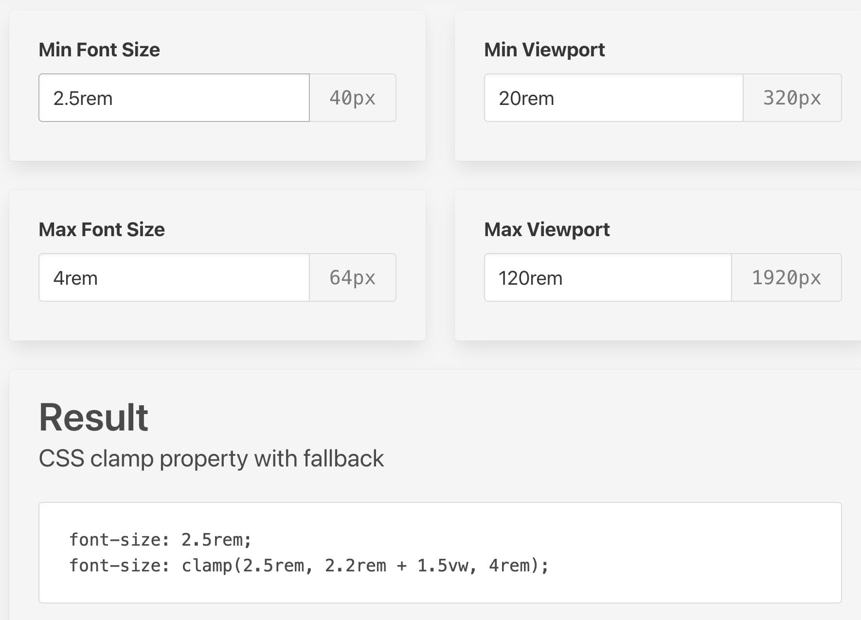
We’ve entered our minimum value, our maximum value, and our minimum and maximum viewports. As you can see, the actual min and max values are the same as our CSS declaration above. The confusing part here is how the four values above come together into a value of 2.2rem + 1.5vw.
Let’s break this down. The first thing you need to know is that the combination of rem and vw units is a technique used to ensure that we can still visually zoom in the browser for accessibility reasons. (Read the next section for details.)
Simply put, the preferred value is determined using a formula. This formula determines the rate at which your font size scales between the min and max values. The formula can be expressed as so:
clamp(
  min-value,
  fluid-value + relative-value,
  max-value
);
We’ve spoken about minimum and maximum values at length, so let’s figure out how to calculate fluid-value + relative-value.
Calculating fluid value
The fluid value can be expressed as follows:
fluid-value = (
  (max-font-size - min-font-size) /
  (max-viewport-width - min-viewport-width)
) * 100;
The fluid value can be explained as the rate at which the font scales. The value will increase from minimum value to maximum value as the screen width increases.
Calculating relative value
In order to figure out the second part of the puzzle, we need to know what the root font size of the browser is. This is usually 16px by default, but users can change this. That’s why we always want to keep this value in rem, as it will scale as the user increases their preferences. Thus our relative value would be 1rem.
A practical example
In most cases, as a developer, you won’t need to calculate all of this each time you want to add fluid typography to your project. There are plenty of tools and calculators available to aid you. The only information you need to bring with you are your min and max viewports, as well as your min and max font sizes.
Note: it’s not always immediately obvious what exact formula each calculator tool uses to calculate its result. For the most part, you’ll see the same output, perhaps but for a discrepancy in the rem value. This has to do with the formula itself, and can be adjusted depending on your needs, which are almost always specific to the context of your site.
We now have part of our formula:
clamp(
  2.5rem,
  calc( <fluid-value>  + 1rem),
  4rem
);
Let’s, see if we can use the fluid-size formula above to calculate this manually first and then plug it into the calculator to visualize our result. Our formula, adjusted to use the values above, would be as follows:
fluid-value = ((64 - 40) / (1920 - 320)) * 100;
That yields a value 1.5, and in this case it would be 1.5vw. Thus our clamp() function would look like the code below. Remember that the fluid value here — the 1.5vw which is our rate of linear scale — can be adjusted depending on how aggressively you want the font to scale. Let’s test this:
font-size: clamp(2.5rem, calc(2.5vw + 1rem), 4rem);
See the Pen
Fluid Typography Example 1 by SitePoint (@SitePoint)
on CodePen.
In the CodePen demo above, we can see our rule at work. Notice how the typography scales up and down gracefully and gradually.
However, in the CodePen demo below, I’ve updated the clamp() function to this:
clamp(2.5rem, calc(3.5vw + 1rem), 4rem);
See the Pen
Fluid Typography Example 2 by SitePoint (@SitePoint)
on CodePen.
What’s the first thing you notice? The font is larger to start with, even though it hasn’t gone over its maximum value. It scales, but the rate at which it scales is far more drastic. You can play with these numbers until you get a good rhythm across devices. There’s no hard or fast rule here.
At all times, I’d recommend using a calculator tool, listed in the Tools and Resources section below. This is not only for efficiency, but to also see what works for you.
Considerations for Designers
Fluid typography is a difficult concept to grasp even for developers. However, designers may have a tough time digesting it. It effectively means that design needs to give up a fair amount of control across breakpoints. But does a designer’s involvement end after defining a minimum and maximum font size?
Typography is an art and a science, mainly because it’s such an important part of design, but its sizing, rhythm and scale are all determined by math. Some designers may go with their gut on this and that’s absolutely fine, but there are those who are intrigued by the numbers side of planning out typography.
As a designer working on a project that plans to implement fluid typography, you need to work with your engineers to determine the following based on your site:
- The minimum screen size you wish to support. This should be guided by a review of your sites analytics and traffic.
- The maximum screen size you wish to support. This should be guided by a review of your sites analytics and traffic.
- The min and max font size for each typographical element. This includes headings, paragraphs, subtitles, and so on. This is just as important as determining your min and max screen sizes.
- The degree of scale. How aggressively do you want your typography to scale over the device ranges in between your min and max screen sizes? That is, should it be a gentle resizing over a large range, or more aggressive resizing over a smaller range?
These considerations will help you collaborate well with the engineering team. It’s worth noting that clamp() can also be used for line height, so don’t forget to speak to your engineering team about that too, as it’s an important consideration for legibility and readability.
A note on accessibility
A good clamp() declaration would look like this:
clamp(1rem, 2.5vw, 3rem);
A better clamp declaration would look like this:
clamp(1rem, calc(2.5vw + 1rem), 3rem);
I’d recommend defining any font values that you leverage within your code using rem. This is standard best practice these days, and shouldn’t really have to be explained further than the fact that setting 16px (or whatever value you want) as the root font size and using rem as a relative unit of measurement to define font sizes is good for accessibility and user experience.
This is particularly important when it comes to our preferred value. Most examples of clamp() rely on a vw value in order to express the size of the font based on viewport width. However, when a user zooms in on their device or browser, because a value is expressed as a viewport width, the font will not increase in size. This is because the screen width doesn’t increase in size.
In order to combat this, you can use calc() to combine rem and vw together so that your preferred value becomes an expression that’s dynamically calculated to result in a rem value which is good for accessibility and zoom, but also has the added benefit of being relative to the screen width.
Using everything we know, we can put the finishing touches on our CSS stylesheet. I’ve again used the Clamp Calculator to determine fluid typography values:
h1 { font-size: clamp(2.5rem, calc(2.2rem + 1.5vw), 4rem) }
h2 { font-size: clamp(2rem, calc(1.7rem + 1.5vw), 3.5rem) }
h3 { font-size: clamp(2rem, calc(1.8rem + 1vw), 3rem) }
h4 { font-size: clamp(1.5rem, calc(1.3rem + 1vw), 2.5rem) }
h5 { font-size: clamp(1rem, calc(0.8rem + 1vw), 2rem) }
h6 { font-size: 1rem }
Applied to our CodePen demo, here’s how the typography scales down. (Resize the browser to see how the headings scale up and down. Look ma! No media queries!)
See the Pen
Fluid Headings by SitePoint (@SitePoint)
on CodePen.
Tools and Resources
Here are some of my go-to resources for implementing fluid typography in projects.
Firstly, I’d highly recommend developers read up on how clamp() works on MDN. MDN offers detailed explanations of its internal mechanisms.
For designers, I’d recommend reading Designing with Fluid Type Scales, by James Gilyead.
Beyond those, here are some other useful resources:
-
Utopia Fluid Typography Calculator. This tool helps you calculate
clamp()function values across breakpoints and provides the code to implement into your CSS files. -
Fluid Type Scale. These practical toolkits of utilities and presets help implement fluid typography, making design work more manageable.
-
Modern fluid typography editor. Adrian Beck developed this great tool for visualizing the linear relationship of minimum, preferred, and maximum values within
clamp(). It’s highly recommended if you’re trying to refine your preferred values.
Conclusion
In this article, we’ve discussed the intricacies of fluid typography, why we might want to use it, and how to implement it within our CSS using the clamp() function. We also discussed its impact on designers and implications for web accessibility.
Calculating fluid typography values for font sizes depends on your site and the device range you wish to support, as well as how your site adapts to each device. Crafting fluid typography keeps our code clean, removes the need for media queries, and is just one more step forward to a consistent and pleasant user experience for all users.
 Daine Mawer
Daine is an experienced engineer with over 10 years of experience building accessible and performant web experiences. He is the Associate Director of Front-end Engineering for the EMEA division at @10up. Daine focuses on building enterprise-level sites using React, Next.js and TypeScript. Outside of his role at 10up, he is a recognized tech lead, writer, and conference speaker in the web industry, WordPress Core contributor, and Web Performance Advocate. Visit his blog for more articles.