
In this article, we’ll walk through how to integrate ShadCn into React apps. Learn how to set up a new React project, install and configure ShadCn, and make the most of its features. Whether you’re a beginner or an experienced developer, discover insights to streamline your development with ShadCn in a React application.
You can check out the complete source code on GitHub.
- What is ShadCn?
- Prerequisites for ShadCn Installation
- Setting Up a New React Application
- Setting Up Tailwind CSS
- Installing and Configuring ShadCn
- Using ShadCn in your React Application
- Conclusion
What is ShadCn?
ShadCn is a versatile library that provides a wide range of utilities and components to enhance your React applications. It’s designed to simplify the development process, improve application efficiency, and create a more user-friendly experience. ShadCn is built on top of Tailwind CSS and Radix UI, allowing for high customizability and seamless integration with Tailwind’s utility-first approach.
Prerequisites for ShadCn Installation
Before you start with ShadCn installation, ensure a well-prepared environment. Have a foundational understanding of JavaScript and React.js, with Node.js installed on your machine. Familiarity with CSS and HTML is beneficial for effective ShadCn usage. Since ShadCn integrates with Tailwind CSS, a basic understanding of Tailwind will also be helpful.
Setting Up a New React Application
To initiate your project, start by setting up a new React application. To do this, run the following command on your terminal:
npm create vite@latest
Then name the project, and select your language (preferably TypeScript, as ShadCn works out of the box with TypeScript).
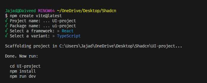
Then move into your project folder and run the install command:
npm install
Finally, start up your dev server by running the command:
npm run dev

Setting Up Tailwind CSS
To customize ShadCn components, you’ll need to install and configure Tailwind CSS. Tailwind is a utility-first CSS framework that works seamlessly with ShadCn, allowing you to easily modify and style the components to fit your project’s requirements. To install Tailwind, run the command:
npm install -D tailwindcss postcss autoprefixer
npx tailwindcss init -p
Then paste the following into your index.css file:
@import "tailwindcss/base";
@import "tailwindcss/components";
@import "tailwindcss/utilities";
After that, head over to your tsconfig.json file and modify the paths:
/* Path resolution */
    "baseUrl": ".",
    "paths": {
      "@/*": ["./src/*"]
    }
By adding the baseUrl and paths sections under compilerOptions, the modified tsconfig.json file enables path resolution for imports starting with @/, which maps to the ./src/ directory in your project.
Finally, install nodes in your project, to prevent path errors:
npm i -D @types/node
Then modify your vite.config.ts:
import path from "path"
import react from "@vitejs/plugin-react"
import { defineConfig } from "vite"

export default defineConfig({
  plugins: [react()],
  resolve: {
    alias: {
      "@": path.resolve(__dirname, "./src"),
    },
  },
})
Updating the vite.config.ts file with the path resolution configuration ensures that your application can resolve the paths correctly, allowing you to import modules using the defined aliases. This step is important for a smooth development experience and to avoid any import errors related to path resolution.
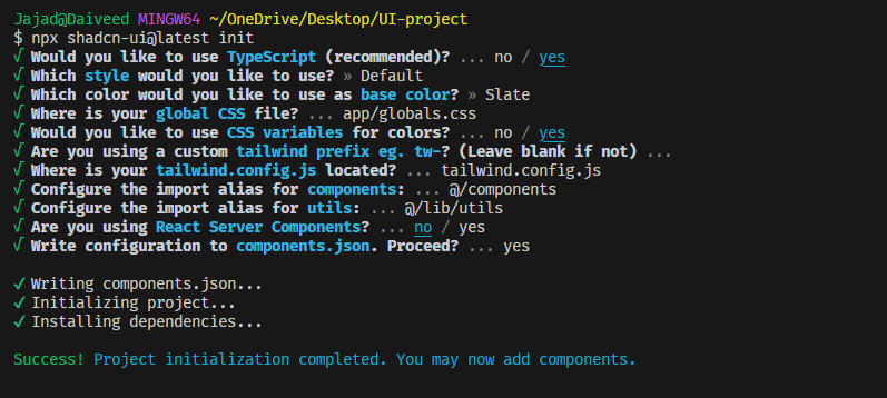
Installing and Configuring ShadCn
With your React application set up, it’s time to install ShadCn. You can do this using npm with the following command:
npx shadcn-ui@latest init
The prompt brings up a couple of options for you to choose from.
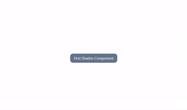
Using ShadCn in your React Application
After the successful installation and configuration of ShadCn, you can now begin using it in your React application. As an example, let’s use the hover-card component. Head over to the Shadcn docs and grab the prompt for the hover-card:
npx shadcn-ui@latest add hover-card
Then import it into your app and use it:
import {
  HoverCard,
  HoverCardContent,
  HoverCardTrigger,
} from "@/components/ui/hover-card";

export default function App() {
  return (
    <div className="flex justify-center  items-center h-screen">
      <HoverCard>
        <HoverCardTrigger>First Shadcn Component</HoverCardTrigger>
        <HoverCardContent>My first of many components</HoverCardContent>
      </HoverCard>
    </div>
  );
}
This yields the result shown below.

Editing a ShadCn component
To edit a ShadCn component, you can leverage the power of Tailwind CSS to customize its appearance and behavior. For instance, you can use Tailwind to edit the appearance of the hover-card component by passing styles via the classname prop:
<HoverCard>
  <HoverCardTrigger className=" rounded-xl text-white py-2 px-4 bg-slate-500 ">
    First Shadcn Component
  </HoverCardTrigger>
  <HoverCardContent className=" font-bold text-slate-500 w-max">
    My first of many components
  </HoverCardContent>
</HoverCard>
This makes the component appear as shown below.
Conclusion
Incorporating ShadCn into your React applications doesn’t need to be a complicated process. With a clear understanding of the prerequisites, a working React application, and the right configuration, you’re well on your way. ShadCn’s wide variety of utilities and components make it an excellent tool for enhancing your React applications, simplifying the development process, and making your applications more efficient and user-friendly.
 David Jaja