The combination of Visual Studio and Expression Blend makes designing and developing Windows Phone applications relatively simple. However, it also makes it easy to use the standard controls without understanding their full capabilities. In this post we’re going to look at a few of the Windows Phone controls that ship with the SDK in more detail.
TextBlock
Let’s start with the TextBlock, which is used for displaying text within a Windows Phone application. The following XAML uses a TextBlock to display the text “Sample text”. It also specifies the FontFamily and FontSize of the text, along with making the text bold, italic and underlined. The last attribute, TextWrapping, is used to force the text to wrap when it reaches the edge of the TextBlock control.
<TextBlock Text="Sample text"  FontFamily="Segoe WP Semibold"
                     FontSize="16" FontWeight="Bold" FontStyle="Italic"
                     TextDecorations="Underline" TextWrapping="Wrap" />
Each of these properties can be set using the designer experience within Expression Blend, as shown in Figure 1.


Rather than setting these attributes on every instance of TextBlock throughout an application that you want to look the same, you can define them within a Style resource. For example, the following code includes a Style resource, MyTextBlockStyle, which includes the same attributes, as well as two TextBlock controls which reference the Style.
<phone:PhoneApplicationPage.Resources>
    <Style x:Key="MyTextBlockStyle" TargetType="TextBlock" >
        <Setter Property="FontFamily" Value="Times New Roman"/>
        <Setter Property="FontSize" Value="16" />
        <Setter Property="FontWeight" Value="Bold"/>
        <Setter Property="FontStyle" Value="Italic" />
        <Setter Property="TextDecorations" Value="Underline" />
        <Setter Property="TextWrapping" Value="Wrap"/>
    </Style>
</phone:PhoneApplicationPage.Resources>

<TextBlock Text="Sample text" Style="{StaticResource MyTextBlockStyle}" />
<TextBlock Text="Another  text" Style="{StaticResource MyTextBlockStyle}" />
The Windows Phone user interface has a very distinct style. Microsoft has gone to great lengths to not only ensure consistency across the core platform but also to give developers the ability to build applications that are consistent. Windows Phone comes with a number of predefined styles which you can use within your application. Figure 2 illustrates the available TextBock styles.


In Expression Blend, apply a style to a control is a simple as right-clicking on the control, selecting Edit Style Apply Resource, and then selecting the Style resource you want to apply. This is illustrated in Figure 3, where the PhoneTextSmallStyle is being selected.


What may not be obvious about the TextBlock is that it can contain multiple sections of text, as well as line breaks. Each section of text can be independently adjusted, for example to make a section bold, underlined or even change the font size or family. For example the following code includes three paragraphs of text, with sections that are bold and underlined.
<TextBlock TextWrapping="Wrap">
    On the Insert tab, the galleries include items that are designed to coordinate
    with the <Run FontWeight="Bold">overall look of your document.</Run>
    <LineBreak />You can easily change the formatting of
              <Run FontStyle="Italic">selected text</Run> in the document text by choosing a
              look for the selected text from the Quick Styles gallery on the Home tab.
    <LineBreak />To change the overall look of your document, choose new
              Theme elements on the Page Layout tab. To change the
              <Run TextDecorations="Underline">looks available in the Quick Style gallery</Run>,
              use the Change Current Quick Style Set command.
</TextBlock>
Button
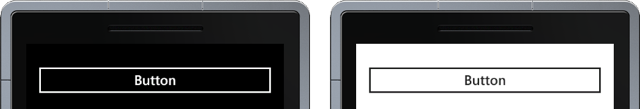
When you add a Button to a page in your Windows Phone application it already comes with an implicit style. This style has built in support for theming, illustrated in Figure 4 which shows a button in the dark theme (left image) and light theme (right image).

The style also includes visual states which define how the button appearance changes when the user interacts with it. We’re getting ahead of ourselves here, let’s jump back a bit and look at how we can adjust the contents within the Button. In most case you’ll just want to adjust the text that is displayed within the Button. This is just a matter of either setting the Content attribute in the XAML for the Button, or by adding the Text as the value of the Button element. The following code illustrates both of these options.
<Button Content="My Action Button"/>
<Button>My Action Button</Button>
Sometimes you may want to include an image or icon alongside the text. To do this you have to add an Image control to the Content of the Button. This can’t be done with the Content attribute; instead you have to add the Image as a sub-element of the Button. If you attempt to simply add this control alongside the existing text you’ll get a compile error. This is because the Content property can only accept a single control. The work around is to wrap both the Image and text into a content container control, such as a Grid or a StackPanel. In this case we’re going to use a StackPanel to stack the controls horizontally.
<Button>
    <StackPanel Orientation="Horizontal">
        <Image Source="/Jellyfish.jpg" />
        <TextBlock VerticalAlignment="Center">My Action Button</TextBlock>
    </StackPanel>
</Button>
You’ll also notice that we’re wrapped the actual text in a TextBlock – this wasn’t required when the text was the only element as there is an implicit conversion from text to a TextBlock. We’ve also centred the text vertically so that it aligns with the middle of the image. The result is a button that looks like Figure 5.


Ok, now back to visual states. Right-click on the Button and select Edit Template Edit a Copy, specify a name for the new template, and click OK. This will take you into template editing mode. Locate the States window and try selecting the different states. You should see that the appearance of the Button changes depending on which state you have selected. For example Figure 6 illustrates the Pressed state.

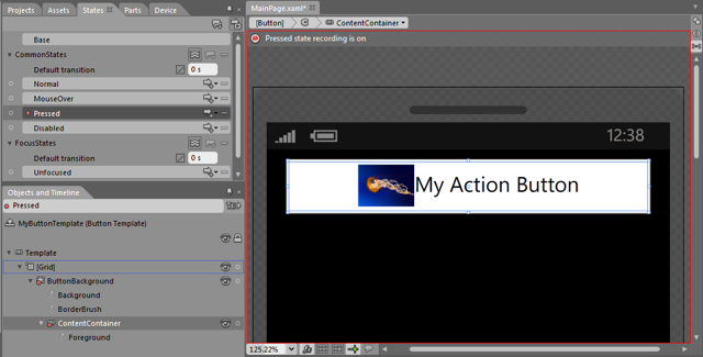
You’ll have noticed that when you selected any of the visual states a red border appears around the design surface. This is a warning, letting you know that you’re in state recording mode – any change you make will only affect the appearance for that state. To exit state recording select the Base state in the States window.
With the Pressed state selected, select the ContentContainer node from the Objects and Timeline window. Across on the Properties window locate the Scale tab within the Transform section. Adjust both the X and Y scale factor to 0.6. You should see that the contents of the button shrink in the design surface, reflecting how they’d appear at runtime. Now run the application and you’ll see that when you click on the button the contents shrink, just as they did in the state recording mode.
In this post you saw a couple of aspects of the TextBlock and Button controls that should help you build better Windows Phone applications. Adjusting the visual states of the Button control is just one example of the power of Expression Blend. Stay tuned for more tips on getting the most from the Windows Phone controls.
 Nick Randolph
Nick is a software architect and developer with experience across a range of technologies, and has a particular interest in the future of rich client and mobile device applications. Nick is a speaker, author, a Microsoft MVP and owner of Built To Roam.