In past articles, we’ve delved into dozens of aesthetic topics, but design work isn’t always purely aesthetic. Often, a truly “well-designed” solution is not only visually appealing, but flexible and efficient as well. There are instances when tunnel-visioning on visual appearance — and ignoring all other facets of a project — can leave you with a design that is beautiful to view but impractical to work with. One example of this could be a high-heeled shoe; it may look stylish and appealing to the public, but to the woman who has to wear it, it’s painful on the feet, useless on soft ground, and makes running impossible. If you took a similar approach to your design projects, you might end up with a design that, just like a high-heeled shoe, is all fashion with very little function. To make sure that your next interface or landing page design doesn’t suffer the same fate as your poorly-chosen footwear, you’ll likely need a way to visualize data that strikes a careful balance between aesthetic appeal and practicality. A designer’s first inclination might be to make a pixel-perfect graph or chart within Photoshop or Illustrator, but that solution entails constantly updating the charts for even the smallest change in the data, which leaves the method well short of being easy and practical. If your metrics change by just a few units or percentage points, you’ll likely have to open the editable file, make the desired changes, export, and upload the static image every time. That’s a lot of work for such miniscule changes. Worse, if your data is based on timelines or other ever-changing metrics, then your charts are literally becoming outdated on a daily basis. And finally, static images are ultimately not interactive, which makes poor use of your programming knowledge and your website’s interactive capabilities.
Pretty, Practical Charts and Graphs
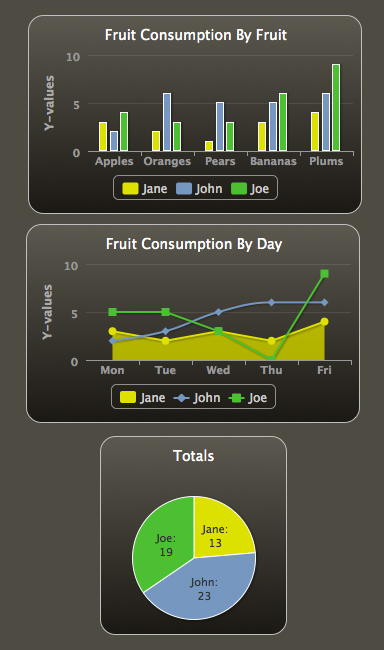
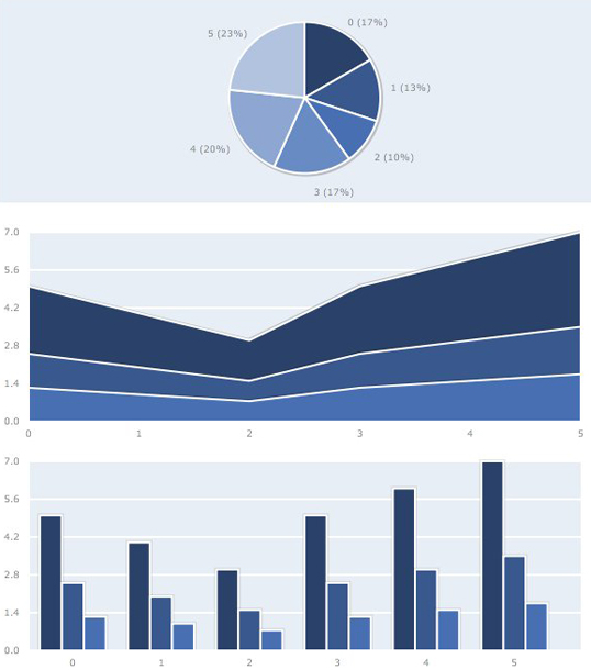
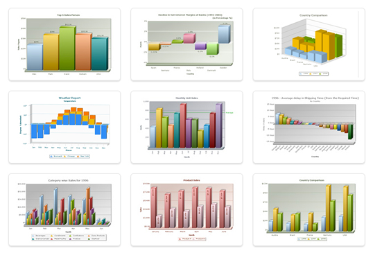
So, rather than trading away every ounce of practicality (and interactivity) for immaculate infographics, it’s likely a better option to use a dynamic chart library. These chart libraries can display surprisingly sharp-looking graphs while still remaining flexible and easy to update, which makes them a great solution for both the designer and the average viewer. Some of these libraries rely on HTML5, which isn’t fully supported by older browsers, but those compatibility problems are vanishing quickly with each new browser update. Dynamic charts are also much smaller and lighter than large image files, which offers an additional upside in terms of site speed. The advantages of using dynamic chart libraries are growing while their potential problems are diminishing. There are quite a few libraries to choose from, all of which have unique strengths and weaknesses.HighCharts
PlotKit
d3.js
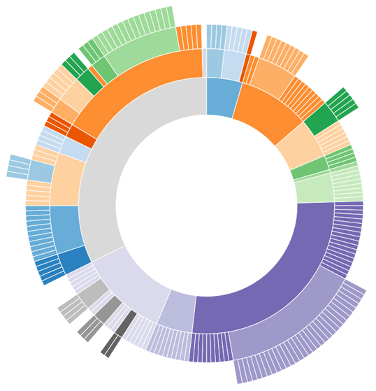 d3.js is a JavaScript-based graphing library that offers sharp aesthetics for its file size, as well as excellent value for its zero-dollar price tag. d3.js is an excellent choice for visualizing large amounts of complex data. The charts are colorful and clean, and the documentation is extensive and helpful. d3.js puts an emphasis on interactive, motion-based transitions and transformations, which could add impressive functionality to the charts and graphs within your web design. The makers of d3.js have tutorials to get new users started, as well as rich documentation for veterans.
FusionCharts
Google Chart Tools
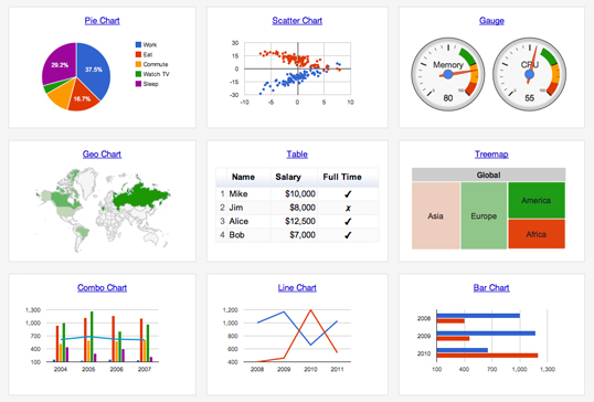
// Create the data table.
var data = new google.visualization.DataTable();
data.addColumn('string', 'Topping');
data.addColumn('number', 'Slices');
data.addRows([
['Mushrooms', 3],
['Onions', 1],
['Olives', 1],
['Zucchini', 1],
['Pepperoni', 2]
]);Flot
Conclusion
From the variety above, there is hopefully at least one chart library that will make your data-based design work both pretty and practical. They range from simple and free to powerful and expensive. Getting comfortable with a dynamic charting tool will likely save lots of time in the long term that would otherwise be spent making tiny, tedious corrections to static imagery. Do you have any chart libraries or plotting tools to recommend? Or, are there advantages to static images that make image editors the best tools to visualize data?Frequently Asked Questions about Dynamic Chart Libraries
What are the benefits of using dynamic chart libraries?
Dynamic chart libraries offer a range of benefits. They allow for real-time data visualization, which is crucial in today’s fast-paced digital world. This means that as data changes, the visual representation of that data also changes instantly. This can be particularly useful in scenarios where data is constantly being updated, such as stock market prices or website traffic. Additionally, dynamic chart libraries often come with a variety of customizable options, allowing you to tailor the look and feel of your charts to suit your specific needs.
How do dynamic chart libraries speed up my site?
Dynamic chart libraries can significantly improve the performance of your site. They do this by reducing the amount of data that needs to be loaded on the page at any one time. Instead of loading all the data at once, dynamic charts load data as and when it is needed. This can greatly reduce the load time of your pages, leading to a smoother and more enjoyable user experience.
Can I use dynamic chart libraries with any programming language?
Most dynamic chart libraries are designed to work with a variety of programming languages. However, some may be more suited to certain languages than others. It’s always a good idea to check the documentation of the library you’re considering to see what languages it supports.
How do I choose the right dynamic chart library for my needs?
Choosing the right dynamic chart library depends on a number of factors. These include the type of data you’re working with, the complexity of the charts you want to create, and the programming languages you’re comfortable with. It’s also worth considering the level of customization you require, as some libraries offer more options in this regard than others.
Are dynamic chart libraries difficult to use?
The difficulty of using a dynamic chart library largely depends on your familiarity with the programming language it uses. However, most libraries come with comprehensive documentation and examples to help you get started. Some even offer interactive tutorials and online communities where you can ask questions and get help from other users.
Can dynamic chart libraries handle large amounts of data?
Yes, most dynamic chart libraries are designed to handle large amounts of data. They do this by dynamically loading data as it is needed, rather than loading all the data at once. This allows them to efficiently handle datasets of virtually any size.
What types of charts can I create with dynamic chart libraries?
Dynamic chart libraries typically support a wide range of chart types. These can include bar charts, line charts, pie charts, scatter plots, and more. Some libraries even support more complex visualizations like heat maps and 3D charts.
Can I customize the look and feel of my charts with dynamic chart libraries?
Absolutely. Most dynamic chart libraries offer a range of customization options. These can include things like color schemes, fonts, and chart styles. Some libraries even allow you to add interactive elements to your charts, such as tooltips and clickable links.
Are dynamic chart libraries free to use?
Many dynamic chart libraries are open-source and free to use. However, some may offer premium features or versions for a fee. It’s always a good idea to check the licensing terms of any library you’re considering using.
Can I use dynamic chart libraries for commercial projects?
Yes, most dynamic chart libraries can be used for commercial projects. However, it’s important to check the licensing terms of the library you’re considering, as some may require a commercial license or have other restrictions for commercial use.
 Peter North
Peter is Chief Digital Officer of CuriosityStream, a multi-platform nonfiction streaming service by the founder of Discovery Communications (Discovery Channel, Science Channel, Animal Planet, etc.). Peter is also Co-Founder of True North, a management consulting firm and digital marketing agency with clientele that includes WebMD and Salesforce.

