Landing pages are carefully-designed destinations for visitors who click on advertisements, promotions, or product listings. Effective landing pages have been refined and polished through dozens of iterations. Less persuasive landing pages are designed solely on hunches and opinions instead of rigorous testing. In lieu of a proper landing page, some advertisements simply lead customers to an unrefined home page, which is rarely effective, and often falls short of the expectations of the original advertisement.
A landing page has a singular goal: to compel you to complete an action, which is usually called a “conversion” in marketing terms. This action could be one of many options: a “conversion” could be the purchase of an item, a signup for a free trial of a service, or perhaps just the capturing of an email address to be used for solicitation and promotion.
Quality landing pages should be easy to understand and should make it exceedingly simple to go to the next step. The landing pages reviewed in this collection were found by performing a search for “Graphic Design” in Google, and then looking through the resulting ads on the sidebar. I wanted to carefully examine how these landing pages were designed. What I found was a diverse array of designs that make a nice compare and contrast study.
I reviewed each site with a love/hate commentary, which seemed appropriate because I have a love/hate relationship with landing pages. I made the source URL available for each as well as a screenshot of each landing page, since these pages will likely change very quickly.
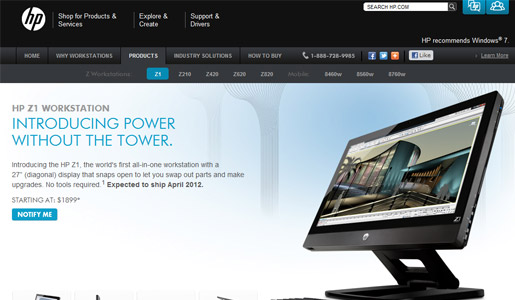
HP Z1 Workstation
Source | Screenshot
Love:
The simple design and layout makes for clear delivery of the intended message. I appreciate that prices are included on this landing page — you immediately know what you’re getting into with no surprises later. The lightbox on the page makes it easy to explore the product and discover why it’s unique.
Hate:
Too many navigational elements distract the visitor from learning about the specific product that they came for. Removing the entire header area could result in many more conversions. After reading the copy, I find that this product isn’t even going to ship for another month, so the call to action is just to receive notification of product availability. The “Notify Me” button is very small, the same color as everything else, and thus isn’t as prominent as it should be. In short, the call to action is hard to find and doesn’t make sense without the context of the copy above it.
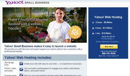
Yahoo! Small Business
Source | Screenshot
Love:
This is a top-notch landing page. The call to action on the right side of the page is clear, intuitive and prominent. The large “Save 50%” sticker stands out from the other information. You can see what you’re getting, how to get it, and what to expect.
Hate:
Dudes in aprons. Poorly-chosen stock photography can alienate a large portion of your customers.
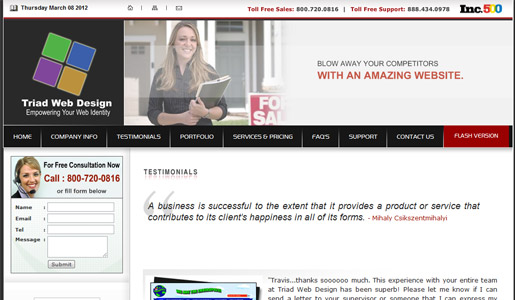
Triad Web Design
Screenshot
Love:
The background is gray?
Hate:
Just about everything. The landing page is just an embellished testimonials page where unknown supporters vouch for the company’s quality and value. It’s also a mile long, having 7,300+ words to fit into our microscopic attention spans. The self-congratulatory page ends with the link to “More Triad Testimonials” which is probably not very enticing to customers who have somehow mustered the attention to read the first hundred. And, it’s hard to overlook the ironic fact that a square-shaped logo was chosen for the brand “Triad.”
In an attempt to be somewhat constructive (and this is hard for me), I will point out a few ways Triad could improve this page quickly:
- Lose the super-fast-rotating-I-don’t-even-have-time-to-read-the-message-header graphics.
- Lose the navigation bar.
- Keep one or two testimonials, but lose the other 98 (I’m not exaggerating – they put 100 testimonials on their landing page).
- Make the call to action more prominent with a greater contrast of colors and put it above the fold.
Unity Mobile
Source | Screenshot
Love:
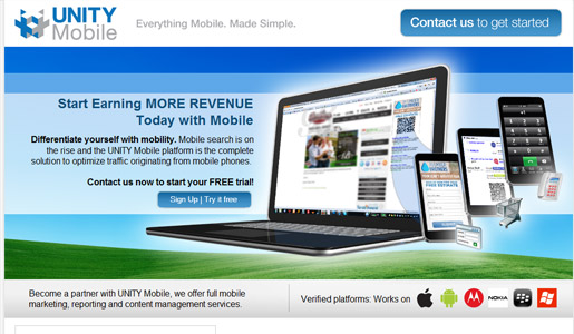
This landing page has several calls to action and the design is simple with no navigational elements to lead you away from the page. While on the generic side of design, it is clean and clear. I also like the way they integrate the logos of the verified mobile platforms — this shows stability and strength by tying their brand to these major players.
Hate:
It’s too busy. It says “mobile,” but the largest image is a laptop. This confused me, although I’m easily confused most days. The call to action buttons are a bit too blended into the background, making them less prominent. Using green buttons, for example, might make them stand off the background a bit and be easier to find.
Overall, it’s a solid landing page. Small improvements will likely lead to more conversions and fewer bounces.
Campus Explorer

Source | Screenshot
Love:
This is a really well-designed landing page. The call to action is dead center with a nice progress bar indicating where you are in the “exploration” process. The “featured on” logos along the bottom of the page lend credibility to the site as well.
Hate:
Nothing. The only nit-picking I could do for this page is that the call to action form may be oversimplified. There’s too much white space for my taste, but that’s just me looking for something to critique. Lots of love for this landing page here.
99 Designs

Source | Screenshot
Love:
This is a simple design and I really like the color-coding as it all ties together. The nav bar is simple and elaborates on the offerings instead of distracting the visitor with unrelated information. The call to action is prominent with several options for responding across the page. The “As featured in…” establishes credibility.
Hate:
Adding a poster frame to the video would be more effective than a blank, black screen, especially for a highly-visual service.
Overall, it’s a winner because of the clear call to action and clean layout.
Art Institute of Pittsburgh

Source | Screenshot
Love:
This site nails the prominent call to action and they include a wonderful step counter, so you know how many steps you have left before completion. There’s no question as to what this site is selling, and the written copy supports the call to action. I especially appreciate that this institution of higher education included their accreditation info, which lends credibility.
Hate:
The chosen shade of red is very strong. And, the student work in the photo should be more impressive if they’re selling top-notch design courses.
Otherwise, this is an excellent example of a focused, clear landing page.
Intuit
Source | Screenshot
Love:
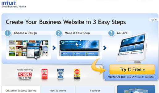
This may be the best landing page of the lot! The navigation is minimalist, and you are given three succinct, descriptive steps so you know what to expect. The price is on the page, and the call to action is super-easy to find. Great use of the “Award Winning” logos within the fold of the page as well. They used testimonials but didn’t over-do it. Near perfection.
Hate:
My only recommendation would be to make the logo at the top a link to the home page.
Shutterstock
Source | Screenshot
Love:
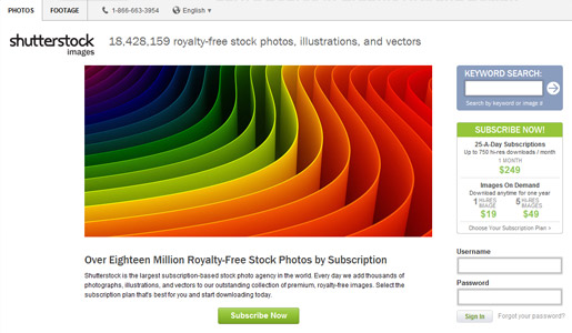
The pricing is immediately visible on the call to action on the right, which I really appreciate. The page is stripped down with very few navigational elements in the nav bar. This is a website that is all about graphics, so it’s one of the few times I would approve of a rotating image in the header. Lots of relevant resources are available on the page as well.
Hate:
The nav bar, while simple, should still be eliminated entirely. The keyword search form on the top right should be moved below the call to action, as it’s far less important than the call to action. Maybe it’s my screen resolution, but I don’t like the way the logo hangs to the left of the rest of the page — it throws off the balance and alignment. Lastly, this is the site’s home page. We’ve established my feelings regarding a landing page being different than a home page.
Logo Design Pros
Source | Screenshot
Love:
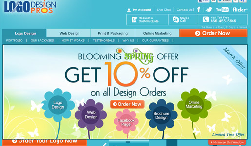
I really appreciate the effort put forth on the design of this page in terms of the graphics themselves. The pricing is included on the page, which is refreshing for this type of business. There are multiple calls to action throughout the page, which make it easy to respond.
Hate:
The page is very cluttered — the nav bar has multiple levels, the main graphic is a pop-out that covers some elements on the page, and there are just too many distractions spread out across the design. After you sit on the page reading for a minute, a pop-up ad jumps out, which is pretty annoying.
Recommendations include, but are not limited to:
- Cut the entire navigational bar area.
- Lose the gimmicky graphic pop-out.
- Lose the pop-up ad.
What are your thoughts? What about these landing pages do you think worked and what didn’t? Do you agree that a home page should never be a landing page, or do some home pages serve effectively as landing pages?
 Tara Hornor
Tara Hornor has a degree in English and has found her niche writing about marketing, advertising, branding, graphic design, and desktop publishing. She is a Senior Editor for Creative Content Experts, a company that specializes in guest blogging and building backlinks. In addition to her writing career, Tara also enjoys spending time with her husband and two children.

