

Key Takeaways
- Chunking, or grouping similar items together, can make long lists easier to navigate and understand, especially when the list contains a mix of high-level and detailed tasks.
- The position of an item in the list can significantly affect the speed and accuracy with which users find it. Items located in the middle or at the end of a list may be harder for users to find quickly.
- Users may struggle to find the correct item in a list, even when the topic is familiar to them. This suggests that the structure and ordering of lists can be as important as the content itself.
- Chunked lists may perform better overall in terms of speed and accuracy, but they may not work as well for users who need to find an item located at the bottom of the list.
- The success of different list structures may depend on how engaged users are with finding the right item. For example, if users are not expected to spend more than five seconds scanning the list, a procedural list might be more effective. However, chunked lists generally had a better success rate in both five- and 10-second timeframes.
The bigger a site or service gets, the more support requests it usually has. And the longer its list of online help articles becomes.
Whether they’re simple FAQs or more instructional how-tos, once the list is long enough, you’ll usually want to break those items up into groups for easier navigation.
So far, so good.
But what happens when those groups start getting longer, and you need to group the items each contains? In practice, you won’t always want to split groups into subgroups with headings.
Here’s a case in point:
Read an email
Create an email
Use spell-check
Include emoticons
Use formatting, fonts and colours
Change the text direction
Add files as attachments
Add images
Add images inline
Add an email signature
Save a draft email
Send an email
Reply to an email
Forward an email
Get a read receipt
We’ve been told for years that menus aren’t meant to have more than seven items, but web users are expected to use long lists all the time — in search results, in forms, and on ordinary content site web pages.

Faced with this problem recently — along with the challenge of ordering a lot of help articles, I decided to do some research into whether there might be better or worse ways to order long lists of help articles.
What’s the problem?
The list above may seem logical to you. Indeed, that was the whole idea. That’s the procedural list order I used in the test.
The list starts with composing an email, then steps through all the things you might do as you compose that email, and finishes with the things you’d probably do after that, like sending and forwarding.
The order is pretty rough — you could argue that the Reply to an email article should come before the one on composing email — but you get the idea.
In terms of “precision” ordering, this is about as good as it gets for most content managers.
The potential problem with this type of order is that topics of a similar level of depth (read, compose, reply, forward) are mixed in among articles that deal with much more fine-grained tasks, like using emoticons and attaching images.
It’s possible that users might want to get a sense of the higher-level options — the bigger picture of a service’s capabilities — before drilling down to the specifics. Like the procedural list, this chunked kind of list is also popular online.
This approach allows us to place the articles that users use most toward the top of the list, so it’s easier and faster for users to access them.
Our chunked email help list looked like this:
Read an email
Create an email
Send an email
Reply to an email
Forward an email
Get a read receipt
Save a draft email
Use spell-check
Include emoticons
Use formatting, fonts and colours
Change the text direction
Add files as attachments
Add images
Add images inline
Add an email signature
Two solid — and pretty standard — list ordering approaches. But which works best?
Our Test Procedure
To be a little more specific, I set out to test which list order let people successfully find an item faster. Essentially, I wanted to test the lists’ scannability.
My test was run online as a simple, single-click test with a database of users who had completed training on my organisation’s help website in the last three months.
I took the list items above from Google’s gmail help page (see a newer, better-chunked version of that here), but simplified them so there were fewer options, and they were more clear-cut and simpler to read.
I used email help article titles in the test because my target audiences work in offices and I believed that email was a commonly understood tool. I expected that people wouldn’t get the text question wrong; the only issue would be the speed at which they could find the result.
The questions I asked the test subjects to answer with their click were:
- Which item in the following list will tell you how to take an email you’ve received and send it on to a friend?
- Which item in the following list will tell you how to add an image into the body of an email?
If you compare the questions with the lists above, you’ll see that for each list, I asked a question whose answer was in the middle of the list, and a question whose answer was toward the end of the list. I did this so I could see if list position made a significant difference to the time it took users to find the right article within the different list types.
I asked both questions of both lists — four tests in all. Each subject answered one question only, though, so no user had the benefit of prior knowledge of the list items. I invited users by email and let the test run for a week.
A few surprises
I’ll be honest: when I devised this test I thought the differences would be measured in milliseconds. They weren’t.
We saw a wide variety of click times — up to 44 seconds in some cases. So we decided that if test subjects had taken more than five seconds to answer, they’d moved past scanning, and disregarded their answer for the initial analysis.
The other thing that struck me about the results was how many people got the answers wrong — in one test, no one got the answer right in five seconds or less. This surprised me even more than the click times, and meant my analysis had to take in accuracy as well as time.
That said, the incorrect answers gave me ideas about interlinking content, which we do on our help site both within help articles themselves and through a Related Articles area at the top of help article pages.
For example, the question about adding images inline prompted many subjects to click on the Compose an email item, so it seems that linking all the more fine-grained how-to content from this higher-level overview would be a good — and logical — idea.
The data: which list order worked best?
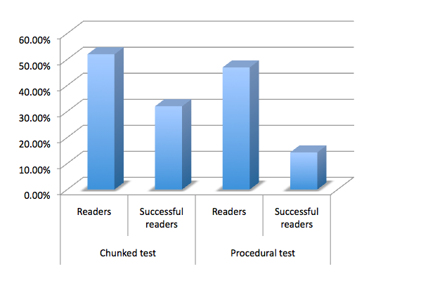
This graph shows the portion of subjects who responded within 5 seconds for both lists (scanners), and what proportion of those subjects got the answer right. These figures are averaged for each type of test, so you can see how they performed overall.
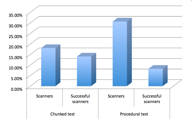
As you can see here, on average, the chunked test received the greater proportion of accurate clicks from scanners.
So are chunked tests best?
Well, there’s a hitch. These figures are averages. In fact no user successfully scanned the chunked list in which the answer was toward the end. Here are the figures broken down. In tests marked I, the answer was toward the middle of the test and in those marked II it was toward the end.
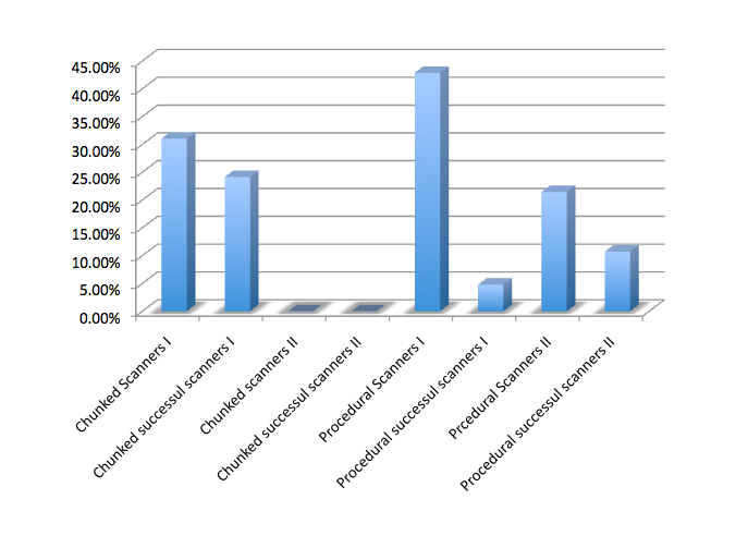
These results suggest to me that chunked lists don’t work for scanners when the answer isn’t near the top.
My UX colleagues were surprised at this result, but I wonder if the procedural list provides a subconscious context for the items it contains. The groupings in the chunked test, I reasoned, were harder to grasp in a short period of time.
So while the chunked test had greater success overall for scanners, it failed completely for scanners who needed an item at the bottom of the list. Meanwhile, the procedural list seemed to encourage more users to click in five seconds or less, but had a comparatively low success rate.
To me as a content manager, this isn’t a clear-cut answer. Should I use procedural lists in an attempt to serve users who need items from any point in the list? Should I use chunked lists in places where I know the vast majority of users will need items that’ll appear in the top half of the list?
To get a clearer picture, I decided to broaden the scope, and analyse the data for users who took up to 10 seconds to answer. I know myself that after about 10 seconds scanning a page looking for a help article, I’m ready to give up, so I thought this was a generous amount of time. I called this group Readers.
The results were very interesting. Within a 10-second timeframe, chunked test users were able to find the right item toward the end of the list. Not only that, but a larger proportion of users had end-of-list success with the chunked test than with its procedural one.
Why might this be the case? Again, it’s hard to tell without more research, but there are a few possibilities. Perhaps when users grasped the procedure they tried to predict it, which reduced accuracy. That might also explain why, though so many (30.6%) felt confident to choose an answer in five seconds or less, so few of those answers were accurate.
Or, perhaps those using the procedural list tried to keep track of the procedure in their minds, which left little room to assess items toward the lists’ end. Meanwhile, maybe the chunked test users were able to more easily discard chunks in their minds as they moved down the list, which left more space to process the remaining list items.
Overall, the chunked test achieved 32% accuracy in 10 seconds, where the procedural one achieved accuracy of just 14.3% — a result that equalled the chunked list’s success for the five-second timeframe.
So which is best?
I think the answer to this question might depend on how engaged your user is with finding the right item in the list. If you don’t expect your users to spend more than five seconds scanning the list, you might not want to leave those whose answer’s at the bottom of the list out in the cold.
But it’s difficult to ignore the stats overall here. In both five- and 10-second timeframes, the chunked test averaged a significantly better success rate than the procedural test.
Tips for chunking lists
Briefly, I wanted to explain the rationale for chunking the list in case you want to try it (or a variation) on your site.
First, I took the highest-level, “essential” items that covered broad-brush procedures. With those out of the way, I tried to find items that formed natural groups:
- help about things you can do with an email (get a read receipt, save it)
- help about what you could insert into an email as content from within the program
- help about what you could attach to at email from another source.
I tempered these groups with word-based logic, which is why the articles about images are grouped together: to allow direct, side-by-side comparison and, hopefully, aid correct selection. I’d be interested to hear about your chunking examples and rationale in the comments.
A final note on list success
As I mentioned above, the thing that surprised me the most from these tests was the success rate of users hitting the right answer in each list. In these tests, no more than one third of users selected the right answer from the list — and the topic was email, something we all use every day.
Sure, not everyone’s used inline images in an email before, but I didn’t think these tests would be as challenging for users as the results indicate they were. To my mind, this could have pretty significant implications for our use of lists on the web, including in places like menus, dropdown selectors on forms, search results, and so on. A 32% success rate for list selection on a topic the user has daily experience with? Is this real?
The solution may well lie in creating smaller lists, but again, we don’t see that happening consistently on the web. Perhaps we should.
Frequently Asked Questions (FAQs) about Making Readable Lists
What are the key elements to consider when creating a readable list?
When creating a readable list, it’s important to consider the structure, content, and design. The structure should be logical and easy to follow, with items grouped in a way that makes sense to the reader. The content should be clear and concise, with each item providing valuable information. The design should be visually appealing and easy on the eyes, with plenty of white space and a font that’s easy to read. Bullet points or numbers can be used to distinguish each item, and subheadings can be used to break up longer lists.
How can I make my list more engaging for readers?
To make your list more engaging, try to use a conversational tone and include examples or anecdotes where appropriate. You can also use visuals, such as images or infographics, to illustrate points and make the content more interesting. Additionally, consider the order of your items – placing the most important or interesting items at the beginning and end of the list can help to grab and hold the reader’s attention.
What are the benefits of using lists in my content?
Lists can make your content more digestible and easier to understand. They break up large blocks of text, making the content more visually appealing and less intimidating for readers. Lists also provide a clear structure for your information, making it easier for readers to follow your argument or understand your points. Additionally, lists can help to highlight key information and make it more memorable for readers.
How can I use lists effectively in technical writing?
In technical writing, lists can be used to break down complex information into manageable chunks. They can be used to outline steps in a process, list features or benefits, or provide a summary of key points. To use lists effectively, ensure that each item is clear and concise, and that the list as a whole provides valuable information to the reader. Avoid overusing lists, as this can make your content feel disjointed and difficult to follow.
What are the different types of lists and when should I use them?
There are several types of lists, including bulleted lists, numbered lists, and checklists. Bulleted lists are great for when the order of items doesn’t matter, while numbered lists are ideal for when the order is important, such as when outlining steps in a process. Checklists can be used when the reader needs to complete tasks in a specific order, or to keep track of completed tasks.
How can I make my lists more accessible for all readers?
To make your lists more accessible, ensure that they are easy to read and understand. Use clear, simple language and avoid jargon where possible. Make sure your lists are well-structured, with a clear hierarchy of information. Use bullet points or numbers to distinguish each item, and ensure that the design is visually appealing and easy on the eyes.
How can I use lists to improve my SEO?
Lists can help to improve your SEO by making your content more readable and engaging, which can increase dwell time and reduce bounce rate. They can also help to highlight keywords and make your content more scannable for search engines. Additionally, using lists in your content can increase the chances of your content being featured in a Google snippet, which can significantly increase visibility and click-through rates.
How can I use lists in my business communication?
In business communication, lists can be used to clearly and concisely convey information. They can be used to outline steps in a process, list key points or benefits, or provide a summary of information. Lists can also be used in presentations to make information more digestible and engaging for the audience.
What are some common mistakes to avoid when creating lists?
Some common mistakes to avoid when creating lists include making the list too long or too short, not grouping items logically, using inconsistent formatting, and not using a clear and concise writing style. It’s also important to avoid overusing lists, as this can make your content feel disjointed and difficult to follow.
How can I use lists to improve my content strategy?
Lists can be a valuable tool in your content strategy. They can make your content more readable and engaging, which can increase dwell time and reduce bounce rate. Lists can also help to highlight key information and make it more memorable for readers. Additionally, using lists in your content can increase the chances of your content being featured in a Google snippet, which can significantly increase visibility and click-through rates.

