User style sheets — CSS files that sit on the user’s desktop machine and override a site’s original styles — have been around for a long time. Personally, though, I’ve never really seen the benefit.
Sure, from an accessibility perspective, I concede that the ability to restore underlines to links, bump up the font size, or improve the contrast of a site would come in handy for someone with a vision impairment (or a low tolerance for offensive colour combinations). But there’s never been any real incentive for me to spend time changing the design of someone else’s site, especially when:
- there was no easy way to share and promote a user style sheet for a particular site
- adding a style sheet still involved a fair amount of mucking around — files had to be saved to specific folders, and browsers needed relaunching before the style would take effect
- per-site user style sheets still aren’t supported in Internet Explorer, and
- the foundations (markup) could change drastically from under your feet anyway.
Power to the User
In 2007, finally, it seems that times are a-changin’. Well, not in IE, they’re not — point number 3 above still stands (and as far as I’m aware, there aren’t any add-ons to enable this functionality). But if you use any of the other major browsers (Firefox, Opera, Safari) there are some recent developments that make installation and management of user style sheets easier than ever:
- userstyles.org: While (somewhat ironically) not the most usable site in the world, what userstyles.org does do well is provide a central repository for user style sheets, addressing point 1 above.
- Stylish: The Stylish extension for Mozilla browsers (Firefox, Flock etc) allows user style sheets to be applied with a single click, and in most cases the style is applied immediately. A terrific solution for point number 2, if Firefox is your main browser.
- SafariStand: SafariStand is an add-on for the Safari browser that increases the amount of customisation permitted by users — including, but not limited to, specifying user style sheets on a per-site basis. While the process of adding a user style sheet still involves saving the CSS file to a specific directory before you can load it in SafariStand, it’s a heck of a lot easier than it was. Tick off point number 2 for Safari users.
And of course (I’m pre-empting brothercake and charmedlover here), there are browsers like Opera that have permitted per-site user style sheets as a core feature for years.
So we’ve addressed points 1 and 2 above. And I mentioned that we’re stuck with point 3. But what of point 4 — having to redo all of your work should the site’s developers decide to change their page structure? Let’s look at that issue through a case study.
A Case Study
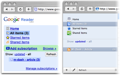
Designer Jon Hicks recently chose to give the popular Google Reader, a web application for reading feeds, a visual makeover. This was an excellent choice of site to author a user style sheet for, given that:
- Google Reader is enormously popular and therefore (hopefully) less likely to change its markup drastically.
- The content of the site is, by its nature, delivered in a consistent manner (as compared to, say, a site that used a different style sheet for every page).
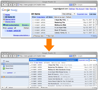
Hicks’s redesign is subtle, reflecting his desire to style Google Reader to “look more like an OS X application” than to completely gut the original layout. As you can see in the screenshot below, some of the text links have been tastefully styled as icons, and the result is a cleaner, more polished-looking version of the same web application.
While there is still the possibility that Google could change the markup and render this user style sheet useless, at least one of the Google engineers knows that it is in Google’s best interest not to, based on his response to Hicks’s announcement of an update to the skin. A community is building around skinning Google Reader and other high-profile sites, and members of that community are the site’s most loyal users.
There has been much discussion in the past over using standard naming conventions for a page’s elements. This probably fueled the microformats movement, but not much else — we’re going to be stuck with inconsistent naming conventions for a long time to come.
Your Markup is an API
With all the hype about APIs and mash-ups, it’s easy to forget that your HTML is also an API, and your users are experimenting with it right now.
With user style sheets providing custom visual representations of your site and Greasemonkey scripts allowing for customised behaviour, now more than ever is a good time to remember that separating your content, presentation and behavior can result in your users doing more with your application than you ever dreamed.
 Matthew Magain
Matthew Magain is a UX designer with over 15 years of experience creating exceptional digital experiences for companies such as IBM, Australia Post, and sitepoint.com. He is currently the Chief Doodler at Sketch Group, Co-founder of UX Mastery, and recently co-authored Everyday UX, an inspiring collection of interviews with some of the best UX Designers in the world. Matthew is also the creator of Charlie Weatherburn and the Flying Machine.