

Bootstrap is undoubtedly one of the most popular front-end frameworks. With more than 73k stars and 27k forks, Bootstrap is also one of the most popular GitHub repositories. In my last article, Responsive Web Design Tips from Bootstrap’s CSS, I explained how Bootstrap functions as a responsive framework. In this article, we will discuss a related topic: The Grid System, one of the most important concepts in Bootstrap.
Key Takeaways
- The Bootstrap Grid System is a library of HTML/CSS components that allows you to structure a website and place content in desired locations. It lets you create up to 12 columns and unlimited rows, making it a versatile tool for creating various types of layouts.
- The grid system consists of three main components: a container, rows, and columns. The container acts as a wrapper for the content, rows act as wrappers around the columns, and columns are where the actual content goes.
- Bootstrap provides various helper classes that can be useful in dealing with grids. These include .clearfix for clearing floats, offsetting columns for leaving a particular number of virtual Bootstrap columns to the left of any column, and reordering classes for shifting a column to the right or left.
- You can create complex designs using Bootstrap’s grid system through nesting. To nest a grid system within a column, you only need rows and columns; no .container or .container-fluid elements are necessary for a nested grid system.
What is the Bootstrap Grid System?
Like any grid system, the Bootstrap grid is a library of HTML/CSS components that allow you to structure a website and place a website’s content in desired locations easily.
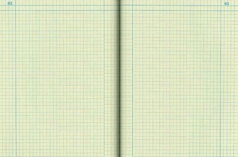
Think of graph paper, where every page has a set of vertical and horizontal lines. When these lines intersect, we get squares or rectangular spaces.
Well, this is also true for Bootstrap’s Grid System. It allows you to create rows and columns and then place content in the “intersected” areas.
Now the question is, how many rows and columns you can create using Bootstrap’s Grid System? Bootstrap allows you to create up to 12 columns and unlimited rows — hence the name 12-Grid System. So, let’s see how we can utilize this grid system to create various types of layouts.
Getting started with Bootstrap’s Grid System
To get started, naturally, you’ll need to have the necessary assets in your page to get Bootstrap working. If you’re new to Bootstrap, you can refer to our previous article Getting started with Bootstrap or my book Jump Start Bootstrap, to dig deeper.
Bootstrap’s Grid System is made up of 3 things:
- A container
- Rows
- Columns
Let’s explore each of the above in detail.
Creating a Container
Bootstrap’s grid system needs a container to hold rows and columns. A container is a simple <div> element with a class of .container. The container is used to provide a proper width for the layout, acting as a wrapper for the content.
Take a look at the following CodePen demo:
See the Pen Bootstrap grid container demo by SitePoint (@SitePoint) on CodePen.
Here the container element wraps the content and sets left and right margins. It also has different fixed widths in different sized devices. Have a look at the following table:
| Device Width | Container Width |
|---|---|
| 1200px or higher | 1170px |
| 992px to 1199px | 970px |
| 768px to 991px | 750px |
| Less than 768px | auto |
You can choose a fluid container if you are not fond of a fixed layout. To do this, you use the class .container-fluid. A fluid container has no fixed width; its width will always be the width of the device.
Just note that both fixed and fluid containers have padding of 15px on the left and right sides.
Creating a Row
A row acts like a wrapper around the columns. The row nullifies the padding set by the container element by using a negative margin value of -15px on both the left and right sides.
A row spans from the left edge to the right edge of the container element. It is created by adding the class .row to a block level element inside the container.
Have a look at the following CodePen:
See the Pen Bootstrap grid demo with row by SitePoint (@SitePoint) on CodePen.
In this demo, you can see the text touching the left edge of the container element. This is because the container’s padding has been removed by the row due to the negative margins on the row.
Finally, there’s no limit on the number of rows you can create.
Creating Columns
Bootstrap uses different column class prefixes for different sized devices. These prefixes are shown in the table below:
| Class Prefix | Device Size |
|---|---|
| .col-xs- | <768px |
| .col-sm- | 768px to 991px |
| .col-md- | 992px to 1199px |
| .col-lg- | ≥ 1200px |
So, let’s create our first Bootstrap column:
See the Pen Bootstrap Grid demo with row and column by SitePoint (@SitePoint) on CodePen.
In the above demo, I used the class .col-xs-12 to create a single column that spans across 12 virtual Bootstrap columns. Hence, this column’s width will be the width of the row.
In the above demo, you will also see the 15px padding reappear to push the element away from the container. This is because every column in Bootstrap has a padding of 15px.
You must be wondering why I used the class prefix that belonged to extra smaller devices, which is .col-xs-. In Bootstrap, if a column is defined for a particular type of device then it is guaranteed to behave similarly in larger devices as well. Therefore, a column defined for extra smaller devices will work in all types of devices.
Let’s now create a 2-column layout for smaller devices and check out its behaviour in larger devices and extra-small devices. We will use the class prefix .col-sm- here. To create 2 columns of equal widths, we should assign 6 virtual Bootstrap columns to each one of them. This way, we maintain the limit of 12 virtual Bootstrap columns for a single row.
Here’s the demo:
See the Pen Bootstrap grid demo, 2 columns by SitePoint (@SitePoint) on CodePen.
Nesting with the Grid System
Nesting is one of the ways to create complex designs using Bootstrap’s grid system. It is also the one section where many first-timers have trouble.
We understand that to use Bootstrap’s grid system, we need 3 things: A container, rows, and columns. So to nest a grid system within a column we will need the same three things. But the only difference is that the container is already defined. In this case, the columns will behave as the containers for the nested grid system.
Here’s the logic: The containers provide 15px of padding, which is nullified by the row. Then we define columns that again have 15px of padding on the left and right side. So, to nest a grid system within a column, we simply need rows and columns. No .container or .container-fluid elements are necessary for a nested grid system.
Here’s an example of a nested grid system:
See the Pen Bootstrap grid demo with nested columns by SitePoint (@SitePoint) on CodePen.
What About More than 12 Columns?
This is one of the root causes for disordered Bootstrap layouts. A wrong calculation in deciding the number of virtual Bootstrap columns can lead to an improper layout.
In such a case, a virtual row will be created and unfitted columns will shift to the next row. For example, if you have defined 2 columns with the classes .col-md-8 and .col-md-5, the second column will shift to a new row because it requires 5 virtual Bootstrap columns whereas only 4 are left.
Helper Classes
Bootstrap provides various helper classes that can be useful in certain situations in dealing with grids. These classes are:
.clearfix: Normally used to clear floats, adding this class to any column will make it shift to a new row automatically, to help you correct problems that occur with uneven column heights.- Offsetting columns: You don’t have to occupy all 12 of the virtual columns. You can use offset classes like
.col-xs-offset-*or.col-md-offset-*to leave a particular number of virtual Bootstrap columns to the left of any column (kind of like invisible place holders). - Reordering: Use classes like
.col-md-push-*and.col-md-pull-*to shift a column to the right or left, respectively.
Complimentary Code Snippet
To conclude, here is a complimentary code snippet for a 3-column layout with a responsive Bootstrap navigation bar. Have fun and let me know in the comments if there’s anything in Bootstrap’s grid system that I haven’t discussed here that you find interesting, problematic, etc.
See the Pen Bootstrap 3-column grid example by SitePoint (@SitePoint) on CodePen.
(Just note that the 3-column layout won’t appear in the CodePen embed above, but you can view it at full screen).
Frequently Asked Questions (FAQs) about Understanding Bootstrap Grid System
What is the Bootstrap Grid System and why is it important?
The Bootstrap Grid System is a responsive, mobile-first fluid grid system that appropriately scales up to 12 columns as the device or viewport size increases. It is important because it allows for easy layout arrangements on different screen sizes. The system is based on a 12 column layout, which can be combined or stacked differently depending on the screen size. This makes it a powerful tool for web developers and designers, as it simplifies the process of creating responsive designs.
How does the Bootstrap Grid System work?
The Bootstrap Grid System works by using rows, columns, and containers to layout and align content. It’s built with flexbox and is fully responsive. The grid system uses a series of containers, rows, and columns to layout and align content. It’s structured in such a way that you have a container, then a row, and inside that row, you can place your columns. The columns will be the actual holders of your content.
What are the key components of the Bootstrap Grid System?
The key components of the Bootstrap Grid System are containers, rows, and columns. Containers are the most basic layout element in Bootstrap and are required when using the default grid system. Rows are wrappers for columns, each column has horizontal padding for controlling the space between them. This padding is then counteracted on the rows with negative margins to ensure the content in your columns is visually aligned down the left side.
How can I customize the Bootstrap Grid System?
You can customize the Bootstrap Grid System by overriding the default parameters in the Bootstrap’s CSS or SCSS files. You can change the number of tiers (or breakpoints), the media query values, the container widths, and the number of columns. Remember, any changes you make should be thoroughly tested to ensure they don’t break the responsiveness of your design.
What are the differences between fixed and fluid grids in Bootstrap?
Fixed grids in Bootstrap use pixels for defining column widths while fluid grids use percentages. This means that a fixed grid does not adjust to the screen resolution and will not be responsive. On the other hand, a fluid grid uses relative units which makes it adjust to the screen resolution and hence, is responsive.
How do I use offsets in the Bootstrap Grid System?
Offsets are a useful feature in the Bootstrap Grid System that allows you to create additional space between your columns. To use offsets, you simply add a class to your column with the format .offset-md-* or .offset-lg-*, replacing the asterisk with the number of columns you want to offset.
What are nested columns and how can I use them in Bootstrap?
Nested columns are essentially columns within columns. They allow for more granular control over the layout of your content. To use nested columns, you simply create a new row within a column, and then create columns within that row.
How does the order of the grid classes affect the layout?
The order of the grid classes in Bootstrap determines how the layout will adjust at different breakpoints. For example, if you use .col-sm-6 .col-md-4, your layout will have two equal-width columns for small devices and three equal-width columns for medium and large devices.
How can I make my layout stack vertically on smaller screens?
To make your layout stack vertically on smaller screens, you can use the .col-12 class. This will make the column take up all 12 columns of the grid, effectively making it full width and causing it to stack vertically on smaller screens.
What is the purpose of the clearfix class in Bootstrap?
The clearfix class is used to clear the floated columns within a row. It’s used when you have columns of different heights and you don’t want the next row of columns to wrap underneath the taller ones. By adding a div with the .clearfix class at the end of the taller columns, you can prevent this wrapping behavior.