


Key Takeaways
- Motion in website backgrounds has evolved from being considered a usability fail to a tool for increasing engagement and prolonging audience visits. However, the use of this feature requires careful consideration to avoid pitfalls that can decrease user satisfaction and slow operations.
- Mobile-friendly design is crucial when incorporating motion, as mobile devices may not support video backgrounds properly. Successful websites transition from desktop to mobile by replacing animations with still images to maintain site integrity.
- Legibility of text over background videos is important. Techniques such as choosing complementary colors, employing text shadow boxes, and using bold, uppercase letters can ensure text is clear and readable. This contributes to ease-of-use, a major factor in audience satisfaction.
- Overuse of motion can detract from a website’s purpose and personality. Keeping the brand identity in mind, designers should find a balance between engagement and subtlety. Techniques like blurring and overlaying can be useful for managing large or low-quality videos, while allowing users to pause or stop videos can cater to a wide range of user preferences.
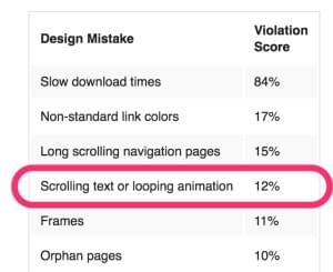
It’s interesting to look back on Jakob Nielson’s 1999 list of ‘Who Commits The “Top Ten Mistakes” of Web Design?‘.
While most issues are still entirely relevant – frames, slow download times, orphaned pages – others we’ve moved on from. In 2016, looping animation is no longer considered an automatic usability fail.
In recent years, animation appeared in website design as interactive buttons, followed by menus. The latest trend is to employ moving backgrounds to create interest and prolong audience visits.
However, companies must be careful in their efforts to apply these features to their sites – there are a number of pitfalls that can decrease user satisfaction and slow operations. Let’s explore websites that have been successful with video backgrounds and why they work.
Mobile-Friendly Nerisson
When building a website, it is vital to consider what it will look like on a mobile device. Mobile operating systems have come a long way and are able to support a large number of features.
However, phones still do not have the capability to host background video properly. In some cases, blank play buttons appear, while other site backgrounds will not load at all. Rather than attempt to use video background on mobile devices and risk unfortunate results, it is wise to accommodate each mode of engagement differently.

Nerisson executes the transition from desktop to mobile flawlessly. Their website design contains subtle movement that creates a better sense of engagement. When users move to mobile devices, these animations are replaced with still images, thereby maintaining the integrity of the site.
Using JavaScript, your site developer can access the user-agent settings and remove the video from all iOS and Android devices.
Clearly Stated Y.CO
It is important to consider how legible text placed on top of background films will be. Choose colors that blend with the overall site design but do not appear in the video proper. Feature these tones in fonts that need to be read over moving images, as the contrast will make them readable.
If there are no colors fitting this description, employ a text shadow box to distinguish writing from the background images. Y.CO‘s website stands as a great example of this technique in action. Their videos are clean and engaging, while writing is clear and legible.

The Y.CO website also demonstrates that dramatic design choices are not always necessary to achieve contrast. By employing bold, uppercase white letters, they achieve a sophisticated and clean look while clearly conveying the necessary information.
Ease-of-use is a major contributing factor in audience satisfaction, and clear, highly-legible text is central to this.
Minimalist EagleClean
It is sometimes tempting to go overboard with new trends. Designers must keep the given brand identity in mind and add elements that make sense for the specific company. Some sites are using video backgrounds beautifully, while others do too much. EagleClean has achieved a balance between engagement and subtlety.
The EagleClean website features a black screen with white and yellow writing. A yellow-gloved hand emerges from the lower right to ‘spot clean’ the inside of the user’s screen. The hand then retracts and you don’t see it on the homepage again. This maneuver adds a touch of humor and interest to the page, without breaking the brand identity. One fact which draws our attention is that this great site with awesome effect has been built in Flash which is not good for search engines.
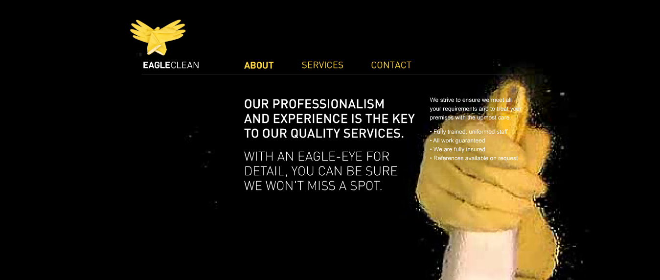
As EagleClean is a cleaning service, a straightforward and clear website is fitting. The company successfully added video without detracting from its purpose or personality.
If continuous video makes sense for your company’s website, embrace it. Media-rich websites tend to increase the time users stay on the page.
However, steer clear of shaky footage or too many quick cuts. It is important to enhance the user experience without distracting from the statement your site makes.
Fernado J. Maclen’s Blurry Vision
Southern California-based designer [Fernando J. Maclen(http://fernando.is/) employs an interesting technique in his website. Maclen features a video of himself working in the background, with menus on the side and bottom of the screen. The surprising factor is that all of his videos are intentionally blurred.
By muting the action, this technique accomplishes a couple things. First, the blur adds interest, because at first glance users are curious about what is happening. After identifying the film subject as a person, attention quickly shifts to homepage welcome note. Maclen’s site is an excellent example of accomplishing interest without distraction.

If your company is trying to use video that is too big to stream smoothly, techniques like blurring can be useful. Rather than eliminating the video, decrease the size and alter it in a way that obscures the quality reduction. Heavy filters are another way to achieve this.
Overlaying My Provence
My Provence‘s homepage opens with footage taken by artists traveling through the city. Though beautiful, some of the footage is not perfectly clean and high definition. My Provence does a great job of navigating this by placing overlays on top of the footage. By employing this technique, the site allows users to recognize the films were shot casually without fussing over quality.
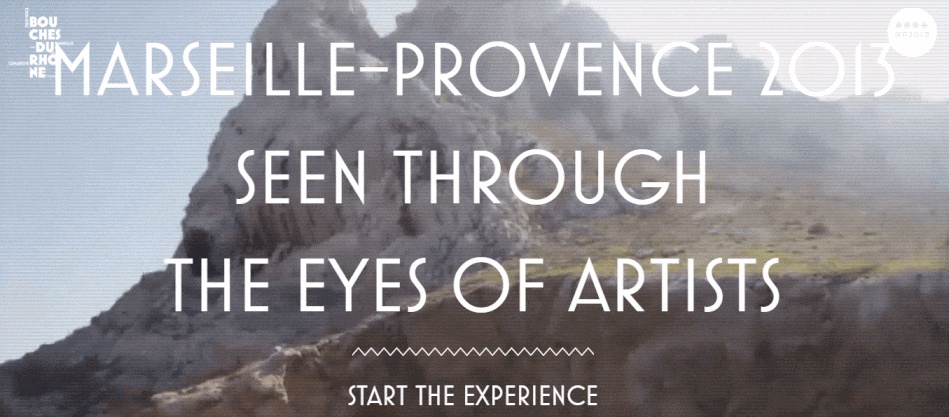
Though My Provence uses words to accomplish this task, there are many other formatting tricks for lower-quality video. Semi-transparent overlays are great ways to obscure grainy images without taking away from their content. In more complex designs, you can apply patterns on top of images to add further interest. Remember that poor video quality can be very distracting – make adjustments as necessary to avoid losing viewers.
Avoid These Pitfalls
The above examples were all well-executed applications of video backgrounds. If you are motivated to try applying these methods to your website, consider the following cautions first.
- Decide whether your video will have audio components. Sound can boost engagement when handled properly. Many websites are set to auto-play soundtracks, which can be annoying for some users. Consider setting videos to mute, with an obvious play button for those who choose to listen. Alternatively, continue to use auto-sound, but have a centralized mute button. If the audience needs to hunt for the mute key, you run the risk of losing their interest.
- Always make sure your users have a way to stop videos. A visual that inspires engagement in one user may turn off another entirely, even if it is only a background. Some people think that films are distracting, while others may find video slows the computer. Offering a pause button is a good way to ensure your site does not lose audience members because of unwanted movement.
- Even users who initially enjoyed a video may find it tiresome after an extended time. Consider how long your target audience will be on a page with background video. If the film appears only on the homepage, it is likely your audience will navigate to other parts of the website fairly quickly.
- However, if it is a form or informational page, the user may be there for a while. Consider these time frames and decide at what point background motion should fade out. Users will appreciate the initial engagement of films and the calmer focus that follows afterward.
- While implementing fade-out techniques, consider fade-ins as well. Sudden bursts of motion can be startling and appear like pop-ups at first, which put users off when they first enter a page. Slowing fading up on the action gives audience members time to adjust, making it more likely that they will stay on the page.
Join the Movement
The background video trend can be fun and engaging for users. However, it is important to remember who the user is and what their preferences may be. While motion might not be an automatic usability fail, that doesn’t mean you can’t get it wrong.
Allowing for a wide range of personalities will ensure higher customer conversion rates. Find the balance between inspiring interest and curbing annoyance in your target audience.
Frequently Asked Questions (FAQs) about Motion in Website Backgrounds
What is the significance of motion in website backgrounds?
Motion in website backgrounds is a growing trend in web design that adds a dynamic and interactive element to a website. It can significantly enhance the user experience by making the website more engaging and visually appealing. Motion can be used to guide users’ attention, provide feedback, show cause-and-effect relationships, and create a sense of depth. It can also be used to tell a story or convey a message in a more compelling way.
How can I incorporate motion into my website background?
There are several ways to incorporate motion into your website background. You can use video backgrounds, animated graphics, parallax scrolling, or even simple hover effects. The key is to use motion sparingly and purposefully, so it enhances the user experience without becoming distracting or overwhelming. It’s also important to ensure that any motion is smooth and fluid, to create a pleasant visual experience for the user.
What are some examples of websites that use motion in their backgrounds effectively?
There are many websites that use motion in their backgrounds effectively. For example, the website for the film “Life of Pi” uses a video background to immerse visitors in the world of the film. The website for the restaurant “Le Mugs” uses parallax scrolling to create a sense of depth and movement. The website for the design agency “Legwork Studio” uses animated graphics to create a playful and engaging user experience.
Are there any drawbacks to using motion in website backgrounds?
While motion can enhance the user experience, it can also have drawbacks if not used properly. Too much motion can be distracting or overwhelming, and can slow down the loading time of your website. It can also cause issues for users with motion sensitivity or certain types of visual impairments. Therefore, it’s important to use motion judiciously and to provide options for users to pause or disable motion if they wish.
How can I ensure that motion in my website background is accessible to all users?
To ensure that motion in your website background is accessible to all users, you should provide options for users to pause or disable motion. You should also ensure that any motion is smooth and fluid, to avoid causing discomfort or disorientation for users with motion sensitivity. Additionally, you should ensure that any important information or functionality is not dependent on motion, so that users who cannot perceive motion can still fully use your website.
What are the technical requirements for incorporating motion into a website background?
Incorporating motion into a website background requires a good understanding of web design and development. You will need to be familiar with HTML, CSS, and JavaScript, as these are the languages typically used to create motion on the web. You may also need to use video editing software if you are creating a video background. Additionally, you will need to ensure that your website is optimized for performance, as motion can increase the loading time of your website.
Can I use stock videos or animations for my website background?
Yes, you can use stock videos or animations for your website background. There are many websites that offer high-quality stock videos and animations that you can use. However, it’s important to ensure that any stock content you use is relevant to your website and enhances the user experience. You should also ensure that you have the necessary rights to use the content.
How can I test the effectiveness of motion in my website background?
You can test the effectiveness of motion in your website background by conducting user testing. This involves observing users as they interact with your website and gathering feedback on their experience. You can also use analytics tools to track user behavior on your website and see how it changes after you incorporate motion.
What are some best practices for using motion in website backgrounds?
Some best practices for using motion in website backgrounds include using motion sparingly and purposefully, ensuring that motion is smooth and fluid, providing options for users to pause or disable motion, and ensuring that any important information or functionality is not dependent on motion. It’s also important to test the effectiveness of motion and to be willing to make adjustments based on user feedback.
Where can I find inspiration for using motion in my website background?
There are many online resources where you can find inspiration for using motion in your website background. Websites like Awwwards, CSS Design Awards, and Dribbble showcase innovative web designs that use motion in creative ways. You can also look at the websites of brands or designers that you admire to see how they use motion.

