Key Takeaways
- Subtle contrast in design refers to the delicate differences in color, texture, size, or shape that help distinguish various elements, creating depth, focus, and visual interest without overpowering the overall aesthetic.
- Techniques to achieve subtle contrast include changing the value of elements, adding a stroke or border around an element, using a background color not too dramatically different from the foreground, and using strong contrast between elements with a background that tones down this contrast.
- Subtle contrast can be used effectively in all types of design including web, graphic, and print design. It’s important to strike a balance to avoid a chaotic or flat design, and resources like Adobe Photoshop, Illustrator, and Canva can assist in creating the desired effect.
 In previous posts I’ve written about the importance of using contrast to create eye-catching designs and bold typography. The concept of contrast in design is to avoid using elements that are similar, but to make them look very different. This is what catches the eye. However, there are of course occasions when you might need to tone down the contrast between elements and/or the background they’re sitting on.
Here’s some straightforward techniques to reduce contrast between elements while still maintaining interest. I’m using a simple, fictional logo to demonstrate.
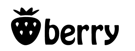
1. Here’s the original high contrast logo.
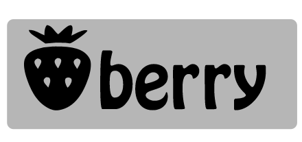
2. Here I’ve changed the value of the text at the top and the symbol underneath. These are two examples of how to tone down the contrast between the elements and the background. Visual impact is still there but I’ve reduced the overall contrast.
3. Another method is to put a stroke or border around an element. In the example below, there is a three pixel mid-gray stroke on the text. This intermediate “step” softens the transition between the black text and the white background.
4. In this example, I’ve used white text on a white background which obviously would be invisible without some kind of border, stroke or glow. The light-gray drop shadow on both elements provides a soft transition between foreground text and background but still allows the symbol and text stand out quite nicely.
5. Another easy way to tone down contrast is to use a value or color in the background that is not too dramatically different from the foreground elements.
6. Subtle contrast doesn’t mean lack of color. Here there is strong contrast between the white symbol and the black text, but the warm colored background tones down contrast with the foreground elements while still appearing eye-catching.
These fundamental techniques are not just for logos, they can be applied to web, graphic and print design. You might look a bit mad if you’re sitting in the office/on the bus, but really squinting your eyes when looking at websites and magazines is a good way to see how “contrasty” elements are in the design.
Frequently Asked Questions about Subtle Contrast in Design
What is subtle contrast in design?
Subtle contrast in design refers to the delicate differences in color, texture, size, or shape that help to distinguish various elements in a design. It’s a technique used by designers to create a sense of depth, focus, and visual interest without overpowering the overall aesthetic of the design. Subtle contrast can be achieved through the careful use of light and dark shades, different textures, or varying sizes of elements.
How does subtle contrast differ from stark contrast?
While both subtle and stark contrast are used to differentiate elements in a design, the key difference lies in the degree of difference. Stark contrast involves a significant difference between elements, such as black and white or large and small. On the other hand, subtle contrast involves less pronounced differences, such as varying shades of a single color or slightly different sizes of elements.
Why is subtle contrast important in design?
Subtle contrast plays a crucial role in design as it helps to create visual interest and guide the viewer’s eye through the design. It can be used to highlight important elements, create a sense of depth, or add a touch of sophistication to a design. Moreover, subtle contrast can make a design more visually appealing and engaging, thereby enhancing the overall user experience.
How can I effectively use subtle contrast in my designs?
To effectively use subtle contrast in your designs, start by identifying the key elements that you want to highlight. Then, experiment with different shades, textures, or sizes to create a contrast that is noticeable but not overpowering. Remember, the goal is to create a balance between the elements, so avoid using too much contrast as it can make your design look chaotic.
Can you provide some examples of subtle contrast in design?
Sure, some examples of subtle contrast in design include using slightly different shades of a single color to create a gradient effect, varying the size of elements to create a sense of depth, or using different textures to distinguish between elements. For instance, in a website design, you might use a slightly darker shade of blue for the header compared to the rest of the page to subtly draw attention to it.
What are some common mistakes to avoid when using subtle contrast?
Some common mistakes to avoid when using subtle contrast include overdoing it, which can make your design look chaotic, and not using enough contrast, which can make your design look flat and uninteresting. It’s also important to ensure that the contrast is noticeable enough to serve its purpose, but not so much that it distracts from the overall design.
How does subtle contrast contribute to the overall aesthetic of a design?
Subtle contrast contributes to the overall aesthetic of a design by adding depth, focus, and visual interest. It can help to create a sense of harmony and balance, making the design more visually appealing and engaging. Moreover, subtle contrast can add a touch of sophistication and elegance to a design, enhancing its overall aesthetic appeal.
Can subtle contrast be used in all types of design?
Yes, subtle contrast can be used in all types of design, including graphic design, web design, interior design, and more. The key is to understand the principles of contrast and how to apply them effectively to create a visually appealing and engaging design.
How can I learn more about using subtle contrast in design?
There are many resources available online to learn more about using subtle contrast in design. You can read articles, watch tutorials, or take online courses on design principles. Additionally, practicing and experimenting with different types of contrast in your own designs can also be a great way to learn and improve.
What tools can I use to create subtle contrast in my designs?
There are many design tools available that can help you create subtle contrast in your designs. These include graphic design software like Adobe Photoshop or Illustrator, which allow you to adjust colors, textures, and sizes to create contrast. Additionally, online tools like Canva also offer features to create subtle contrast in your designs.
Jennifer Farley is a designer, illustrator and design instructor based in Ireland. She writes about design and illustration on her blog at Laughing Lion Design.
