

 There’s a lot more to typography that just picking a font. It is the ability to choose an arrangement of type that is legible and attractive. In this series, I’m taking a look at four fundamentals that can help you maximize the readability and improve the look of your website. They are;
- Contrast
- Hierarchy
- Space
- Size
Today, let’s look at contrast.
When we talk about contrast in typography, it can mean several things.
• The contrast between large and small type.
• The contrast between different typefaces, for example a script font used for a heading and a sans-serif font used for body copy.
• The contrast between the font colour and the background it appears on.
In a nutshell, contrast is an important factor in how easy it is to read text. You want to avoid making your web visitors squint, or feel the need to put on sunglasses when they visit your site and you can do that by choosing suitable foreground and background colours.
Let’s look at a very simple example of good contrast. Black text on a white background. It’s very easy to read.
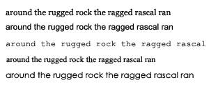
Reversing that out, with white text on black background.
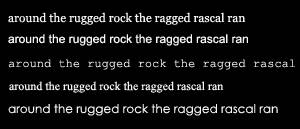
Again, easy to read. However, things would be a little dull on the web if EVERYONE used black and white. Dark coloured text with an off-white background colour, or vice versa, still provides excellent contrast while bringing a bit of colour harmony to your site. Here are some examples of contrast between text colour and background colour that work well.
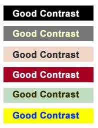
Obviously this is only a small list, but the key point to remember is you want to avoid making it difficult for readers. Always ensure that there is sufficient contrast between text and its background.
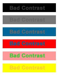
The above are examples of contrast from the wrong side of the tracks – they’re bad! As you can see, some of these colour schemes actually hurt your eyes and should definitely be avoided if you want to keep your readers. The top three are also nearly impossible to read.
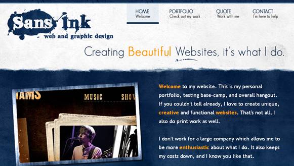
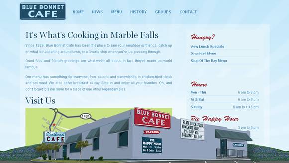
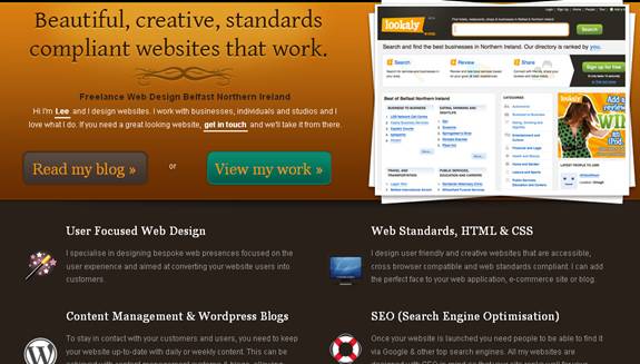
Let’s take a look at some working examples of good contrast. I’ve picked out 5 sites that have a colour scheme which uses good contrast, none of which are black and white.
ArtDesign

Sans Ink
Mr Vector

Blue Bonnet Cafe
Lee Munroe
Tomorrow we’ll take a look at how hierarchy can affect typography. In the meantime, have you come across any nice or unusual colour contrast on a web site that you’d like to share?
Frequently Asked Questions on Typography Contrast
What is the importance of contrast in typography?
Contrast in typography is crucial as it helps in creating visual interest and hierarchy. It allows the reader to distinguish between different elements on the page, such as headings, subheadings, and body text. This differentiation aids in guiding the reader’s eye through the content, making it easier to understand and digest. Contrast can be achieved through variations in font size, weight, color, and typeface. It’s not just about aesthetics, but also about improving readability and user experience.
How can I effectively use contrast in my design?
Effectively using contrast in your design involves understanding the principles of hierarchy and balance. Start by deciding which elements should stand out and which should be secondary or tertiary. Use bold or larger fonts for headings and lighter, smaller fonts for body text. Experiment with different typefaces, but ensure they complement each other. Color can also be a powerful tool for creating contrast. However, always prioritize readability and clarity over stylistic choices.
What is the role of color in creating contrast?
Color plays a significant role in creating contrast in typography. It can help differentiate between different elements, guide the reader’s eye, and evoke emotions. However, it’s important to choose colors that complement each other and don’t strain the reader’s eyes. Tools like color contrast checkers can help ensure your color choices are accessible to all users, including those with visual impairments.
Can too much contrast be a bad thing?
While contrast is essential in typography, too much of it can be overwhelming and confusing to the reader. It can create visual clutter, making it difficult for the reader to focus on the content. Therefore, it’s important to strike a balance. Use contrast to highlight key elements, but ensure the overall design remains cohesive and harmonious.
How does contrast contribute to the readability of text?
Contrast significantly contributes to the readability of text. It helps distinguish text from the background, making it easier for the reader to recognize and read the words. High contrast, especially between text and background color, can improve readability, while low contrast can make text difficult to read. However, extremely high contrast, like bright colors on a dark background, can also strain the eyes, so it’s important to find a balance.
What is the difference between contrast and hierarchy in typography?
Contrast and hierarchy in typography are closely related but not the same. Contrast refers to the difference between various elements to make them stand out, while hierarchy is about arranging elements in a way that indicates their importance. Contrast is one of the tools that can be used to establish a visual hierarchy.
How can I create contrast using different typefaces?
Creating contrast using different typefaces involves selecting fonts that have distinct characteristics yet work well together. For instance, pairing a serif font with a sans-serif font can create an effective contrast. However, it’s important to limit the number of different typefaces to maintain a cohesive and professional look.
What are some common mistakes to avoid when using contrast in typography?
Some common mistakes when using contrast in typography include using too many different typefaces, colors, or font sizes, which can create visual clutter; not using enough contrast, making it hard for readers to distinguish between different elements; and using colors that are too bright or too dark, which can strain the eyes.
How does contrast affect the mood or tone of a design?
Contrast can significantly affect the mood or tone of a design. High contrast, with bold, dark text on a light background, can create a serious, formal tone. On the other hand, low contrast designs can feel softer and more casual. The choice of colors can also influence the mood, with warm colors often creating a lively, energetic feel, and cool colors evoking a calm, professional tone.
How can I check if my design has enough contrast?
There are several tools available online, such as contrast checkers, that can help you determine if your design has enough contrast. These tools usually require you to input your foreground and background colors, and they provide a contrast ratio that indicates whether your design meets accessibility standards. Additionally, getting feedback from others, especially those with different visual abilities, can also be helpful.