
Key Takeaways
- Website forms should be visually compelling, intuitive, user-friendly, accessible, and consistent with the rest of the site’s design, all of which can be achieved through CSS.
- CSS allows designers to style each element of a form, including the form tag itself, input areas, and buttons, enhancing the form’s aesthetic and functionality.
- Using CSS, designers can add dimension to forms with gradients, shadows, and borders, and improve user experience with hover states and focus styles that highlight active input areas.
- CSS also enables the styling of specific elements such as textareas and buttons, giving designers the ability to control the form’s layout and appearance down to the smallest detail.
A big part of our work as website designers is the ability to make things look good and function well. We spend hours taking the time to make every aspect of our site visually compelling, intuitive, user friendly, accessible and overall beautiful. Our forms are no exception! Our forms should be beautiful, easy to use, and should look consistent with the rest of our website. We can do this easily with CSS.
The process isn’t difficult, you just can to know what each tag does, and how to style it. The first thing we need to do is bring in our HTML. Below is the HTML found in our sample form.
<form>

  <div>

    <h1>Contact Form :</h1>

    <label>

      <span>Your name</span><input id="name" type="text" name="name" />

    </label>
    <label>

      <span>Email Address</span><input id="email" type="text" name="email" />

    </label>
    <label>

      <span>Subject</span><input id="subject" type="text" name="subject" />

    </label>
    <label>

      <span>Message</span><textarea id="feedback" name="feedback"></textarea>

      <input type="button" value="Submit Form" />

    </label>
  </div>

</form>
You will notice that in the HTML, I used words, names, and ids that make sense. They are consistent with what you’d expect each field to be called. Each Field is wrapped in a label tag to make things easy for us to style. Our form looks pretty plain without any styling, as you can see from the sample below:
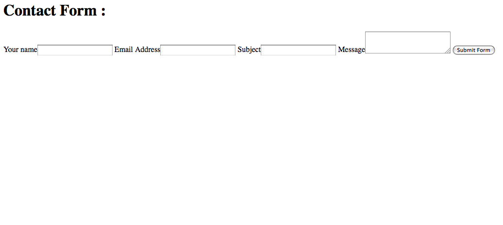
Our form has no structure, no color, and no personality. We can change that with a little bit of code. First, we are going to style the form tag itself.
form {

  background: -webkit-linear-gradient(bottom, #CCCCCC, #EEEEEE 175px);

  background: -moz-linear-gradient(bottom, #CCCCCC, #EEEEEE 175px);

  background: linear-gradient(bottom, #CCCCCC, #EEEEEE 175px);

  margin: auto;

  position: relative;

  width: 550px;

  height: 450px;

  font-family: Tahoma, Geneva, sans-serif;

  font-size: 14px;

  font-style: italic;

  line-height: 24px;

  font-weight: bold;

  color: #09C;

  text-decoration: none;

  border-radius: 10px;

  padding: 10px;

  border: 1px solid #999;

  border: inset 1px solid #333;

  -webkit-box-shadow: 0px 0px 8px rgba(0, 0, 0, 0.3);

  -moz-box-shadow: 0px 0px 8px rgba(0, 0, 0, 0.3);

  box-shadow: 0px 0px 8px rgba(0, 0, 0, 0.3);

}
The code above can look like a mouthful, but it is fairly simple when broken down. Flat colors can be really boring, so adding a slight gradient can break up the monotony and give your design some dimension. That is done with the background style. When using this property and gradients, you have to include the specific prefixes for certain browsers such as Firefox, or they won’t show up. Both are saying the same thing. Create a linear gradient, start from the bottom, and use a medium gray and a light gray and blend it over 175px.
Since this is where you entire form is going to be contained, I decided to center the form in the browser by setting margin to auto. Setting the Position to Relative is intended for aligning an element later, so that explanation is to come. I specified the width and the height of the form, the fonts used, and styled it to be bold, italic, 14px in size and a line height (spacing between each line of text) of 24px.
Border radius gives us rounded corners for our boxes. Increase the number for more rounded corners. Padding gives some space between the text and the edge of the form, so that your text doesn’t run outside the bounds of your form and its rounded corners.
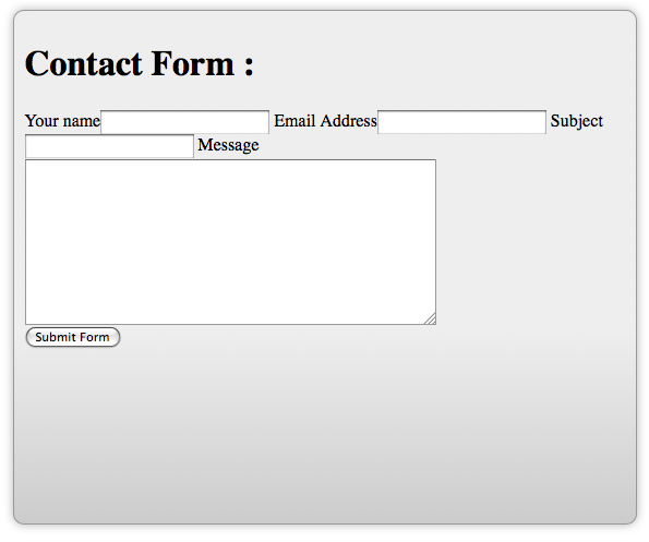
You can create subtle borders for contrast and dimension. I also added box shadows to the overall form, so if this becomes a popup form, it will add dimension and make the form look like it is floating over the rest of the site. This is a popular technique right now. This is yet another style that needs you to specify the proper prefix in order to get it to show up. You form should look something like this:
Next, we should style the input area. That is where the text is actually entered into each field.
input {

  width: 375px;

  display: block;

  border: 1px solid #999;

  height: 25px;

  -webkit-box-shadow: 0px 0px 8px rgba(0, 0, 0, 0.3);

  -moz-box-shadow: 0px 0px 8px rgba(0, 0, 0, 0.3);

  box-shadow: 0px 0px 8px rgba(0, 0, 0, 0.3);

}
The code shown above selects all of the text input areas, and styles them to be 375px wide, and setting the display to block stacks them vertically. Adding a 1px border helps to emphasize each input area, and setting the height to 25px gives the user plenty of room visually to enter their text.
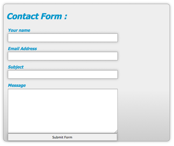
I added a box shadow for dimension, but remember to include the prefix for each browser. The first 2 digits control the offset for the shadow. Positive numbers push the shadow to the right and up, and negative numbers push it to the left and down. The 3rd number determines how much the shadow is blurred. The higher the number, the larger the blur. Inside of the parenthesis, the 1st three numbers determine the red, green, and blue values of the shadow, and the decimal number determines the opacity of the shadow itself. 1 is 100% opacity and 0.1 is 10% opacity. With these style added, your form should begin to take shape, and look like the image below:
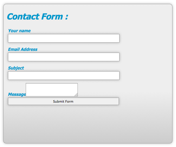
Everything is aligned, but notice that the submit button has been affected b the width styling. We will fix this later. The message area doesn’t look right, but we can fix this easily.
textarea#feedback {

  width: 375px;

  height: 150px;

}
You can specify the width and the height directly, but this still doesn’t make the textarea fall in line with the other fields.
We have to set the display property to block manually, so that it performs the same way as the input areas.
textarea#feedback {

  width: 375px;

  height: 150px;

  display: block;

}
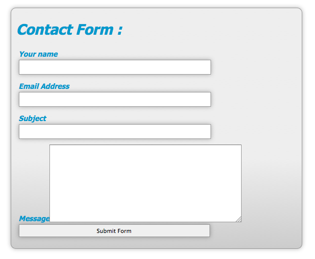
Now that everything is aligned properly, we can get down to fixing the submit button. The CSS that we need to fix this is fairly simple:
button {

  width: 100px;

  position: absolute;

  right: 20px;

  bottom: 20px;

  background: #09C;

  color: #fff;

  font-family: Tahoma, Geneva, sans-serif;

  height: 30px;

  border-radius: 15px;

  border: 1p solid #999;

}
input.button:hover {

  background: #fff;

  color: #09C;

}
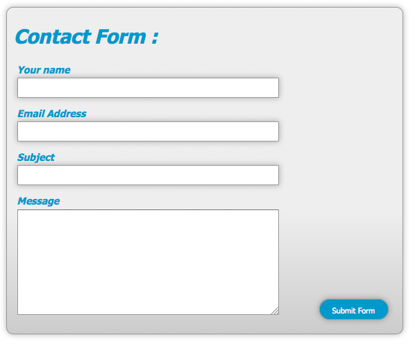
We select the button named submit and define its width to 100px and set its position to absolute. As we mentioned earlier, we had styled the form to have a relative position. The way this works is that when you set something to have a absolute position, it looks for the last element that has its position set to relative. If that element is nested inside of the element with a position of relative, its absolute position is relative to that element. In other words, the submit button will be positioned somewhere inside of the bounds of the form container. I defined that it will be 20px from the right and from the bottom with those respective styles.
I set the background to blue and the text to white. I gave it a definite height of 30px and rounded corners. I also have it a 1px gray border. This is the normal state for your submit button.
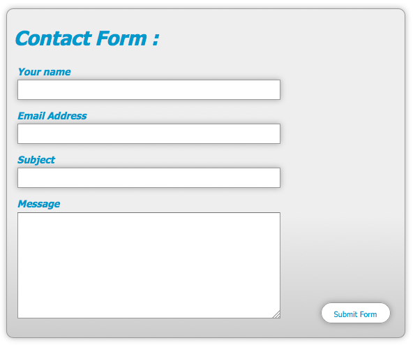
You will notice that I defined a hover state for the submit button. The styles defined here override the original styling once the user hovers over the button. I changed the background to white and the text to blue, giving the user a highly contrasting effect when they mouse over the button.
Here is the normal state:
Here is the hover state:
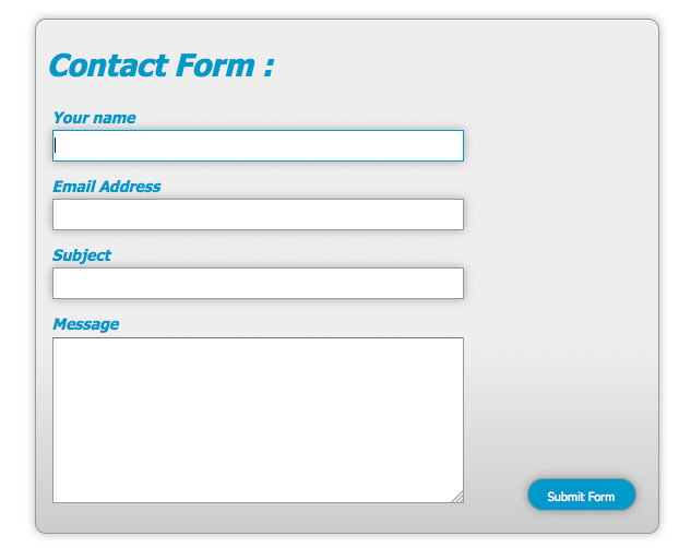
Our form’s structure is done. You could stop here and you would have a great form, all styled with CSS. However, you could take it one step further, by adding a little user friendly styling to the text input areas, so that the user can tell where they are typing. You can do this with a small amount of CSS:
textarea:focus, input:focus {

  border: 1px solid #09C;

}
What this does is it tells the browser that if a person has a text input or text area selected, that it needs to add a 1px blue border around the active input area, so the user knows where they are visually in the form. This is just a little extra something that is much appreciated by many users.
Conclusion
You can do some wonderful things with CSS, including creating beautiful web forms for your users. With just a little CSS and some imagination, you can make something as boring as filling out a form, much more enjoyable for anyone who is visiting your site.
Below you’ll find a CodePen demo with the example we’ve built in this post:
See the Pen 729ceb6e733ccb086a414ed7a4d381e4 by SitePoint (@SitePoint) on CodePen.
If you enjoyed reading this post, you’ll love Learnable; the place to learn fresh skills and techniques from the masters. Members get instant access to all of SitePoint’s ebooks and interactive online courses, like Styling Forms with CSS.
Style your own forms from the ground up with HTML5 and CSS3 – our CSS forms course is here, and it’s free with a SitePoint Premium trial!
Comments on this article are closed. Have a question about CSS? Why not ask it on our forums?
Frequently Asked Questions on Styling Web Forms with CSS
How can I style the input fields in my web form using CSS?
Styling input fields can significantly improve the user experience on your website. To style input fields, you can use CSS properties such as ‘border’, ‘background’, ‘width’, ‘height’, and ‘color’. For instance, to change the background color and border of an input field, you can use the following CSS code:input[type=text] {
background-color: #f9f9f9;
border: 2px solid #ccc;}
This code will apply a light grey background and a 2px solid border to all text input fields.
How can I style the submit button in my web form?
Styling the submit button can make it more appealing and noticeable to users. You can use CSS properties such as ‘background-color’, ‘color’, ‘padding’, ‘border’, ‘cursor’, and ‘font-size’ to style your submit button. Here’s an example:input[type=submit] {
background-color: #4CAF50;
color: white;
padding: 14px 20px;
border: none;
cursor: pointer;
font-size: 16px;}
This code will style the submit button with a green background, white text, and a hand cursor when hovered.
How can I add hover effects to the elements in my web form?
Hover effects can make your web form more interactive. You can use the ‘:hover’ pseudo-class in CSS to add hover effects. For example, to change the background color of the submit button when hovered, you can use the following code:input[type=submit]:hover {
background-color: #45a049;}
This code will change the background color of the submit button to a darker shade of green when it’s hovered.
How can I style the labels in my web form?
Styling labels can make your web form more readable. You can use CSS properties such as ‘color’, ‘font-size’, ‘font-weight’, and ‘text-transform’ to style your labels. Here’s an example:label {
color: #4CAF50;
font-size: 18px;
font-weight: bold;
text-transform: uppercase;}
This code will style the labels with green text, 18px font size, bold font weight, and uppercase text.
How can I style the placeholders in my web form?
Styling placeholders can provide a better visual cue to users. You can use the ‘::placeholder’ pseudo-element in CSS to style your placeholders. For example, to change the color and font-style of the placeholders, you can use the following code:input::placeholder {
color: #ccc;
font-style: italic;}
This code will style the placeholders with grey text and italic font style.
How can I style the fieldset and legend elements in my web form?
The ‘fieldset’ and ‘legend’ elements can be styled to group related fields and provide a caption. You can use CSS properties such as ‘border’, ‘color’, ‘font-size’, ‘font-weight’, and ‘text-align’ to style these elements. Here’s an example:fieldset {
border: 2px solid #ccc;}legend {
color: #4CAF50;
font-size: 18px;
font-weight: bold;
text-align: left;}
This code will style the fieldset with a 2px solid border and the legend with green text, 18px font size, bold font weight, and left-aligned text.
How can I style the select element in my web form?
The ‘select’ element can be styled to make dropdown lists more appealing. You can use CSS properties such as ‘width’, ‘padding’, ‘border’, ‘background’, and ‘color’ to style the select element. Here’s an example:select {
width: 100%;
padding: 16px;
border: 1px solid #ccc;
background: #f9f9f9;
color: #4CAF50;}
This code will style the select element with 100% width, 16px padding, 1px solid border, light grey background, and green text.
How can I style the textarea element in my web form?
The ‘textarea’ element can be styled to improve the user experience when entering multi-line text. You can use CSS properties such as ‘width’, ‘height’, ‘padding’, ‘border’, ‘background’, and ‘color’ to style the textarea element. Here’s an example:textarea {
width: 100%;
height: 150px;
padding: 12px;
border: 1px solid #ccc;
background: #f9f9f9;
color: #4CAF50;}
This code will style the textarea element with 100% width, 150px height, 12px padding, 1px solid border, light grey background, and green text.
How can I style the radio buttons and checkboxes in my web form?
Styling radio buttons and checkboxes can make them more noticeable and consistent with your website’s design. However, due to browser inconsistencies, it’s often recommended to use custom images or icons for radio buttons and checkboxes. You can use the ‘background’ property in CSS to set a custom image or icon.
How can I style the error messages in my web form?
Styling error messages can make them more noticeable and understandable to users. You can use CSS properties such as ‘color’, ‘font-size’, ‘font-weight’, ‘background’, and ‘padding’ to style your error messages. Here’s an example:.error {
color: #f00;
font-size: 14px;
font-weight: bold;
background: #fdd;
padding: 10px;}
This code will style the error messages with red text, 14px font size, bold font weight, light red background, and 10px padding.