In the last part, we saw what appeared to be a finished redesign of the Southern Savers site. Matthew Smith had wrapped up the design of the home page and co-working developer Kevin Smith was already building out the layout and using Cufo?n to include the Fago Office Serif typeface. In reality, though, there was a lot of work left to do. While most of the posts and a few of the basic pages on the Southern Savers site would rely on the standard content template we saw in Part IV, there were a few pages that Jenny insisted receive some individualized design love.
While Jenny spends a lot of her time teaching workshops and explaining how to use coupons, she was also wasting much time on her old site replying to comments and emails that asked the same questions over and over again. To her, it was obvious that a simple FAQ page wouldn’t suffice to solve the problem here. These instructional pages needed to be fun, eye-catching, and easy to understand. In short, they needed imagery! This integral part of the project was hardly an afterthought; it had been in the plans since Emily Smith began the information architecture work I talked about in Part I. One of the concepts Jenny has to explain often to her site visitors is that of grocery store sales cycles. Most stores, she says, offer their rock-bottom price on a particular item every six to eight weeks. To illustrate this, Emily included the rough sketch shown here in her wireframe for the site’s “learn to coupon” page.
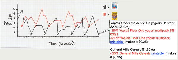 Emily’s sketch of the sales cycle concept
When choosing images for your designs you should ask yourself the following questions: Is it relevant? Is it interesting? Is it appealing? In this case, Matthew knew that he’d be creating the final graphic himself, but he still kept these three questions in mind. His goal with this little information graphic was to grab the users’ attention and teach a concept, rather than merely show the actual price fluctuations of yogurt and cereal. For this reason, he removed the individual price labels and generalized the chart by making the price between the sales a simple bouncing line. Combining these concepts with high-contrast, complementary colors ensured that the final graphic, seen below, would definitely be noticed.
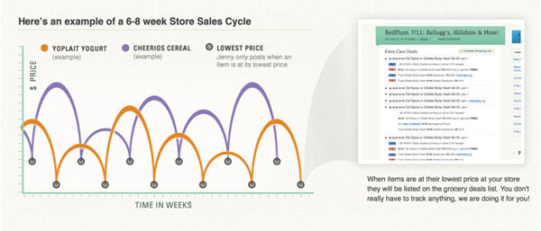 Matthew’s final interpretation of the sales cycle chart
Another essential graphic element from the site is at the bottom of the same “learn to coupon” page. It’s a step-by-step summary of Jenny’s recommended couponing process. Again, the concept for this area was forged during Emily’s information architecture process. The sticky-note version from the wireframe, seen below, gives a strong visual idea of what the section should look like, but it needs to match the style, color, and texture of the rest of the site.
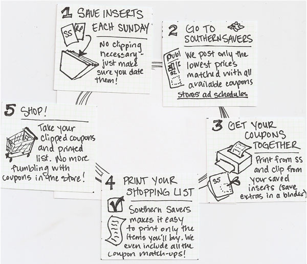 The beginnings of the couponing process infographic
To accomplish this, Matthew designed some simple illustrations based on Emily’s sketches that used the teal and blue colors from the scheme we established in Part II. He paired those illustrations with circles for the background, and numbers that tie in well with the geometric curve of the header banner and the bouncing line from the sales cycle chart. The final graphic can be seen below.
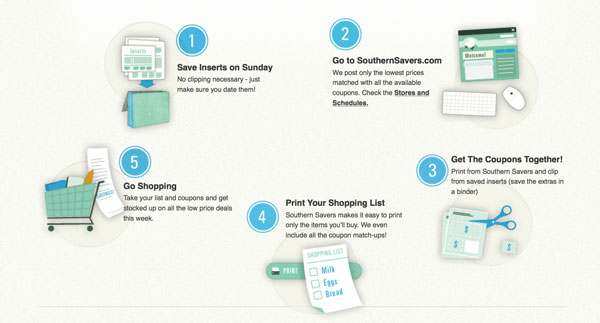 The final “learn to coupon” summary
Coming up with imagery like this is really a matter of applying the design principles I’ve talked about with solid content. Without having the content for these sections up-front, Emily would have been unable to lay a strong foundation with her wireframes, and Matthew would have had nothing to work from for the final graphics. It was that forethought and professional design process that really makes the new Southern Savers site stand out from other “deal” blogs—from any other site, for that matter.
I hope you’ve enjoyed this series, and also that you’ve been able to draw something from it that you can apply to your work. This case study was my favorite part of working on the second edition of The Principles of Beautiful Web Design, but there’s loads more stuff in there that I think anyone interested in web design can benefit from, so why not check out the sample PDF?
Happy designing!
This is the last installment in a five-part case study drawn from SitePoint’s The Principles of Beautiful Web Design, 2nd edition. The book covers all the principles of graphic design as they pertain to the Web, and it’s presented in a way that’s easy for non-designers to digest.
Check out the other parts in this series:
Jason Beaird is a designer and front-end developer with over ten years of experience working on a wide range of award-winning web projects. With a background in graphic design and a passion for web standards, he’s always looking for accessible ways to make the Web a more beautiful place. When he’s not pushing pixels in Photoshop or tinkering with markup, Jason loves sharing his passion for the Web with others.

