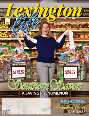
As the design process on the Southern Savers site moved along, Jenny was hosting more and more couponing workshops throughout the southeast of the US, and the popularity of her site continued to grow. Despite the worn-out WordPress template and lack of cohesive branding, Southern Savers was becoming a household name. During this time, Jenny was interviewed by several newspapers and local interest magazines, all of which were directing even more traffic back to her site. It was obvious that this project needed to keep moving forward.
 Local magazine coverage on Southern Savers
By the end of Part II, team Squared Eye was making great progress. It had wireframes approved, and had learned through the use of Andrew Ramos’s mood boards what colors Jenny might like to see in the final design. Before the actual site design could begin, though, Andrew had to nail down the Southern Savers branding.
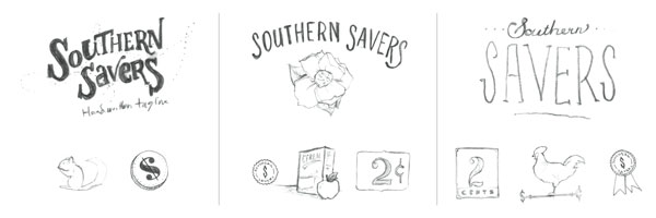
 Three potential branding directions for Southern Savers
Direction one: playful
For this concept, Andrew wrote out the name in a custom typeface and paired it with a hand- written tag line. The winding dotted line behind the text gives it a fun, whimsical feel. While working on this idea, he came up with the idea of including a chipmunk, an animal that spends much of its time collecting and storing food before it’s needed—a key principle of using coupons.
Direction two: general store
In this design, the text style in the logo was made to look like a hand-painted sign. For the logo mark, Andrew included a magnolia blossom. Incorporating this familiar element from the old design would help to establish a personality that would build off the site’s existing brand equity. The other grocery images would support the idea that, like an old general store, Southern Savers should be your one-stop shop for great deals.
Direction three: classic southern living
This concept combined a tasteful script font paired with a narrow slab serif. The classically styled numbers, weather vane, and blue ribbon are meant to convey Southern Savers as a “traditional and reliable Southern establishment.”
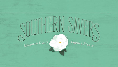
Jenny ended up liking bits and pieces of each of the three directions. She wasn’t sold on the playful logo, but really liked the idea of incorporating a chipmunk in the site. She was excited about the idea of keeping a magnolia blossom in the design, but also liked the look of the slab serif typeface in the classic southern direction. The result was the graceful marriage of those concepts as seen in the final business card design below. Notice the subtle wood texture behind the logo and the soft, hand-painted look of the magnolia blossom illustration. These textural branding decisions established a sense of depth and personality for the Southern Savers brand, and would play a key role in Matthew Smith’s work on the website design.
 Southern Savers Business Card
You’ll see how that turned out later. In the next part, it’ll be time for us to move on to the next chapter of this design adventure: typography!
This is the third in a five-part case study drawn from SitePoint’s The Principles of Beautiful Web Design, 2nd edition. The book covers all the principles of graphic design as they pertain to the Web, and it’s presented in a way that’s easy for non-designers to digest.
Check out the other parts in this series:
Jason Beaird is a designer and front-end developer with over ten years of experience working on a wide range of award-winning web projects. With a background in graphic design and a passion for web standards, he’s always looking for accessible ways to make the Web a more beautiful place. When he’s not pushing pixels in Photoshop or tinkering with markup, Jason loves sharing his passion for the Web with others.


