When we last checked in on the Southern Savers redesign project, all the pieces of Jenny’s site were collated, just begging to be assembled into a fresh new design. Emily Smith laid the groundwork with her usability research, information architecture, and wireframes. Next, Andrew Ramos presented mood boards to Jenny to gain an idea of what colors and texture she favored for the new and improved Southern Savers branding.
It was at this stage of the game that Matthew Smith, Squared Eye’s creative director and principal, stepped up to the plate to knock out the website design. Working from Andrew’s branding elements, his first order of business was choosing typography. “When working from a brand,” said Matthew, “I try to maintain its authentic nature, but interpret it through a web lens.” Part of that interpretation involved finding a typeface that paired well with the unique hand-lettered, arched type in the new logo.
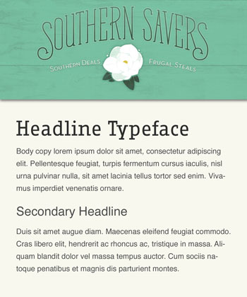
After browsing through his options, Matthew finally settled on the slab serif face Fago Office Serif. Considering that the logo type is a hybrid of a slab serif and a script, this option fitted the look of the branding while still providing enough contrast to stand out on its own. For the body copy, Matthew wanted a simple out-of-the-way typeface that would let the Fago headlines stand out rather than compete with them. Helvetica was the best option, he decided, making the default font stack simply: Helvetica, Arial, sans-serif. The figure below shows how the new logo looks paired with Fago Office Serif and Helvetica body copy.
 Southern Savers Typography
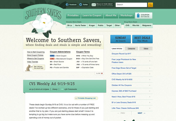
With the typography selection nailed down, there were still some color and texture decisions required to flesh out the wireframes. Matthew decided to use the flower portion of the identity as his inspiration here. “There’s some really nice texture happening in those petals that feels elegant but earthy, and I wanted to bring that through the rest of the site.” Drawing from that illustrative style, Matthew incorporated a teal ribbon for the header area that arched out of the page geometrically to give emphasis to the logo. Above that ribbon, he used the dark green from the color palette, accented with copies of the magnolia’s leaves. These elements provided a visual container for the site’s navigation elements that were defined in Emily’s wireframes.
As Matthew was continuing with the design comps, Kevin Smith, the project’s development kung fu expert, was starting on the front-end development and WordPress integration. It was Kevin’s job to determine just how all these typography decisions would get baked into the site’s build. He knew he had to use a dynamic font replacement technique, so he decided to go with Cufo?n for most instances of the headline font, and image replacement for some of the buttons and static items. The screenshot below shows how these typefaces, as well as Matthew’s header design elements, ended up looking in the finished site.
 Southern Savers home page design
In the final installment, we’ll be looking at the last piece of design for the Web: imagery. Stay tuned!
This is the second in a five-part case study drawn from SitePoint’s The Principles of Beautiful Web Design, 2nd edition. The book covers all the principles of graphic design as they pertain to the Web, and it’s presented in a way that’s easy for non-designers to digest.
Check out the other parts in this series:
Jason Beaird is a designer and front-end developer with over ten years of experience working on a wide range of award-winning web projects. With a background in graphic design and a passion for web standards, he’s always looking for accessible ways to make the Web a more beautiful place. When he’s not pushing pixels in Photoshop or tinkering with markup, Jason loves sharing his passion for the Web with others.


