Sketchy Design Style Still Going Strong: 10 Examples
 It may have been a reaction to the slickness of Web 2.0 glossy icons and reflections that kicked off a big trend for the sketchy, hand-drawn style web design. Done well, this style creates a tactile, artistic and somewhat home-made feel on web sites.
In many cases, the design elements are drawn on paper and scanned in, keeping a certain amount of roughness and texture in the process. Pencils, markers, pen and ink provide a unique and artistic touch.
I think this style works best when the designer throws themselves fully into it. What I mean by that is that the designer uses many hand-drawn elements: lines, doodles, sketchy fonts for headings, and not just use one element in isolation. This style certainly lends itself to a more personal feeling, that you won’t find on many of the big corporate sites.
So here’s a collection of ten websites which make excellent use of the hand-drawn style. Many, but not all are portfolio sites.
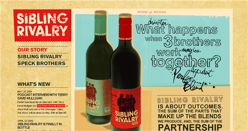
Sibling Rivalry uses images with a slightly retro look, handwritten fonts and little sketches around the site, on a textured paper background.
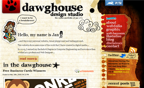
Dawghouse Design Studio is a mixture of doodles, textured papers and headings set using a sketchy typeface.
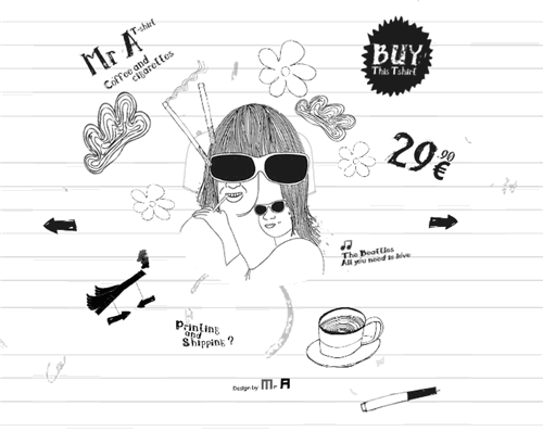
Mr A T-Shirts is a flash-based site and gives the appearance of back-to-basics pen drawing on a copy book.
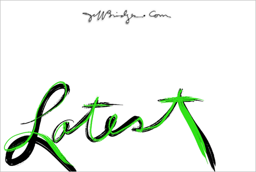
From The Dude himself, Jeff Bridges’ web site is minimalist and looks like it has been hand-written almost in its entirety.
Grady McFerrin illustration style spills out onto the typography used on his website.

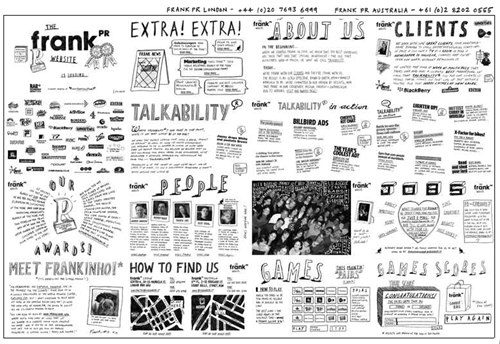
Frank PR looks like a large sheet of paper filled with information. Each section is clickable.
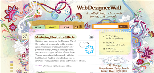
Web Designer Wall is well recognized as both a site filled with great information for designers, but also for its sketchbook style.
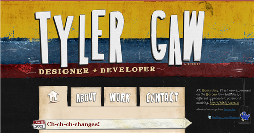
Tyler Gaw a New York based web-designer, has a colorful site with large hand-drawn lettering.
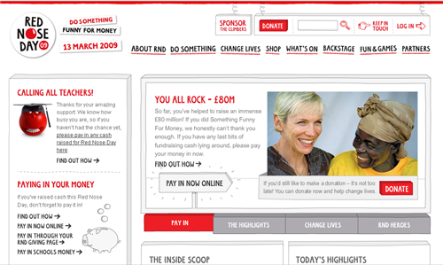
Red Nose Day combines handwritten text, hand-drawn lines, boxes and icons.
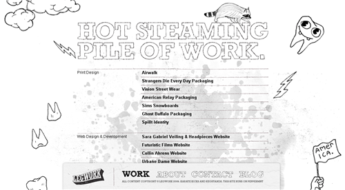
Legwork Studio’s site is black and white and doodled all over.
And that’s a wrap. This style is clearly not suitable for all kinds of web sites, but it brings a tangible, personal feel.
What do you think of this style? Do you think it’s time to move on, or is it something you’d like to see sticking around?
Frequently Asked Questions about Sketchy Design Style
What is the sketchy design style and why is it popular?
The sketchy design style is a unique approach to web design that mimics hand-drawn sketches. This style is popular because it adds a personal and creative touch to websites, making them stand out from the more traditional, clean-cut designs. It’s also a great way to express a brand’s personality and create a more engaging user experience.
How can I incorporate the sketchy design style into my website?
Incorporating the sketchy design style into your website can be done in several ways. You can use hand-drawn icons, backgrounds, and fonts. You can also use sketchy illustrations to highlight important information or to guide users through your site. Remember, the key is to maintain balance and not to overdo it, as it can make your site look cluttered and confusing.
What are some examples of successful sketchy design style websites?
There are many websites that have successfully incorporated the sketchy design style. Some examples include MailChimp, which uses hand-drawn illustrations to make their site more engaging and user-friendly, and Etsy, which uses sketchy elements to highlight their handmade and vintage products.
Is the sketchy design style suitable for all types of websites?
While the sketchy design style can add a unique touch to any website, it may not be suitable for all types of websites. For instance, corporate or professional websites may prefer a more traditional, clean-cut design. However, for creative businesses, personal blogs, or websites that want to stand out, the sketchy design style can be a great choice.
How can I ensure my sketchy design style website is user-friendly?
To ensure your sketchy design style website is user-friendly, make sure the design does not interfere with the site’s functionality. The site should be easy to navigate, with clear call-to-action buttons and easy-to-read text. Also, ensure that the design is responsive, meaning it looks good on all devices, from desktops to mobile phones.
Can I combine the sketchy design style with other design styles?
Yes, the sketchy design style can be combined with other design styles for a unique look. For instance, you can combine it with minimalistic design for a clean yet creative look, or with vintage design for a nostalgic feel. The key is to maintain balance and ensure the overall design is cohesive.
What tools can I use to create a sketchy design style website?
There are many tools available that can help you create a sketchy design style website. Some popular ones include Adobe Illustrator for creating hand-drawn illustrations, and Google Fonts for finding sketchy fonts. You can also use website builders like WordPress or Wix, which offer sketchy design templates.
How can I make my sketchy design style website stand out?
To make your sketchy design style website stand out, focus on creating unique, hand-drawn elements that reflect your brand’s personality. Also, use colors and fonts that complement the sketchy design. Remember, the key is to be creative and original.
What are some common mistakes to avoid when designing a sketchy style website?
Some common mistakes to avoid when designing a sketchy style website include overdoing it with too many sketchy elements, making the site look cluttered and confusing, and not ensuring the design is responsive, which can make the site difficult to use on mobile devices.
How can I measure the success of my sketchy design style website?
You can measure the success of your sketchy design style website by tracking user engagement and conversion rates. Tools like Google Analytics can provide valuable insights into how users are interacting with your site. If users are spending more time on your site, and if your conversion rates are increasing, it’s a good indication that your design is effective.
Jennifer Farley is a designer, illustrator and design instructor based in Ireland. She writes about design and illustration on her blog at Laughing Lion Design.
