

We can’t ignore the mobile world when we have a website. For instance, if your articles are shared on social networks, chances are these links will be seen on a smartphone.
If you want visitors to engage with your website, you need to provide a good experience on mobile. You have to use a responsive theme.
In WordPress 4.5, a new responsive view was introduced in the Theme Customizer. This article will cover what is the responsive view in the Theme Customizer, why it’s useful and, finally, how to use it as a developer.
Key Takeaways
- The responsive view in the WordPress Theme Customizer allows users to visualize their website in different formats, such as how it would appear on a smartphone or tablet, directly from their desktop browser.
- The responsive view is particularly useful for testing changes made in a theme without having to save them first, ensuring nothing is broken due to testing on a mobile device.
- Developers can manage the available views, including disabling the responsive view if their theme is not responsive, or disabling specific views if their theme can only be used on certain devices.
- The sizes of the different views can be customized using CSS, and new responsive views can be created by adding entries to the $devices array in the callback function called by the filter customize_previewable_devices.
- A JavaScript function can be set to be called each time the responsive view is changed, useful for themes that react to the resize event. This can be achieved using the function wp.customize.previewedDevice.bind().
What Is the Responsive View
The responsive view allows you to visualize your website in another format than the one you’re currently using. For instance, you will be able to see how your website is displayed on a smartphone, directly in your desktop browser, without the need to use a real mobile device.
It’s really useful, as you can test on a smaller device changes you make in your theme with the Theme Customizer, without having to save them first. That means you won’t break anything just because you needed to test on a mobile device.
Basically, the only thing the responsive view will do is reduce the frame where you view your website. It’s more or less what happens when you resize your browser’s window, or when you use your browser’s own responsive view.
Changing the window’s size (or the viewport’s size in the case of the browser’s responsive view) is enough to see what your website looks like on a smaller devices. However, there’s an issue when you’re using the Theme Customizer: the sidebar (the customizer itself) will also be resized. If you want to test on very small devices like a smartphone, it’s not really practical.
The advantage of using the Theme Customizer’s responsive view is that only the website’s preview is resized: the only thing which is resized is the only thing you want to test. You can then test changes, faster and easier.
Moreover, a classical user won’t necessarily know that there’s a responsive view in their browser, and they won’t necessarily have the habits to resize their browser’s window to test the view. As the Theme Customizer’s responsive view is easy and clear to use, it’s a good tool.
How To Use the Responsive View
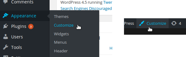
To use the responsive view you need to be in the Theme Customizer. To access it you can use the ‘Customize’ entry in the WordPress dashboard under the ‘Appearance’ menu. You can also use the “Customize” button in the top bar present on every page of your website once you’re logged in.
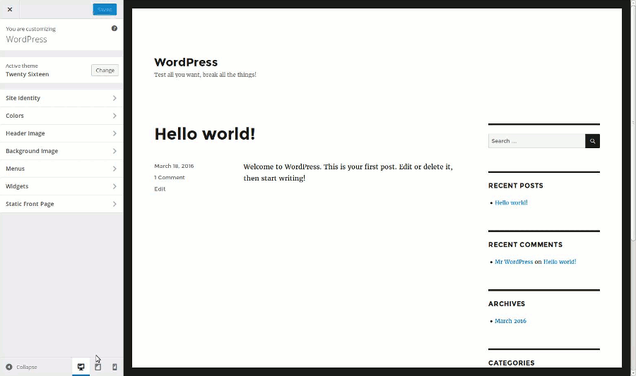
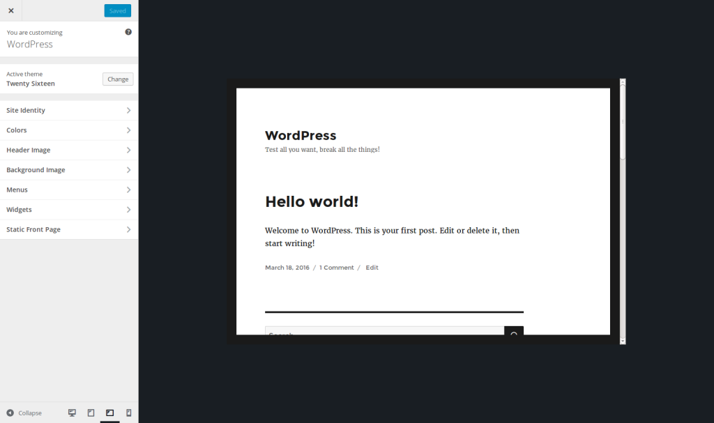
The Theme Customizer is split into two parts: the website’s preview on the right, and the sidebar on the left to change the details. At the bottom of this sidebar you can find the buttons allowing you to enable the responsive view.
Several formats are available: by default we find the desktop view, the tablet view (in portrait mode) and the smartphone view (also in portrait mode). To enable a view, you have to click on the corresponding button. The website’s preview will then be resized, without needing to do anything more.
Let’s be clear, in case you’re wondering, these buttons won’t resize your website itself. They are just a way to preview what your website looks like on smaller devices. If you enable the smartphone view, a user visiting your website will continue to see it in full size!
Choosing the Views to Show
If you’re developing a theme, either for you or for sharing it (or both!), you have to make it responsive. As a developer, you’ll want to use your browser’s tools also to test the responsiveness of your theme, as they are more complete than the Theme Customizer’s responsive view.
However, this view will be preferred by your users, as it’s more comfortable to navigate with the Theme Customizer. That’s why you can’t ignore this responsive view.
The good news is that you don’t have to do anything to enable the responsive view: once a user has updated their WordPress installation to Version 4.5 (or higher), they will be able to use it. However, you can manage the available views, if you need it.
For instance, if your theme is not responsive, you can disable the responsive view. You can also disable a specific view: if for some reason your theme can only be used on a mobile phone, you can only enable this view and even disable the desktop view. Another possible application is simply choosing the default view.
To manage the responsive views, you can use the customize_previewable_devices filter. The function used in this filter must admit one parameter (the available views) and return the views to show. Below is the basic code to implement in the functions.php file of your theme:
<?php

add_filter('customize_previewable_devices', function($devices){

    return $devices;

});

?>
which is equivalent to (if you prefer):
<?php

function manage_previewable_devices($devices) {

    return $devices;

}

add_filter('customize_previewable_devices', 'manage_previewable_devices');

?>
To manage the devices we need to know what is contained in the variable $devices. It’s an associative array listing the views. By default it’s set to:
Array

(

    [desktop] => Array

        (

            [label] => Enter desktop preview mode

            [default] => true

        )

    [tablet] => Array

        (

            [label] => Enter tablet preview mode

        )

    [mobile] => Array

        (

            [label] => Enter mobile preview mode

        )

)
Once WordPress applied the customize_previewable_devices filter, it will list the views following this array. The first entry having the default key set to true will be the default view (even if there are other entries that have this key set to true). The label entries are not displayed on the screen, not even in a title attribute. They are used by screen readers for example. Chances are great that you don’t need to change their values.
If you want to disable a view, you have to remove the corresponding entry. For example, if you want to disable the tablet view, use the following line of code in the function called by the filter:
<?php

unset($devices['tablet']);

?>

To disable the responsive view, return an empty array:
<?php

$devices = array();

// OR:

return array();

?>
Finally, to change the default view, we need to do two things: setting the default attribute of the current default view to false, then setting the default attribute of the view we want to set as default to true. For example, with the following code, the users will always see the mobile view by default.
<?php

$devices['desktop']['default'] = false;

$devices['mobile']['default'] = true;

?>
Customizing the Sizes of the Different Views
The desktop view will take all the available space, as we would expect it to. However, maybe you wonder what are the different sizes used by the other views.
The mobile view simulates a screen in portrait mode. It’s set to 320 × 480 pixels. The tablet view, also in portrait mode, simulates a screen of 6 × 9 inches (between 10 and 11 inches in diagonal).
These are the default values. They are set in a CSS file and you can’t customize them through the filter we used above. However, if you really want to customize these sizes, it’s possible by using your own CSS file, without editing a WordPress core file (which is never recommended).
Create a new CSS file in your theme’s folder. I named it custom-responsive-views.css and placed it at the root of my theme’s folder but feel free to choose whatever you want for these details.
Then, in the functions.php file of your theme, use the admin_enqueue_scripts action to enqueue your style.
<?php

add_action('admin_enqueue_scripts', function() {

    wp_enqueue_style('custom-responsive-views', get_template_directory_uri() . '/custom-responsive-views.css');

});

?>
Now WordPress will read this file and the changes will be taken into account. Let’s take a concrete example and assume that you want to display the tablet view in landscape mode. Then you can use the following CSS code in the file you just created.
.preview-tablet .wp-full-overlay-main {

    margin: auto 0 auto -4.5in;

    width: 9in;

    height: 6in;

}
As you can see, don’t forget to adapt the margin, to always center the view. If you want to customize the mobile view, use the .preview-mobile class instead of the .preview-tablet one. The desktop view uses the .preview-desktop class. Thanks to these simple CSS rules, you can choose the size you want for the different views. Below is the tablet view I obtain with the above CSS.
Creating a New Responsive View
Contrary to built-in browsers tools, WordPress’ responsive view doesn’t allow the resizing of the view. That means that the user won’t be able to resize the mobile view if they want to see a bigger device for instance.
Maybe we will see such a feature in the future. In the meantime, if you really want to provide a bigger mobile view or a landscape mode for the tablet view without overriding the default views, it’s still possible by creating your own view.
To do that, let’s return in our callback function called by the filter customize_previewable_devices. As we saw above, WordPress will list all the entries in the $devices array as buttons. Then, to create a new view, add your own entry, as below.
<?php

$devices['tablet-landscape'] = array(

    'label' => 'Enter tablet preview mode (landscape)'

);

?>
You can choose this view as the default one if you want to, by adding the key default set to true (but don’t forget to disable the current default view as we saw above).
With this entry, WordPress will generate the corresponding button, with the right JavaScript callback: when the button is hit, the website preview will automatically take the right CSS class. In the example above for instance, the preview will get the class preview-tablet-landscape.
We have a problem here: the button we created is near to be invisible. You can find it if you know where to search, but it’s not really what we want. We need to add some CSS to display it the right way (i.e. the way other buttons are displayed). We will use the CSS file we created in the previous part to do that.
The icon displayed in the button is in a :before pseudo-element. Your button can be found thanks to the name you provided. With the example above, the CSS to use to retrieve our button’s icon is .wp-full-overlay-footer .devices .preview-tablet-landscape:before. Then, all you have to do is indicate the content, an icon to display. WordPress’ buttons use the Dashicons font. You can retrieve the whole list of available icons on WordPress Developer Resources website.
In our example, we have a tablet so we choose the icon f471. The CSS is then as below.
.wp-full-overlay-footer .devices .preview-tablet-landscape:before {

    content: '\f471';

}
However, our tablet is in landscape mode while the tablet shown in the icon is in portrait mode. We will here use the power of CSS to transform the icon: with the CSS below, the tablet is now shown in landscape mode.
.wp-full-overlay-footer .devices .preview-tablet-landscape:before {

    transform: scaleX(-1) rotate(0.25turn);

    content: '\f471';

}
You still need to do one thing: defining the size corresponding to your new view. This can be achieved the same way we changed a view above, thanks to the same CSS file. Below are the CSS rules corresponding to our tablet in landscape mode.
.preview-tablet-landscape .wp-full-overlay-main {

    margin: auto 0 auto -4.5in;

    width: 9in;

    height: 6in;

    max-height: 100%;

    max-width: 100%;

    left: 50%;

}
Setting a JavaScript Trigger
It’s possible to define a JavaScript function that’ll be called each time the responsive view is changed. It’s useful if, for example, your theme reacts to the resize event. In the Theme Customizer, the window is not resized by itself, so this event won’t be triggered.
You can then use the function wp.customize.previewedDevice.bind(). This callback can use an argument: a string representing the new view. For instance, if the view changes to the mobile one, this string will be mobile. In the case of the view we created above, it will be tablet-landscape.
Below is an example which displays the new view in the console.
wp.customize.previewedDevice.bind(function(new_device) {

    console.log('Reponsive view has been changed to: ' + new_device);

});
This code can be put in a JavaScript file and enqueued thanks to the wp_enqueue_script() function. The action admin_enqueue_scripts we used above to enqueue our custom CSS is perfect for this call.
<?php

add_action('admin_enqueue_scripts', function() {

    wp_enqueue_style('custom-responsive-views', get_template_directory_uri() . '/custom-responsive-views.css');

    wp_enqueue_script('responsive-views-callback', get_template_directory_uri() . '/responsive-views-callback.js', array(), false, true);

});

?>
See our article about properly including JavaScript files in WordPress if you need more help with the meaning of the arguments we used.
Closing Words
The Theme Customizer’s responsive view is useful for the end user who wants to easily see their changes in all the available devices. Disabling some views and adding your own views can be achieved fairly easily. It’s just the first version of this feature. Maybe we’ll see some new things in future versions, like view resizing for instance.
If you want to retrieve the examples we created in this article, I created an example plugin you can download right here. Note that this plugin exists for only one reason: it’s simpler (and clearer) to provide an example plugin than an example theme. However, playing with the Theme Customizer as we do in this plugin is theme-related functionality, so it should always be done in a theme.
Frequently Asked Questions about Responsiveness in WordPress Theme Customizer
What is the importance of responsiveness in a WordPress theme?
Responsiveness in a WordPress theme is crucial in today’s digital age. It ensures that your website adjusts and displays correctly on different devices, including desktops, laptops, tablets, and smartphones. This is important because it enhances user experience, as visitors can easily navigate and interact with your site regardless of the device they are using. Additionally, Google also considers website responsiveness as a ranking factor, meaning a responsive site can help improve your SEO.
How can I make my WordPress theme responsive?
Making your WordPress theme responsive involves a few steps. First, you need to ensure that your theme is designed to be responsive. This can be done by selecting a responsive theme from the WordPress theme directory or purchasing one from a reputable source. Next, you need to customize the theme using the WordPress Customizer, adjusting elements like layout, typography, and images to ensure they adapt well to different screen sizes.
What are some of the best responsive WordPress themes?
There are numerous responsive WordPress themes available, each with its unique features. Some of the best include Astra, OceanWP, and GeneratePress. These themes are highly customizable, SEO-friendly, and come with a variety of pre-built templates to suit different website types.
Can I make a non-responsive WordPress theme responsive?
Yes, it’s possible to make a non-responsive WordPress theme responsive, but it requires a good understanding of CSS and HTML. You’ll need to modify the theme’s code to ensure elements like images, text, and layout adjust correctly on different screen sizes. However, it’s often easier and more efficient to choose a responsive theme from the start.
How can I test the responsiveness of my WordPress theme?
You can test the responsiveness of your WordPress theme using various online tools like Google’s Mobile-Friendly Test or Responsive Design Checker. These tools allow you to see how your website displays on different devices and highlight any issues that might affect its responsiveness.
Does a responsive WordPress theme affect website speed?
A responsive WordPress theme can potentially improve your website’s speed, especially on mobile devices. This is because responsive themes are designed to load only the necessary elements for each device, reducing the amount of data that needs to be downloaded.
What is the role of the WordPress Customizer in theme responsiveness?
The WordPress Customizer plays a crucial role in theme responsiveness. It allows you to preview how your website looks on different devices and make real-time adjustments to elements like layout, typography, and images. This ensures that your site displays correctly and provides a good user experience on all devices.
Can I use plugins to improve my WordPress theme’s responsiveness?
Yes, there are several plugins available that can help improve your WordPress theme’s responsiveness. These plugins can optimize images, implement lazy loading, and make other adjustments to ensure your website displays correctly on different devices.
How does a responsive WordPress theme benefit SEO?
A responsive WordPress theme benefits SEO in several ways. First, it improves user experience, which is a ranking factor for Google. Second, it ensures that your website displays correctly on all devices, which can reduce bounce rates and increase time spent on your site. Finally, Google has a mobile-first indexing policy, meaning it primarily uses the mobile version of a website for indexing and ranking.
Are all WordPress themes responsive?
While many WordPress themes are responsive, not all of them are. When choosing a theme, it’s important to check whether it’s designed to be responsive. This information is usually provided in the theme’s description or features list. If it’s not mentioned, you can test the theme using an online tool like Google’s Mobile-Friendly Test.

