


The internet is a little like a world-sized roll of duct tape, binding us together in a million different ways.
While vast distances have often melted away online, some global differences are more fundamental. Language is a big differentiator, and is arguably the most important way that we localize our sites and apps.
This leads us to an important UI question: “How do you graphically represent a language on the web?”
What’s the Problem?
At first glance this seems like a ridiculous question. Using flags to represent languages for a website seems like a no-brainer. But look a little bit closer and we start to notice obvious issues.
A flag is a pictorial symbol representing a nation or group, and is most commonly tied to a distinct geographical area.
The problem with using flags to denote language is that many nations around the world have two, three and even four national languages.
This means that displaying, for instance, a Swiss flag is not especially useful to denote language as Switzerland recognizes German, French, Italian and Romansh as national languages. Even ‘playing the numbers’ and choosing to select the most commonly spoken language is only likely to disenfranchise locals who do not speak the majority tongue.
By the same token, languages are also shared across nations, so it’s as counter-intuitive for New Zealanders to click an English flag as it is for Brazilians to click a Portuguese flag.
What are the alternatives?
Looking at the current state of play, there currently isn’t any widely agreed upon solution. Certainly many sites still use flags to note translating options while others have gone a different route. While not conclusive in which is a better method it is a great way to get more people talking on what is the best way to solve this apparent issue.
I think this article is as much a question to provoke discussion as it is any kind of answer.
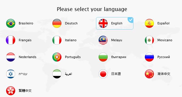
Solution 1: Flags with Abbreviated Text

One common variation is to keep the flags but add a text label. This is seemingly an improvement as it clears up any possible confusion that visitors may have. It also allows you to keep a graphic while allowing visitors to identify their country without much effort.
Accompanying the flag, a simple abbreviation of your preferred language can be placed beside or below your icon. This gives you the ability to not just generalize one language per country. You can now, with the appropriate abbreviations, display a Swiss flag with the abbreviations such as GER,FRA, ITA and ROM. This allows visitors to view your site in the language they know best and doesn’t isolate anyone.
There are some clear problems to this method however, as it assumes that all languages can be abbreviated with two or three flag-ready letters.
But what about users who speak Persian, Arabic, Thai and Telugu just to name a few? How do you abbreviate those?
Solution 2: Translation Image
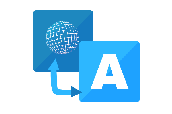
Another solution substitutes the flag images for something new altogether, instead showing a graphic that visually communicates the concept of translation.You may be familiar with this type of setup seeing as sites like Google already do this on their translate page.
Here you would see a letter from the alphabet, typically the letter “A” that is then connected with a two sided arrow to a different symbol. Usually this symbol is either a Chinese or Japanese character. Ideally this icon would serve to inform visitors that the site features translation services and once clicked a pop of menu would prompt them to pick their preferred language.
While this does come out to be a preferable option in lieu of the flag, there is something to consider. Though it might be understandable to most users that pressing the button will display other language choices, some may be under the assumption that, let’s say, a kanji glyph will only offer translation to Japanese.
Solution 3: Text Only
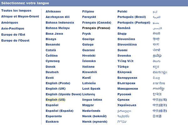
Our third solution sees us just tossing out graphics altogether, which may be the wisest option to avoid any type of confusion.
There are many sites that currently follow this method, and it seems to be gaining mindshare over the flag users. Perhaps it’s safe to assume that this method if done correctly causes less issues than flags.
There are various options available when just using text to display available languages. You can use drop down menus, place your language choices at the bottom of the screen or some other way so that it fits within and compliments the design of your site with no problem.
Other than general literacy problems, there doesn’t seem to be any other issue to understanding why the languages are shown. You will however need to make sure that each language link/button is written in the language for which it is targeted.
In other words, ‘German’ should be shown as ‘Deutsch’ and ‘Spanish’ should be shown as ‘Español’. Also make sure to denote between American English and British English, i.e. English (US) and English (UK).
Solution 4: Autodetection
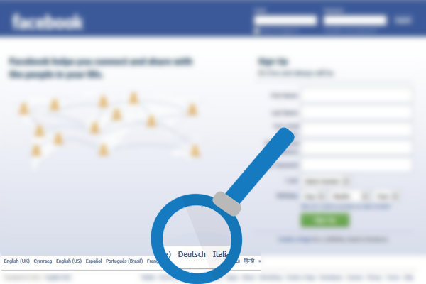
Last but not least you can always use autodetection instead of prompting users for a press of the translation button. This is obviously a technical solution that generally tries to identify the user’s language via their browser settings. Once configured, the server will attempt to automatically display the site in the language which it detects. It will fallback to a default if no useful language data is available.
Facebook is just one of many sites that utilize autodetection in order to provide a better experience in regards to language preferences.
Of course, with autodetection there is no way to ensure 100% accuracy with its detection results. Sometimes a visitor may be temporarily abroad or simply be using an unfamiliar browser, so the detected language may not be the best match for them.
Autodetection is a great first guess, but always ensure there is a visible option to change the language just in case. There are few more frustrating tasks than trying to find hidden language controls on a site you can’t read.
Conclusion
So there you go, four possible approaches to combat the flag as a language dilemma.
Now it’s time for you to chime in. What do you think is the best method to graphically represent a language? Do you have your own solution? Let me know what you think in the comments and feel free to share any site translation issues you may have encountered.
Frequently Asked Questions (FAQs) about Representing Language on the Web
What is the significance of representing language on the web?
Representing language on the web is crucial for a variety of reasons. Firstly, it allows for the communication and exchange of information across different cultures and languages. This is particularly important in our increasingly globalized world where information is shared across borders. Secondly, it enhances accessibility. By representing multiple languages, websites can cater to a broader audience, including those who speak different languages or have different cultural backgrounds. Lastly, it promotes inclusivity and diversity, acknowledging the multitude of languages spoken worldwide.
How are languages typically represented on the web?
Languages on the web are typically represented through language codes, which are standardized sets of characters that denote specific languages. These codes are based on the ISO 639-1 standard, which includes two-letter codes for most languages. For example, ‘en’ represents English, ‘fr’ represents French, and ‘es’ represents Spanish. These codes are used in HTML and other web technologies to specify the language of content.
What are flag icons and how are they used in representing languages?
Flag icons are graphical representations of a country’s flag, often used on websites to represent the language of that particular country. For instance, a website might use the flag of France to represent French language content. However, this method can be problematic as many languages are spoken in multiple countries. Therefore, using a single country’s flag might not accurately represent all speakers of that language.
What is flag semaphore and how is it related to language representation?
Flag semaphore is a system of communication that uses visual signals with hand-held flags, rods, disks, paddles, or occasionally bare or gloved hands. Each signal represents a specific character or function in the message. While it’s not directly related to web language representation, it’s another example of how symbols can be used to convey language and meaning.
How can I specify the language of a webpage in HTML?
In HTML, you can specify the language of a webpage using the ‘lang’ attribute in the ‘html’ tag. For example, to specify that a page is in English, you would use . This helps search engines understand the language of your page and can improve accessibility for users with screen readers.
Why is it important to specify the language of a webpage?
Specifying the language of a webpage is important for both accessibility and SEO (Search Engine Optimization). For accessibility, screen readers use the language attribute to correctly pronounce text, which is crucial for users with visual impairments. For SEO, search engines use the language attribute to serve the most relevant content to users based on their language settings.
What are some challenges in representing languages on the web?
Some challenges in representing languages on the web include dealing with languages that are written right-to-left, such as Arabic and Hebrew, as this can affect webpage layout. Another challenge is handling languages with unique characters or scripts, such as Chinese or Russian. Additionally, accurately representing languages with regional variations can be difficult.
How can I make my website more accessible to speakers of different languages?
There are several strategies to make your website more accessible to speakers of different languages. These include offering a language selection option, using language tags in your HTML, and providing translations of your content. Additionally, avoid using flag icons to represent languages, as this can be confusing for users.
Can I use Google Translate to automatically translate my website?
While Google Translate can provide a quick and easy way to translate your website into different languages, it’s not always the most accurate or reliable method. Machine translations can often miss nuances and cultural references, leading to potentially confusing or incorrect translations. For important or professional content, consider hiring a professional translator.
How can I learn more about representing languages on the web?
There are many resources available to learn more about representing languages on the web. These include online tutorials, web development courses, and articles on websites like SitePoint. Additionally, the World Wide Web Consortium (W3C) provides guidelines and standards for web language representation.

