

Key Takeaways
- To create an accordion component with React.js, one needs Node.js installed, a basic understanding of HTML, CSS, and JavaScript, as well as a basic knowledge of React.js.
- The accordion component is created using a React environment, established via a command prompt. The component structure includes a main Accordion component and an AccordionItem component, which is rendered inside the main component.
- An array of objects containing questions and answers text is created inside the AccordionData.js file, to ensure that the data is dynamically stored and the accordion component is reusable.
- To create the layout of the accordion component, react-icons needs to be installed from the npm registry, and useState and useRef hooks need to be imported. The HTML structure is then rendered inside the AccordionItem component.
- The Accordion component manages the state of the currently active accordion item and uses this state to control the opening and closing behavior. It dynamically generates a list of AccordionItem components based on the data obtained, allowing users to interact with the accordion interface by clicking on each of the questions to reveal or hide their answers.
In this article, we’ll harness the full capabilities of React.js to create an accordion component — a user interface device that’s frequently used in web and mobile applications to arrange and show content in a user-friendly and space-efficient way.
To get the most our of this article, you’ll need the following:
- Node.js installed. You can download and install Node.js from the official website, and learn how to install Node.js here.
- A basic understanding of HTML, CSS, and JavaScript.
- A basic knowledge of React.js.
- A code editor (preferably Visual Studio Code).
The following video shows our finished accordion component.
Project Setup
We’ll be using React.js to create our accordion component. To use React.js, we’ll need to create a React environment, and we’ll do that via a command prompt.
Open your terminal application and navigate to the desktop (or somewhere else if you prefer). Then run the following command to create your React app:
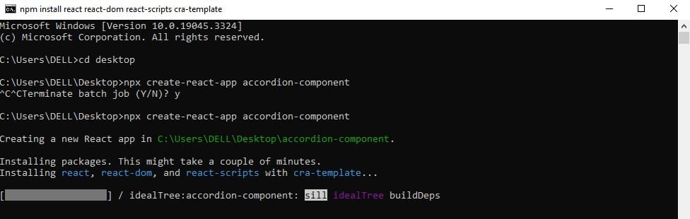
npx create-react-app accordion-component
Once the packages are installed, we’ll see something like the image below.
Now if we check our project folder, we’ll find a folder named /accordion-component/ with all the packages installed.
Folder Structure
Open the new /accordion-component/ folder in a code editor. Also open the React application in the browser. We can do that via the inbuilt terminal in our code editor by typing the command npm run start to run the application on the browser.
Note: if you’re using Visual Studio, you can use the shortcut (ctrl + shift + `) to open up the terminal. If your code editor doesn’t have the feature of an inbuilt terminal, you can just run commands in the command prompt app.)
Let’s next edit the unnecessary files and code blocks that will hinder the execution of our application. Firstly, open App.js and remove the whole header element that’s wrapped in the <div> element with a class name of App, so we now have an empty <div> element. Then open App.css and index.css and delete the contents of both files. (If you view the web page once more, you’ll see that it’s now blank, which is just what we want for now.)
Next, let’s create a new folder called /AccordionComponent/ under the /src/ folder directory. Inside the /AccordionComponent/ folder, create a file called Accordion.js for the components and another file named AccordionData.js to store the text to be used for our accordion. Then go to the App.js file and import the Accordion.js file. After the file has been imported, we render it inside the <div> element like so:
import './App.css';
import Accordion from './AccordionComponent/Accordion';

function App() {
 return (
  <div className="App">
   <Accordion />
  </div>
 );
}

export default App;
After that’s done, go to the Accordion.js file and create a component called AccordionItem. Inside the return keyword, we’ll create a heading element with “Accordion” as the content (<h1>Accordion</h1>), and underneath that another component called Accordion. After doing that, we’ll render our AccordionItem component inside that of the main Accordion, making sure the rendered component is wrapped in a <div> element with a class name of container. We then export the main Accordion component. Now we have something like this:
import React from 'react';

//  accordionitem component
const AccordionItem = () => {
  return(
    <h1>Accordion</h1>
  )
}

// main Accordion component
const Accordion = () => {
 return (
  <div>
    <AccordionItem />
  </div>
 )
}

export default Accordion;
If we view our web page, we’ll see our heading on the screen.
We’ll next create an array of objects containing the questions and answers text inside the AccordionData.js file. By storing our accordion data in an array of objects, we ensure that the data is dynamically stored and the accordion component is reusable. Below is the accordion data. You can copy and paste it in your AccordionData.js file directly:
const data = [
  {
   question: 'What are accordion components?',
   answer: 'Accordion components are user interface elements used for organizing and presenting content in a collapsible manner. They typically consist of a header, content, and an expand/collapse action.' ,
  },
  {
   question: 'What are they used for?',
   answer: 'They are commonly employed in various contexts, including FAQs, product descriptions, navigation menus, settings panels, and data tables, to save screen space and provide a structured and user-friendly interface for presenting information or options.',
  },
  {
   question: 'Accordion as a musical instrument',
   answer: 'The accordion is a musical instrument with a keyboard and bellows. It produces sound by air passing over reeds when the player expands or compresses the bellows, used in various music genres.',
  },
  {
   question: 'Can I create an accordion component with a different framework?',
   answer: 'Yes of course, it is very possible to create an accordion component with another framework.',
  }
 ];

 export default data;
In the code above, we have an array of objects holding the data that will be displayed in our accordion component. The question property contains the question or header text, while the answer property contains the answer or content that appears when the question is clicked or expanded. Make sure to import the component in the Accordion.js file. That’s all for the AccordionData.js file.
Accordion Component Layout
Let’s create the layout of our accordion component.
We first have to install react-icons to our project from the npm registry:
npm install react-icons
We also need to import useState and useRef hooks. We can do that by pasting this into the top of the file:
import React, { useRef, useState } from 'react'
The HTML structure will be rendered inside the AccordionItem component. We’ll pass four props into the AccordionItem component: question, answer, isOpen, and onClick.
Let’s break down the props to see what they’ll be needed for:
question. This prop represents the text or content for the question part of the accordion item.answer. This prop represents the text or content for the answer part of the accordion item.isOpen. This prop is a Boolean that indicates whether the accordion item is currently open (expanded) or closed (collapsed). It controls whether the answer content is visible or hidden.onClick. This prop is a callback function that gets executed when the user interacts with the accordion item. It’s usually used to toggle theisOpenstate when the user clicks on the item to expand or collapse it.
The AccordionComponent Body
At the top of the Accordion.js file, make sure to import the arrow icon from the react-icons package, like this:
import { RiArrowDropDownLine } from 'react-icons/ri'
This will be the structure of a single accordion item:
const AccordionItem = ({ question, answer, isOpen, onClick }) => {
 const contentHeight = useRef()
  return(
    <div className="wrapper" >
    <button className={`question-container ${isOpen ? 'active' : ''}`} onClick={onClick} >
     <p className='question-content'>{question}</p>
     <RiArrowDropDownLine className={`arrow ${isOpen ? 'active' : ''}`} />
    </button>

     <div ref={contentHeight} className="answer-container" style={
          isOpen
          ? { height: contentHeight.current.scrollHeight }
          : { height: "0px" }
         }>
      <p className="answer-content">{answer}</p>
     </div>
   </div>
  )
}
In this code snippet, the accordion item sits within a parent <div> with a class name wrapper. This structure allows for displaying a question and its answer in a collapsible manner.
We store our useRef hook in a variable called contentHeight so it can be passed into the ref attribute of our answer-container element. We do that so we’ll be able to dynamically adjust the height of the container based on the answer content’s scroll height.
Let’s break down the code structure.
-
Button element (
<button>). This is the interactive part of the accordion item that users click to toggle the answer’s visibility. It has a class namequestion-container. The class name is conditionally set toactiveif theisOpenprop is true, which is used to style the button differently when the answer is open. -
Question content. The question content consists of a
<p>element with a classquestion-content. The text for the question is taken from the question prop. -
Arrow Icon (
<RiArrowDropDownLine />). An arrow icon used for toggling is displayed to the right of the question. The class name is conditionally set toactiveif theisOpenprop is true, which can be used to rotate or style the arrow differently when the answer is open. -
Answer div. Following the
<button>, there’s a<div>element with the class nameanswer-container. This div has anrefattribute set to thecontentHeightvariable, which allows it to measure itsscrollHeight. The style attribute is used to dynamically set the height of this container based on whether the item is open or closed. WhenisOpenis true, it will have a height equal to its content’sscrollHeight, making the answer visible. WhenisOpenis false, it has a height of0px, hiding the answer content. -
Answer content. The answer content consists of a
<p>element with classanswer-content. The text for the answer is taken from the answer prop.
Styling our Accordion Component
Now that we’re done with the markup, let’s style our accordion component. The styling can be found in the code block below:
* {
  padding: 0;
  margin: 0;
  box-sizing: border-box;
}

body {
  background-color: #f2f2f2;
}

.container {
  max-width: 650px;
  width: 100%;
  position: absolute;
  top: 50%;
  left: 50%;
  transform: translate(-50%, -50%);
}

.wrapper {
  border-bottom: 1px solid black;
  overflow: hidden;
}

.wrapper .question-container {
  width: 100%;
  text-align: left;
  padding: 20px 10px;
  display: flex;
  align-items: center;
  justify-content: space-between;
  font-weight: 500;
  font-size: 20px;
  background: transparent;
  border: none;
  cursor: pointer;
}

.question-container.active {
  color: #1db954;
  background-image: linear-gradient(90deg,transparent,rgba(0,0,0,0.04),transparent);
}

.wrapper .question-container:hover {
  background-image: linear-gradient(90deg,transparent,rgba(0,0,0,0.04),transparent);
}

.wrapper .arrow {
  font-size: 2rem;
  transition: .5s ease-in-out;
}

.arrow.active {
  rotate: 180deg;
  color: #1db954;
}

.wrapper .answer-container {
  padding: 0 1rem;
  transition: height .7s ease-in-out;
}

.wrapper .answer-content {
  padding: 1rem 0;
  font-size: 20px;
  font-style: italic;
}
As a result of the styling above, we now have the outline of our accordionItem. Now let’s import the data from our AccordionData file and declare the basic functionalities of our accordion component. We do that inside the main Accordion component.
Main accordion component structure
The code below defines the functional component named Accordion:
const Accordion = () => {
 const [activeIndex, setActiveIndex] = useState(null);

 const handleItemClick = (index) => {
  setActiveIndex((prevIndex) => (prevIndex === index ? null : index));
 };

 return (
  <div className='container'>
    {data.map((item, index) => (
    <AccordionItem
     key={index}
     question={item.question}
     answer={item.answer}
     isOpen={activeIndex === index}
     onClick={() => handleItemClick(index)}
    />
   ))}
  </div>
 )
};

export default Accordion;
The purpose of this component is to create the accordion-style interface that displays a list of items, each consisting of a question and its corresponding answer. The user can click on a question to expand or collapse its answer. Let’s break down the code step by step.
-
const [activeIndex, setActiveIndex] = useState(null);. This line sets a piece of component state using theuseStatehook.activeIndexrepresents the index of the currently active (open) accordion item, ornullif no item is open.setActiveIndexis the function used to update this state. -
const handleItemClick = (index) => { ... }. ThehandleItemClickfunction is responsible for handling clicks on accordion items. It takes anindexparameter, which represents the index of the item that was clicked.Inside the function,
setActiveIndexis called with a function that toggles theactiveIndexstate. If the clicked item’s index (index) matches the current active index (prevIndex), it setsactiveIndextonull, effectively closing the item. If they don’t match, it setsactiveIndexto the clicked item’s index, opening it.This approach ensures that only one accordion item can be opened at a time, because if we open one accordion item, it closes any previously opened accordion item.
-
The
returnstatement. This component returns JSX that defines the structure of the accordion interface. The outermost<div>with the class namecontaineris the container for all accordion items. -
{data.map((item, index) => ( ... ))}. This code maps over an array calleddatathat’s retrieved from theAccordionData.jsfile. For each item in thedataarray, it renders anAccordionItemcomponent. Thekeyprop is set toindexto ensure each item has a unique key for React’s rendering optimization.The
question,answer,isOpen, andonClickprops are passed to theAccordionItemcomponent. Thequestionandanswerprops contain the text to be displayed for each item. TheisOpenprop is set totrueif the item’s index matches the currently active index (indicating that it should be open), and theonClickprop is a callback function that triggers thehandleItemClickfunction when the item is clicked. -
export default Accordion;. This line exports theAccordioncomponent so that it can be imported and used in other parts of our application. We have previously rendered the component in ourApp.jsfile.
In summary, the Accordion component manages the state of the currently active accordion item and uses this state to control the opening and closing behavior. It dynamically generates a list of AccordionItem components based on the data obtained, allowing users to interact with the accordion interface by clicking on each of the questions to reveal or hide their answers.
Our Finished Product
We now have a beautiful and fully functional accordion component! 🥳 🎉 The complete source code for this tutorial is available on CodeSandbox.
Conclusion
In this article, we’ve looked at how to utilize React.js to create a dynamic and user-friendly accordion component. Accordions are a common user interface element for neatly organizing and displaying content.
We began by creating a React project, organizing the component, and styling it for a finished appearance. We went into the inner workings of the system, including state management and dealing with user interactions. In addition, for scalability and reusability, we covered the concept of storing the accordion data in another file.
Hopefully you now have a solid understanding of how to develop a feature-rich accordion component with React.js. Happy coding!
Frequently Asked Questions (FAQs) about React JS Accordion Component
What is the React JS Accordion Component?
The React JS Accordion Component is a specialized UI element that allows you to display content in a collapsible format. It’s particularly useful when you want to present a large amount of information in a limited space. The accordion component is made up of multiple sections, each of which can be expanded or collapsed by the user. This allows users to focus on the specific section of content they’re interested in, while keeping the rest of the content hidden to reduce clutter.
How do I install the React JS Accordion Component?
To install the React JS Accordion Component, you need to have Node.js and npm installed on your computer. Once you have these prerequisites, you can install the component by running the command npm install react-accordion-component in your project directory. This will add the accordion component to your project’s dependencies and allow you to import it into your React components.
How do I use the React JS Accordion Component in my project?
After installing the React JS Accordion Component, you can use it in your project by importing it into your React component. You can then use the <Accordion> tag in your JSX code to create an accordion. Each section of the accordion is represented by an <AccordionSection> tag, which contains a title and content.
Can I customize the appearance of the React JS Accordion Component?
Yes, you can customize the appearance of the React JS Accordion Component. The component accepts a variety of props that allow you to control its appearance and behavior. For example, you can use the color prop to change the color of the accordion, or the open prop to control whether a section is initially open or closed.
How do I handle events in the React JS Accordion Component?
The React JS Accordion Component provides several event handlers that you can use to respond to user interactions. For example, you can use the onOpen prop to specify a function that will be called when a section is opened, or the onClose prop to specify a function that will be called when a section is closed.
Can I use the React JS Accordion Component with other libraries?
Yes, the React JS Accordion Component is designed to be compatible with other libraries. You can use it alongside other UI libraries like Material-UI or Bootstrap, or with state management libraries like Redux or MobX.
Is the React JS Accordion Component responsive?
Yes, the React JS Accordion Component is designed to be responsive. It will automatically adjust its layout to fit different screen sizes, making it suitable for both desktop and mobile devices.
Can I nest accordions within each other?
Yes, you can nest accordions within each other to create a hierarchical structure. Each <AccordionSection> can contain another <Accordion>, allowing you to create complex nested structures.
How do I test the React JS Accordion Component?
You can test the React JS Accordion Component using any JavaScript testing framework that supports React, such as Jest or Mocha. The component’s behavior can be tested by simulating user interactions and checking that it responds correctly.
Where can I find more information about the React JS Accordion Component?
You can find more information about the React JS Accordion Component in the official documentation, which provides a detailed overview of the component’s props and event handlers, as well as examples of how to use it in your projects.