

All too often, writing is a solitary pursuit; hours at a time spent hunched over the keyboard, pounding out word after word, sentence after sentence. Some days, what with writer’s block and the never-ending stream of readily available procrastination-inducing distractions (think Twitter, YouTube, Reddit), writing can seem impossible.
So, why not give yourself a head start with these WordPress plugins for writers and writing?
When it comes to WordPress, there really is a plugin for anything and everything a writer could possibly need: editing, proofing, distraction-free writing, revision control, and every possible statistic you can imagine. Here are some of the best.
Key Takeaways
- WordPress offers a variety of plugins that can enhance the writing process, including editing, proofing, distraction-free writing, revision control, and statistical analysis.
- WordPress SEO by Yoast’ is a plugin that helps writers optimize their content for search engines by targeting specific keywords. It ensures the keyword is used throughout the post or page in body copy, headings, page titles, meta descriptions, etc.
- Google Analytics by Yoast’ is another useful plugin that helps track website statistics and provides insights for content planning. It helps determine audience demographics, what type of content performs best, and the best times to publish posts.
- Just Writing’ is a plugin that enhances the Distraction Free Writing Mode (DFWM), adding additional commands to the toolbar such as spell check, paragraph styling options, headings, alignment, colours, undo and redo, cut, copy, paste and many more.
- Other notable plugins include ‘WP Super Edit’ for more control over the visual editor, ‘FD Word Statistics’ for readability analysis, ‘Proofread Bot’ for eliminating grammatical errors, ‘Revision Control’ for managing revisions, and ‘Copyright Proof’ for securing a digitally signed and time-stamped certificate of content for each post.
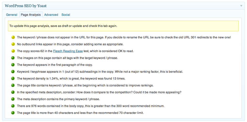
WordPress SEO by Yoast
Joost de Valk and his team of experts over at Yoast developed this plugin. Strictly speaking, it wasn’t designed specifically for writers or writing, but it can definitely help you write better content. It does this by forcing you to target one specific keyword for every page or post created for your WordPress website. Once your keyword is selected, this plugin ensures that you use this keyword throughout your post or page: in body copy, headings, page titles, meta descriptions and more. This way, your content is optimized for the search engines. This plugin can be very handy for writers more experienced in traditional off-line mediums; it takes the guesswork out of search engine optimization for you.
Plus, with over 15 million downloads and a 4.7 star rating, WordPress SEO by Yoast is one of the most popular plugins on the market. It does so much more than help you write better content. If you don’t already have this plugin installed on your WordPress website, then I suggest you jump to it!
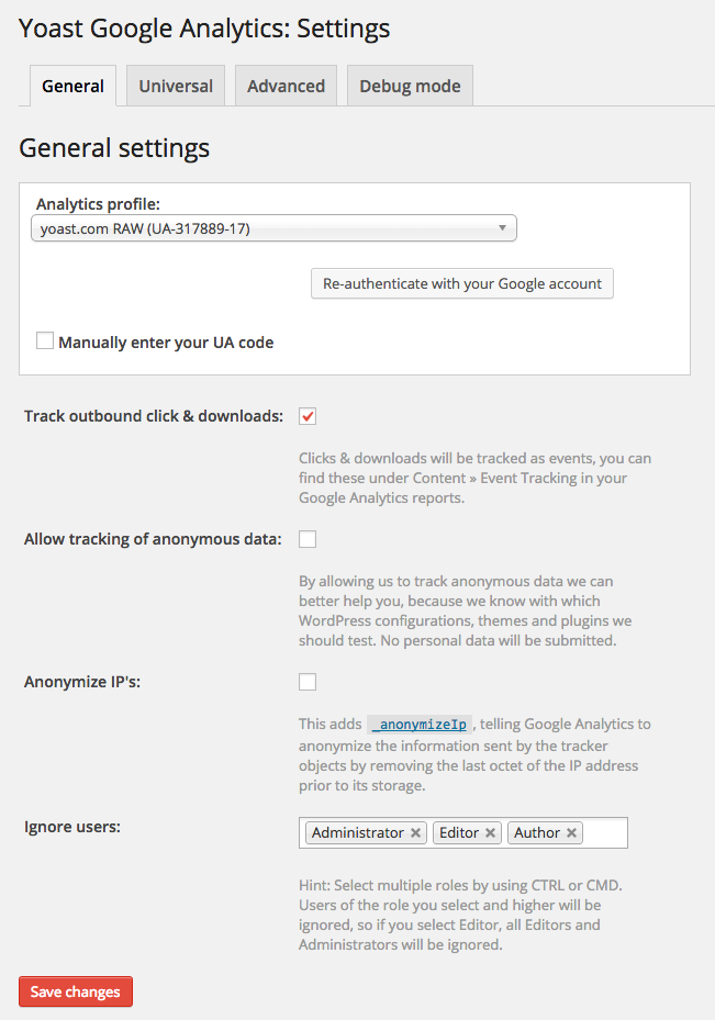
Google Analytics by Yoast
We come to our second plugin from Yoast for the day: Google Analytics by Yoast. Again, while this plugin was not built specifically with writers in mind, it can be invaluable in terms of planning what sort of content to write for your WordPress website. This plugin helps you track just about every website statistic you could ever need. You can keep tabs on demographics, downloads, search results, acquisition, and so much more. Using this plugin, you can determine if your audience is comprised mostly of females or males, and then tailor content to suit. You can see what type of content is performing best, and then create more of this type of content. You can see when posts perform best, and publish more posts around that time of day. It is really more of a holistic, big-picture writers plugin.
Again, with over 7.5 million downloads and a 4.3 star rating, Google Analytics by Yoast is one of the most popular plugins on the market. It does so much more than help you determine what sort of content you should be writing, and when you should be publishing it. If you haven’t already, install this plugin today.
Just Writing
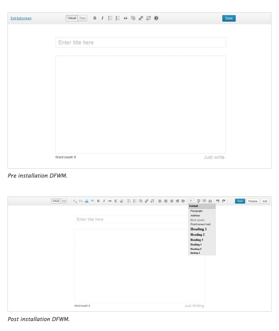
Distraction Free Writing Mode (DFWM) can be the perfect way to focus purely on your writing; nothing more, nothing less. If you’re like me, at some stage or another, you’ve probably wished that there was slightly more functionality available while using DFWM. With the Just Writing plugin, that’s exactly what is on offer. Using this plugin, you can add a whole raft of additional commands to the toolbar (whilst still in DFWM), including spell check, various paragraph styling options, headings, alignment, colours, undo and redo, cut, copy, paste and many more. It will even add a ‘Preview’ button and allows you set which preferences display, and which are hidden.
While this plugin hasn’t had a heap of downloads (only 6,391 at the time of writing), it is regularly updated and has garnered itself a 5 out 5 star rating. It also gives me some confidence that the plugin works well, given that the plugin’s author is Greg Ross, who also built WP Statistics, which has had almost 1 million downloads.
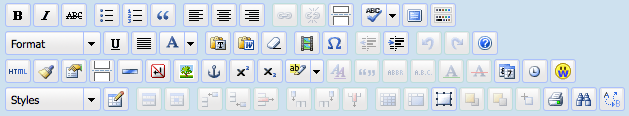
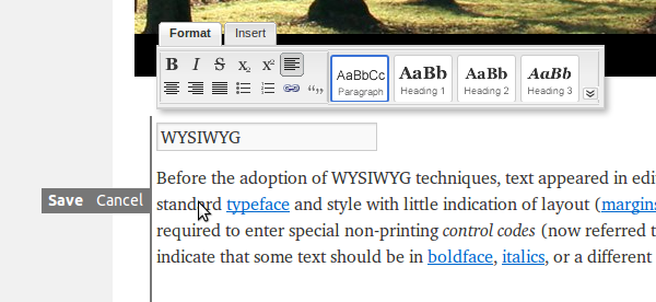
WP Super Edit
This plugin gives you a bit more control over the in-built WordPress WYSIWYG visual editor. Basically, it operates like a framework for TinyMCE, allowing you to rearrange buttons and add plugins to the visual editor using a drag and drop interface. Using WP Super Edit, you can add tables, layers, advanced XHTML, image and link options, emoticons, styles, CSS classes for themes, and even search and replace.
This powerful little plugin is currently undergoing redevelopment, so you may not want to install it right now, but keep it in mind for future use. It’s already had 280,000 downloads, and has a 4 star rating, so it must be doing something right.
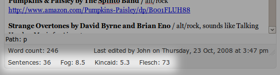
FD Word Statistics
From the team at Flagrant Disregard (that’s where the FD in the name comes from), the Word Statistics plugin is one of the best readability analyses tools available for WordPress posts. It does this by using three different readability measurements:
- Flesch and Flesch-Kincaid measurements: both of which are based on formulas that detect the average number of words per sentence, as well as the average number of syllables per word.
- Gunning Fog: which detects the average number of words per sentence, as well as the number of ‘difficult’ words per paragraph. Words are considered ‘difficult’ if they have three or more syllables.
Once the analysis is complete in a Flesch-Kincaid or a Gunning-Fog style measurement, you are presented with a score. This score represents the number of years of education your reader must have to be able to understand your copy. For more informal writing (such as this), you would be aiming for a score between 7 and 10. For more formal or technical subjects, a higher score would be appropriate. A Flesch test gives you a result as a percentage; the higher the percentage, the better the readability.
With 7,000 downloads, regular software updates and a 5 out of 5 star rating, this isn’t a bad performing plugin at all.
FD Footnotes Plugin
Also from Flagrant Disregard, this plugin allows you to quickly and easily add elegant looking footnotes to your WordPress posts. The plugin employs a natural syntax that is easy for any user to understand and use. All you have to do to add a footnote is add them inline to your post, like so:
![]()
They will then display like this:

Each of your footnotes must include a number, a full stop and then a space, followed by your actual reference. Best of all, you don’t need to remember what number you are up to (particularly handy if you’re writing an extremely long piece of copy); the footnotes will auto-magically renumber themselves when you publish the post. You can include anything you like in your footnotes using this plugin, apart from square brackets.
Updated regularly, this plugin has been downloaded 23,000 times, and has a 4.5 star rating.
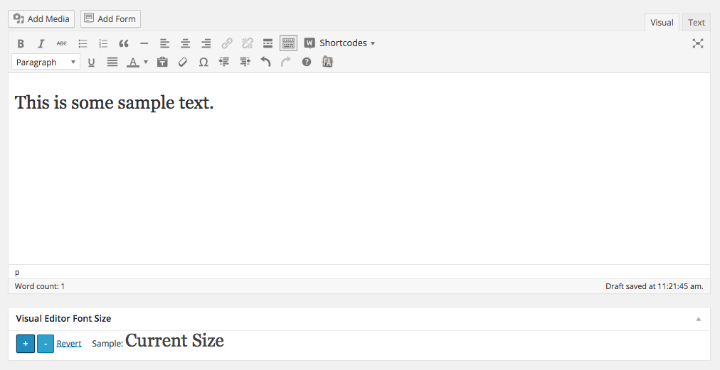
Visual Editor Font Size
If, like me, you spend quite a good deal of time writing in WordPress, chances are you might have found yourself wondering whether you were in need of an eye test! The font size of the WordPress dashboard can be quite miniscule, particularly if you’re used to working in Word documents. With the Visual Editor Font Size plugin you can alter the size of the font in WordPress’ visual editor. This obviously doesn’t change anything on your live site; you are the only person that this plugin will affect.
With more than 25,000 downloads, this plugin is more popular than many of the others I’ve covered today. However, it hasn’t been updated for quite some time, so keep this in mind if you decide to install it on your site.
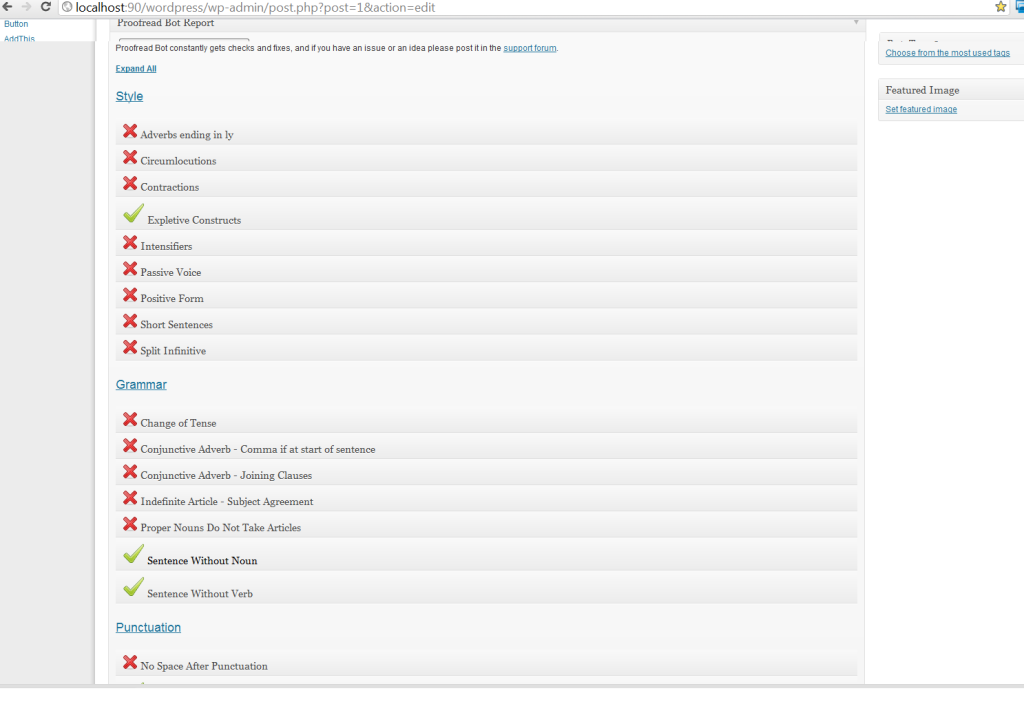
Proofread Bot
Even professional writers make mistakes in their content sometimes. But, with the Proofread Bot plugin, you can eliminate grammatical gaffes and stylistic issues in your content. According to the WordPress Plugin Directory, Proofread Bot uses ‘cutting edge natural language processing’. It even checks your copy for plagiarism using Bing. It’s easy to use: once you’ve installed it on your site, an extra box will appear in your site’s dashboard. Simply click on the ‘Proofread Bot’ button, and after a couple of seconds’ worth of analysis time, you’ll receive a detailed report outlining any issues in your post. Unlike most plugins, there is a small catch when it comes to Proofread Bot: you have access to one free proofread per day, up to a limit of 600 words. Beyond this, you’ll need to purchase a proofreading package.
At the time of writing, Proofread Bot had been downloaded approximately 15,000 times, had a five star rating, and was updated just two weeks ago.
Front End Editor
If, on the odd chance, both you and Proofread Bot happen to miss a typo, then there is the Front End Editor plugin. I don’t know about you, but I like to proofread my WordPress posts and pages directly on my website, on the real, live version of the site, rather than from the dashboard. I think it’s a habit gained from proofing hard-copy print proofs. So, it can be time-consuming, and more than a little frustrating, to have to toggle backwards and forwards between the live site and the dashboard in the back-end. With Front End Editor installed, this problem disappears. It allows you to change content directly on your site (provided that you are logged in). Quite nifty really.
With 241,000 downloads and a 4.3 star rating, there must be quite a few people out there that prefer ‘live’ proofing.
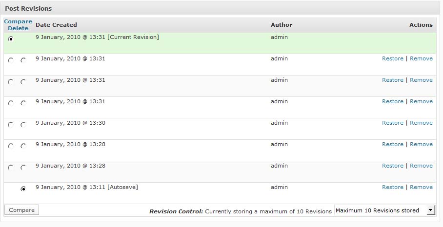
Revision Control
If you prefer to do the proofreading yourself, rather than rely on an automated system, then the Revision Control plugin might be right up your alley. The proofing process often results in multiple revisions of piece, while writers perfect, update and polish their prose. With Revision Control, you have much more control over this process. You can limit the number of revisions allowed by post or page, and save multiple revisions of posts and pages so that you can revert back to them if needs be.
This plugin has more than 253,000 downloads, a 4.5 star rating, and was updated in early January. Although, support is no longer offered on the plugin. So, if you run into any issues, you’re on your own.
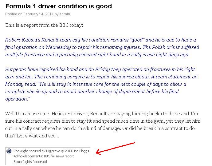
Copyright Proof
As any writer, author, or content marketer will tell you, proving ownership and copyright is getting harder and harder every day. With the veritable explosion of online content over the last few years, it is becoming increasingly difficult to pinpoint the origin of ideas and unique content. With the Copyright Proof plugin, you can go some way towards protecting your work. This plugin allows you to secure a digitally signed and time-stamped certificate of content for each and every one of your WordPress posts. It automatically inserts a combined copyright, certification, licensing, and even attribution notice at end of each of your posts. You can even opt to include an anti-theft feature on all of your copy, and the plugin will record the IP address of anyone attempting to use it. It sounds quite useful in theory, although I haven’t sought professional legal opinion on this plugin, so I’m not 100% certain how it might hold up in a court of law.
This copyright protection plugin has been downloaded more than 67,000 times, and was updated just a few months ago. With a 4.7 star rating, it must be performing as it is advertised…maybe it does hold up in a court of law…
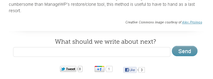
What Should We Write About Next?
I came across this plugin for the first time while researching this article. It is very simple, and quite limited in terms of functionality, but I thought it was a novel idea. It allows your website visitors to leave you feedback about what topic they would like to read about next on your blog. According to its creators, it is a win-win plugin, increasing two-communication with your audience, and generating new blog topics for you.
Built by Vladimir Prelovac, this particular plugin hasn’t had a huge amount of downloads (just over 2,000), but I think it’s quite a novel idea, for the right type of website of course. Just keep in mind that you could use any of the commenting plugins available to achieve the same result, and many of these commenting plugins are much more powerful.
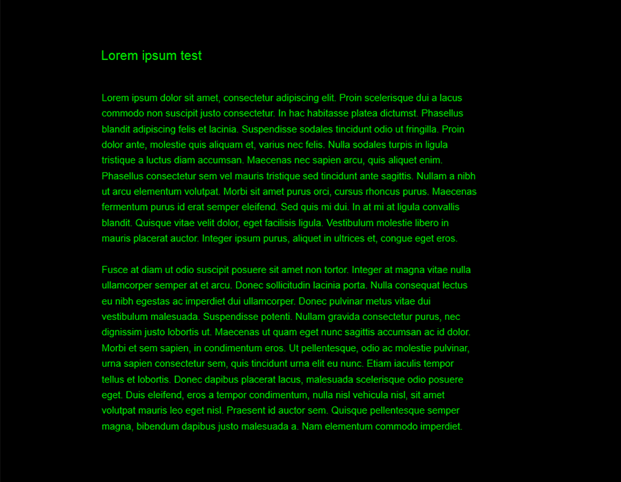
Distraction Free Writing Mode Themes
This is another novel plugin for writers. If you use DFWM regularly, you may tend to become a little bored or put-off by the stark white screen. In fact, if you happen to suffer from a bout of writer’s block, a stark white screen can often only exacerbate the problem. This little plugin can eradicate that issue. You can use it to give your DFWM a theme. There are plenty available (like the black background with lime green text or the starry night sky included below), and more and more are being added all the time. You can even write your own theme (in CSS) and add it to their database. This plugin has only had approximately 2,000 downloads, but it does carry a 4.8 star rating.

A Quick Warning on Novel Plugins
You’ll notice that I have included a couple of ‘novel’ plugins. While these offer new and improved functionality for writers using WordPress, I do urge you to consider whether you really need to install these on your website. The more plugins you install, the more likely it is that your site will run more slowly and require a little more maintenance. Install only the plugins that you really need. That way, you ensure that the performance of your website is as optimized as it can possibly be.
There you have it, a round up of some of the most useful, productivity-enhancing WordPress plugins for writers and writing. If you have any other up your sleeve that deserve a mention, please feel free to let me know in the comments below.
Frequently Asked Questions about WordPress Plugins for Writers
What are the best WordPress plugins for writers?
There are several WordPress plugins that are beneficial for writers. Some of the best include Yoast SEO, which helps optimize your content for search engines, and Grammarly, which checks your writing for grammar and spelling errors. Other useful plugins include Jetpack, which offers a suite of tools for security, performance, and site management, and Editorial Calendar, which helps you schedule and manage your posts.
How do WordPress plugins help writers?
WordPress plugins can help writers in a variety of ways. They can improve your writing by checking for grammar and spelling errors, help you optimize your content for search engines, and even help you manage and schedule your posts. Some plugins also offer features like distraction-free writing modes, which can help you focus and improve your productivity.
Are there any free WordPress plugins for writers?
Yes, there are many free WordPress plugins available for writers. Some of the most popular include Yoast SEO, Jetpack, and Editorial Calendar. However, keep in mind that while these plugins offer a lot of functionality for free, they also offer premium versions with additional features.
How do I install a WordPress plugin?
Installing a WordPress plugin is a straightforward process. From your WordPress dashboard, go to Plugins > Add New. Search for the plugin you want to install, then click “Install Now”. Once the plugin is installed, click “Activate” to start using it.
Can I use multiple WordPress plugins at the same time?
Yes, you can use multiple WordPress plugins at the same time. However, it’s important to be careful not to overload your site with too many plugins, as this can slow down your site and potentially cause conflicts.
How do I choose the right WordPress plugin for my writing needs?
When choosing a WordPress plugin for your writing needs, consider what features you need most. For example, if you struggle with grammar and spelling, a plugin like Grammarly might be helpful. If you want to improve your SEO, consider a plugin like Yoast SEO.
Are there any WordPress plugins for collaborative writing?
Yes, there are several WordPress plugins designed for collaborative writing. These include plugins like Edit Flow, which allows you to collaborate with your team directly within your WordPress dashboard, and Google Docs Embed, which lets you embed Google Docs directly into your posts.
Can WordPress plugins help me improve my writing skills?
Absolutely. Many WordPress plugins offer features that can help you improve your writing skills. For example, plugins like Grammarly can help you identify and correct grammar and spelling errors, while plugins like Yoast SEO can help you learn how to optimize your content for search engines.
How do I update my WordPress plugins?
Updating your WordPress plugins is easy. From your WordPress dashboard, go to Plugins > Installed Plugins. Here, you’ll see a list of all your installed plugins. If a plugin has an update available, you’ll see a notification. Simply click “Update Now” to update the plugin.
Can I use WordPress plugins on any website?
WordPress plugins are specifically designed for websites that are built on the WordPress platform. If your website is not built on WordPress, you won’t be able to use WordPress plugins. However, there are similar tools and extensions available for other website platforms.