 A few years ago, using photographs as a background was the reserve of the daring and those who didn’t worry too much about making their visitors wait while the site loaded. Now with broadband and a good understanding of how to compress image file sizes while maintaining quality, many web designers are using large photographic images as backgrounds for their web sites.
As with all design though, it’s not just a case of slapping something on there and hoping for the best. Designers are using photographs in striking and clever ways.
As the point of most web sites is to communicate information and ideas, it’s vital that the information is both legible and visible. So if you’re using a dark photographic background, you’ll want to steer clear of using dark text. That sounds obvious of course, but sometimes people get excited about using a beautiful image and forget about the information sitting on top.
Another important issue to consider here is that the photographic background has to conform to lots of screen resolutions and monitor sizes. You need to test how the image looks on as many different browser widths as possible, which is not always easy to do. Chris Coyier has a terrific tutorial on how to work with a resizeable background image with CSS.
The examples I’ve picked out below show what I believe to be a strong creative slant combined with sound design principles. Each one has been nicely thought out. There are LOTS of flash sites using this technique so I specifically looked for site built in HTML and CSS for this post. So without further ado, for your viewing pleasure and inspiration here are ten web sites using photographs as backgrounds.
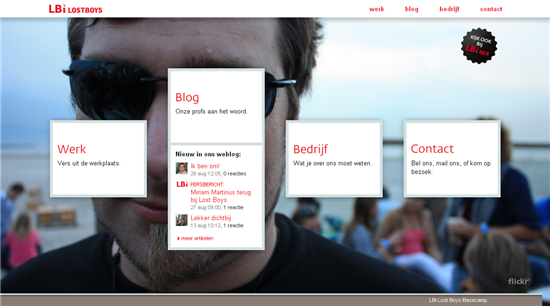
Lbi Lostboys. This one is quite clever. Each time you refresh the page, a new background image is pulled in from Flickr.
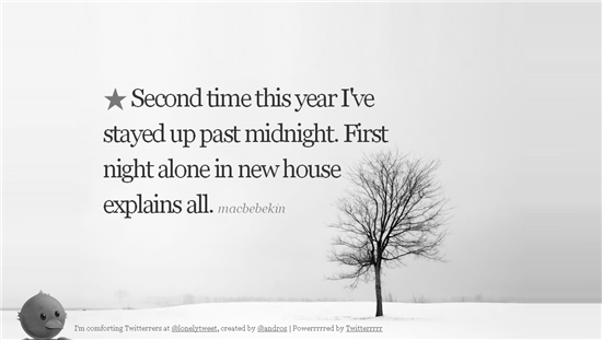
Lonely Twitters. It’s probably best not to look at this if you’ve just broken up with someone. I think it will make you feel more depressed. Nice looking site, though.
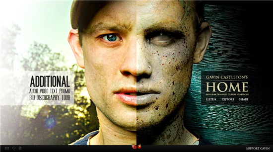
Gavin Castleton has a nice handsome/zombie look going on with his home page.
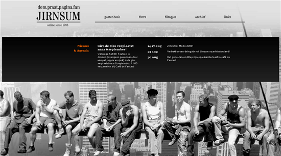
Jirnsum has a cool image reminiscent of the famous New York construction workers photographs of Lewis W. Hine.
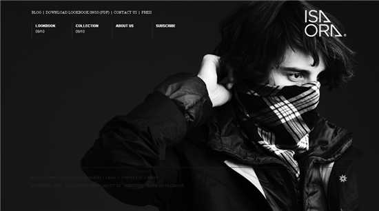
Isaora, looking mean and moody in black and white.
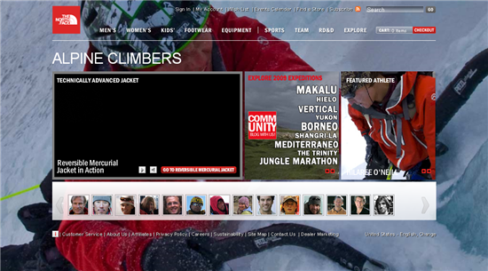
The background of The North Face web site changes on each page. Rollover the small “I” on the bottom left of each page to see a full view of the image.
Jansport has a nice rough grungy feel and large background image.

Coba Hair products use black and white photography for their backgrounds.

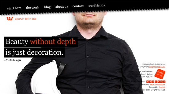
Upstruct, simple and fun.
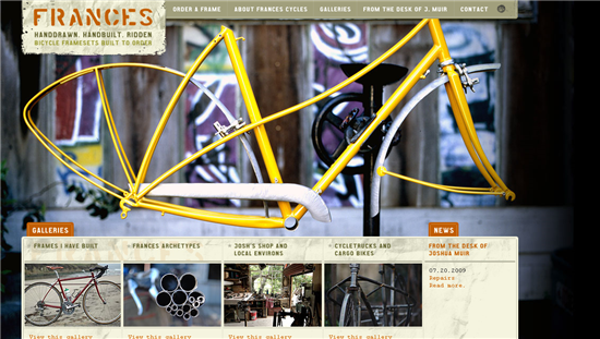
Frances Hand Built Bikes
Is this a style of web design you like? What other sites have you seen that make good use of large photographic backgrounds?
Jennifer Farley is a designer, illustrator and design instructor based in Ireland. She writes about design and illustration on her blog at Laughing Lion Design.


