Perfecting Your Website’s Favicon
Key Takeaways
- A favicon is a small 16 by 16px or 32 by 32px icon that displays in a browser’s bookmarks next to its URL, and it’s a key element in distinguishing your site from others, encouraging return visits and reinforcing your brand.
- When creating a favicon, it’s important to balance positive and negative space, avoid overly complex images, and ensure it’s easily recognizable even at its small size. The favicon can be made in any image editor and should ideally be an abbreviated version of your logo or a signature typeface used on your site.
- Favicons can be uploaded in GIF or PNG file formats for alpha transparency, which allows for distinct non-square shapes in your favicon, adding a touch of creativity to your tiny canvas.
- Once the favicon is created, it can be converted into the .ico format using an online favicon generator, and then placed in the root directory of your website. If the favicon doesn’t show up immediately, clearing the browser cache and restarting the browser usually solves the problem.
What is a Favicon?
When you visit a site that you like, you can add it to your favorites, bookmarking it for later. You can organize your bookmarks fairly well using any browser, but after a while, your bookmarks may begin to pile up. How do you distinguish one bookmark from the other? Maybe you would like to be able to visually recognize a site’s bookmark without having to read every single site name and description. This is where the favicon comes into play. A favicon is the small 16 by 16px or 32 by 32px icon that displays in a browser’s bookmarks (or “favorites”) listing next to its URL. Here, you can place your logo or a small, recognizable image that represents your site effectively with just a handful of pixels.
Creating a Favicon
You can build a favicon in just about any image editor that you’d like. You will have to convert your file later, but the initial creation can be done in a program such as Photoshop. You can start by creating a new document that is either 32px by 32px, or 16px by 16px. I would suggest starting out at the larger size, because most browsers will shrink the icon to fit its purposes. The larger size would be using for displaying larger icons.
With a blank canvas, the look of your favicon could follow a couple of different routes. If you have an existing website or logo, you will want to incorporate elements of your design into your favicon. You have very limited space, so it will likely be an abbreviated version of your logo or perhaps a signature typeface that you have used on your site.
Working with such a small format can be a pain, but if you are using Photoshop, you can zoom in very far to ensure that your favicon is set up pixel-perfect. Just make sure to view your icon at actual size to make sure it has the desired appearance at its true-to-life dimensions. I zoomed in to 1600% in order to build mine. Working at this near-microscopic level will help when adjusting alignment and sizing; you can simply use the arrow keys to nudge your favicon in one of the cardinal directions.
The key to an effective favicon is having a balance between positive and negative space. If you fill your favicon up too much, there won’t be enough negative space to make out what it is. This is especially true if you are using letters as your favicon.
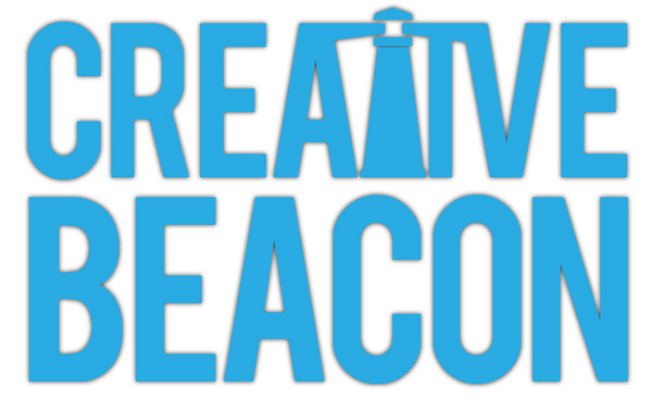
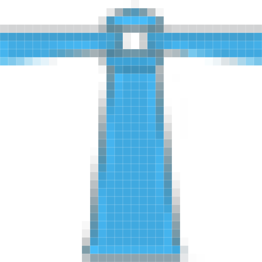
I am going to use Creative Beacon as a real-life example (shown above). The logo consists of the website name with a lighthouse built into the lettering. This provides a nice visual to illustrate the message. Our favicon can go one of two ways. The first might be vetting out the lighthouse and using that as the icon. I did this using the lasso tool and simply copying and pasting. when I zoomed out to true size, I couldn’t tell what it was. You couldn’t make out that it was a lighthouse at all.
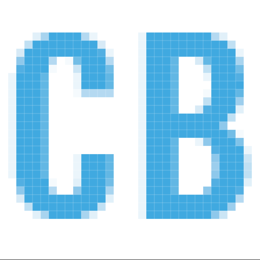
The other idea is to use the first letter in both words of the logo, which of course are “C” and “B”. I used the same typeface, Trade Gothic, and used the same signature blue found in the logo. I centered the letters, but I did not tighten the kerning. Normally, I would pull the “C” and “B” closer together, but we have to remember that this will be 16px by 16px, and negative space will really help to define the forms. This will make them easily readable and recognizable.
You also want to avoid using long or tall images, or anything with a lot of detail, as it will break down at such a small size. After all, you are generally only working with 16px by 16px in your design. The key is to keep it simple.
Let’s compare the two favicons that we created at actual size, and you’ll immediately be able to tell which one is better. In the sample below, the lighthouse isn’t recognizable. The only way that I know it is a lighthouse is because I created the icon. However, you can read the “C” and the “B” very easily. We used colors that contrast well with each other. For example, I wouldn’t use aquamarine as the background color for my favicon, because it would make the letters difficult to read. In this case, the lighthouse just doesn’t work well, so make sure that you choose the right format that goes along with your site.
Favicon File Formats
If you upload a GIF or a PNG file, your favicon will have alpha transparency, so if your icon appears in the tab in Firefox, it won’t have the square background behind it. This can offer some rare creativity for your tiny canvas, because if you desire a distinct non-square shape in your favicon, you can achieve it fairly easily. Notice in the favicon that I created (using a JPEG file format) that the white background shows up in Firefox’s tab, shown below. If you don’t want this, then you will want to save your initial design as a GIF or a PNG.
Uploading Your Favicon
Once you have decided on a favicon, you can search for a favicon generator online. These make it easy for anyone to generate a favicon from a JPEG, GIF, or PNG file type. I found a good favicon generator here. Simply click upload an image in the left menu bar, and select the file that you created in Photoshop earlier. They have an option to shrink to fit a square or to keep as its current format. We wouldn’t want to squish our icon; we already created a square icon to begin with.
You can preview how your favicon will look, and if you are happy with it, you can download your own custom favicon. Once finished, click the download link to download your favicon in the .ico format. Now, all we have to do is place the favicon in the root directory of your website. Browsers will be looking for this when then they bring up your site. Notice in the example below, my new favicon is showing up next to the URL in the browser.
Your favicon might not show up immidiately, especially if you had a generic one in place before. Don’t despair, simply empty the browser cache and restart the browser. If that doesn’t work (especially if you are using Safari) you will have to reset Safari.
Conclusion
Creating a favicon for your site isn’t difficult, but it is something that few designers consider carefully. In a competitive online world, it’s one of few opportunities to distinguish your site from others, and to make returning to your site (by clicking on a browser bookmark) more likely to happen. Having no favicon at all — or worse, the favicon of the CMS software that you’re running your site with — is a common, easily-fixable mistake that makes your website and your bookmarked pages blend in and go unnoticed.
You can create your own custom favicon in minutes. You can make your favicon stand out and encourage return visits by following a few simple rules, such as giving it a lot of contrast, plenty of space, and by keeping your favicon very simple. You want instant recognition, return visits, and brand reinforcement.
Do you have tips that you’d like to share regarding the creation of your custom favicon? Do you have some favorite favicons from the web? Share them with us in the comments below.
Frequently Asked Questions about Perfecting Your Website’s Favicon
What is a favicon and why is it important for my website?
A favicon, short for favorite icon, is a small square image or logo that appears next to a web address. You can usually see favicons in your browser tabs, as well as in lists of bookmarks. Having a favicon for your website is crucial for several reasons. Firstly, it helps with branding and recognition. A unique favicon makes your website stand out in a crowded browser and helps users quickly identify your site. Secondly, it enhances user experience. A favicon provides visual cues to users, helping them navigate tabs more easily. Lastly, it can contribute to your site’s SEO. While a favicon isn’t a direct ranking factor, it can influence user behavior signals that Google considers, such as bounce rate and time spent on site.
How can I create a favicon for my website?
There are several ways to create a favicon. You can design one from scratch using graphic design software like Adobe Photoshop or Illustrator. Alternatively, you can use online favicon generators that allow you to create a favicon by uploading an image and then resizing and cropping it to fit the favicon dimensions. Some popular favicon generators include Favicon.io, Favicon.cc, and Icons8.
What are the best practices for designing a favicon?
When designing a favicon, simplicity is key. Remember, your favicon will be displayed at a small size, so intricate designs may not be clearly visible. Stick to simple shapes and minimal colors. Try to incorporate elements of your brand, such as your logo or brand colors, to maintain consistency. Also, make sure your favicon is legible on different backgrounds, as it may appear on various browser tabs and bookmark lists.
What format should my favicon be in?
The most commonly used format for favicons is ICO, as it’s supported by all browsers. However, you can also use PNG, GIF, or JPEG formats. Some modern browsers even support SVG and WebP formats. It’s a good idea to provide your favicon in multiple formats to ensure it displays correctly across all browsers and platforms.
How do I add a favicon to my website?
To add a favicon to your website, you need to upload the favicon file to your website’s root directory and then add a link to the favicon in your HTML code. The exact process may vary depending on your website platform. For example, if you’re using WordPress, you can add a favicon through the Customizer under Site Identity.
Can I use animated favicons?
While it’s technically possible to create animated favicons using GIFs, it’s generally not recommended. Animated favicons can be distracting and may slow down your website, negatively impacting user experience and SEO.
How can I test if my favicon is working correctly?
After adding a favicon to your website, you should test it to ensure it’s displaying correctly. You can do this by simply opening your website in different browsers and checking if the favicon appears in the browser tab. There are also online tools available that can check your favicon for common issues.
Can I have different favicons for different pages on my website?
Yes, it’s possible to have different favicons for different pages on your website. However, this can be confusing for users and may dilute your branding, so it’s generally best to use a consistent favicon across your entire site.
What size should my favicon be?
The standard size for a favicon is 16×16 pixels. However, modern browsers and devices often display favicons at larger sizes, so it’s a good idea to provide a larger version of your favicon as well. A 32×32 or 64×64 pixel favicon can provide a crisper image on high-resolution displays.
What should I do if my favicon isn’t displaying correctly?
If your favicon isn’t displaying correctly, there could be several reasons. The favicon file may not be in the correct format, or the link to the favicon in your HTML code may be incorrect. You should also check if the favicon file has been uploaded to the correct location on your website. If you’re still having issues, consider using an online favicon checker tool to identify any potential problems.
James George is a professional web developer and graphic designer. James is an expert in design, and a professional web developer, with a special interest in WordPress. Founder of Design Crawl, James has been a professional designer since 2005.
Published in
·Database·Extensions·Installation·Libraries·Performance·Performance & Scaling·PHP·Scaling·July 27, 2015


