Make A Big, Beautiful Call-To-Action Button In Photoshop
Yesterday, I published a post with some guidelines on creating call to action buttons. Today, we’re going to make one in Photoshop. I’m using some fairly bright colors here, but of course you can change the button to suit your own site’s style and color. Let’s get started.
1. Create a new document in Photoshop, 400 x 400 pixels.
2. Select the Rounded Rectangle shape tool (Hit Shift U on the keyboard to cycle through the shape tools) and in the tool options bar, choose “shape layers,” set the radius to 20px and choose whichever color you’d like.
![]()
3. Draw out a rectangle. In the Layers palette you’ll see a new layer with your rectangle on it, with a vector mask thumbnail beside it.
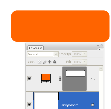
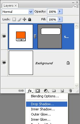
4. We’ll add a few styles to our rectangle to make it look a little more interesting. Make sure the rectangle shape layer is selected, then click on the Fx icon at the bottom of the layers palette. Choose Drop Shadow from the drop down menu.
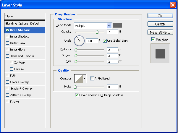
5. I chose the following settings. Blend mode = multiply, color = mid grey #666666, distance = 2, spread = 2, size = 2. Click Ok to apply.
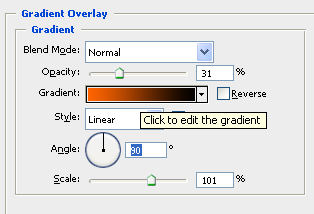
6. Again click on the layer styles icon on the layers palette and choose Gradient Overlay from the drop down menu. Photoshop comes with tons of pre-made gradients, but we’re going to make our own for this button. Click directly on the gradient drop down box (not on the triangle) to edit the gradient.
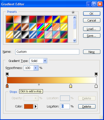
In this case I picked a dark orange for the first color stop on the left, a yellow for the middle and white for the third color stop. (To add a color stop just click under the gradient.)
At this point, the button looks like this. The gradient and drop shadows are subtle but already look much better than the plain rectangle we started with.

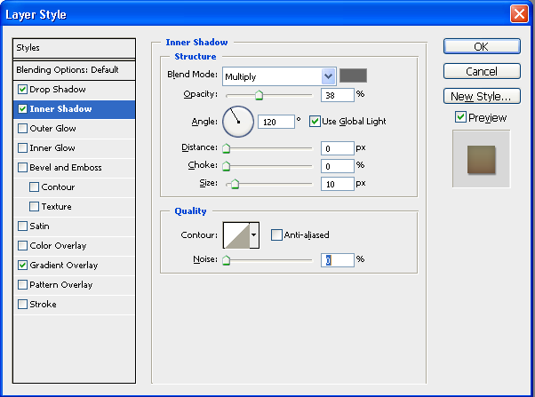
7. The next style to add is also a subtle one. We need a little bit of Inner Shadow, so select that from the layer effects dialog box. I used the following setting: Blend Mode = multiply, color = #666666, Distance = 0, Size = 10px and Opacity set to about 35%.
The button now looks like this.

So I’m going to leave it there with the styles. You could add a stroke or a color overlay, just play around until you find the look you like.
Important Stuff: If you’ve gone to the trouble of creating a button, or any other layer with a number of styles, it’s a good idea to save the styles so that you can use them again without having to go through all of the above. So before you click OK on the Layer Styles dialog box, click New Style and give your style a name and save it.
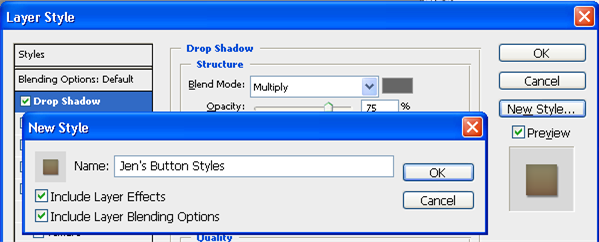
When you want to use it again, open the Layer Styles dialog box, click on the word Styles in the top left corner (yes that is a button!) and you will see all the premade and your own styles in there.
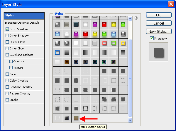
8. OK, now to add some text. Choose the Type tool and then pick a font you like. I’ve used Avenir Heavy, size 38 for “Sign Up Now” and Avenir Medium, size 18 with Tracking 50 for the tagline. Make sure your text and the button are all nicely aligned. I added a drop shadow to “Sign Up” with a Distance = 1 and Size = 5, so the text now looks like this:

I think that looks reasonably smart and eye-catching. You could make the button more elaborate by adding an image or an icon. Keep it simple though.
I love the Firefox and Thunderbird download buttons and the icons they use, but I’m not going to attempt to draw them. I’ll add a Photoshop shape instead.


9. Choose the Custom Shape tool, and from the tool options bar choose the shape you want from the drop down box. I chose a heart because I love ALL of my website visitors.
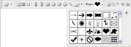
10. Drag out the shape and drop it on the left side of the button. I set the shape color to light blue as a complimentary and contrasting color with the orange button. I added a drop shadow and subtle gradient overlay as before. Now that the shape is taken up some of the button area, you need to move the text a little to the right to give it some breathing space. My final button looks like this.

Related Reading:
Frequently Asked Questions about Creating Call-to-Action Buttons in Photoshop
What are the best colors to use for a call-to-action button?
The best color for a call-to-action button largely depends on the overall design and color scheme of your website. However, research has shown that bright, contrasting colors like red, orange, and green tend to perform well because they stand out on the page. It’s important to test different colors to see what works best for your specific audience and design.
How can I create a phone shape in Photoshop?
Creating a phone shape in Photoshop can be done using the Pen Tool or the Shape Tool. You can start by drawing the outline of the phone, then adding details like the screen, buttons, and speaker. Remember to use layers for each element so you can easily edit them later.
Where can I find free icons and shapes for my call-to-action button?
There are many online resources where you can find free icons and shapes for your call-to-action button. Websites like Freepik and Flaticon offer a wide range of free vectors and icons that you can download and use in your design.
How can I test which color button converts best?
The best way to test which color button converts best is through A/B testing. This involves creating two versions of your call-to-action button with different colors, then showing them to different segments of your audience to see which one performs better.
How can I create a contact shape in Photoshop?
Creating a contact shape in Photoshop can be done using the Shape Tool. You can choose from a variety of pre-made shapes, or you can create your own custom shape using the Pen Tool. Remember to use layers for each element so you can easily edit them later.
How can I make my call-to-action button stand out?
There are several ways to make your call-to-action button stand out. One is by using a contrasting color that catches the eye. Another is by adding a drop shadow or other effects to give the button depth. You can also use large, bold text to make the button’s message clear and compelling.
How can I add text to my call-to-action button in Photoshop?
Adding text to your call-to-action button in Photoshop is easy. Simply select the Text Tool, click on your button, and start typing. You can adjust the font, size, color, and alignment of the text using the options bar at the top of the screen.
How can I create a 3D effect on my call-to-action button?
Creating a 3D effect on your call-to-action button can be done using layer styles in Photoshop. You can add a gradient overlay to give the button a shiny, 3D look, and a drop shadow to give it depth. You can also use the Bevel and Emboss style to add a 3D effect to the edges of the button.
How can I create a hover effect for my call-to-action button in Photoshop?
While Photoshop is primarily a photo editing tool, you can create a mockup of a hover effect for your call-to-action button. This involves creating two versions of your button – one for the normal state and one for the hover state. You can then show these in your design to give an idea of how the hover effect will look.
How can I save my call-to-action button for use on a website?
Once you’re happy with your call-to-action button, you can save it for use on a website by going to File > Save for Web. This will allow you to choose the file format and quality settings that are best suited for web use.
Jennifer Farley is a designer, illustrator and design instructor based in Ireland. She writes about design and illustration on her blog at Laughing Lion Design.
