

Key Takeaways
- Extending the properties of an HTML element in TypeScript can be achieved in two ways: creating an abstraction over one kind of element or defining different elements through polymorphic components, which maintain the same properties and behaviors while rendering as different HTML elements.
- TypeScript requires explicit definition of what props a component will accept, which can be tedious for every single prop. To match the same props used for an HTML element in React, the ‘React.ComponentProps’ can be used. To exclude certain props, the ‘Omit’ utility type can be used.
- To extend the props of a component, an intersection can be used. This allows the component to accept all the properties of the HTML element plus additional ones. This is useful for creating adaptable components that change according to the current theme or for adding new functionalities to standard HTML elements.
In this quick tip, excerpted from Unleashing the Power of TypeScript, Steve shows you how to extend the properties of an HTML element in TypeScript.
In most of the larger applications and projects I’ve worked on, I often find myself building a bunch of components that are really supersets or abstractions on top of the standard HTML elements. Some examples include custom button elements that might take a prop defining whether or not that button should be a primary or secondary button, or maybe one that indicates that it will invoke a dangerous action, such as deleting or removing a item from the database. I still want my button to have all the properties of a button in addition to the props I want to add to it.
Another common case is that I’ll end up creating a component that allows me to define a label and an input field at once. I don’t want to re-add all of the properties that an <input /> element takes. I want my custom component to behave just like an input field, but also take a string for the label and automatically wire up the htmlFor prop on the <label /> to correspond with the id on the <input />.
In JavaScript, I can just use {...props} to pass through any props to an underlying HTML element. This can be a bit trickier in TypeScript, where I need to explicitly define what props a component will accept. While it’s nice to have fine-grained control over the exact types that my component accepts, it can be tedious to have to add in type information for every single prop manually.
In certain scenarios, I need a single adaptable component, like a <div>, that changes styles according to the current theme. For example, maybe I want to define what styles should be used depending on whether or not the user has manually enabled light or dark mode for the UI. I don’t want to redefine this component for every single block element (such as <section>, <article>, <aside>, and so on). It should be capable of representing different semantic HTML elements, with TypeScript automatically adjusting to these changes.
There are a couple of strategies that we can employ:
- For components where we’re creating an abstraction over just one kind of element, we can extend the properties of that element.
- For components where we want to define different elements, we can create polymorphic components. A polymorphic component is a component designed to render as different HTML elements or components while maintaining the same properties and behaviors. It allows us to specify a prop to determine its rendered element type. Polymorphic components offer flexibility and reusability without us having to reimplement the component. For a concrete example, you can look at Radix’s implementation of a polymorphic component.
In this tutorial, we’ll look at the first strategy.
Mirroring and Extending the Properties of an HTML Element
Let’s start with that first example mentioned in the introduction. We want to create a button that comes baked in with the appropriate styling for use in our application. In JavaScript, we might be able to do something like this:
const Button = (props) => {
  return <button className="button" {...props} />;
};
In TypeScript, we could just add what we know we need. For example, we know that we need the children if we want our custom button to behave the same way an HTML button does:
const Button = ({ children }: React.PropsWithChildren) => {
  return <button className="button">{children}</button>;
};
You can imagine that adding properties one at a time could get a bit tedious. Instead, we can tell TypeScript that we want to match the same props that it would use for a <button> element in React:
const Button = (props: React.ComponentProps<'button'>) => {
  return <button className="button" {...props} />;
};
But we have a new problem. Or, rather, we had a problem that also existed in the JavaScript example and which we ignored. If someone using our new Button component passes in a className prop, it will override our className. We could (and we will) add some code to deal with this in a moment, but I don’t want to pass up the opportunity to show you how to use a utility type in TypeScript to say “I want to use all of the props from an HTML button except for one (or more)”:
type ButtonProps = Omit<React.ComponentProps<'button'>, 'className'>;

const Button = (props: ButtonProps) => {
  return <button className="button" {...props} />;
};
Now, TypeScript will stop us or anyone else from passing a className property into our Button component. If we just wanted to extend the class list with whatever is passed in, we could do that in a few different ways. We could just append it to the list:
type ButtonProps = React.ComponentProps<'button'>;

const Button = (props: ButtonProps) => {
  const className = 'button ' + props.className;

  return <button className={className.trim()} {...props} />;
};
I like to use the clsx library when working with classes, as it takes care of most of these kinds of things on our behalf:
import React from 'react';
import clsx from 'clsx';

type ButtonProps = React.ComponentProps<'button'>;

const Button = ({ className, ...props }: ButtonProps) => {
  return <button className={clsx('button', className)} {...props} />;
};

export default Button;
We learned how to limit the props that a component will accept. To extend the props, we can use an intersection:
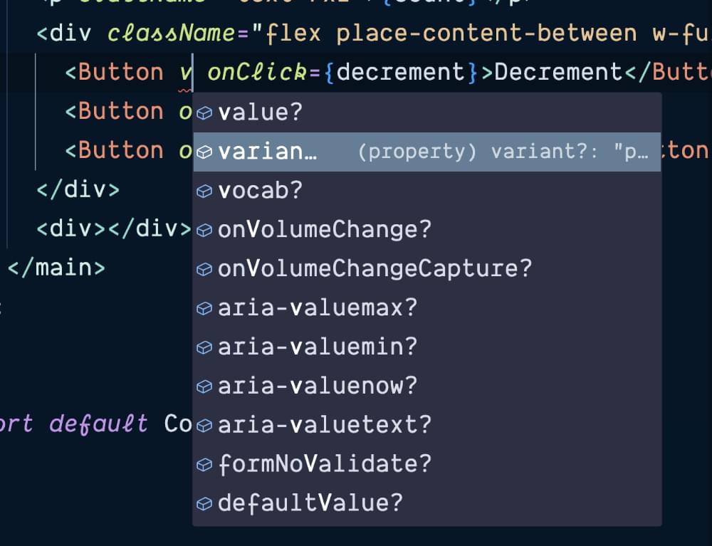
type ButtonProps = React.ComponentProps<'button'> & {
  variant?: 'primary' | 'secondary';
};
We’re now saying that Button accepts all of the props that a <button> element accepts plus one more: variant. This prop will show up with all the other props we inherited from HTMLButtonElement.
We can add support to our Button to add this class as well:
const Button = ({ variant, className, ...props }: ButtonProps) => {
  return (
    <button
      className={clsx(
        'button',
        variant === 'primary' && 'button-primary',
        variant === 'secondary' && 'button-secondary',
        className,
      )}
      {...props}
    />
  );
};
We can now update src/application.tsx to use our new button component:
diff --git a/src/application.tsx b/src/application.tsx
index 978a61d..fc8a416 100644
--- a/src/application.tsx
+++ b/src/application.tsx
@@ -1,3 +1,4 @@
+import Button from './components/button';
 import useCount from './use-count';

 const Counter = () => {
@@ -8,15 +9,11 @@ const Counter = () => {
       <h1>Counter</h1>
       <p className="text-7xl">{count}</p>
       <div className="flex place-content-between w-full">
-        <button className="button" onClick={decrement}>
+        <Button onClick={decrement}>
           Decrement
-        </button>
-        <button className="button" onClick={reset}>
-          Reset
-        </button>
-        <button className="button" onClick={increment}>
-          Increment
-        </button>
+        </Button>
+        <Button onClick={reset}>Reset</Button>
+        <Button onClick={increment}>Increment</Button>
       </div>
       <div>
         <form
@@ -32,9 +29,9 @@ const Counter = () => {
         >
           <label htmlFor="set-count">Set Count</label>
           <input type="number" id="set-count" name="set-count" />
-          <button className="button-primary" type="submit">
+          <Button variant="primary" type="submit">
             Set
-          </button>
+          </Button>
         </form>
       </div>
     </main>
You can find the changes above in the button branch of the GitHub repo for this tutorial.
Creating Composite Components
Another common component that I typically end up making for myself is a component that correctly wires up a label and input element with the correct for and id attributes respectively. I tend to grow weary typing this out over and over:
<label htmlFor="set-count">Set Count</label>
<input type="number" id="set-count" name="set-count" />
Without extending the props of an HTML element, I might end up slowly adding props as needed:
type LabeledInputProps = {
  id?: string;
  label: string;
  value: string | number;
  type?: string;
  className?: string;
  onChange?: ChangeEventHandler<HTMLInputElement>;
};
As we saw with the button, we can refactor it in a similar fashion:
type LabeledInputProps = React.ComponentProps<'input'> & {
  label: string;
};
Other than label, which we’re passing to the (uhh) label that we’ll often want grouped with our inputs, we’re manually passing props through one by one. Do we want to add autofocus? Better add another prop. It would be better to do something like this:
import { ComponentProps } from 'react';

type LabeledInputProps = ComponentProps<'input'> & {
  label: string;
};

const LabeledInput = ({ id, label, ...props }: LabeledInputProps) => {
  return (
    <>
      <label htmlFor={id}>{label}</label>
      <input {...props} id={id} readOnly={!props.onChange} />
    </>
  );
};

export default LabeledInput;
We can swap in our new component in src/application.tsx:
<LabeledInput
  id="set-count"
  label="Set Count"
  type="number"
  onChange={(e) => setValue(e.target.valueAsNumber)}
  value={value}
/>
We can pull out the things we need to work with and then just pass everything else on through to the <input /> component, and then just pretend for the rest of our days that it’s a standard HTMLInputElement.
TypeScript doesn’t care, since HTMLElement is pretty flexible, as the DOM pre-dates TypeScript. It only complains if we toss something completely egregious in there.
You can see all of the changes above in the input branch of the GitHub repo for this tutorial.
This article is excerpted from Unleashing the Power of TypeScript, available on SitePoint Premium and from ebook retailers.