
Analytics are often overlooked as a source of information for UX designers. Many designers don’t consider analytics, and instead base their decisions solely on what they know about user psychology. While this isn’t wrong, analytics offer us more insight into our users, rather users in general. While data-driven design can sound intimidating at first, it’s actually really simple once you know the basics, and in this article we’ll learn those basics as we familiarize ourselves with the #1 web analytics tool, Google Analytics.
With over 50 million users, Google Analytics is the most widely used website analytics service in the world. It’s also free, forever. With only a small snippet of JavaScript code, you can have Google Analytics set up in minutes. With a little more tweaking, we can use Goal and Event tracking too, which will help you track very specific things such as users completing forms or reaching the checkout.
Let’s start by learning the UI.
Note: if you need a little help installing the Google Analytics tracking code on your website first, here’s a quick guide on how to do that.
Google Analytics UI
Have a look at the screen below (notice the reference numbers).
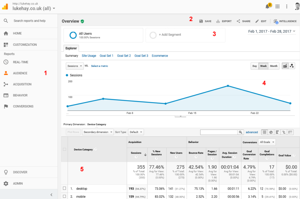
To make the most out of Google Analytics, you’ll need to know the following things:
- Reports (found in the main navigation) are split into the following categories:
- Audience (the users you have)
- Acquisition (how you gained those users)
- Behavior (what those users did on your website)
- Conversions (any Goals/Events you want to track)
- You can save, export and share your reports
- You can segment specific user groups in your reports
- Graphs appear on reports to give you an overview of what’s happening
- Most of your analysis will happen within detailed reports.
Now let’s discuss the key terms.
Dimensions and Metrics
Most detailed reports in Google Analytics will take the form of tables. It’s important to understand the makeup of these tables in order to analyze them. The key terminology, which is common to all reports, are the terms Dimensions and Metrics. Dimensions are a way to group data — a form of categorization or identification. They’re normally shown in the first column of your reports, as things like Country, Page Title and Device Type. Metrics, on the other hand, are the numbers associated with those Dimensions. Metrics appear in the other columns of your reports, showing the numbers relating to the Dimensions in the first column.
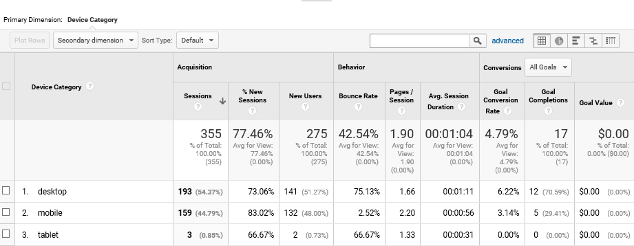
Examples of metrics include Bounce Rate, Avg. Time on Page and Goal Completions, which can help you to better understand the behavior of your users. In follow-up articles, we’ll learn more about these metrics and what they really mean.
Goals
Goals are the metrics that Google Analytics wouldn’t necessary track by default. Goals describe a notable action taken by a user on your website, such as viewing a specific web page, or submitting a specific form, and these require setup. Goals should reflect the key objectives of your website (for example, completing a form). They’ll generally be an indication of how well your website is performing.
Segments
In order to analyze what different types of users are doing on your website, you might want to use Segments to narrow down the data in your reports. Once a segment is applied, the reports will show only the data from demographics that match your segment conditions. Common segmentation types include segmenting users by device (e.g. desktop, tablet or mobile), by country, or by language.
We’ll learn more about segmentation later in a future article.
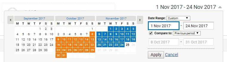
Trends
You need to look at trends over time if you want to extract the most usefulness out of your data. Rather than fixating on individual numbers, you’ll want to see whether your key metrics are increasing or decreasing, and whether this matches what you want your website to achieve. It’s important to analyze data over time by looking at different date ranges. With the date chooser in the top-right corner, you can narrow down your reports to a certain date range. You can also compare two different date ranges, which can be helpful for comparing month-on-month or year-on-year data.
Creating a measurement plan is a good way to understand what KPIs (key performance indicators) you want to measure exactly. This will help you focus on the right objectives of your website and measure the metrics that really matter.
5 Pitfalls to Avoid
Analyzing your data in the wrong way can be worse than not considering it at all. Looking at misleading information may lead you to make the wrong design decisions. Here are some things you should be wary of on your journey:
1. Vanity metrics
If you really want to improve the user experience of your website, focus on the metrics that describe your users’ behavior or demographic. Leave vanity metrics like Number of Visitors for the marketing department to worry about.
2. Getting drawn into the numbers
As mentioned previously, don’t obsess about individual numbers. Instead, you’ll want to analyze trends over time to get a better overview of what’s been happening with your users. Use the date chooser to zoom in on an appropriate date range.
3. Misinterpreting numbers
Increases in some metrics can be positive or negative. For example, if you notice that users are spending more time on your website, this could mean they’re really engaged in your content, or it could mean they’re struggling to find things and leaving the website frustrated. Don’t rush to draw conclusions; keep investigating.
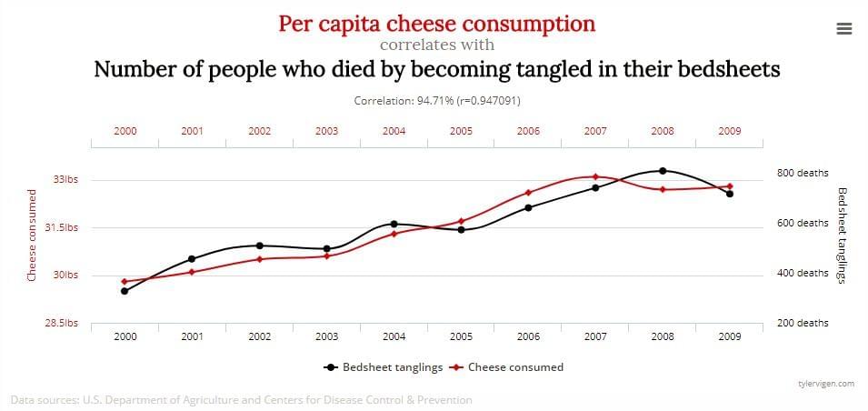
4. Confusing correlation and causation
Just because something changes in your analytics right about the same time that you make a change to the website doesn’t mean the two are connected in any way. If you notice changes in your analytics after making a design change, you should delve deeper into your reports to be sure it’s not a coincidence.
5. Walking away from analytics with no actionable takeaways
While it’s obviously good to understand what’s happening with your users by observing analytics, truly useful insights will give you actionable takeaways. When you discover interesting insights in your reports, make sure you always know what to do with them. For example, if the reports indicate an issue with the performance of a certain web page, what will your next step be? Perhaps you’ll want to run some usability testing on that page to find out what the issue is?
Conclusion
After reading this article, you should now have a fundamental understanding of how Google Analytics works, where to find certain reports, what the key terms mean, and how you should approach data-driven design. If you still have questions about how Google Analytics works, don’t worry, we’ll dive into more detail in the next article as we discuss how to conduct user research with Google Analytics.
If you can’t wait for that, I’ve also written a book for SitePoint covering this topic in detail: Researching UX: Analytics.
 Luke Hay
Luke Hay is a UK-based UX Consultant who’s been working with websites since the 1990s. He prides himself on taking a user-centric, analytical approach to design, development and optimization of websites and apps. Luke currently splits his time between working as the Senior User Researcher at digital transformation agency Clearleft, and as a freelance UX and analytics consultant and trainer. Always involved in his local digital community, Luke has helped organize and curate events for UX Brighton, and is one of the organizers of UX Camp Brighton.