
This article was peer reviewed by Giulio Mainardi. Thanks to all of SitePoint’s peer reviewers for making SitePoint content the best it can be!
Imagine your designer asked you to implement a beautiful frame by frame animation for the awesome project you’ve been working on. As the front-end dev on the project, not only is it up to you to come up with a working animation, but also to deliver a silky smooth, performant and maintainable frame by frame animation that works great across different browsers, both on desktop and mobile.
This tutorial shows you the various ways you can create this type of animation with HTML, CSS, and JavaScript, while improving on each iteration to achieve the best result for your project.
Key Takeaways
- Frame by frame animation offers a range of techniques using CSS and JavaScript, each with unique benefits and drawbacks, allowing developers to choose based on specific project needs.
- Using SVG for animations enhances scalability and responsiveness across different screen sizes, making it preferable over GIFs, especially for complex interactive animations.
- Sprite-based animations and CSS keyframe animations can significantly reduce the number of HTTP requests and improve rendering performance, crucial for maintaining smooth user experiences.
- Transform properties in CSS, particularly when combined with hardware acceleration, can optimize performance by minimizing repaints and reflows, leading to smoother animations especially on mobile devices.
- Considerations for choosing the right animation technique include scalability, responsiveness, performance, and ease of maintenance, with the ultimate goal of enhancing user engagement and interaction on web platforms.
What Is a Frame by Frame Animation?
According to this definition by Adobe, a frame by frame animation:
… changes the contents of the Stage in every frame. It is best suited to complex animation in which an image changes in every frame instead of simply moving across the Stage.
In other words, the subject of the animation is represented in a set of images. Each image in the set occupies an animation frame, and the rate of change with which each frame replaces the next produces the illusion of motion in the image.
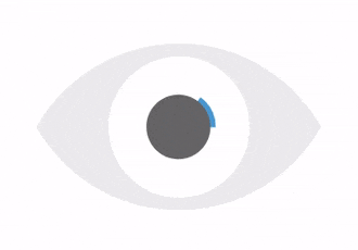
I will demonstrate the whole workflow as you’ll be working on this great blinking eye animation from Zeiss website.
This is the set of images you’ll be using to build the animation frames:
And here’s the final result:

For this tutorial, I’ve chosen to use SVG images because they are great at scaling with different screen sizes for responsive web design. However, if for whatever reason you don’t want to use SVG graphics, you can create web animations with PNG, JPEG, and GIF image formats or use HTML5 Canvas. I will share my thoughts on these alternatives at the end of the article.
For simplicity’s sake, in this tutorial you’ll be using the jQuery library and have Autoprefixer up and running, therefore the code will be free of browser-specific CSS prefixes.
Now, let’s do some coding!
1 — Frame by Frame Animation by Changing the Image’s Source
The first option is straightforward enough, and that’s one reason why I like it.
In your HTML document, create an img element, which acts as container for the images, one at a time, as each animation frame is replaced by the next:
<img class="eye-animation"

  src="/images/Eye-1.svg"

  alt="blinking eye animation"/>
The CSS:
.eye-animation {

  width: 300px;

}
The next step is to replace the existing image with the next one over a period of time dynamically, so as to create the illusion of movement.
You could do it with setTimeout but it’s better to use requestAnimationFrame. Doing so has some advantages from the point of view of performance. For example:
- The quality of other animations on the screen won’t be affected
- The browser will stop the animation if users navigate to another tab.
Here’s the jQuery code:
const $element = $('.eye-animation');

const imagePath = '/images';

const totalFrames = 18;

const animationDuration = 1300;

const timePerFrame = animationDuration / totalFrames;

let timeWhenLastUpdate;

let timeFromLastUpdate;

let frameNumber = 1;
function step(startTime) {

  if (!timeWhenLastUpdate) timeWhenLastUpdate = startTime;
  timeFromLastUpdate = startTime - timeWhenLastUpdate;
  if (timeFromLastUpdate > timePerFrame) {

    $element.attr('src', imagePath + `/Eye-${frameNumber}.svg`);

    timeWhenLastUpdate = startTime;
    if (frameNumber >= totalFrames) {

      frameNumber = 1;

    } else {

       frameNumber = frameNumber + 1;

    }

  }
  requestAnimationFrame(step);

}
When the page loads, you call requestAnimationFrame for the first time and pass the step function to it, together with the animation’s startTime parameter built into the requestAnimationFrame function.
At each step the code checks how much time has passed from the last image source update and, if it’s longer than the required time per frame, then it refreshes the image.
Because you’re building an infinite animation, the code above checks if it’s got to the last frame and if so, it resets the frameNumber to 1; if not, it increases the frameNumber by 1.
Images should have the same name structure made of an increasing number series and the same location (e.g., images/Eye-1.svg, images/Eye-2.svg, images/Eye-3.svg, etc.) so that the code can easily iterate through them.
Finally, call requestAnimationFrame again to continue the whole process.
It looks good. However, if you try this you’ll see it won’t work because when the animation starts, only the first image gets loaded. The reason for this is that the browser knows nothing about the images you want to display until the code updates the image element’s src attribute in the middle of the animation loop. For a smooth animation, you need to preload the images before the loop starts.
There are different ways you can do this. Here’s the one I like best. It consists in appending hidden divs and setting their background-image property to point to the required images.
The jQuery code:
$(document).ready(() => {

  for (var i = 1; i < totalFrames + 1; i++) {

    $('body').append(`<div id="preload-image-${i}" style="background-image: url('${imagePath}/Eye-${i}.svg');"></div>`);

  }

});
Here’s the full working demo on CodePen:
See the Pen Frame by frame-animation-1-source by SitePoint (@SitePoint) on CodePen.
Below I’ve listed some pros and cons to this approach.
Cons:
- With
HTTP v1.1, having to load multiple images can significantly increase page load time on the first visit - The animation can be janky on mobile devices. That’s because the browser has to perform a repaint each time the image element’s
srcattribute is updated (please check out Paul Lewis’ blog post for the details).
Pros:
- Declarative — the code just iterates through the set of images
- The image is fixed in one place — no jumping back and forth is visible (you’ll see why this is important below).
2 — Frame by Frame Animation by Changing the Image’s Opacity
To avoid browser repaints, you could change the images’ opacity instead of changing their source.
You could render all the images with opacity: 0 at page load and then set opacity: 1 for exactly when you want to show that frame.
That would improve rendering performance, but you’ll still have to preload all the images up front (which could be tricky if you have other images on the page as well and don’t want to wait for all of them to load). Also, because of multiple images, you’ll still have a longer first-time page load duration.
Here’s the full code:
See the Pen Frame-by-frame-animation-2-opacity by SitePoint (@SitePoint) on CodePen.
You can avoid HTML code duplication by leveraging the capabilities of template engines such as Pug, Twig, React, Angular etc., or by just appending the divs using JavaScript as you did in the previous example.
3 — Frame by Frame Animation by Changing the Sprite’s Position
The usual workaround to prevent having to download multiple images consists in using an image sprite.
So, let’s do that.
Put all your images in one sprite by creating a line of frames that preserves the images’ order, i.e., the first image will be the leftmost and the last image will be the rightmost. Then, using CSS animations, move the sprite left to right frame by frame.
The HTML:
<div class="eye-animation"></div>
The CSS:
.eye-animation {

  width: 300px;

  height: 300px;
  background-image: url('/images/blinking-eye-sprite.svg');

  background-size: 1800%, 100%;

  background-position: left;

  background-repeat:no-repeat;
  animation-name: eye-fill;

  animation-duration: 1.3s;

  animation-timing-function: steps(17);

  animation-iteration-count: infinite;

}
@keyframes eye-fill {

  from {

    background-position: left;

  }

  to {

    background-position: right;

  }

}
The code above sets the background-size property depending on the number of frames — because there are 18 frames, it sets it to 1800%.
The initial background-position is left so that at the beginning of the animation, the first image is shown.
Then, with keyframes animation, the code gradually changes the position of the background to right over the time set in the animation-duration property (1.3s in the example above).
The animation-timing-function property allows you to build a step by step animation which ensures users won’t see half of one frame and half of the following frame both at the same time. This introduction to CSS sprite sheet animation by Chris Mabry is a perfect explanation of how this approach works.
And you don’t need JavaScript. Yay!
See the Pen Frame-by-frame-animation-3-position by SitePoint (@SitePoint) on CodePen.
Cons:
- It requires a browser repaint each time the sprite’s position changes, which can lead to janky animation on mobile
- If the image’s width in pixels has many digits after the decimal point, the image can wobble left and right during the animation (though rounding the image’s size to 2 digits after the decimal point should be enough to fix the problem):
Pros:
- No JavaScript
- Only one image to load, which is good for first-time page load performance.
4 — Frame by Frame Animation by Moving the Sprite with Transform
Same as previously, you’re now going to upgrade the solution implemented above in such a way as to avoid a browser repaint. You will do this by changing only the transform property of the element rather than its background-position.
For this purpose, put the div you want to animate inside a wrapper. This enables you to translate the position of the whole HTML element instead of its background.
Next, position this div absolutely inside the wrapper and start animating it with the help of the translateX property.
The weird -94.44444444% comes from having 18 slides and moving the image only 17 slides from the first one (17 / 18 * 100%).
The HTML:
<div class="eye-animation__wrapper">

  <div class="eye-animation"></div>

</div>
The Sass code (feel free to use CSS, if you prefer):
.eye-animation {

  width: 1800%;

  height: 100%;

  background-image: url('/images/blinking-eye-sprite.svg');

  background-size: 100%, 100%;

  background-repeat:no-repeat;
  animation-name: eye-fill;

  animation-duration: 1.3s;

  animation-timing-function: steps(17);

  animation-iteration-count: infinite;
  position: absolute;

  left: 0;

  top: 0;
  &__wrapper {

    overflow: hidden;

    position: relative;

    width: 300px;

    height: 300px;

  }

}
@keyframes eye-fill {

  from {

    transform: translateX(0);

  }

  to {

    transform: translateX(-94.44444444%);

  }

}
It definitely looks better now!
However, there is one bug in IE, which doesn’t allow for the use of percentage values for the translate property
inside animations. caniuse.com provides an example and explanation for that inside the known issues tab:
IE10 and IE11 on Windows 7 have a bug where translate transform values are always interpreted as pixels when used in animations.
As fallback, you’ll need to detect the browser using JavaScript and provide a separate animation for this specific case.
transform: translate3d(0, 0, 0) below tells the browser to move the element into a separate compositing layer, which improves rendering performance.
Here’s the JavaScript code:
var isIE = /Edge\/\d./i.test(navigator.userAgent) || /trident/i.test(navigator.userAgent);
if (_this.isIE) {

   $('html').addClass('ie');

}
And the Sass code:
// fallback for IE

.ie {

  .eye-animation {

    transform: translate3d(0, 0, 0);

    animation-name: eye-fill-ie;

  }

}
@keyframes eye-fill-ie {

  from {

    left: 0;

  }

  to {

    left: -1700%;

  }

}
Have a play with the code in the live demo below:
See the Pen Frame-by-frame-animation-4-transform by SitePoint (@SitePoint) on CodePen.
Cons:
- Be aware of image quaking if sizes are too precise
- It doesn’t work in IE, though a fallback is available.
Pros:
- Only one image to load, which is good for first-time page load performance
- No janky animation on mobile because no repaints are involved!
Using Inline SVG for Your Frame by Frame Animation
One possible improvement would be inlining the SVG image (i.e., dumping the SVG code straight into your HTML page) instead of pointing to it as an external resource.
Typically, external resources are cached by the browser. This way, on a repeated visit the browser uses the locally cached version of the file instead of making a new request to the server.
However, if the probability of the page being revisited is low (say, a landing page), then it makes sense to use inline SVG, because doing so reduces the number of requests to the server and decreases the first-time page load time.
Sprite-Transform Has the Best Rendering Performance
To be 100% sure about performance, I created a performance test for all four different approaches and this is the result I got using Chrome:
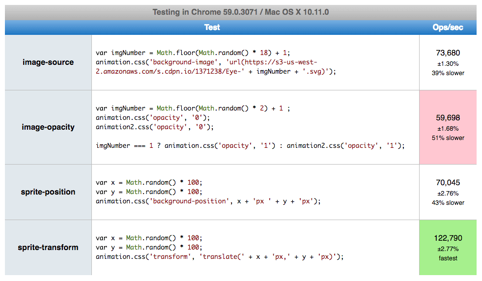
if you want to play with it, you can reproduce the tests using any other browser of your choice on jsPerf.com.
5 – Why Not GIF for Frame by Frame Animation on the Web?
If the ability to scale with different screen sizes is not a requirement, then a GIF file could be an option too. But together with scalability, you’ll also lose the ability to control the animation flow like stop, reverse, or combine it with other animations. And you usually end up increasing the size of the asset, which affects performance.
If you want to deep dive into the reasons why SVG is preferable to GIF, then check out Sara Soueidan’s excellent article on the topic.
6 – Why Not Canvas for Frame by Frame Animation?
If you have a small screen and multiple animated objects at one time, Canvas would be an excellent choice. Performance is fabulous, but this approach comes with several drawbacks:
- In Canvas, you can’t use inline assets, which means this might not be the best choice for one-time visited pages
- Canvas API knowledge is required to build such a solution, which adds to the application maintenance costs
- No support for DOM events — so, for example, you couldn’t do something with the DOM outside of the
canvaselement once the animation is finished.
There are a few more arguments for and against Canvas over SVG, but if you decide to go with Canvas, then head over to William Malone’s tutorial on this topic, which does an outstanding job at explaining how you can achieve the best results.
Conclusion
Nowadays, you have plenty of options for implementing frame by frame web animation. This is generally a good thing, but having to choose what works best could be confusing. The points below will help you make the right decision:
- Use SVG over GIF/PNG/JPEG if you care about scalability and responsiveness
- Animate the
opacityandtransformproperties if you care about rendering performance - Use sprites and inline SVG over multiple external assets if you care about first-time page load performance
- Use sprites over inline SVG if you care about page load performance during repeated page visits
- Use whatever solution you and your team feel comfortable with, if it keeps your code more readable and decreases maintenance costs inside the team.
Which method do you go for to create your frame by frame web animations? Let me know in the comments.
Frequently Asked Questions (FAQs) about Frame-by-Frame Animation with CSS and JavaScript
How can I create a smooth frame-by-frame animation using CSS and JavaScript?
Creating a smooth frame-by-frame animation requires a good understanding of CSS and JavaScript. First, you need to define your animation in CSS using keyframes. This allows you to specify the changes in CSS properties over time, which creates the animation effect. Next, you need to use JavaScript to control the timing and sequence of the animation. This can be done using the requestAnimationFrame method, which allows you to create a smooth animation by updating the animation before the next repaint.
What are the benefits of using CSS and JavaScript for frame-by-frame animation?
CSS and JavaScript offer several benefits for creating frame-by-frame animations. They are both widely supported by modern browsers, making them a reliable choice for web animations. CSS animations are also generally smoother and more efficient than JavaScript animations, as they are run on the browser’s GPU. JavaScript, on the other hand, provides more control over the animation, allowing you to create complex animations with ease.
Can I use CSS and JavaScript to animate SVG images?
Yes, you can use CSS and JavaScript to animate SVG images. SVG, or Scalable Vector Graphics, is a vector image format that is ideal for web animations due to its scalability and resolution independence. You can animate SVG images using CSS by changing their properties over time with keyframes. JavaScript can also be used to control the timing and sequence of the SVG animation.
How can I optimize my frame-by-frame animations for better performance?
Optimizing your frame-by-frame animations can significantly improve their performance. One way to do this is by using the will-change property in CSS. This property allows you to inform the browser ahead of time about what properties will be animated, which can help the browser optimize the animation. Another way to optimize your animations is by using the requestAnimationFrame method in JavaScript, which ensures that your animation updates in sync with the browser’s refresh rate.
What are the common challenges in creating frame-by-frame animations with CSS and JavaScript?
Creating frame-by-frame animations with CSS and JavaScript can be challenging, especially for beginners. One common challenge is synchronizing the animation with the browser’s refresh rate. This can be overcome by using the requestAnimationFrame method in JavaScript. Another challenge is managing the complexity of the animation, especially when dealing with multiple animated elements. This can be mitigated by using CSS animation libraries or JavaScript animation frameworks, which provide pre-defined animation effects and simplify the animation process.
How can I create a frame-by-frame animation with a PNG sequence using CSS and JavaScript?
Creating a frame-by-frame animation with a PNG sequence involves changing the background image of an element over time. This can be done using CSS keyframes and the background-image property. The sequence of images can be controlled using JavaScript, by changing the background image at regular intervals.
Can I use CSS and JavaScript to create interactive animations?
Yes, you can use CSS and JavaScript to create interactive animations. JavaScript allows you to add interactivity to your animations, such as starting, stopping, or changing the animation in response to user actions. CSS, on the other hand, allows you to create the visual effects for the animation.
How can I test and debug my frame-by-frame animations?
Testing and debugging your frame-by-frame animations is crucial to ensure they work as expected. You can use the developer tools in your browser to inspect the animation and identify any issues. You can also use JavaScript to log information about the animation, such as its current state or progress.
Can I use CSS and JavaScript to create 3D animations?
Yes, you can use CSS and JavaScript to create 3D animations. CSS provides properties such as transform and perspective, which allow you to create 3D effects. JavaScript can be used to control the 3D animation, by changing the properties over time.
How can I learn more about frame-by-frame animation with CSS and JavaScript?
There are many resources available online to learn more about frame-by-frame animation with CSS and JavaScript. You can start by reading tutorials and guides, such as the ones on SitePoint. You can also take online courses or watch video tutorials on platforms like Udemy or YouTube. Additionally, practicing by creating your own animations is a great way to learn and improve your skills.