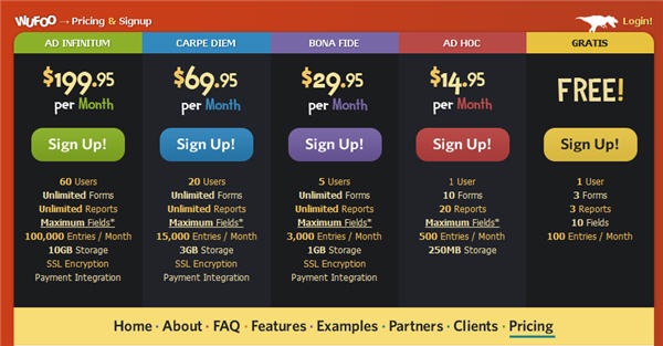
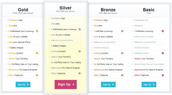
Tables are our friends. They allow us to show large amounts of information in a small space, but when designing tables for print or the web there are a number of guidelines you should keep in mind. The main aim when creating a table of data is to make it easy to digest what otherwise could be a large chunk of textual information. It’s the designer’s job to choose suitable backgrounds, borders, typography and images that go into a table to make it eye-catching and informative.
1. Breathing Space. Make sure the data in the table cell has some padding around it so that the information is easy to read.
Big Cartel
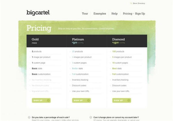
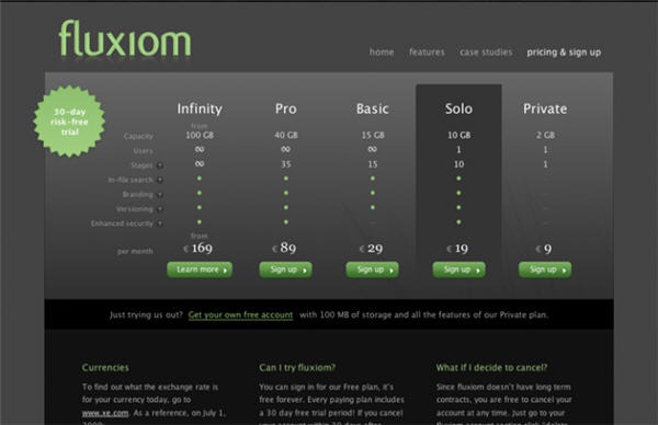
2. Typography. Generally it’s a good idea to avoid script and decorative typefaces and instead choose clean, legible serif or sans-serif fonts.
Fluxiom
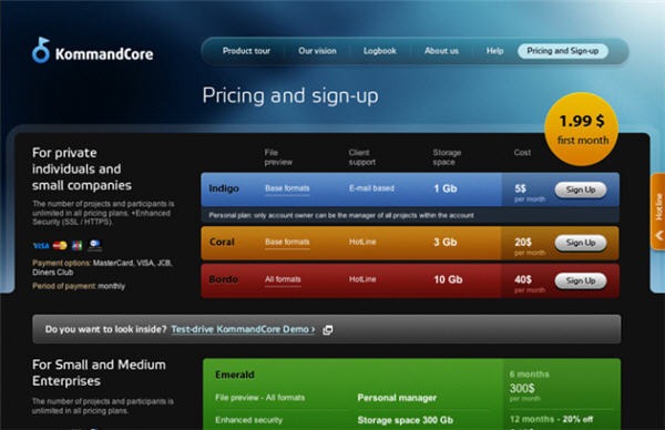
3. Color Coding. You can use colors to catch the eye and also to group related information together. In the Wufoo example below the color used for the name of each of their plans is repeated in the Sign Up call to action button within the table.
Colors can also be used to highlight individual rows or columns in a table. Designers frequently alternate a background color in every second row of a horizontal table because it makes the information easier to read across the page. If you want to highlight information going down the page, use alternating colors for each column backdrop.
KommandCore
Mindmeister

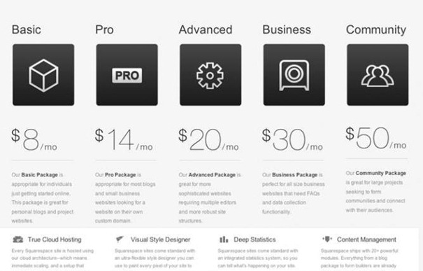
4. Images and Icons. A picture tells a thousand words as the saying goes and you may find your table benefits from adding an image or an icon. The Squarespace table below uses some fairly generic looking icons but they do add visual interest and break up what could otherwise be a very “wordy” table.
Squarespace
5. Background Images. You can use images in the background of your table to add visual interest but always make sure the information is legible. Avoid using backdrops that compete visually or thematically with the content which overlays it. In the example below, InGloss use a simple yellow gradient which helps the “Silver” service stand out while keeping the information easy to read.
Most of these tables shown here are used to provide pricing information for their services but the concepts are the same regardless of the type of information you want to convey. While many of these tables are colorful, there is also a consistency between them and the web sites they’re on.
What other guidelines would you add when designing tables for the web?
Jennifer Farley is a designer, illustrator and design instructor based in Ireland. She writes about design and illustration on her blog at Laughing Lion Design.
