

Key Takeaways
- The article explains how to design fancy forms using CSS, with the same HTML markup but different CSS rules for each form layout.
- The author suggests using an ordered list within the fieldset elements in the HTML. This adds an extra level of semantics to the form structure and makes the form display well, even in the absence of styles.
- The author also provides a detailed explanation of how to apply general form styling, focusing mainly on the inclusion of whitespace to separate form elements and fieldset elements.
- The article includes a FAQ section answering common questions about styling form fieldsets, legends, input fields, submit buttons, and more with CSS.
Using the CSS
To create each of these different types of form layouts, we’ll use identical markup, but with different CSS rules.
In our example, the HTML looks like this:
<form action="example.php">
<fieldset>
<legend>Contact Details</legend>
<ol>
<li>
<label for="name">Name:</label>
<input id="name" name="name" class="text" type="text" />
</li>
<li>
<label for="email">Email address:</label>
<input id="email" name="email" class="text" type="text" />
</li>
<li>
<label for="phone">Telephone:</label>
<input id="phone" name="phone" class="text" type="text" />
</li>
</ol>
</fieldset>
<fieldset>
<legend>Delivery Address</legend>
<ol>
<li>
<label for="address1">Address 1:</label>
<input id="address1" name="address1" class="text"
type="text" />
</li>
<li>
<label for="address2">Address 2:</label>
<input id="address2" name="address2" class="text"
type="text" />
</li>
<li>
<label for="suburb">Suburb/Town:</label>
<input id="suburb" name="suburb" class="text"
type="text" />
</li>
<li>
<label for="postcode">Postcode:</label>
<input id="postcode" name="postcode"
class="text textSmall" type="text" />
</li>

<li>
<label for="country">Country:</label>
<input id="country" name="country" class="text"
type="text" />
</li>
</ol>
</fieldset>
<fieldset class="submit">
<input class="submit" type="submit"
value="Begin download" />
</fieldset>
</form>
This HTML uses exactly the same fieldset-legend-label structure that we saw earlier in this chapter. However, you should see one glaring addition: inside the fieldset elements is an ordered list whose list items wrap around each of the form element/label pairs that we’re using.
The reason for this addition? We need some extra markup in order to allow for all of the styling that we’ll do to our forms in this chapter. There are just not enough styling hooks in the standard fieldset-label structure to allow us to provide robust borders, background colors, and column alignment.
There are a number of superfluous elements that we could add to the form that would grant us the extra styling hooks. We could move the form elements inside their label elements and wrap the label text in a span, or wrap a div around each form element/label pair. However, none of those choices would really contribute anything to the markup other than its presence.
The beauty of using an ordered list is that it adds an extra level of semantics to the structure of the form, and also makes the form display quite well in the absence of styles (say, on legacy browsers such as Netscape 4, or even simple mobile devices).
With no CSS applied and without the ordered lists, the rendered markup would appear as in Figure 6.
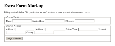
Figure 6: Unstyled form without any superfluous markup (See larger image in new window.)
Figure 7 shows how the unstyled form looks when we include the ordered lists.
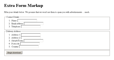
Figure 7: Unstyled form that includes an ordered list inside each fieldset
(See larger image in new window.)
I’m sure you’ll agree that the version of the form that includes ordered lists is much easier to follow, and hence fill out.
Using Lists in Forms If you’re vehemently opposed to the inclusion of an ordered list inside your form.markup, you can easily substitute it for some other wrapper element; all you need is one extra container around each form element/label pair in order to style your forms any way you want.
Two other HTML oddities that you might have picked up on:
- Each form input has a class that replicates its type attribute, for example
class="text" type="text". If you need to style a form element, this is a handy way of accessing it, given that Internet Explorer 6 and earlier don’t support CSS attribute selectors (although Internet Explorer 7 does, so you mightn’t need to include these extra classes in the near future). - The form submit button is contained inside its own
fieldsetwithclass="submit.” You’ll frequently have multiple actions at the end of a form, such as “submit” and “cancel.” In such instances, it’s quite handy to be able to group these actions, and afieldsetdoes this perfectly. If any styles are applied to normalfieldsetelements, you’ll most often want to have a different style for thefieldsetsurrounding these actions, so the class is necessary to distinguish our actionsfieldset. Thefieldsetand theinputinside it both have the same class name because the term “submit” makes sense for both of them, but it’s easy to distinguish them in the CSS by preceding the class selector with an element selector, as we’ll see below.
Applying General Form Styling
There are a number of styles which we’ll apply to our forms, irrespective of which layout we choose. These styles revolve mainly around the inclusion of whitespace to help separate form elements and fieldset elements:
fieldset {
margin: 1.5em 0 0 0;
padding: 0;
}
legend {
margin-left: 1em;
color: #000000;
font-weight: bold;
}
fieldset ol {
padding: 1em 1em 0 1em;
list-style: none;
}
fieldset li {
padding-bottom: 1em;
}
fieldset.submit {
border-style: none;
}
The margin on the fieldset helps to separate each fieldset group from the others. All internal padding is removed from the fieldset now, because later on it’ll cause problems when we begin floating elements and giving them a width. Since padding isn’t included in the width, it can break the dimensions of your form if you have a width of 100% and some padding. Removing padding also helps to sort out inconsistencies between browsers as to the default internal spacing on the fieldset.
To help define a visual hierarchy that clearly shows each label inside the fieldset grouped under the legend, we give our legend elements a of bold. We also have to replace the spacing that was removed from the padding on the fieldset, so we give the legend a margin-left of 1em.
In order to turn off the natural numbering that would appear for the ordered list, we set list-style to none on the ol, and thus remove any of the bullet formatting that normally exists in such a list. Then, to recreate the internal spacing which we removed from the fieldset, we give the ordered list some padding. No padding is put on the bottom of the list, because this will be taken up by the padding of the last list item.
To separate each form element/label pair from each other pair, we give the containing list item a padding-bottom of 1em.
Finally, to remove the appearance of the submit button as a form element group, we need to take the borders off its surrounding fieldset. This step is achieved by targeting it using the fieldset.submit selector and setting the border-style to none.
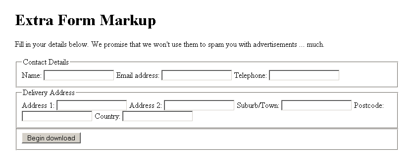
After applying all of this markup and adding some general page layout styles, we end up with Figure 8 — a form that’s beginning to take shape, but is still a bit messy.
Figure 8: Form with general styling applied, but no layout styles
Now we can go ahead and add in some layout styles!
Frequently Asked Questions (FAQs) about Fancy Form Design with CSS
How can I style a form fieldset using CSS?
Styling a form fieldset using CSS is quite straightforward. First, you need to select the fieldset in your CSS file or style tag. You can do this by simply typing “fieldset” followed by curly braces. Inside these braces, you can define the styles you want. For example, you can set the border color and width, background color, margin, padding, and more. Here’s a simple example:fieldset {
border: 2px solid #f00;
background-color: #fff;
margin: 10px;
padding: 20px;}
This will give your fieldset a 2px solid red border, a white background, a margin of 10px, and a padding of 20px.
How can I style the legend of a fieldset?
The legend of a fieldset can also be styled using CSS. You can select it by typing “legend” in your CSS file or style tag. You can then define the styles you want, such as font size, color, background color, padding, and more. Here’s an example:legend {
font-size: 20px;
color: #f00;
background-color: #fff;
padding: 5px 10px;}
This will give your legend a font size of 20px, a red color, a white background, and a padding of 5px top and bottom, 10px left and right.
How can I align the legend in the center of the fieldset?
To align the legend in the center of the fieldset, you can use the “text-align” property in CSS. Here’s how you can do it:legend {
text-align: center;}
This will align the text of the legend in the center of the fieldset.
How can I style the input fields inside a fieldset?
Input fields inside a fieldset can be styled using CSS. You can select them by typing “fieldset input” in your CSS file or style tag. You can then define the styles you want, such as width, height, border, margin, padding, and more. Here’s an example:fieldset input {
width: 100%;
height: 30px;
border: 1px solid #ccc;
margin: 5px 0;
padding: 0 10px;}
This will give your input fields a width of 100%, a height of 30px, a 1px solid light gray border, a margin of 5px top and bottom, and a padding of 10px left and right.
How can I style the submit button inside a fieldset?
The submit button inside a fieldset can be styled using CSS. You can select it by typing “fieldset input[type=’submit’]” in your CSS file or style tag. You can then define the styles you want, such as width, height, background color, border, color, and more. Here’s an example:fieldset input[type='submit'] {
width: 100%;
height: 40px;
background-color: #f00;
border: none;
color: #fff;
cursor: pointer;}
This will give your submit button a width of 100%, a height of 40px, a red background color, no border, a white color, and a pointer cursor.
How can I make a fieldset responsive?
To make a fieldset responsive, you can use media queries in CSS. Media queries allow you to apply different styles depending on the width of the viewport. Here’s an example:@media (max-width: 600px) {
fieldset {
width: 100%;
}}
This will make the fieldset take up 100% of the width of the viewport when the viewport is 600px wide or less.
How can I style a disabled fieldset?
A disabled fieldset can be styled using CSS. You can select it by typing “fieldset:disabled” in your CSS file or style tag. You can then define the styles you want, such as opacity. Here’s an example:fieldset:disabled {
opacity: 0.5;}
This will give a disabled fieldset a 50% opacity.
How can I style a fieldset and its elements when they are focused?
The focus state of a fieldset and its elements can be styled using CSS. You can select them by typing “fieldset:focus” or “fieldset input:focus” in your CSS file or style tag. You can then define the styles you want, such as border color. Here’s an example:fieldset:focus, fieldset input:focus {
border-color: #f00;}
This will give a focused fieldset or input field a red border color.
How can I style a fieldset based on its attribute values?
A fieldset can be styled based on its attribute values using CSS attribute selectors. For example, you can select a fieldset with a certain class or id, or a fieldset that has a certain attribute. Here’s an example:fieldset[class='myClass'] {
border-color: #f00;}
This will give a fieldset with the class “myClass” a red border color.
How can I style a fieldset and its elements in different states (hover, active, etc.)?
The different states of a fieldset and its elements can be styled using CSS pseudo-classes. For example, you can use the “:hover” pseudo-class to style a fieldset or its elements when they are hovered over, or the “:active” pseudo-class to style them when they are being clicked. Here’s an example:fieldset:hover, fieldset input:hover {
border-color: #f00;}fieldset:active, fieldset input:active {
border-color: #0f0;}
This will give a hovered fieldset or input field a red border color, and an active fieldset or input field a green border color.