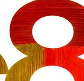
 On to the third element of design in our series. Previously we looked at the line and shape and how they can be used to enhance your design and communicate a message. Today we’re looking at texture.
Texture can be defined as “the properties held and sensations caused by the external surface of objects received through the sense of touch.” It tends to play more of a supporting role in design, rather than being the main player. An exception to this is in interior design, where the designer will pay close attention to wall, floor and furniture textures when making decisions to do with colors and positioning in a room.
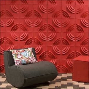
Image Credit: Great Interior Design
Obviously texture is easier to create on print work because a designer can choose the type of paper, card or material used in the design. On the web, however it’s a little more difficult because we can’t physically feel the design in our hands. We can give the impression of texture by using background images of various material, for example, stone, cardboard and scanned old paper or cloth are used frequently by web designers to bring a tactile element to their web site.
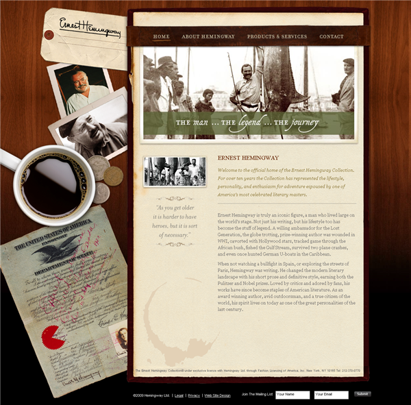
On the Ernest Hemmingway website it’s not hard to imagine what it would feel like if you ran your fingers over the “desk”. There’s old paper with a coffee cup stain, coins and wooden furniture.
Texture Supports The Content
Just as with the other design elements we’ve looked at, it’s important not to use texture just for the sake of it. Only use it when it supports the message you’re communicating.
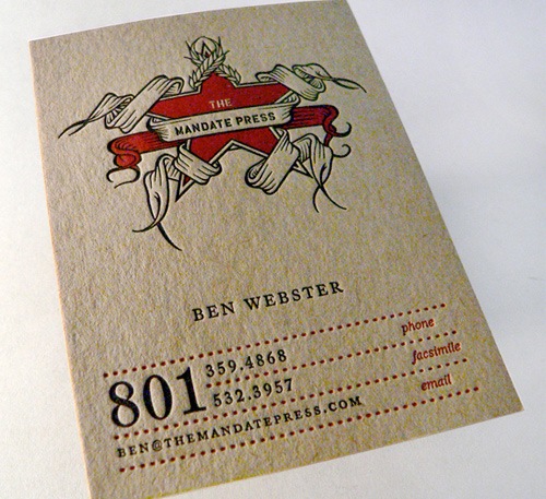
In the last year or two there has been a massive interest in Letterpress printing. Letterpress leaves a noticeable impression on paper because of the hot metal die casts used to put ink on the paper. Look at this business card from Mandate Press, you can almost feel the grooves in the paper just by looking at it.
The I Shot Him Because I Loved Him website (love that name) has a subtle textured background. Additional texture is added with the beautiful line drawings and a hint of a drop shadow lifting the characters off the page.

Guidelines For Using Texture
1. Is the texture appropriate for the message? Does it support the message? If your site or brochure is for an under 12s ballet school then a blood spattered, corroded metal background is probably not the way to go.
2. Texture is not limited to backgrounds. Use images, either Photographs or Illustrations that show elements that are in complete contrast to each other. Use strongly contrasting type such as grungy, rough or distorted type with a smooth, elegant font.
3. Remember texture is used in a supporting role, it shouldn’t be the star of the show.
Related Reading:
Frequently Asked Questions about Elements of Design: Texture
What is the importance of texture in graphic design?
Texture plays a crucial role in graphic design as it adds depth and visual interest to a design. It can be used to emphasize certain elements, create contrast, or add a tactile dimension to a design. Texture can also evoke certain feelings or moods, making it a powerful tool for communication in design.
How can texture be used effectively in design?
Texture can be used effectively in design by considering its impact on the overall composition. It can be used to create contrast, highlight certain elements, or add depth to a design. The choice of texture should also align with the message or mood that the design intends to convey.
What are the different types of textures in design?
There are two main types of textures in design: tactile and visual. Tactile textures can be felt with the touch, such as the roughness of a canvas or the smoothness of silk. Visual textures, on the other hand, are created using various design elements and techniques to give the illusion of a certain texture.
How can texture influence the perception of a design?
Texture can greatly influence the perception of a design. It can add depth and dimension, making a design more engaging and interesting. Texture can also evoke certain feelings or moods, such as warmth, coolness, roughness, or smoothness, influencing how a design is perceived and interpreted.
Can texture be used in digital design?
Yes, texture can be used in digital design. Digital textures, also known as bitmap or raster textures, are created using pixel-based images. They can be used to add depth, dimension, and visual interest to digital designs.
What are some examples of texture in design?
Examples of texture in design can be found in various mediums, from print to digital. In print design, texture can be created through the choice of paper or printing techniques. In digital design, texture can be created using various design elements and techniques, such as gradients, patterns, or filters.
How can I create texture in my designs?
Texture can be created in designs through various methods, depending on the medium. In print design, texture can be created through the choice of paper or printing techniques. In digital design, texture can be created using various design elements and techniques, such as gradients, patterns, or filters.
What is the relationship between texture and color in design?
Texture and color in design are closely related. Texture can affect how a color is perceived, and vice versa. For example, a rough texture can make a color appear darker, while a smooth texture can make a color appear lighter. Therefore, when using texture in design, it’s important to also consider its impact on color.
How can texture be used to create contrast in design?
Texture can be used to create contrast in design by juxtaposing different textures. For example, a smooth texture can be contrasted with a rough texture to create visual interest and highlight certain elements. The contrast between different textures can also add depth and dimension to a design.
What are some common mistakes to avoid when using texture in design?
Some common mistakes to avoid when using texture in design include overusing texture, using inappropriate or conflicting textures, and not considering the impact of texture on other design elements, such as color and form. It’s important to use texture strategically and thoughtfully to enhance a design, rather than detract from it.
Jennifer Farley is a designer, illustrator and design instructor based in Ireland. She writes about design and illustration on her blog at Laughing Lion Design.

