There are a number of design elements we can use as part of our designs and one of the simplest and most useful is the line. The type of lines you use can convey different feelings, moods and add strength to your ideas. Hairlines, dotted, dashed and curved lines can spice up a design.
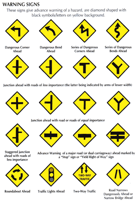
When you’re driving you stay on one side of the white line, and you’re allowed to overtake when the white line is dashed. In keeping with the driving analogy, here’s some traffic warning signs, the vast majority of which consist only of lines. We’re used to seeing and obeying lines (or what they represent) every single day.
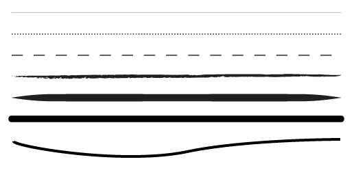
 Take a look at the lines below and at how each one has its own personality. By varying thickness, curves and stroke width we can produce different feelings or ideas.
 Lines For Organization
Frequently, lines are used in design to divide sections of a page or layout, and to join sections that are related to each other. On websites and in magazines we see lines used to frame photographs, separate sidebars and join articles together.
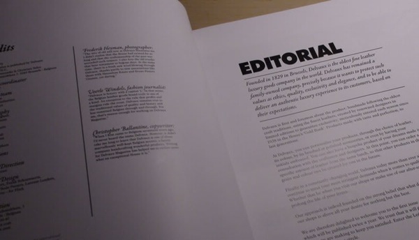
In the image below you can see a magazine spread which makes use of both vertical and horizontal lines. On the page on the left, a vertical line separates two columns of text. On the page on the right, the introduction is separated from the heading and the main copy by using two horizontal lines along with text in italics.
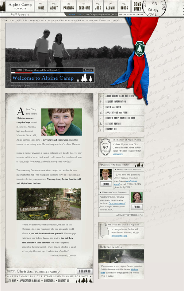
 The Alabama Alpine Camp website also uses lines to separate information into blocks.
 The Grid
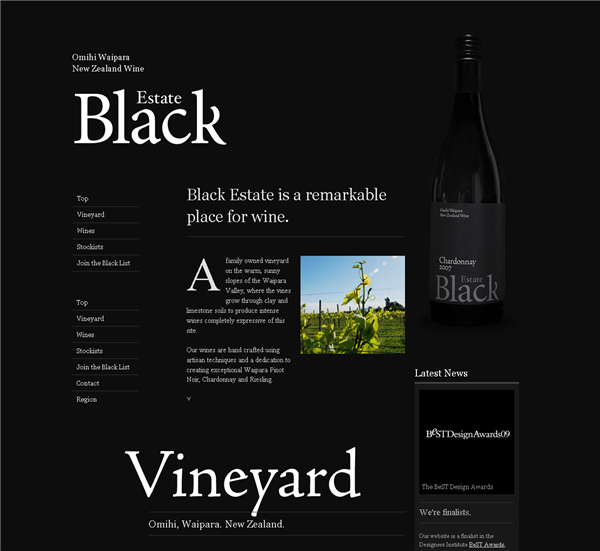
Grids are created by designers as an aid to positioning elements on a page. The grid itself is invisible on the final design, but sometimes grid lines are drawn to strengthen the effect of the grid. This can help maintain consistency throughout a website, magazine, booklet or brochure. The Black Estate Wine website uses a 12 column grid with visible lines under the main headings and also to separate links in the sidebar.
 Big River Man is an Indie documentary. In this poster, the lines are used almost as punctuation while sitting on a grid. Where you might expect a full stop (period) what you see is a horizontal orange line and where you might expect a comma you get a vertical line. So this is an example of lines joining, rather than separating content.
 Lines Provide Texture
The type of line you use can add texture to the piece. Rough hand-drawn lines give a very different feel than a precise hairline. As a simple example look at the movie poster below.
There’s lots of line work on the poster for Away We Go. The lines are loosely drawn in the background and on top of the photographs of the two main characters. This design is clearly aimed at a certain audience and has a trendy Indie feel about it.
 Image Credit : Jo Blo
Guidelines For Using Lines
1. Think about what kind of line you will use. Thick, thin, wavy, dotted, dashed, hand-drawn. Each type of line can convey a different feeling.
2. What’s the purpose of the line? Is it to join related content or to separate unrelated content? Is it to add a border around an image?
3. If you’re using a grid, are your lines helping to reinforce the grid, or are they breaking out of the grid? Either can be good, as long as you know what the lines are supposed to be doing and you’re making a conscious decision about it.
4. Think about multiple lines to create texture. A repeating thin hairline can be used as a background texture, as can an elaborate hand-drawn pattern of lines.
5. Don’t just put lines in for the sake of it. As with any design element, if you don’t need it take it away.
Next week, we’ll continue the series and will look at Shape as a design element.
Related Reading:
Frequently Asked Questions (FAQs) about Elements of Design: The Line
What is the significance of lines in design?
Lines are one of the most fundamental elements of design. They can be used to divide space, guide the viewer’s eye, or emphasize a particular area or object. Lines can be vertical, horizontal, diagonal, or curved, and each type has its own implications. For instance, vertical lines can suggest strength and stability, while horizontal lines can convey calm and tranquility. Diagonal lines can imply movement or change, and curved lines can evoke feelings of softness and comfort. Understanding the power of lines can greatly enhance your design work.
How can I effectively use lines in my design work?
Using lines effectively in design involves understanding their potential impact and using them strategically to achieve your desired effect. For instance, if you want to draw attention to a particular area, you might use bold, thick lines. If you want to create a sense of movement, you might use diagonal or zigzag lines. It’s also important to consider the relationship between lines and other elements in your design, such as color, texture, and form. By carefully considering these factors, you can use lines to create compelling and effective designs.
What are the different types of lines in design?
There are several types of lines in design, each with its own unique characteristics and effects. Straight lines can be vertical, horizontal, or diagonal. Vertical lines can suggest strength and stability, while horizontal lines can convey calm and tranquility. Diagonal lines can imply movement or change. Curved lines, which include arcs, bends, waves, and loops, can evoke feelings of softness, fluidity, and comfort. Zigzag lines can create a sense of excitement or tension. Understanding these different types of lines can help you use them more effectively in your design work.
Can lines affect the mood of a design?
Yes, lines can significantly affect the mood of a design. For instance, straight lines can create a sense of order and precision, while curved lines can evoke feelings of softness and comfort. Bold, thick lines can draw attention and create a sense of drama, while thin, delicate lines can convey a sense of delicacy and subtlety. By understanding the emotional impact of different types of lines, you can use them to create designs that evoke the desired mood or feeling.
How can lines guide the viewer’s eye in a design?
Lines can guide the viewer’s eye in a design by creating a path for the eye to follow. This can be used to direct attention to a particular area or element, or to create a sense of movement or flow. For instance, diagonal lines can create a sense of direction and movement, leading the eye from one point to another. Curved lines can guide the eye in a gentle, flowing path, creating a sense of rhythm and harmony. By using lines strategically, you can guide the viewer’s eye and control how they interact with your design.
What is the relationship between lines and other elements of design?
Lines have a complex relationship with other elements of design, such as color, texture, and form. For instance, the color of a line can affect its visibility and impact, with bright, bold colors drawing more attention than soft, subtle hues. The texture of a line can also affect its impact, with smooth lines creating a different effect than rough, jagged ones. Additionally, lines can be used to define the form of an object or area, outlining its shape and giving it structure. Understanding these relationships can help you use lines more effectively in your design work.
Can lines be used to create texture in a design?
Yes, lines can be used to create texture in a design. By varying the thickness, length, and direction of lines, you can create a variety of textures, from smooth and sleek to rough and rugged. For instance, short, jagged lines can create a rough, textured effect, while long, smooth lines can create a sleek, polished look. By using lines in this way, you can add depth and dimension to your designs, making them more engaging and visually interesting.
How can lines create a sense of depth in a design?
Lines can create a sense of depth in a design by suggesting perspective and dimension. For instance, parallel lines that converge towards a single point can create a sense of depth and distance, a technique known as linear perspective. Similarly, lines can be used to outline the form of an object, giving it a three-dimensional appearance. By using lines in this way, you can create designs that have a sense of depth and realism, making them more engaging and visually appealing.
What is the role of lines in graphic design?
In graphic design, lines play a crucial role in defining structure, creating emphasis, and guiding the viewer’s eye. They can be used to divide space, outline forms, suggest movement, and create texture. Lines can also be used to create a sense of depth and perspective, making designs more engaging and visually interesting. By understanding the power of lines, graphic designers can create more effective and compelling designs.
Can lines convey a message in a design?
Yes, lines can convey a message in a design. For instance, straight, rigid lines can suggest order and precision, while curved, flowing lines can convey a sense of freedom and creativity. Bold, thick lines can convey a sense of strength and power, while thin, delicate lines can suggest subtlety and elegance. By understanding the symbolic meanings of different types of lines, you can use them to convey specific messages and evoke desired emotions in your designs.
Jennifer Farley is a designer, illustrator and design instructor based in Ireland. She writes about design and illustration on her blog at Laughing Lion Design.


