CSS3 Pong: Insane Things to Do with CSS #17
Key Takeaways
- Dive into the world of CSS3 Pong, a playable game created solely with HTML and CSS, showcasing the power of modern CSS3 animations and sibling selectors.
- Explore the setup of a simple Pong game court using CSS properties, where animations are applied to simulate the movement of a ball across the court without any JavaScript.
- Learn how CSS3’s `translate3d()` function is utilized for efficient animation rendering, offloading processing to the GPU for smoother visual effects.
- Discover how to make CSS3 Pong interactive by using pseudo-classes like `:hover` to control game elements, demonstrating the potential of CSS for interactive design.
- Understand the concept of “keeping score” in CSS3 Pong using HTML form elements and CSS, pushing the boundaries of what CSS can achieve beyond static designs.
- Consider the limitations and creative challenges faced when using CSS3 for dynamic and interactive content, emphasizing the experimental and innovative use of CSS in web development.
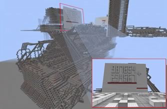
Before we kick things off, let’s try a quick ‘What am I?’. Is this picture..:
a). An Imperial Star Destroyer from Star Wars?
b). A Lego model of the Wankel Rotary Engine?
c). A scientific calculator?
If you answered ‘C – a calculator‘, give yourself a big smiley-face stamp! You are looking at a fully-functional, scientific calculator, built entirely within the virtual world of Minecraft.
Now, Minecraft — if you’re not familiar with it — is an online construction play-world with a very 8-bit aesthetic. Think ‘virtual Lego’.
Most Minecrafters spend their time constructing elaborate palace/fortresses. Sometimes these structures include the relatively rare ‘redstones’, which can be used as simple switches to control doors, gates and the like.
In the example above, a 16 year old (‘MaxSGB’) has wired together a virtual mountain of redstone into a stadium-sized, working calculator —complete with graphing abilities, sine, cosine, tan and square root functions.
If you’re having trouble getting your head around this, imagine a kid building his own Playstation II from Lego Mindstorm – you’re getting close.
Amazing. Crazy. Ridiculous. Tenacious. I’m not sure which is the best description.
Is this a good calculator?
No. The reality is, I had a digital watch in Grade 5 that had a better, built-in calculator than this creation.
But that’s not the point.
By pushing the boundaries, we can only guess at how much this guy has taught himself along the way — lessons in everything from architecture to engineering to programming to electronics to just raw problem-solving.
The Plan
With this idea of pushing things until they shudder in pain, we’re going to do something equally silly with CSS — construct a playable game – Pong (1972). No JavaScript or Flash. Just HTML, CSS and a healthy dollop of nutty professor.
Along the way we’ll:
- do some interesting stuff with CSS animation
- fiddle with CSS3 sibling selectors
- hopefully have a chuckle about the ingenuity/insanity we employ
We’re going to be using a lot of very modern CSS3. In theory, it *should* work in Firefox, Opera and Safari but I’m only going to guarantee Chrome for this code demo.
I’m also only going to quote the official W3C version of the CSS in the examples to keep the code de-cluttered, — though real-world browsers will need their prefixes (-moz, -webkit, etc..).
Most of my demo code uses prefixfree to add the appropriate browser-specific prefixes at runtime, but you might prefer Compass, Fire, Scout, Sass, Less or even hard-coding your own hand ‘prefixerated’ CSS.
If you want to know what we’re heading towards, here’s the final demo.
Part 1 – The Animation
1). Setting up the court
First, let’s set up a court and ball to play with.
Here’s our starting markup:
<h1>CSS PONG</h1>
<div id="court">
    <div id="horizontal">
	<span id="ball"></span>
    </div>
</div>
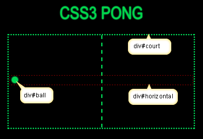
The outer #court DIV defines our playing court. We’ll give it a dashed green border like the original game.
We have a #ball which sits inside a wrapping DIV called #horizontal, which runs the full width of the court. This invisible DIV will become a useful platform from which to hang other screen elements later.
#court{
	margin: 30px auto;
	width: 600px;
	height: 300px;
	position: relative;
	border: 4px dotted #3f3;
Our #court needs a net. We can use a ‘:before’ pseudo element to attach it to our court.
#court:before {
	left: 50%;
	content:'';
	width: 10px;
	height: 300px;
	position: absolute;
	border-left: 4px dashed #3f3;
	}
Our ball is a simple 20px by 20px round-cornered DIV. No external image required.
#ball {
	position: absolute;
	width: 20px;
	height: 20px;
	display: block;
	background :#3f3;
	border-radius: 50%;
	transform: translate3d(10px,0,0) }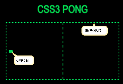
We now have our starting structure.
2). Animating the ball
Let’s back up a bit. If you’re already a CSS animation wizard, feel free to jump down page to Back to Pong. If not, we’ll dash through a few general ‘need to knows’.
First, most — but NOT ALL — CSS properties are ‘animatable’. As a general rule, if you can describe it with a number, it should be animatable.
For instance, we CAN animate:
left: 0px → left: 100pxmargin-top: 10% → margin-top:90%opacity: 0 → opacity: 1z-index: 1 → z-index: 99
However, we CAN’T animate:
float: left → float: rightdisplay: block → display: nonevisibility: hidden → visibility: visible
You’ll notice that second group consists of discrete ‘states’. There are no inbetween states — like ‘slightly-hidden’ or ‘a little bit block’, which is why you can’t animate those properties.
Thankfully colors are always easy to animate — even when you use exotic keywords such as ‘dark orchid’ or ‘cornflower blue’ — because your browser automatically converts them into numbers.
But there’s more to consider.
Often, we’ll want to move things around on screen, and there are many ways do to that. In theory, animating any of the these properties would work:
leftrighttopbottommarginpaddingtransform:translate(x,y)transform:translate3d(x,y,z)
While they all work, surprisingly, there are BIG differences in how browsers handle them.
Believe it or not, translate3d() is the most efficient method to move objects with CSS3 — even if you’re only animating 2d objects!
Apparently, translate3d() offloads the animation grunt-work onto the graphics processor, which speeds things up considerably. Certainly, my MacBook Pro processor stayed much cooler when I use translate3d().
The takeaway: Try to use translate3d() whenever you’re moving stuff around the screen.
Back to Pong.
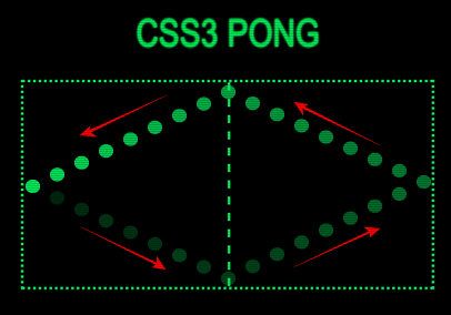
Let’s take what we know about translate3d(), and give our ball a simple left-to-right-and-back bounce.
The transform:translate3D asks us for three values — X, Y and Z. Animating X moves objects left and right, while animating Y moves things up and down. We can leave the Z value at 0.
Let’s create a ‘leftright’ animation and apply it to our #ball.
@keyframes leftright {
0%,100% {transform: translate3d(10px,0,0)}
50% {transform: translate3d(570px,0,0)}
}
#ball{
 ...
 animation: leftright 2s infinite linear
 }
The ball should now bounce from left to right in our #court DIV every two seconds.
Now let’s create a new animation called ‘updown’ — you can guess what that does — and apply it to our #horizontal platform.
@keyframes updown {
 0%,50%,100% {transform: translate3d(0,0,0)}
 25% {transform: translate3d(0,142px,0)}
 75% {transform: translate3d(0,-136px,0)} }
 #horizontal{
 ...
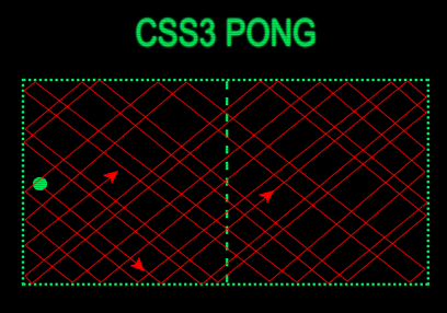
animation: updown 2s infinite linear; }As you can see, our ball completes a perfect, diamond-shaped loop of the court, every two seconds.
Nice … but it quickly becomes boring.
What happens if we make a tiny tweak to the animation timing? Instead of 2.0 seconds, let’s set the #ball to cycle every 1.9 seconds and the #horizontal platform animation to 2.3 seconds.
As you can see, that small timing change has a large effect on the ball’s path. It’s true, this path WILL repeat, but instead of a two-second repeat cycles, it’s now on a 46 second cycle.
A much more interesting result.
Adding players
Lets add some players to the mix. We’ll pop in two new SPANs inside our platform (#player1 and #player2) and position them at either end.
<h1>CSS PONG</h1><div id="court">
 <div id="platform">
     <span id="ball"></span>
         <span id="player1"></span>
         <span id="player2"></span>
    </div>
</div>#player1, #player2 {
background:#3f3;
position:absolute;
width:7px;
height:44px;
left:4px;
margin-top:-12px;
}
#player2{right:4px}As the players are contained inside our moving platform, they really CAN’T HELP but perfectly track the ball from top to bottom.
But we know that real players don’t play like that. They twitch. They lunge. They dive. They scramble.
What if we create a new ‘twitchy’ animation keyframe that makes the bats twitch erratically — relative to the platform?
@keyframes twitchy { /* make player twitch like a real player  */
  0%,
  100%{transform: translate3d(0, 0px, 0); }
  20% {transform: translate3d(0, -45px, 0); }
  44% {transform: translate3d(0, 25px, 0); }
  46% {transform: translate3d(0, -15px, 0); }
  48% {transform: translate3d(0, 15px, 0); }
  50% {transform: translate3d(0, 50px, 0); }
  70% {transform: translate3d(0, 60px, 0); }
  85% {transform: translate3d(0, -30px, 0); }
  95% {transform: translate3d(0, 30px, 0); }
}
#player1, player#2{ animation: leftright 2.3s infinite linear; }
#player1 {animation-delay:1.15s} /* delay player 2 for half a cycle */
Now, as long as we keep the bat animation on the same timing as the ‘leftright’ ball animation, they should always meet the ball between twitches.
Let’s put that into the demo (in ESPN super slo-mo!).
That’s an improvement. The bats twitch to-and-fro like a couple of 7-year olds on too much red cordial.
So, at this point we have an interesting animation example, but it’s no game.
Part 2: Making it Playable … kinda
‘Hey, wouldn’t it be cool if you could actually play it?‘
That was Casey’s first comment when he saw the animation experiment. I laughed and shrugged at the time, but it did get me thinking over the next few days.
Obviously the difference between a game and an animation is interactivity. If I’m not using JavaScript, I need a way for my CSS to interact with the user. I listed all the built-in ‘user events’ that CSS could tap into.
:hover:active:visited:checked:focus:enabled:disabled:selection:target
Maybe we could somehow piggyback on one of these events? I decided :hover was my best chance, so our cursor will become our bat.
#court {
cursor: url(/bat.gif), text;
}
Next, we need a new element that will act as our trigger for the animation. I’m going to insert a DIV called ‘#targetzone’ just before our #horizontal platform. We can lose the automated player #1 too.
<h1>CSS PONG</h1>
   <div id="court">
	<div id="court">
        <span id="targetzone"></span>
	<div id="horizontal">
            <span id="ball"></span>
	    <span id="player2"></span>
	</div>
  </div>
#targetzone {
  background: rgba(0,0,255,0.25);
  position: absolute;
  margin:-50% 0 0 -50%;
  z-index:100;
  width:800px;
  height:600px;
}
The CSS ‘sibling selectors’ — the + and the ~ — are quite powerful, yet often overlooked. In this case, we can use them to pass a :hover state from one HTML element to the element next to it. This let’s us use #targetzone to trigger our animation.
So, we’ll need to remove all of our current animations and transfer them to new ‘hover triggered’ rules like this:
#targetzone:hover{
    animation: updown 2.3s infinite linear;
}
#targetzone:hover + #horizontal{
    animation: updown  2.3s infinite linear;
}
#targetzone:hover + #horizontal #player2{
    animation: twitchy 1.9s infinite linear;
    animation-delay:0.95s;
}
#targetzone:hover + #horizontal #ball{
    animation: leftright 1.9s infinite linear;
}
Now our animation only plays when the cursor hovers over this #targetzone — I’ve made #targetzone semi-transparent blue for the demo, but it would normally be invisible to the player.
Like this. We’re getting closer.
Now, let’s think about ANY real-world game of tennis.
The funny thing about tennis is: most of the time the game doesn’t NEED you.
You can’t catch, dribble or carry the ball. For 98% of the each point, the ball is travelling (or animating) across the court, well out of your reach or direct influence.
For literally micro-seconds each rally you have a chance to either hit the ball back, or make a mistake.
So, if you broke it down into steps, our tennis logic could be written as:
1) BEGIN: ball animation.
2) ANIMATE: ball to the opponent. IGNORE player
3) ANIMATE: ball back to player. IGNORE player
4) CHECK: player’s cursor position
5) IS PLAYER BLOCKING BALL’S PATH?
5) IF: YES – GOTO: Step #2
6) IF: NO – END animation & SCORE 1 for computer.
So, if, as the ball nears the baseline, we were to quickly shrink our #targetzone trigger to the area just in front of the ball, the player would have to be on that spot for the animation to continue. We’d have some sort of very, very rudimentary CSS ‘collision detection’.
Here’s the new keyframe animation to resize the #targezone.
@keyframes targetzone {
  /* ball is in general play - targetzone is big */
  0%, 96% {
    width: 800px;
    height: 600px;
    margin: -50% 0 0 -50%;
  }
  /* ball is approaching player 1's baseline - targetzone shrinks*/
  96.1%, 100% {
    width: 150px;
    height: 100px;
    top: 0;
    left: 0;
    margin: 10% 0 0 -50px;
  }
}
Using a comma, we can add this new animation to our #targetzone trigger.
#targetzone:hover {
  animation:
    updown 2.3s infinite linear,
    targetzone 1.9s infinite linear;
}It’s essentially working as planned, but with one issue.
The microsecond any player misses the ball (and the hover state ends), #targetzone resets and instantly re-triggers the animation to start again. You have to be paying close attention to even notice that the point ended.
We need one more animation to force a short break between points (like real tennis). This animation will play through just once (rather than loop) for each new rally, and will reshape #targetzone from height: 0 through to height: 150px.
@keyframes preparetoserve {
  /* Give targetzone no height so trigger is hidden */
  0%, 90% {
    height: 0px;
  }
  /* after a short time, resize the targetzone, ready to serve*/
  90.1%, 100% {
    height: 100px;
   }
}
We can attach it directly to #targetzone because we don’t need the player to trigger it.
#targetzone {
  ...
  animation: preparetoserve 2s 1 linear;
}It’s taking shape!
Part 3: Keeping Score
As Oscar Wilde said, ‘Nothing succeeds like excess’ so why stop now? This puppy needs a CSS-powered scoring system, goshdarnit!
Now, rather than breaking down every line of code — it’s already a lengthy post — I’m going to talk you through the general principle and leave you to pull the demo apart if you’re interested.
Maintaining State with HTML & CSS
To update any scoreline, we need a way to use HTML/CSS to ‘maintain state’ — to keep track of what has happened so far. This is usually handled by servers and cookies.
A couple of years ago, Lea Verou wrote a really fun article on using restyled checkboxes to build a CSS-powered Tic-tac-toe game. It showed how HTML forms can record mouse clicks and how CSS can instantly respond to those clicks. She also showed that HTML form elements didn’t have to look like HTML form elements.
I thought it was super clever stuff.
So, what if:
1). I replaced my single #targetzone SPAN with a series of five HTML radio buttons — one for each scored point (1-5)? With a little CSS re-jigging, I could make our animation require that the radio button was both checked AND hovered over (i.e. input:checked:hover).
2). I also linked the scoreboard display to which of these inputs is checked? The scoreboard would tick over as soon as Player 1 clicks to serve. Yes, the sad truth is, the computer currently CAN’T lose this game — so the only real question is ‘How long will it be until Player 1 (you) misses the ball?‘.
I know, this feels unfair when you find out. It is.
Of course, for the sake of theatre, we want our player to *think* they have a chance of winning. The fact is, we can only update our radio button scoreboard when a click happens, and there are no clicks when someone misses the ball.
This means I have to update the score on the service click, but somehow not let the player SEE that new score until the point ends. Hmmm …
3). So, what if I position the new score just out of view while the hover is in place? Like jamming open an old window pane with a pencil, the window will come slamming down as soon as we pull out the pencil. In our case, removing the hover will bring our new score crashing down into place.
A CSS transition makes the new score slide into place smoothly.
I didn’t say it was pretty.
But it works.
Here’s the Codepen version of the final code:
See the Pen CSS3 Pong by Alex (@alexmwalker) on CodePen.
Feel free to poke around in there.
Issues, Caveats, and Challenges
1). You may have already accidently discovered this. If you don’t move your cursor, the ball will be returned — EVEN IF YOU AREN’T ANYWHERE NEAR IT.
Unfortunately, this is just a fundamental property of the way browsers work and I doubt there is any way to code around it (without using JavaScript, anyway).
Essentially, every time you move your cursor — even the tiniest amount — your browser fires off the question ‘Hey, are there any new hover events happening??’ If the answer is yes, it renders some new CSS.
However, if the mouse doesn’t move, the browser simply doesn’t ask that question—even if other elements have moved in relation to the cursor. I can’t think how you could possibly change that behavior (without JavaScript).
But hey, stop cheating, and just keep the bat moving, OK?!
2). I’d love to be able to limit the movement of the player#1 bat to strictly up and down. If you can figure a way to pull it off, I bestow great glory unto you, sir or madame!
3). I have a vague idea it might be possible to allow the robot player lose sometimes. If we set a limit on the animation — let’s say 20-25 iterations — and the human player lasted that long, we could let them win.
However, scoring it correctly is the tough part. How do we tell whether someone outlasted the bot, and adjust the score accordingly? I’ve put some thought into this, but it’s hurting my brain.
If you’re inclined, feel free to fork it on CodePen and have a go.
Final word
So, are we at the shiny new dawn of the CSS3 Games era?
Um … no.
Just to clarify. No.
This wasn’t just a hack. It was a glittering city of hacks built on the banks of the ol’ Hack River. On the Planet Hack.
So, why bother?
The fun for me was asking CSS do something that it’s not in any way designed to do. It was quite hard to do something that would be relatively simple with other languages. It was just a fun problem to think about in my play time. Like sudoku or Rubik’s cube.
Secondly, like the Minecraft guy, there are some things you can only truly learn by pushing outside the boundaries of what you normally do. I had to force myself to really look at the CSS spec with fresh eyes for the first time in a long time.
With any luck, this article will give some people ideas about using CSS in ways that might not have occurred to them otherwise.
Also, if you made it this far, I thank you for your patience! I tried to keep this short but there was a lot to explain.
* So, what do you think?
* Got an improvement?
* Got a question?
* Got an idea for a CSS3-powered World of Warcraft?
Frequently Asked Questions (FAQs) about CSS3 Pong and Insane Things to Do with CSS
What is CSS3 Pong and how does it work?
CSS3 Pong is a creative application of CSS3, a style sheet language used for describing the look and formatting of a document written in HTML. It’s a simple game that mimics the classic Pong game, but it’s entirely built using CSS3, without any JavaScript. The game utilizes CSS3 animations and transformations to move the paddles and the ball. It’s a great example of how CSS3 can be used to create interactive and dynamic web content.
How can I create my own CSS3 Pong game?
Creating your own CSS3 Pong game requires a good understanding of CSS3 animations and transformations. You’ll need to create two paddles and a ball using HTML elements, and then use CSS3 to style them and animate their movements. The paddles should move up and down in response to user input, and the ball should bounce back and forth between the paddles. It’s a challenging project, but it’s a great way to learn more about CSS3 and its capabilities.
What are some other insane things I can do with CSS?
CSS is an incredibly versatile language that can be used to create a wide range of effects and animations. For example, you can use CSS to create complex animations, 3D transformations, and even interactive games like CSS3 Pong. You can also use CSS to create dynamic backgrounds, image galleries, and responsive layouts. The possibilities are virtually endless, and with a bit of creativity and experimentation, you can create some truly amazing things with CSS.
How does CSS3 compare to JavaScript for creating animations and games?
CSS3 and JavaScript are both powerful tools for creating animations and games, but they have different strengths and weaknesses. CSS3 is generally easier to use and requires less code than JavaScript, making it a good choice for simple animations and effects. However, JavaScript is more flexible and powerful, allowing for more complex and interactive animations and games. For example, while you can create a simple game like Pong with CSS3, you would need JavaScript to create a more complex game with multiple levels, power-ups, and other features.
Can I use CSS3 to create animations for my website?
Absolutely! CSS3 includes a range of features designed specifically for creating animations. You can use CSS3 to animate almost any property of an element, from its position and size to its color and opacity. You can also use CSS3 to create keyframe animations, which allow you to specify the state of an element at different points in time. This makes it possible to create complex animations with smooth transitions and effects.
What are some resources for learning more about CSS3 and its capabilities?
There are many great resources available for learning more about CSS3. Some popular online tutorials and guides include the CSS3 section of the Mozilla Developer Network, the CSS3 tutorials on W3Schools, and the CSS3 courses on sites like Codecademy and Udemy. There are also many great books on CSS3, such as “CSS3: The Missing Manual” and “CSS3 for Web Designers”.
How can I practice and improve my CSS3 skills?
The best way to improve your CSS3 skills is through practice. Try creating your own projects, like a CSS3 Pong game or a dynamic background for your website. You can also participate in coding challenges on sites like CSSBattle, which can help you learn new techniques and get feedback on your work. Additionally, reading and analyzing the CSS code of other websites can be a great way to learn and get inspired.
What are some common challenges when working with CSS3 and how can I overcome them?
Some common challenges when working with CSS3 include browser compatibility issues, understanding the box model, and managing complex layouts. To overcome these challenges, it’s important to stay up-to-date with the latest CSS3 features and best practices, and to test your code in multiple browsers. Tools like Can I Use can help you check browser compatibility, and resources like CSS-Tricks and the Mozilla Developer Network can provide helpful tips and tutorials.
Can I use CSS3 to create responsive designs?
Yes, CSS3 includes several features that make it easier to create responsive designs. For example, you can use media queries to apply different styles depending on the size of the user’s screen, and you can use flexible box (Flexbox) and grid layouts to create flexible, responsive layouts. These features make it possible to create websites that look and work great on a wide range of devices, from smartphones to desktop computers.
How can I debug and troubleshoot my CSS3 code?
Debugging and troubleshooting CSS3 code can be challenging, but there are several tools and techniques that can help. Most modern web browsers include developer tools that allow you to inspect and modify your CSS code in real time, making it easier to identify and fix issues. You can also use online tools like CSS Lint to check your code for errors and potential issues. Additionally, using a systematic approach to debugging, such as the “divide and conquer” method, can help you identify and fix issues more efficiently.
Alex has been doing cruel and unusual things to CSS since 2001. He is the lead front-end design and dev for SitePoint and one-time SitePoint's Design and UX editor with over 150+ newsletter written. Co-author of The Principles of Beautiful Web Design. Now Alex is involved in the planning, development, production, and marketing of a huge range of printed and online products and references. He has designed over 60+ of SitePoint's book covers.


