
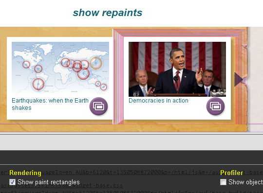
So today I was taking a closer look at using the GPU to pevent flickr and trails (repaints) CSS3 transitions. The screenshot shows CSS3 scale repaint leaving trails on chrome. Then later in the post take a quick look at some of the CSS3 control properties.
Key Takeaways
- Utilizing the Graphics Processing Unit (GPU) for hardware acceleration can significantly enhance the rendering performance in browsers, leading to smoother CSS3 transitions and reduced resource consumption on mobile devices.
- The use of Scale3D and cubic-bezier curves in CSS3 transitions can further enhance the animation fidelity, providing a more fluid and visually appealing user experience.
- While GPU acceleration offers numerous benefits, it’s important to consider potential drawbacks such as increased power consumption and heat generation, particularly on mobile devices with limited battery life and cooling capabilities.
HARDWARE ACCELERATION
Hardware acceleration is an important milestone for overall render performance in the browser. The general scheme is to offload tasks that would otherwise be calculated by the main CPU to the graphics processing unit (GPU) in your computer’s graphics adapter. This can yield massive performance gains and can also reduce resource consumption on mobile devices.

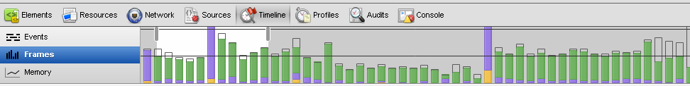
Frame rate.
No trails.?!?
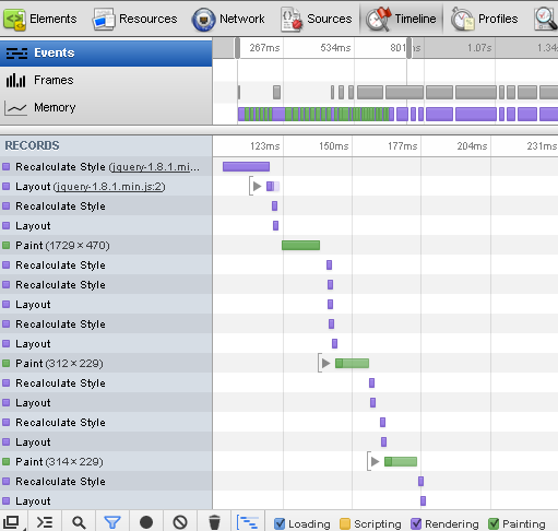
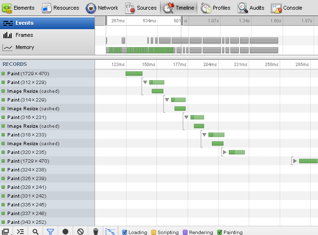
Relayouts / Repaints
A possible outcome is that an object that is animated on the screen does not require a single “relayout” of the page while the animation happens. Because a CSS transition is managed by the browser, the fidelity of its animation can be greatly improved, and in many cases hardware accelerated.
Repainting in dev tools.
Repaint only.
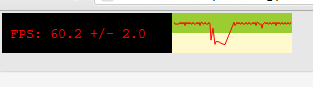
FPS Counter
To do this simply type “chrome:flags” in Chrome scroll down to the FPS counter, enable it and click on the Relaunch Now button on the bottom of the screen. After enabling it, you should be able to see the FPS rate displayed in the top left corner of your window, indicating that the page is indeed GPU accelerated.
So do we use Scale or Scale3d?
See an example of scale vs scale3d: https://jsfiddle.net/Hw6AM/2/
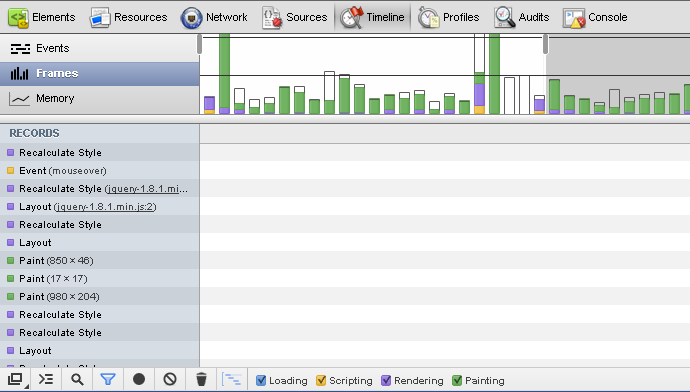
Scale3D frams in dev tools.
cubic-bezier Curves and Timing Functions
For 3D animation Bézier curves are often used to define 3D paths as well as 2D curves for keyframe interpolation. Essentially easing functions which control the speed of the animation by setting fixed css co-ordinate points derived from ratios.
-webkit-transition: -webkit-transform 0.2s ease-in-out;

-moz-transition: -moz-transform .2s ease-in-out;

-o-transition: -o-transform .2s ease-in-out;

-ms-transition: -ms-transform .2s ease-in-out;

transition: transform .2s ease-in-out;
Same as the example above, but the speed curves are specified with the cubic-bezier function:
-webkit-transition: all 300ms cubic-bezier(0.420, 0.000, 0.580, 1.000);

   -moz-transition: all 300ms cubic-bezier(0.420, 0.000, 0.580, 1.000);

    -ms-transition: all 300ms cubic-bezier(0.420, 0.000, 0.580, 1.000);

     -o-transition: all 300ms cubic-bezier(0.420, 0.000, 0.580, 1.000);

        transition: all 300ms cubic-bezier(0.420, 0.000, 0.580, 1.000); /* ease-in-out */
More on timing functions See Mozila Timing Function.
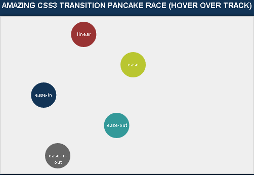
Timing Functions – More Examples
Pancake Theorem! AMAZING CSS3 TRANSITION PANCAKE RACE (HOVER OVER TRACK)
Google CSS3 Rotate with cubic-bezier.

CSS3 transition control properties
Let’s take a look at some of the CSS3 transition control properties and any limitations to using them.
-webkit-backface-visibility: hidden;
Useful, note that Chrome displays backface as visible as default. Read more on CSS Tricks Backface Visibility.
-webkit-perspective: 1000;
Doesn’t work too good and only supported by Chrome and Safari. Read more on W3 CSS3 Perspective.
-webkit-font-smoothing: subpixel-antialiased;
Interesting for those who are developing to target safari. Read more on maxvoltar font smoothing.
-webkit-transform-style: preserve-3d;
Cool effect check out the transform style demo.
useTranslate3d: true;
Google says: “useTranslate3d option to true for smoother (hardware-accelerated) animation on iDevices.” Read more on CSS Animatable Properties.
Resources and further reading
HTML5 Rocks on Speed.
jQuery Animate Enhanced.
Paul Irish on requestAnimationFrame.
Advanced animation demos (uses prototype).
Pretty cool article on css transforms.
GPU CSS.
cubic-bezier easing tool.
Frequently Asked Questions about CSS3 and GPU Acceleration
What is the difference between CSS3 transitions and GPU acceleration?
CSS3 transitions and GPU acceleration are both techniques used to create smooth, high-performance animations on a webpage. CSS3 transitions are a feature of CSS that allows you to smoothly change from one style to another without using JavaScript or Flash. On the other hand, GPU acceleration refers to the process of offloading intensive computing tasks from the CPU to the GPU, which can handle these tasks more efficiently. This can significantly improve the performance of animations and other graphic-intensive tasks.
How can I use CSS3 transitions in my web design?
CSS3 transitions can be used in web design by defining the CSS properties you want to animate and the duration of the animation. For example, you can use the ‘transition’ property to specify the duration of the transition and the ‘transition-property’ to specify which properties should be animated. You can also use the ‘transition-timing-function’ property to control the speed of the transition.
What are the benefits of using GPU acceleration for web animations?
GPU acceleration can significantly improve the performance of web animations. This is because the GPU is specifically designed to handle graphic-intensive tasks, which means it can process these tasks more efficiently than the CPU. By offloading these tasks to the GPU, you can free up the CPU to handle other tasks, which can improve the overall performance of your website.
How can I enable GPU acceleration in my web design?
GPU acceleration can be enabled in web design by using the ‘transform’ property in CSS. This property allows you to apply 2D or 3D transformations to an element, which can be processed by the GPU. You can also use the ‘will-change’ property to inform the browser that an element will be animated, which can help the browser optimize the rendering process.
What are the potential drawbacks of using GPU acceleration?
While GPU acceleration can improve the performance of web animations, it can also consume more power and generate more heat than CPU processing. This can be a concern for mobile devices, which have limited battery life and cooling capabilities. Additionally, not all devices have a powerful GPU, which means that GPU acceleration may not always result in improved performance.
Are there any compatibility issues with CSS3 transitions and GPU acceleration?
CSS3 transitions and GPU acceleration are widely supported by modern browsers. However, older browsers may not support these features, or may require vendor prefixes to use them. It’s important to test your website on multiple browsers and devices to ensure that your animations work as expected.
Can I use both CSS3 transitions and GPU acceleration in the same animation?
Yes, you can use both CSS3 transitions and GPU acceleration in the same animation. In fact, using these two techniques together can often result in the best performance. CSS3 transitions can be used to create smooth animations, while GPU acceleration can be used to improve the performance of these animations.
How can I optimize my CSS3 transitions for better performance?
There are several ways to optimize your CSS3 transitions for better performance. One way is to limit the number of properties that are animated. Animating too many properties at once can strain the CPU and result in choppy animations. Another way is to use the ‘will-change’ property to inform the browser that an element will be animated, which can help the browser optimize the rendering process.
How can I test the performance of my web animations?
There are several tools you can use to test the performance of your web animations. One of these is the Chrome DevTools Performance panel, which allows you to record and analyze the performance of your website. This can help you identify any bottlenecks in your animations and make necessary optimizations.
What are some best practices for creating smooth, high-performance web animations?
Some best practices for creating smooth, high-performance web animations include limiting the number of properties that are animated, using the ‘will-change’ property to inform the browser of upcoming animations, and offloading graphic-intensive tasks to the GPU. It’s also important to test your animations on multiple browsers and devices to ensure they work as expected.