Progressively Enhanced CSS Layouts: Floats to Flexbox & Grid


It can be difficult to achieve complex yet flexible and responsive grid layouts. Various techniques have evolved over the years but most, such as faux columns, were hacks rather than robust design options.
Most of these hacks were built on top of the CSS float property. When the Flexbox layout module was introduced to the list of display property options, a new world of options became possible. Now you can not only define the direction the container is going to stack the items but also wrap, align (items and lines), order, shrink, etc. them in a container.
With all that power in their hands, developers started to create their own combinations of rules for all sorts of layouts. Flexibility reigned. However, Flexbox was designed to deal with one-dimensional layouts: either a row or a column. CSS Grid Layout, in contrast, permitted two-dimensional row and column layouts.
Key Takeaways
- The CSS float property has been traditionally used to achieve complex grid layouts, but it has many limitations and often requires hacks rather than robust design options.
- The introduction of the Flexbox layout module opened up a new world of possibilities for developers, allowing them to define the direction of stacking items, as well as their alignment, order, and size within a container. However, Flexbox is designed for one-dimensional layouts.
- CSS Grid Layout offers a solution for two-dimensional layouts, allowing for flexible and responsive row and column designs. It has the same alignment and space distribution capabilities as Flexbox, but works in two dimensions.
- Progressive enhancement is a web design strategy that starts with minimum functionality and adds features when they’re supported. This approach can be used to transition a website from a float-based layout to a Flexbox layout, and then to a CSS Grid layout.
- Both Flexbox and Grid are well supported in modern browsers, but older versions may not fully support these layout models. Developers need to be aware of browser compatibility issues and may need to use fallbacks or alternative layout methods for older browsers.
Progressive Enhancement vs Graceful Degradation
It’s difficult to create a website that supports every user’s browser. Two options are commonly used — “graceful degradation” and “progressive enhancement”.
Graceful degradation ensures a website continues to function even when something breaks. For example, float: right may fail if an element is too big for the screen but it wraps to the next empty space so the block remains usable.
Progressive enhancement takes the opposite approach. The page starts with minimum functionality and features are added when they’re supported. The example above could use a CSS media query to verify the screen is a minimum width before allowing an element to float.
When it comes to grid layouts, each browser determines the appearance of its components. In this article, you’re going to understand with some real samples how to evolve some web contents from an old strategy to a new one. More specifically, how to progressively enhance the model from a float-based layout to Flexbox, and then CSS Grid, respectively.
Your Old Float Layout for a Page
Take a look at the following HTML page:
<main>
  <article>
    article content
  </article>

  <aside>
    aside content
  </aside>
</main>
It’s a small, common example of grid disposition you can have in a web page: two divs sharing the same container (body).

The following CSS can be used in all the examples we’ll create to set the body style:
body {
  font-family: Segoe UI;
  font-style: normal;
  font-weight: 400;
  font-size: 1rem;
}
Plus, the CSS snippet for each of our divs, enabling the floating effect:
main {
  width: 100%;
}

main, article, aside {
  border: 1px solid #fcddd1;
  padding: 5px;
  float: left;
}

article {
  background-color: #fff4dd;
  width: 74%;
}

aside {
  width: 24%;
}
You can see the example in action here:
You can float as many elements as you want, one after another, in a way all of them suit the whole available width. However, this strategy has some downsides:
- it’s hard to manage the heights of the container elements
- Vertical centering, if needed, can be painfully hard to manage
- depending on the content you have inside the elements (along with each inner container’s CSS properties), the browser may wrap elements to the next free line and break the layout.
One solution is the display: table layout:
main {
  display: table;
}

main, article, aside {
  display: table-cell;
}
However, using display: table becomes less convenient as your layouts get more complex, and it can get messy to work with in responsive layouts. display: table works best with small sections of a page, rather than major layout sections.
Flexbox Approach
The flexible box module, known by the name of Flexbox, is a more recent layout model capable of distributing space and powerfully aligning items of a container (the box) in a one-dimensional way. Its one dimensional nature, though, does not impede you to design multidimensional layouts (rows and columns), but Flexbox may not result in reliable row stacking.
Besides the float approach being very popular and broadly adopted by popular grid frameworks, Flexbox presents a series of benefits over float:
- vertical alignment and height equality for the container’s items on each wrapped row
- the container (box) can increase/decrease based on the available space, and you determine whether it is a column or a row
- source independence — meaning that the order of the items doesn’t matter, they just need to be inside the box.
To initiate a Flexbox formatting strategy, all you need to do is set the CSS display property with a flex value:
main {
  width: 100%;
  display: flex;
}

main, article, aside {
  border: 1px solid #fcddd1;
  padding: 5px;
  float: left;
}

article {
  background-color: #fff4dd;
  width: 74%;
}

aside {
  width: 24%;
}
The following image shows the result:

Here’s a live example:
Progressing to CSS Grid Layout
The CSS Grid layout follows up closely the Flexbox one, the big difference being that it works in two dimensions. That is, if you need to design a layout that deals with both rows and columns, the Grid layout will most likely suit better. It has the same aligning and space distribution factors of Flexbox, but now acting directly to the two dimensions of your container (box). In comparison to the float property, it has even more advantages: easy elements disposition, alignment, row/column/cell control, etc.
Working with CSS Grid is as simple as changing the display property of your container element to grid. Inside the container, you can also create columns and rows with divs, for example. Let’s consider an example of an HTML page with four inner container divs.
Regarding the CSS definitions, let’s start with the grid container div:
div.container {
  display: grid;
  grid-template-columns: 24% 75%;
  grid-template-rows: 200px 300px;
  grid-column-gap: 15px;
  grid-row-gap: 15px;
}
The property grid-template-columns defines the same configuration you had before: two grid columns occupying 24% and 75% of the whole container width, respectively. The grid-template-rows do the same, applying 200px and 300px as height for the first and second rows, respectively.
Use the properties grid-column-gap and grid-row-gap to allocate space around the grid elements.
In regards to applying grid alignment properties to specific cells, let’s take a look:
.div1 {
  background-color: #fff4dd;
  align-self: end;
  justify-self: end;
}

.div4 {
  align-self: center;
}
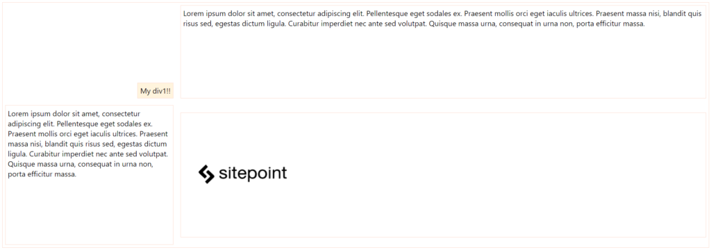
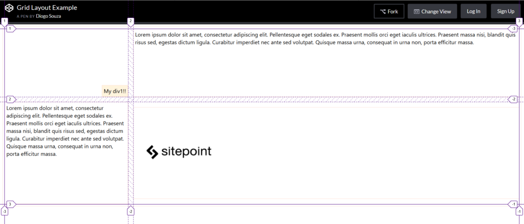
For the div of class div1, you’re aligning and justifying it at the end of the grid cell. The properties align-self and justify-self are valid for all flex items you have in the layout, including, in this case, the grid cells. div4 was set only the centered alignment, for you to check the difference between both.
Here’s how the elements are positioned now:
You can check out the final grid layout example here:
Most browsers also offer native support for Grid layout inspections, which is great for seeing how it handles the Grid mechanism internally. Let’s try our Grid example on Firefox with its Grid Inspector, available via Firefox DevTools. In order to open it, right-click the container element and, at the CSS pane’s Rules view, find and click the Grid icon right after the display: grid:
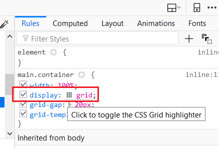
This will toggle the Grid highlighter. You can also control more display settings at the CSS pane’s Layout view like the line numbers or the area names exhibition:
Progressively Enhancing a Blog Layout
In this next example, we’re going to use a blog page as a reference to upgrade from a totally float-based page to a CSS Grid layout, exploring the way the old layout can be completely transformed to a layout that embraces both Flexbox and Grid.
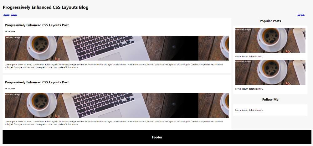
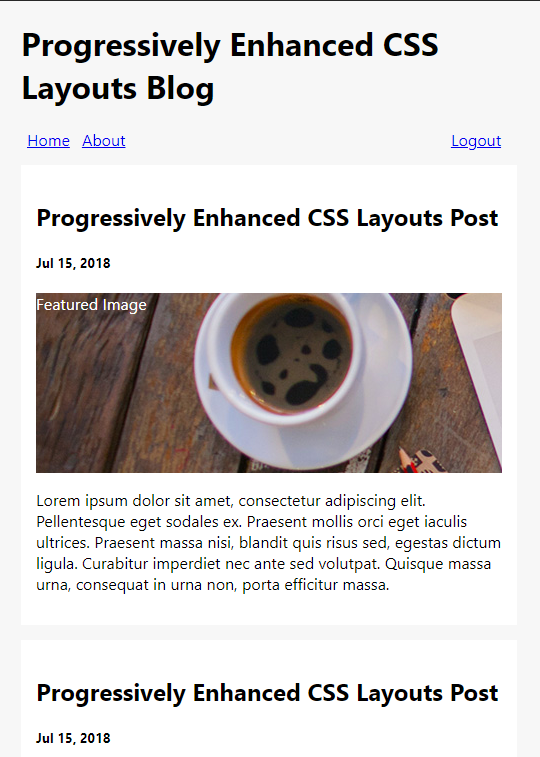
In the following updates, we’ll keep an eye on the old browsers that don’t support Flexbox or CSS Grid, as well as how the blog behaves on mobile versions. This is the look and feel of our blog page totally based on divs and CSS float property:
And this a pen of the example:
Note that the HTML structure is common for anyone already familiar with semantic tags: a div (the container) containing all the inner elements that’ll compose the final layout based on who’s floating who.
It’s basically made up of a simple header with a menu that defines how its items (links) will be displayed and aligned:
nav.menu {
  width: 98%;
}

ul {
  list-style: none;
  padding: 0px;
  margin: 0px;
}

.left {
  float: left;
}

.right {
  float: right;
}

a {
  padding: 4px 6px;
}
The content of the page is divided into two parts, the section and aside elements:
main {
  float: left;
  width: 74%;
}

aside {
  float: left;
  width: 24%;
  margin-left: 15px;
  margin-bottom: 15px;
}

aside h2 {
  text-align: center;
}
Nothing exceptional, just left floating the divs and determining the maximum width of each one on top of the full width. Note also the need for clearing (clear) things whenever we need to disable the floating effect after a div:
header:after {
  content: "";
  display: table;
  clear: both;
}
The end of the CSS brings an @media rule that’ll break the sidebar to the next column when the page is opened in small screen devices. The end of the HTML brings a simple footer with some simple text.
Note: the beginning of the HTML includes the HTML5 Shiv script in order to enable the use of HTML5 sectioning elements in legacy Internet Explorer.
Menu Enhancements with Flexbox
As seen before, Flexbox works better with one-dimensional layouts like a horizontal menu. The same menu structure could be enhanced to this one:
nav.menu {
  width: 98%;
}

nav.menu ul {
  display: flex;
}

nav.menu ul > li:last-child {
  margin-left: auto;
}
The use of the Flexbox property automatically disables the float for newer browsers. However, since we preserved the old CSS configurations for the float property, the float will still apply when a browser doesn’t support Flexbox.
At the same time, the display: flex was added in order to lay out the menu using Flexbox along with the margin-left: auto to the last menu item. This will ensure that this item will be pushed to the right of the layout, separating them into distinct groups.
Enhancing to Grid Areas
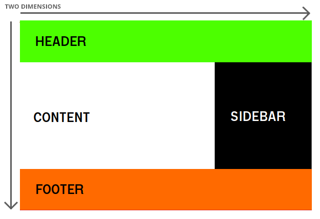
CSS Grid gives us more flexibility when it comes to the placement of inner elements. Just as Flexbox is a perfect choice for a horizontal container (the menu), a grid would be perfect for a two-dimensional blog layout that basically divides into three parts:
The Grid Area feature consists of the combination of two properties: grid-template-areas and grid-area. The first one defines how the whole layout height and width would be divided into groups by explicitly putting the names of each group as they’d be in the final layout:
div.container {
  width: 100%;
  display: grid;
  grid-gap: 20px;
  grid-template-areas:
    "header header header"
    "content content sidebar"
    "footer footer footer"
}
Here, we’re dividing the whole container space into three rows and three columns. The names of the areas repeated alongside the definition say how much space each of them will occupy vertically and horizontally.
Then, we can use the second property by setting for each of the grid areas the respective grid-area value:
header {
  grid-area: header;
}

main {
  grid-area: content;
  /* other properties */
}

aside {
  grid-area: sidebar;
  /* other properties */
}

footer {
  grid-area: footer;
  /* other properties */
}
Just as with Flexbox, grid items automatically disable float declarations in browsers which support CSS Grid. The rest of the properties remain the same (the float will still apply when a browser doesn’t support Grid).
You can see this example fully running here:
Enhancing Grid Templates
The grid-template property is also very useful when we need to define a template that’ll follow a pattern for our grid’s definitions.
Let’s take a look at the following .container CSS:
div.container {
  width: 100%;
  display: grid;
  grid-gap: 20px;
  grid-template-columns: auto auto auto;
}
Here, we’re basically saying that the size of the columns is determined by the size of the container and the size of the content of the items in the column.
Then, each of our grid areas will have to adapt:
header {
  grid-column: 1/4;
}

section {
  grid-column: 1/3;
  /* other properties */
}

aside {
  grid-column: 3/4;
  /* other properties */
}

footer {
  grid-column: 1/4;
  /* other properties */
}
Here, grid-column: 1/4 instructs the browser to start a column at track one and end at track four. Tracks are the separators between each grid cell, so this element would occupy cells one to three:
The example can be tested here:
You can go now and test it in different browser versions as well as your mobile phone to check how the pages are progressively enhanced.
More About CSS Grid Layout
For more information about CSS Grid, refer to SitePoint’s CSS Grid Layout Introduction, and also check out SitePoint’s CSS Flexbox Introduction.
Mozilla has also provided a great article about CSS Grid Layout and Progressive Enhancement that will certainly add a lot. Good studies!
You might also be interested in reading How to Center a Div Using CSS Grid.
Frequently Asked Questions (FAQs) about CSS Layouts
What are the differences between Floats, Flexbox, and Grid in CSS layouts?
Floats, Flexbox, and Grid are all techniques used in CSS to control the layout and positioning of elements on a webpage. Floats were originally designed for text wrapping around images but have been used for creating entire layouts. They work by shifting an element to the left or right, allowing other elements to wrap around it. However, they can be tricky to manage, especially for complex layouts.
Flexbox, on the other hand, is a more modern layout model designed specifically for one-dimensional layouts. It provides more control over alignment, direction, order, and size of elements, making it easier to create responsive designs.
Grid is the latest addition to CSS layout techniques, designed for two-dimensional layouts. It allows you to create complex layouts with rows and columns, and control the placement and size of items within the grid. It’s particularly useful for creating complex, responsive web designs.
When should I use Floats, Flexbox, or Grid?
The choice between Floats, Flexbox, and Grid depends on the specific layout needs of your project. Floats are best suited for simple layouts or for wrapping text around images. However, they can become complex and difficult to manage for more intricate designs.
Flexbox is ideal for one-dimensional layouts, where you’re primarily dealing with a row or a column. It’s great for aligning items and creating responsive designs that need to adjust to different screen sizes.
Grid is best for two-dimensional layouts that require both rows and columns. It’s perfect for creating complex, responsive designs where you need precise control over the placement and sizing of items.
Can I use Flexbox and Grid together?
Yes, Flexbox and Grid can be used together in a layout. In fact, they complement each other quite well. For instance, you could use Grid to create the overall layout of the page, and then use Flexbox for the alignment and distribution of items within the grid cells. This combination allows for a high level of control over the layout, making it easier to create complex, responsive designs.
What are the main challenges with using Floats for CSS layouts?
While Floats can be useful for certain layout tasks, they come with several challenges. One of the main issues is that they can cause elements to collapse, as floated elements are taken out of the normal document flow. This can be fixed with a clearfix, but it adds extra complexity.
Another challenge is that Floats don’t have built-in features for vertical alignment or equal height columns, which are common requirements in modern web design. Lastly, managing Floats can become complex and difficult for more intricate layouts, making them less suitable for these cases compared to Flexbox or Grid.
Are there any browser compatibility issues with Flexbox and Grid?
Both Flexbox and Grid are well supported in all modern browsers. However, older versions of certain browsers may not fully support these layout models. For instance, Flexbox is not supported in Internet Explorer 10 and earlier, while Grid is not supported in Internet Explorer 11 and earlier.
It’s always a good idea to check the browser compatibility of any CSS features you’re using. Websites like Can I Use provide up-to-date information on browser support for various CSS features. If you need to support older browsers, you may need to use fallbacks or alternative layout methods for those browsers.
Diogo works as Java Developer at Fulcrum Worldwide and has worked for companies such as Indra Company, Atlantic Institute and Ebix LA. He is also an Android trainer, speaker at events on Java and mobile world and a DevMedia consultant.