

Key Takeaways
- CSS Grid is a powerful tool for creating web layouts, and there are several online CSS Grid generators that offer visual interfaces for designing layouts. These include CSS Grid Generator by Sarah Drasner, LayoutIt by Leniolabs, Griddy by Drew Minns, Vue Grid Generator by Masaya Kazama, and CSS Grid Layout Generator by Dmitrii Bykov.
- While these generators can simplify the process of creating layouts, not all of them fully support the extensive features of CSS Grid. Only Dmitrii Bykov’s CSS Grid generator was able to reproduce a complex, hand-coded layout flawlessly in the author’s tests.
- CSS Grid generators can be particularly useful for those who prefer visual coding or are new to CSS Grid, but they may feel limiting to those with more advanced knowledge of CSS Grid.
- Despite their limitations, CSS Grid generators can be a handy tool for quickly creating basic layouts. However, understanding the basics of CSS Grid is beneficial when using these tools, especially for more complex designs.
CSS Grid has turned out to be the most exciting evolution of CSS for quite a while. It’s a specific CSS tool for building any web layout you can think of, from the simplest to the most complex. Today, CSS Grid is widely supported by all major browsers — it’s clear that the dark days of hacking layouts using floats are gone forever.
Coding your CSS Grid layout directly in your code editor can be fun. Although the spec is a complex document, the key concepts you would need to build a simple layout don’t have a steep learning curve. There are many resources that will get you started in no time, with CSS Master by Tiffany Brown, Rachel Andrew’s Grid by Example, and Jen Simmons’s Layout Land at the top of the list.
For those of you who feel more comfortable coding layouts using a visual editor, there are several interesting online options that you can try out.
Here are five CSS online tools with great visual interfaces that I’m going to put through their paces. The idea is: design your CSS Grid-based layouts in a few clicks, grab the code and run with it! Let’s put this idea to the test and see what happens.
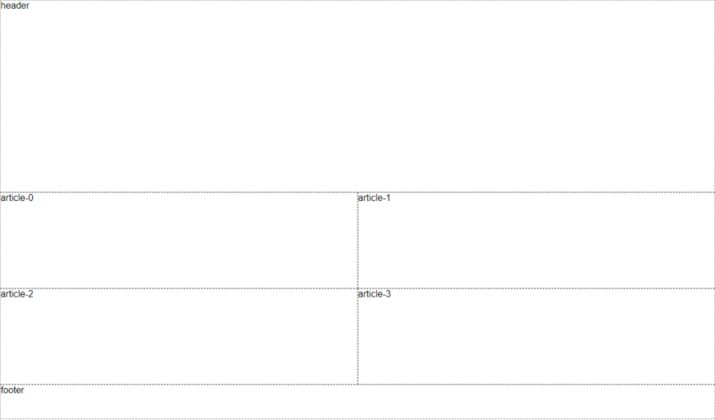
The Test Page Layout
In this article, I’m going to provide this simple hand-coded CSS Grid layout.
See the Pen
responsive CSS Grid example by Maria Antonietta Perna (@antonietta)
on CodePen.
The layout has more than one HTML container tag working as a Grid container in a nested structure. I could have used the new subgrid feature that’s been recently added to Grid, but at the time of writing only Firefox 69+ supports it, and none of the online generators discussed here have implemented this functionality yet.
For most of the CSS Grid generators, I’m going to focus my tests only on the <ul> that works as Grid container for the individual cards. This is what the code looks like:
    .kitties > ul {
      /* grid styles */
      display: grid;
      grid-template-columns: repeat(auto-fit, minmax(320px, 1fr));
      grid-gap: 1rem;
    }
Notice how the value of the grid-template-columns property alone enables you to add responsiveness without media queries by:
- using the CSS Grid
repeat()function together with theauto-fitproperty. You can add as many columns as you want and they will fit perfectly into the grid’s width, whatever that may be. - using the
minmax()function, which ensures that each column is at least320pxwide, thereby displaying nicely on smaller screens.
Most CSS Grid generators don’t include the ability to set the grid-template-columns using the CSS Grid features above, so you’ll need to adjust the values generated by the tool inside media queries to add responsiveness to your layouts.
As I try out the CSS Grid generator tools, I’m going to replace the code above with the code generated by each tool, and examine its capabilities against the results displayed on the screen. The exception will be the fourth CSS Grid generator in the list, a Vue-powered tool by Masaya Kazama. This is because it makes it quite straightforward and quick to build the entire layout, including header and footer, with a few clicks and minor adjustments to one of its preset layouts.
Enough talking, let’s dive right in!
1. CSS Grid Generator by Sarah Drasner
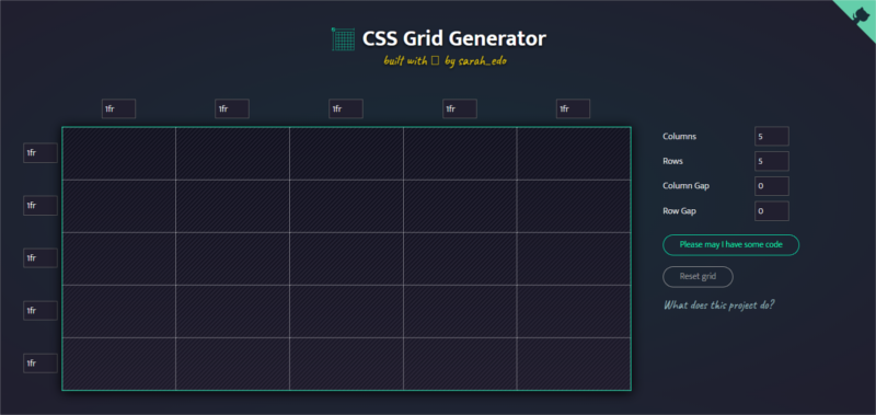
CSS Grid Generator is a shiny new generator coded by Sarah Drasner. The interface is super sleek and you can put together a basic CSS Grid layout in no time.
I generated a 2-column grid and dumped the code in my original example. You need media queries to make the layout responsive. Here’s the result:
See the Pen
CSS Grid Generator #1 by Sarah Drasner by Maria Antonietta Perna (@antonietta)
on CodePen.
The code looks like this:
    .kitties > ul {
      /* grid styles */
      display: grid;
      grid-template-columns: 320px 320px;
      grid-template-rows: 1fr 1fr;
      /* units for row and column gaps
       only available in px */
      grid-column-gap: 16px;
      grid-row-gap: 16px;
    }
This tool lets you:
- set the numbers and units of rows and columns
- drag within the boxes to place divs within them
At the time of writing, Sarah’s CSS Grid generator lets you create simple implementations of CSS Grid-based layouts. This is clearly stated by the author:
Though this project can get a basic layout started for you, this project is not a comprehensive tour of CSS Grid capabilities. It is a way for you to use CSS Grid features quickly.
However, since this is a brand new open-source tool, it’s still in active development and the community is invited to contribute. Complex features like minmax() are not implemented yet, but they might find their way into it at a later time.
2. LayoutIt by Leniolabs
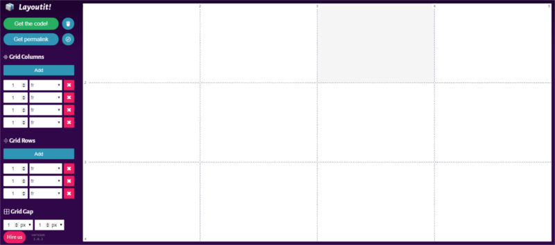
LayoutIt is quite intuitive and has a few more features than CSS Grid Generator. For example, it lets you set the grid-gap property in px, em and % units, and set grid-template-columns and grid-template-rows using minmax(). However, this is not enough to ensure responsiveness, so you’ll still need to adjust your values using media queries.
Also, I found no way of setting the grid-gap property, so you’ll have to do it manually if you’d like some white space in between rows and columns.
Here’s the result as I entered the generated code into my original example:
See the Pen
CSS Grid Generator #2 by Leniolabs by Maria Antonietta Perna (@antonietta)
on CodePen.
Below is what the relevant code looks like:
    .kitties > ul {
      /* grid styles */
      display: grid;
      grid-template-columns: minmax(320px, 1fr) minmax(320px, 1fr);
      grid-template-rows: 1fr 1fr;
      /* grid gap not in code
      repeat, auto-fit, and auto-fill
      not there */
    }
3. Griddy by Drew Minns
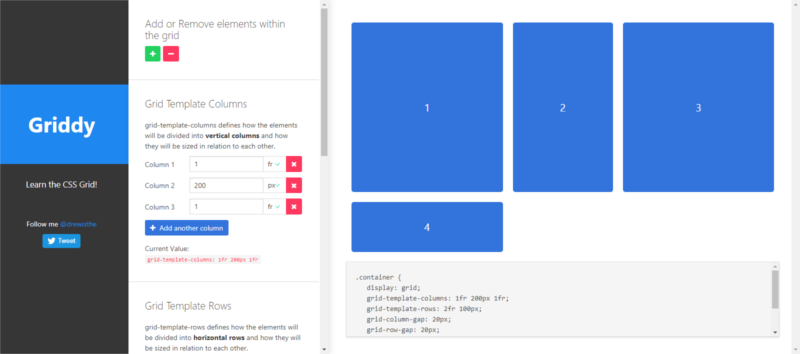
With Griddy you can set the number of columns and rows using fr, px, % and auto units, but there’s no minmax() function. You can add gaps to your columns and rows using both px and % and set justify-items and align-items properties to align items within the grid. You’ll need media queries for responsiveness.
Below is what the generated code displays on the screen:
See the Pen
CSS Grid Generator #3 by Drew Minns by Maria Antonietta Perna (@antonietta)
on CodePen.
Here’s the generated code in place on the original demo:
    .kitties > ul {
      list-style-type: none;
      /* grid styles */
      display: grid;
      /* no minmax */
      grid-template-columns: 320px 320px;
      grid-template-rows: 1fr 1fr;
      grid-column-gap: 16px;
      grid-row-gap: 16px;
    }
4. Vue Grid Generator by Masaya Kazama
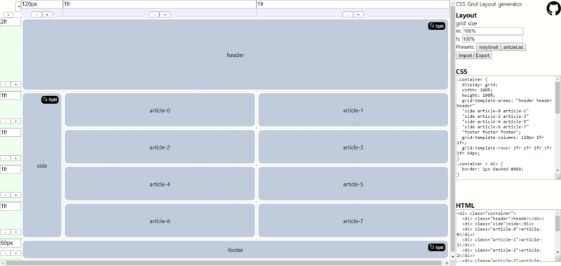
Vue Grid Generator has a couple of handy preset layouts, the Holy Grail and the Article List, that you can easily customize by adding and removing elements and adjusting sizes. This is the reason why, instead of confining myself to the CSS Grid code for the cards container, I approximated the entire layout simply by customizing the preset Article List layout.
This tool lets you build your CSS Grid using the grid-template-areas and related grid-area properties. Also, you need media queries to make the page responsive and you can only set the grid-gap property manually.
Here’s what the default layout looked like after I copied and pasted the generated code into a new Pen and set the html selector’s height to 100vh:
Below is the final result, after a few CSS and HTML adjustments to approximate the look and feel of the original demo:
See the Pen
CSS Grid Generator #4 by Masaya Kazama by Maria Antonietta Perna (@antonietta)
on CodePen.
5. CSS Grid Layout Generator by Dmitrii Bykov
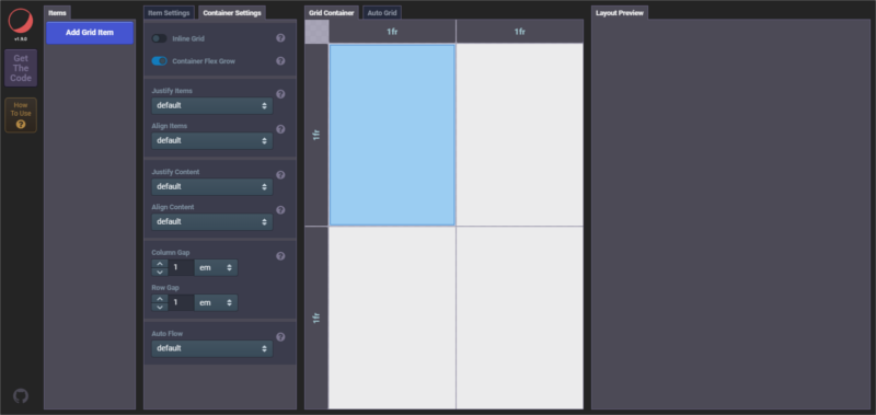
CSS Grid Layout Generator is a fully-featured CSS Grid generator by Dmitrii Bykov. To get started, you can check out the intro video, which gives you a short overview of the tool’s capabilities in action.
The tool makes available tons of settings, both for the Grid container and the Grid items. Available features include:
- You can set the Grid inline
- You can set the number of columns and rows using
fr,px,em,rem,vw,vh,%,min-content,max-contentand even useminmax()withrepeat(),auto-fitandauto-fill. This means that your layout can be responsive out of the box - All the units are available when setting the
grid-gapproperty - You can align your page’s content by setting
justify-items,align-items,justify-content,align-content - and much more.
Going back to my original demo, this tool is the only one in the list that could reproduce the original code’s functionality.
Here’s the CodePen demo:
See the Pen
CSS Grid Generator #5 by Dmitrii Bykov by Maria Antonietta Perna (@antonietta)
on CodePen.
Conclusion
CSS Grid generators can be handy if you’re looking for a way to create a basic CSS Grid layout quickly using a visual tool. Keep in mind that not all of the amazing CSS Grid features are usually made available by these tools. Among the five tools I listed here, only Dmitrii Bykov’s CSS Grid generator is capable of most of the features detailed by the spec and could reproduce my original hand-coded version flawlessly.
Finally, it helps if you know the basics of CSS Grid when using online generators. However, the more you learn about CSS Grid the clunkier these visual editors will feel to you, especially when you venture into bolder layout designs.
Frequently Asked Questions (FAQs) about CSS Grid Generators
What is a CSS Grid Generator and why should I use it?
A CSS Grid Generator is a tool that allows you to create complex web layouts easily and quickly. It uses the CSS Grid Layout, a two-dimensional system that can handle both columns and rows. The main advantage of using a CSS Grid Generator is that it simplifies the process of creating web layouts. You don’t need to write complex code manually, the generator does it for you. This not only saves time but also ensures that your code is error-free and efficient.
How do I use a CSS Grid Generator?
Using a CSS Grid Generator is quite straightforward. You start by defining the grid template, which includes the number of columns and rows, and their respective sizes. You can then place your content in the grid cells. Most generators provide a visual interface, so you can see the changes in real-time. Once you’re satisfied with the layout, you can export the generated CSS code and use it in your project.
Can I use a CSS Grid Generator for responsive design?
Yes, you can use a CSS Grid Generator for responsive design. Most generators allow you to define different layouts for different screen sizes. This is done using CSS media queries. You can specify the number of columns and rows, and their sizes, for each screen size. This ensures that your website looks good on all devices, from smartphones to desktop computers.
Are there any limitations to using a CSS Grid Generator?
While CSS Grid Generators are powerful tools, they do have some limitations. For example, they may not support all CSS Grid features, such as grid template areas or grid auto flow. Also, the generated code may not be as optimized as manually written code. However, for most use cases, these limitations are minor and the benefits of using a generator far outweigh them.
How do I choose the best CSS Grid Generator for my needs?
When choosing a CSS Grid Generator, you should consider several factors. First, check if the generator supports all the features you need. Second, see if it provides a visual interface that you find easy to use. Third, check if it allows you to export the generated code in a format that you can use in your project. Finally, consider the reputation of the generator. Look for reviews or testimonials from other users.
Can I use a CSS Grid Generator if I don’t know how to code?
Yes, you can use a CSS Grid Generator even if you don’t know how to code. Most generators provide a visual interface that allows you to create layouts by dragging and dropping elements. You don’t need to write any code yourself. However, having a basic understanding of CSS can help you make the most of the generator.
Is it possible to edit the code generated by a CSS Grid Generator?
Yes, you can edit the code generated by a CSS Grid Generator. The code is just regular CSS, so you can modify it as you would any other CSS code. This allows you to fine-tune the layout or add additional styles.
Can I use a CSS Grid Generator for commercial projects?
Yes, you can use a CSS Grid Generator for commercial projects. The generated code is usually free to use and doesn’t require any attribution. However, it’s always a good idea to check the terms of use of the generator.
Do I need to install anything to use a CSS Grid Generator?
No, you don’t need to install anything to use a CSS Grid Generator. Most generators are web-based, so you can use them directly in your browser. This makes them accessible from any device with an internet connection.
Can I use a CSS Grid Generator to learn CSS Grid?
Yes, you can use a CSS Grid Generator to learn CSS Grid. By experimenting with different settings and seeing the resulting code, you can get a better understanding of how CSS Grid works. However, a generator should not replace a proper tutorial or course. It’s a tool to supplement your learning.