CSS Architectures: Refactor Your CSS

The top scalable and modular approaches I covered in the previous article in my CSS Architectures series all have pieces of brilliance that can help you change the way you think about and structure your CSS. They also overlap in many areas, which indicates which aspects of the process of improving your CSS are truly critical. Although you could follow any single approach while constructing a new site to great success, the fact of the matter is that what most of us are doing is trying to make sense of existing CSS run amok.
So, while the approaches I described are great on their own, what we really need is a way to combine the superpowers from them all to combat the evil of crazy code – a sort of “Justice League” of scalable and modular techniques. Furthermore, just as Rome wasn’t built in a day, it’s a fool’s errand to try to correct in one fell swoop thousands of lines of code that lack rhyme or reason. Thus, it’s a good idea to pass over the code in focused waves through a phased approach.
Key Takeaways
- Embrace the MetaCoax CSS refactoring process to improve readability, simplicity, and extensibility of CSS while maintaining the design and functionality of the site.
- Apply a phased approach to refactoring; start with simple selector and ruleset optimizations before restructuring and modularizing CSS for scalability and maintainability.
- Utilize tools like CSS Lint during the refactoring process to identify areas for cleanup and optimization.
- Avoid over-specificity and deep selector chains to ensure CSS is easier to maintain and more efficient in performance.
- Incorporate principles from scalable CSS frameworks such as OOCSS, SMACSS, and CSSG to create a cohesive and flexible coding structure.
- Focus on reducing the use of !important declarations and leverage CSS inheritance and cascading to simplify stylesheets.
Giving CSS Refactoring a Good Name
Last year, I had a project for a client where I was retained to do exactly that. After studying DRY CSS, OOCSS, SMACSS, and CSSG, I endeavored to distill them into their essential practices. In a moment of insight, I realized that all these approaches boiled down to the well-known adage “measure twice, cut once.” Of course! They all encourage looking at patterns, creating portable styles and modules that can be reused and not adding superfluous and redundant selectors or styles.
Additionally, my client had a lot of code and wanted to have flexibility in terms of the amount of changes that could be made to the CSS. So, I developed a cohesive, phased plan of attack to reduce the number of lines in my client’s CSS. By the end, all of the practices and techniques for all four scalable CSS frameworks were incorporated, and the process I developed is very effective at reducing lines of CSS.
Once I created the process, I had to figure out what to name it. Taking “measure twice, cut once” as my base, I added CSS to it and this is what I got:
measure twice, cut once css → mtco css → meta coa css → MetaCoax!
So, in this article, I’ll share with you my MetaCoax CSS refactoring process, designed to “de-bloatify” thousands of lines of redundant CSS—improving the readability, simplicity and extensibility of the CSS while keeping the visible design and functionality of the site the same. (Check out the slides from my recent presentation on de-bloatifying CSS.)
To get yourself ready to refactor CSS, here are some suggestions. First, be conversant with specificity and the cascade – it will make a huge difference. I hope that in the first two articles in this series (Part 1, Part 2), I’ve driven home that making selectors and rules overly specific limits their reusability. When using descendent selectors especially, specificity can easily and quickly spiral out of control, and that’s precisely what we’re working to avoid. Second, remember inheritance rules: certain properties are inherited by child elements; thus, how these properties cascade down the DOM should always be kept in mind.
The MetaCoax Process
The MetaCoax process is a four-phased approach. Each phase builds on the previous one, and they all incorporate practices that decrease the amount of code, increase scalability and maintainability and, as an added bonus, lay the foundations for a future-friendly site. We’ll look at a detailed breakdown of each phase and the practices and techniques each encompasses. In this article, I’ll cover phases 1 and 2. Details about phases 3 and 4 will appear in the final article in the series.
Note: An excellent tool to use while you’re going through the MetaCoax refactoring process is Nicole Sullivan’s CSS Lint, which identifies additional places in the CSS to clean up and gives you ideas on how to do so.
Phase 1: Shorten Selectors and Leverage and Layer Rulesets
The first phase is focused on a minimum amount of work to improve a site’s CSS. These changes involve modifying the CSS but don’t touch the current HTML for a site’s pages. The goal is to make the stylesheet a little more lightweight and also easier to maintain and update with a small amount of time and effort. The method involves optimizing selectors while reducing redundancy with smarter reuse of rulesets. Even if you apply only the practices from this phase to your CSS, you’ll see an improvement in maintainability.
Here’s what we’re going to do:
- Shorten selectors chains
- Kill qualifiers
- Drop descendants
- Make the selector chain three or less
- Leverage and layer declarations
- Leverage the cascade by relying on inheritance
- Review, revise and reduce !important properties
- DRY (“don’t repeat yourself”) your rulesets
Shorten Selector Chains
To best optimize selectors, the goal is to use a shallow instead of a deep selector chain, making the chain as short as possible. This practice makes the code easier to work with, and the styles become more portable. Other advantages are reducing the chances of selector breakage, reducing location dependency, decreasing specificity and avoiding specificity wars by preventing overuse of !important declarations.
You have several ways in which you can shorten the selector chain, incorporating practices from all of the scalable architectures I outlined and further applying the “reduce, reuse, recycle” ethos. All of the practices are guaranteed to make the CSS code more forgiving. And isn’t that essentially the goal of updating our stylesheets?
Drop Descendent Selectors
The descendent selector (a b) is one of the most “expensive” combinatory selectors to use to target an element. Other expensive CSS selectors include the universal selector (*) and the child selector (a > b). What makes them expensive? They are very general, and thus force the browser to look through more page elements to make a match. The longer the selector chain and the more checks required, the longer the browser takes to render the styles on the screen. When matching a descendent selector, the browser must find every instance of the key selector (which is the one on the far right) on the page, and then go up the ancestor tree to make the match.
While this might not be a problem for a stylesheet of a few hundred lines, it becomes more of an issue when the size of a document nears 10,000 lines or more. Even more important, in adopting a future-friendly and mobile first approach, long selector chains create a situation where small, less capable devices are forced to load and process unnecessarily large CSS documents.
Overdependence on descendent selectors is a vestige of the days of coding for Internet Explorer 6, as Internet Explorer 6 did not render the other CSS 2.1 combinator selectors at all. Because Internet Explorer 6 usage is now almost nonexistent in the United States and other major markets, it’s completely safe to start employing selectors that are compatible with Internet Explorer 7 and Internet Explorer 8 and let go of the heavy use of descendent selectors once and for all. Table 1 shows the selectors you can use with Internet Explorer 7. All versions of Internet Explorer since then support all the selectors shown here.
| Selector |
Internet Explorer 7 |
| Universal * |
y |
| Child: e > f |
y |
| Attribute: e[attribute] |
y |
| :first-child |
y |
| :hover |
y |
| :active |
y |
| Sibling/Adjacent: e + f |
n |
| :before |
n |
| :after |
n |
Table 1. CSS 2.1 Selectors Safe for Internet Explorer 7.
Note: Check the charts at http://caniuse.com/ and http://www.findmebyip.com/litmus/ to determine the browser support of other CSS selectors.
Instead of the descendent selector, use the child selector. The child selector selects elements that are direct descendants of the parent element—that is, direct children in the first generation—as opposed to a grandchild or great-grandchild, which is what the descendent selector includes. Figure 1 illustrates this selection process.
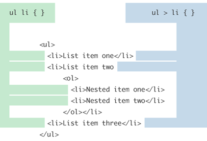
Figure 1. A Descendent Selector vs. a Child Selector
Although the child selector is still an “expensive” selector, it is more specific. This means that the browser won’t search as far down the inheritance chain to match the key selector. Thus, such a selector targets the element you need much better.
If you must use a descendent selector, eliminate all superfluous elements in it. For example:
.widget li a
would become
.widget a
The style will be applied whether the li is there or not.
Kill Qualified Selectors
Qualifying both #IDs and .classes with elements causes the browser to slow unnecessarily to search for the additional elements on the page to make a match with the selector. It is never necessary to qualify an ID. An ID has one of the highest specificity weights in CSS because it is unique to whatever page it is on, and it will always have a direct match on its own. Qualified selectors also cause the specificity of the selectors to be ridiculously high, necessitating the use of even more specific selectors and the use of !important to trump these super-specific rulesets.
Selectors such as
div#widget-nav div#widget-nav-slider
can be simplified to
#widget-nav #widget-nav-slider
and further whittled down to
#widget-nav-slider
Each provides the same outcome.
Dropping an element class qualifier in selectors lessens the specificity of the selector, which better enables you to correctly use the cascade to override the style if necessary. For example,
li.chapter
would ideally be changed to
.chapter
Even better, because it is more specific to the case of the
.li-chapter or .list-chapter
Make It Three or Less
When working on optimizing selectors, institute a “three or less” rule: a combinator selector should have no more than three steps to get to the key selector. For example, take this doozy of a selector:
div#blog-footer div#col2.column div.bestright p.besttitle {margin-bottom: 4px;}
To have three steps or less to get to the key selector, make a change like this:
#col2.column .besttitle {border: 1px solid #eee;}
Leverage and Layer Declarations
The next order of business is to focus on the style declarations themselves. When refactoring bloated CSS down to something more manageable, it’s easy to focus primarily on the selectors and believe that the styles will work themselves out. However, paying attention to what style declarations you’re creating (see Figure 2) and where they go makes a difference as well in moving toward sleek CSS.
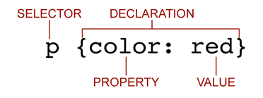
Figure 2. Anatomy of a CSS Ruleset
Leverage Inheritance
Often, we think we know something really well when actually we don’t, and inheritance in CSS may just be one of those areas. You might remember that inheritance is a fundamental concept of CSS, but you might not remember exactly which properties naturally inherit and which do not. Table 2 shows the most commonly used properties that get inherited by descendent elements, unless the descendent elements are styled otherwise. (There are other more obscure properties that are inherited as well.)
color font-family font-family font-size font-style font-variant font-weight font letter-spacing line-height |
list-style-image list-style-position list-style-type list-style text-align text-indent text-transform visibility white-space word-spacing |
Table 2. Common Elements Inherited by Descendent Elements
These properties are important to keep in mind when you’re looking for redundant styles to consolidate or eliminate. When you’re updating the stylesheet, properties that can be inherited should be placed in the CSS so that they are best utilized and not repeated. With proper placement of these properties, later redundant style declarations could be eliminated completely.
Review, Revise and Reduce !important Properties
If your CSS boasts an impressive number of !important declarations, then it’s time to reduce it. You should really use !important declarations only in certain instances. Chris Coyier of CSS Tricks recommends using them with utility classes or in user stylesheets. If you use them otherwise, you may end up being branded as selfish and lazy, and who wants that?!
How to cut down on !important? First, keep the specificity of selectors low by following the suggestions I made earlier. Second, remember that, ideally, new styles should not undo previous rulesets but add to them.
Here’s what I mean: if you find yourself writing new styles to undo an earlier style (and then using !important to try to trump the style in the event of a specificity war), then you need to rethink the older style, distill it down to its necessities, and then create new styles that augment the original style instead of working to undo what’s already there. This is what I think of as “layering” style rulesets. This can also be referred to as “extending” (or “subclassing”) a style, which is part of creating modules in phase 2.
If you have a large number of !important properties for the same styles, I bet those properties could be turned into a portable style that could be applied to multiple elements, which I’ll also talk about when I describe phase 2.
DRY Your Rulesets
To cut down on large numbers of repeated styles in the CSS, a little DRY coding can help. While adopting the full DRY CSS approach may be a bit draconian, being aware of when you repeat the same ruleset and then getting your group on is a great practice.
Phase 2: Restructure, Adjust, and Modularize
The techniques in phase 2 are focused on doing a moderate to high level of work to improve a site’s CSS. The changes encompass altering both the CSS and the HTML of the pages, with the changes to the HTML most likely to involve renaming or reassigning class names. The goal is to give structure and organization to the stylesheet, through grouping styles by category rather than by pages, by removing archaic HTML, clearing the excess from the selectors and creating modules to increase code efficiency.
This phase will further eliminate redundancy, make the stylesheet more lightweight by improving selector accuracy and efficiency and also aid in maintenance. This level of improvement takes more time and effort than phase 1, but it includes the bulk of the work required to make your CSS better and is estimated to dramatically cut down the number of lines of CSS code.
Here is what we are going to do:
- Restructure to refactor
- Categorize CSS rules in the stylesheet
- Restructure styles that rely on qualifiers high in the DOM
- Use class names as key selector
- Begin instituting modules
- Extend module substyles with a double hyphen (–)
- Create portable helper styles
- Surgical layout helpers
- Typographical styles
- Adjust the HTML
- Eliminate inline styles
- Decrease use of for better semantics
Restructure to Refactor
Let’s not forget that restructuring the CSS is our main objective. These practices start the process of moving away from thinking about and creating styles that are based on and specific to page components and page hierarchy, and moving toward thinking of styles in a portable, reusable and modular manner.
Categorize CSS Rules in the Stylesheet
In the first article in this series, I suggested creating a table of contents to make finding the sections of the styles in your CSS easier. In this phase of CSS refactoring, I recommend stepping up that process several notches by transforming these sections to the types of styles they describe, following the SMACSS categories. These categories are:
- Base The default styles, usually single element selectors that will cascade through the whole document.
- Layout The styles of the page sections.
- Module The reusable styles of the various modules of the site: callouts, sidebar sections, product, media, slideshows, lists, and so on.
- State The styles that describe how a module or layout looks in a particular state.
- Theme The styles that describe how modules or layouts might look.
So now, your table of contents and document sections will look like this:
/* Table of Contents
- Base

- Layout

- Module

- State

- Theme
*/

…
(later in the document…)
/* =Layout */ (etc.)
This reorganization of the stylesheet helps lay the foundation for the rest of the phase 2 practices and is a part of phase 3 as well.
Restructure Styles That Rely on Qualifiers High in the DOM
This recommendation is one of most important in this whole article: to completely eliminate page specific styles—that is, styles that are based on adding a class to the body element to signify a different page. A style such as this forces the browser to check all the way up the DOM chain to the tag. Here’s an example:
body.donations.events div#footer-columns div#col1 div.staff span.slug {

display: block;

margin: 3px 0 0 0;

}
This practice is the root of long selector chains, super-high specificity of selectors and the need to use !important to override styles higher up the cascade, as in the following example:
body.video div#lowercontent div.children.videoitem.hover a.title { background: #bc5b29;

color: #fff !important;

text-decoration: none;

}
In other words, it’s bad. Mmkaay?
To fix it, you need to follow all of the previous suggestions, such as three or less, kill the qualifiers and reduce specificity. What you could end up with is something more like this:
.donations-slug {

display: block;

margin: 3px 0 0 0;

}
Use Class Names as Key Selector
Because IDs are highly specific, you should avoid using them whenever possible, as they cannot be reused as classes can. However, in creating classes you want to keep your class names semantic yet portable. The goal is to make a selector as direct as possible. By doing this, you avoid specificity problems and can then even combine styles to layer them as suggested earlier.
From SMACSS, you should instill the practice that when you create selectors, the key selector should be a .class instead of a tag name or an #id. Always keep in mind that the far-right key selector is the most important one. If a selector can be as specific to the element in question as possible, then you’ve hit the jackpot. This way, the styles are targeted more directly because the browser matches only the exact elements.
Review all places where child selectors are used, and replace them with specific classes when possible. This also avoids having the key selector in the child combinator as an element, which is also discouraged.
For example, instead of doing this:
#toc > LI > A
it’s better to create a class, as shown next, and then add it to the appropriate elements.
.toc-anchor
Begin Instituting Modules
Nothing epitomizes the “measure twice, cut once” adage in the scalable CSS approaches as well as modules, which are the heart and soul of all of them. Modules are components of code that can be abstracted from the design patterns—for example, frequent instances of lists of items with images that float either to the left or right or underneath; these can be abstracted into a module with a base set of styles that every module would share. Then the module can be extended (or skinned) with changes in text, background, font color, borders, floats, and so on, but the structure remains the same.
The best thing about modules is that they are portable, meaning that they are not location dependent. Abstracting a design pattern into a code module means that you can put in anywhere in any page and it will show up the same way, without you having to reinvent the wheel style-wise. Now that’s what CSS was made for, right?! In addition to my earlier suggestions, modularizing your CSS is one of the best ways to dramatically decrease the amount of code.
OOCSS provides a great way to think about how to structure and skin a module and also about what can be made into a module. SMACSS provides clear guidelines on how to name modules and extend them.
Extend Substyles with —
Although SMACSS gives great guidance for thinking about extending modules, I prefer the technique from CSS for Grownups of extending substyles with –. This makes a lot of sense to me because it is a visual indication that the new style is based on the previous one but is taking it further.
Here’s an example:
#go, #pmgo{

    width: 29px;

    height: 29px;

    margin: 4px 0 0 4px;

    padding: 0;

    border: 0;

    font-size: 0;

    display: block;

    line-height: 0;

    text-indent: -9999px !important;

    background: transparent url("/images/go.jpg") 0 0 no-repeat;

    cursor: pointer; /* hand-shaped cursor */

    x-cursor: hand; /* for IE 5.x */

}
#pmgo{

    margin: 2px 0 0 3px;

    background: transparent url("/images/go.jpg") no-repeat center top;

}
This code could be modified and changed into something more like this:
.button-search{

    width: 29px;

    height: 29px;

    margin: 4px 0 0 4px;

    padding: 0;

    border: 0;

    font-size: 0;

    display: block;

    line-height: 0;

    text-indent: -9999px !important;

    background: transparent url("/images/go.jpg") 0 0 no-repeat;

    cursor: pointer; /* hand-shaped cursor */

    x-cursor: hand; /* for IE 5.x */

}
.button-search--pm{

margin: 2px 0 0 3px;

background: transparent url("/images/go.jpg") no-repeat center top;

}
Create Portable Helper Styles
Along with the process of modularization, portable styles are another handy tool to have in your arsenal. Here are some examples from CSS for Grownups.
Surgical Layout Helpers
By CSS for Grownups’ standards, there’s no shame in having a little extra layout help. While a grid takes care of a lot of issues, these styles may give elements a little nudge when needed (especially in terms of vertical spacing), while eliminating lines of code.
.margin-top {margin-top: 5px;}

.margin-bottom {margin-bottom: .5em;}
Although in most cases we strive to keep names semantic when creating classes, in this instance descriptive names are fine.
Typographical Styles
Typographical styles are perfect if you find that much of your CSS is devoted to changing the font face, size and/or line height. Both OOCSS and CSS for Grownups suggest dedicated typographical styles that are not tied to the element, such as the following:
.h-slug {font-size: .8em;}
.h-title {font-size: 1.5em;}
.h-author {font-size: 1em;}
A great exercise is to search for the properties font, font-size, font-face, and h1 through h6 and marvel at the sheer magnitude of the instances of these properties. Once you’ve had a good laugh, figure out which styles apply to what, which sizes are important, and then start making some portable typographical styles.
Adjust the HTML
While the practices in phases 1 and 2 that we’ve covered so far offer miracles in terms of CSS cleanup, we can’t forget about the page markup. Most likely, as suggested by Andy Hume in CSS for Grownups, you’ll need to make changes to the HTML beyond adding new class names.
Decrease Use of for Better Semantics
Do you have a rampant use of the tag where a more semantic tag would be much more appropriate? Remember, the tag is really for inline elements, not block-level elements, as stated by the W3C (https://www.w3.org/TR/html401/struct/global.html#h-7.5.4), so using for headers and other elements intended to be block-level is technically incorrect.
Here, for example, the spans should really be paragraphs or header tags that indicate where this content fits in the document’s hierarchy. Either of those other elements could have provided a base for the class hooks.
<li>
<a href="/learning/hillman" title="">
<img src="/images/brenda-hillman.jpg" alt="Air in the Epic" />
</a>
<span>Brenda Hillman Essays</span>
<span><a href="/learning/hillman" title="Air in the Epic" class="title">Air in the Epic</a></span>
<span>Brenda Hillman</span>
</li>
The following version of this code would be an improvement from a semantics standpoint:
<li>
<a href="/learning/hillman" title="">
<img src="/images/brenda-hillman.jpg" alt="Air in the Epic" />

</a>
<p>Brenda Hillman Essays </p>
<h3><a href="/learning/hillman" title="Air in the Epic" class="title">Air in the Epic</a></h3>
<p>Brenda Hillman</p>
</li>
Eliminate Inline Styles
Finally, you need to get rid of inline styles. In this day and age, inline styles should rarely if ever be used. They are much too closely tied to the HTML and are akin to the days of yore when tags were running rampant. If you use inline styles to override specificity, then making the changes suggested in this article should already help you avoid specificity wars, effectively eliminating the need for inline styles.
For example, this inline style:
<span class="text-indent: 1em">Skittles are tasty</span>could easily be turned into its own class that can be applied throughout the document, like so:
.indent {text-indent: 1em:}Your mission, should you choose to accept it, is to find all the instances of inline styles and see where you can make those styles portable helpers. The property you’re using could easily be made into a portable style that can be reused on the other instances of text.
Try It, It Will Be Good for You!
At the Øredev Web development conference in Malmö, Sweden, I had the pleasure of seeing the brilliant Katrina Owen present “Therapeutic Refactoring.” She suggested that when faced with a deadline, she turns to refactoring horrible code to help her gain a sense of control and rightness in the world.
You can approach restructuring your CSS for the better the same way. By healing what ails your CSS, you can gain a sense of calm and power, while beginning to make the world of your site’s stylesheets a better place, one line of code at a time.
Stick with me, though, because we aren’t quite finished. We have two more phases to cover in the MetaCoax process that will fully oust the evil from your CSS once and for all, and will also enable you to leave a legacy of goodness behind for all of the front-end devs that come after you.
Links for Further Reading
- CSS Lint Pages
- Breaking Good Habits – Harry Roberts’ talk at Front Trends Conference 2012
- Big CSS – Another great Harry Roberts presentation
—–
Frequently Asked Questions (FAQs) about CSS Architectures and Refactoring
What is the importance of CSS refactoring in web development?
CSS refactoring is a crucial aspect of web development. It involves revising and improving your existing CSS code without necessarily changing its behavior. The primary goal is to improve the non-functional attributes of the software. This process helps in making the code more efficient, readable, and maintainable. It also helps in reducing complexity, making it easier to understand and manage the code. This is particularly important when working on large projects or when transitioning the project to a new team.
How can I effectively refactor my CSS code?
Effective CSS refactoring involves several steps. First, you need to understand the existing codebase. This involves identifying the different components, their relationships, and their dependencies. Next, you need to identify areas of improvement. This could be redundant code, inefficient selectors, or outdated practices. Once these areas are identified, you can start refactoring the code. This should be done incrementally, testing the changes at each step to ensure that the functionality remains intact.
What are the best practices for CSS refactoring?
Some of the best practices for CSS refactoring include: keeping the code DRY (Don’t Repeat Yourself), using a consistent naming convention, organizing the code logically, and using comments to explain complex sections of the code. It’s also recommended to use a CSS preprocessor like Sass or Less, which provides features like variables, nesting, and mixins that can make the code more maintainable.
What are the common challenges in CSS refactoring?
Some of the common challenges in CSS refactoring include: dealing with legacy code, managing dependencies, ensuring browser compatibility, and maintaining the functionality of the website during the refactoring process. It’s also challenging to refactor CSS without a good understanding of the existing codebase and the design principles behind it.
How can I ensure that my refactored CSS code is efficient?
To ensure that your refactored CSS code is efficient, you should aim to reduce redundancy, minimize the use of expensive selectors, and use shorthand properties whenever possible. It’s also important to test the performance of your code, using tools like Google’s PageSpeed Insights or Chrome’s DevTools.
What is the role of CSS architectures in refactoring?
CSS architectures provide a structured approach to writing and organizing CSS code. They provide guidelines on how to structure your CSS files, name your classes, and manage dependencies. This can make the refactoring process easier and more efficient, as it provides a clear roadmap for improving the code.
What are some popular CSS architectures that I can use?
Some popular CSS architectures include OOCSS (Object-Oriented CSS), SMACSS (Scalable and Modular Architecture for CSS), and BEM (Block, Element, Modifier). These architectures provide different approaches to structuring CSS code, and you can choose the one that best fits your project’s needs.
How can I transition to a new CSS architecture?
Transitioning to a new CSS architecture is a gradual process. It involves understanding the principles of the new architecture, planning the transition, and then incrementally refactoring the code to fit the new architecture. It’s important to test the changes at each step to ensure that the website’s functionality remains intact.
Can I use CSS frameworks in conjunction with CSS architectures?
Yes, CSS frameworks can be used in conjunction with CSS architectures. The frameworks provide pre-written CSS code that can help speed up development, while the architectures provide a structured approach to organizing this code. However, it’s important to ensure that the framework and architecture are compatible and that the framework doesn’t introduce unnecessary complexity or bloat.
What are some tools that can help with CSS refactoring?
There are several tools that can help with CSS refactoring. These include CSS preprocessors like Sass or Less, linters like Stylelint, and code editors with built-in refactoring tools. There are also online tools like CSS Lint and CSS Compressor that can help identify issues and optimize your CSS code.
Denise R. Jacobs is an author, speaker, web design consultant, and creativity evangelist. Based in Miami, Florida, she is the author of The CSS Detective Guide, and co-authored InterAct with Web Standards: A Holistic Approach to Web Design.